Checkout abandonment is one of the most fixable problems in eCommerce. The best-performing brands are applying proven checkout best practices that reinforce trust and make buying feel effortless.
eCommerce Checkout: Key Findings
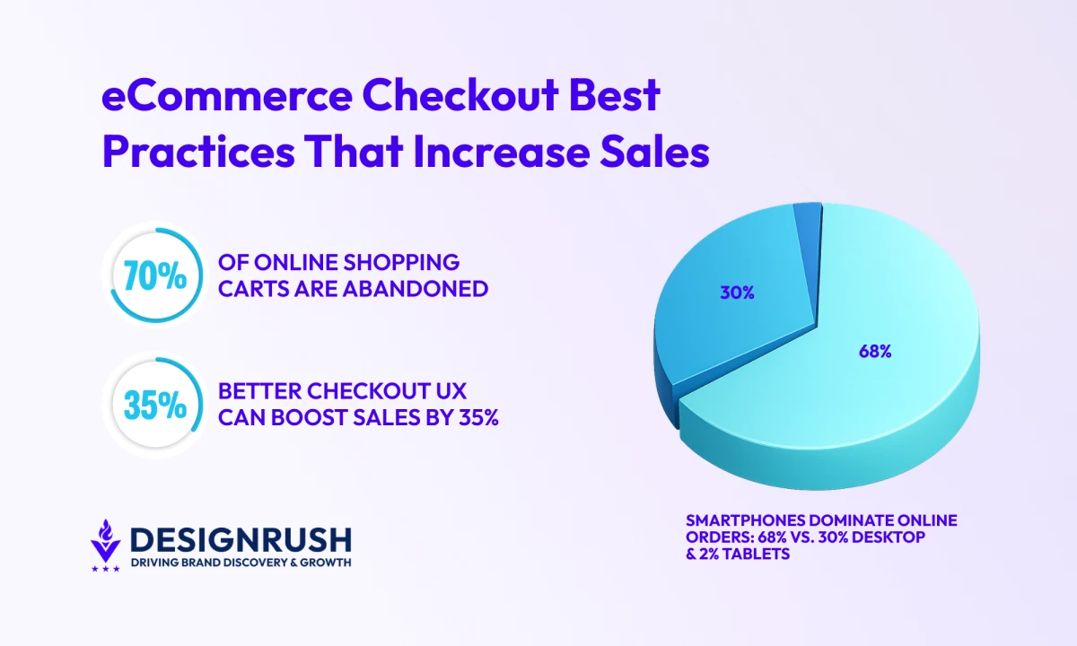
- With nearly 70% of carts abandoned, the biggest gains come from removing obstacles like forced account creation, long forms, and late-stage surprises.
- Most sites can cut visible form fields by 20–60% without losing critical data, and large retailers have seen 35%+ conversion lifts from simplifying checkout alone.
- Supporting digital wallets and BNPL options reduces hesitation at the final step, especially on mobile and higher-value orders.
Why Do Customers Abandon Carts During Online Checkout?
Nearly 70% of online shoppers leave without completing their purchase, making checkout one of the most critical failure points in eCommerce.
Research from Baymard Institute shows that abandonment is rarely caused by a lack of intent; instead, it’s driven by avoidable friction in the checkout experience.
The most common reasons shoppers abandon their carts are strikingly practical. Unexpected extra costs, such as shipping, taxes, or fees, are the top deterrent, cited by roughly 40% of shoppers.
A significant share also abandon purchases simply because the checkout process is too long or complicated, or because the returns policy feels unclear or restrictive.
Every unnecessary form field, forced step, or surprise cost increases hesitation at the exact moment shoppers are deciding whether to pay.
In fact, checkout-flow analysis shows that most eCommerce sites could reduce the number of visible checkout form elements by 20% to 60% without sacrificing required information, immediately lowering friction and cognitive load.
Large eCommerce sites that optimize checkout usability can unlock conversion rate gains of over 35%, purely through better checkout design.
That’s why eCommerce checkout best practices will help directly determine whether high-intent shoppers convert or walk away.
1. Offer Guest Checkout to Let Shoppers Buy Without Commitment
Forcing shoppers to create an account is one of the quickest ways to derail a purchase. In well-designed eCommerce checkout flows, customers expect speed and certainty at this stage, not a commitment.
Guest checkout keeps the focus on buying, not signing up, so shoppers can complete their purchase without unnecessary friction.
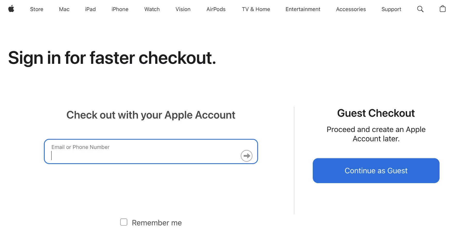
Clearly present “Continue as Guest” alongside login options and avoid framing it as a secondary or limited experience.
You can defer account creation until after purchase. Prompt users to create an account on the confirmation page using the email they’ve already provided.
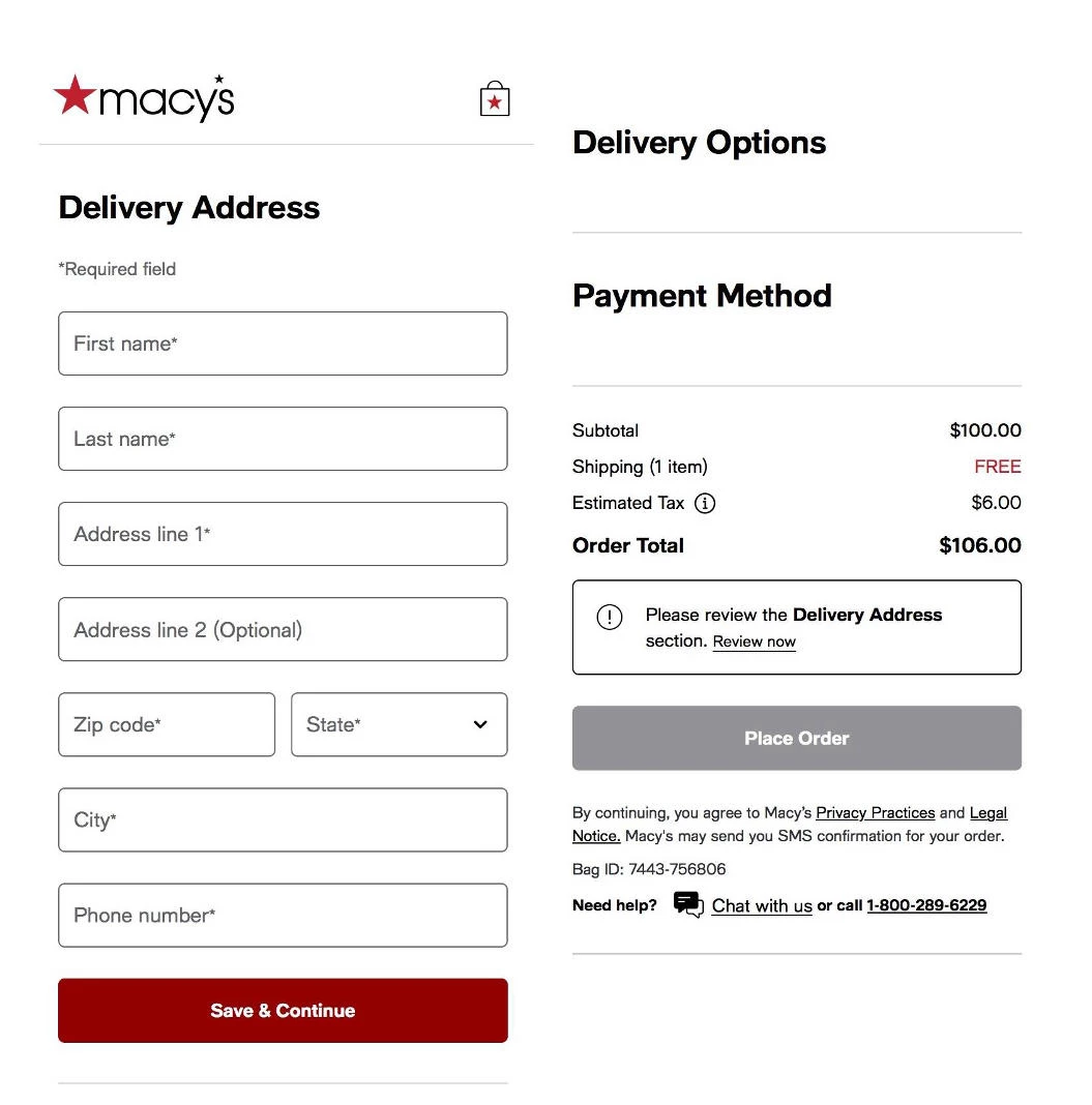
2. Simplify Checkout to Keep Shoppers Moving
Long, complicated checkouts slow shoppers down at the worst possible moment. Every extra field, step, or page break gives buyers more time to reconsider the purchase and click away from their cart.
A streamlined checkout keeps momentum intact. When shoppers can move from cart to confirmation quickly, they’re much more likely to follow through.
Reduce checkout forms to only what’s required to complete the order. In most cases, billing, shipping, and payment details are all that’s needed; everything else can wait.
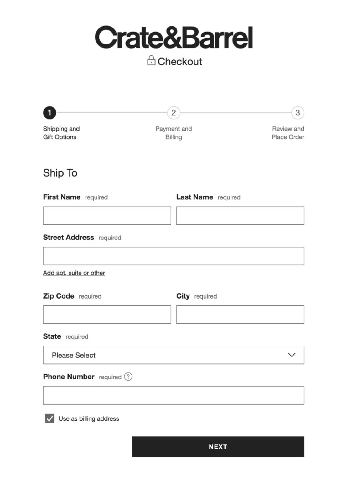
Group related fields logically and avoid asking for the same information twice. Use smart defaults, autofill, and address lookup to minimize manual input, especially on mobile.
Limit the number of steps and clearly show progress. Shoppers should always know where they are and how close they are to finishing.
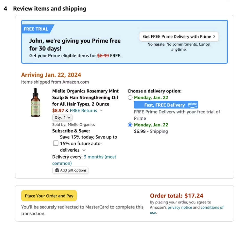
3. Give Shoppers More Ways to Pay at Checkout
Providing multiple payment options is a core part of eCommerce checkout optimization.
Credit cards alone no longer cover how people want to pay, especially on mobile and for higher-ticket items.
@npdigitalglobal We saw a record-shattering $222B 💵 made this holiday season from online shopping. 🛍️ David is here to explain the new shopping experience that allowed for such a big number to be hit and what we can expect moving forward 🙌 #onlineshopping#bnpl#buynowpaylater#holidayshopping#digitalmarketing♬ original sound - NP Digital
Digital wallets and Buy Now, Pay Later (BNPL) options reduce hesitation by making checkout faster and purchases feel more manageable.
Offer a mix of major credit cards, digital wallets, and BNPL providers so shoppers can pay the way they prefer without friction.
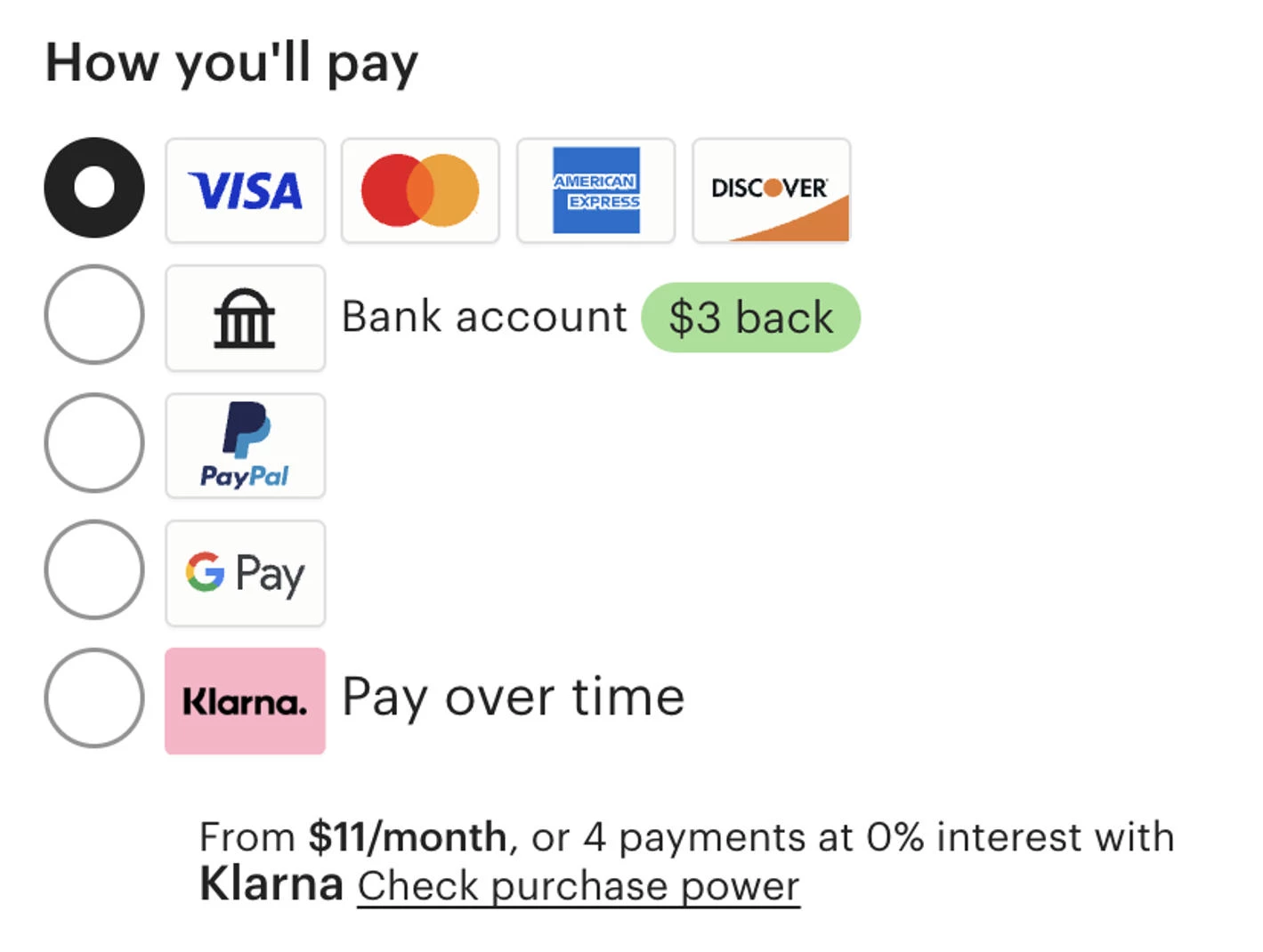
Ensure payment methods are fast, recognizable, and optimized for mobile to avoid delays or trust concerns at the final step.
4. Avoid Checkout Surprises With Clear Pricing
Unexpected costs are one of the fastest ways to break trust during the eCommerce checkout process.
When shipping, taxes, or fees appear late, shoppers feel misled, and many abandon their cart rather than recalculate the value of the purchase.
Clear pricing keeps shoppers confident. When the full cost is visible early, buyers can move through checkout without hesitation or second-guessing.
Show estimated shipping, taxes, and fees before checkout begins, ideally on the cart page. Use clear, plain-language labels for all costs, so shoppers immediately understand what they’re paying for.
Avoid last-minute price changes at the payment step, where trust is most fragile.
5. Give Shoppers Control With Flexible Shipping Options
Shipping speed and cost also play a major role in whether shoppers convert. A single, expensive shipping option can stop a purchase just as easily as an unexpected fee.
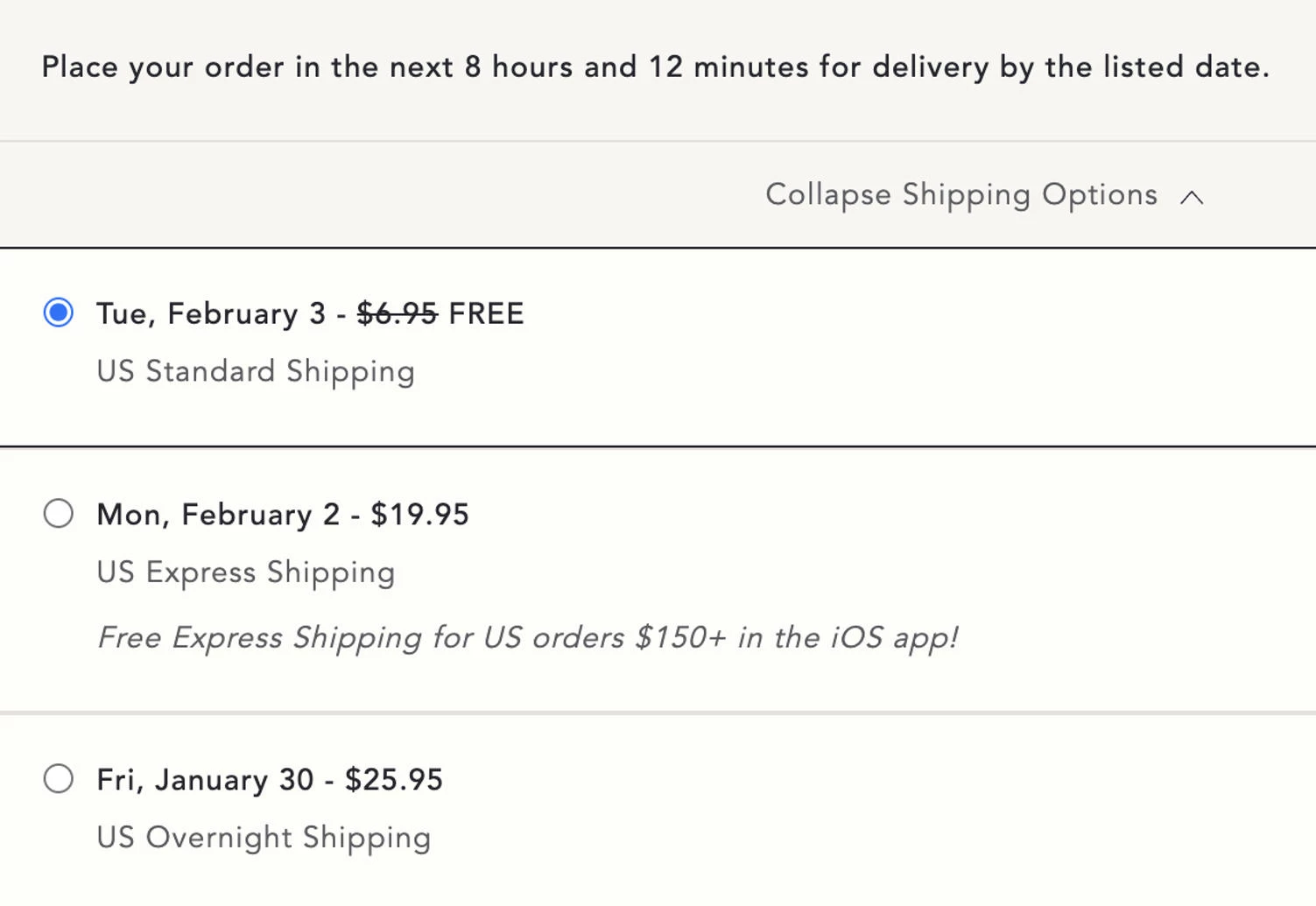
Offer free shipping where possible, even if it requires a minimum order value.
Provide multiple shipping options, clearly showing delivery timelines and costs for each. Set clear delivery expectations so shoppers know exactly when their order will arrive.
6. Build Confidence With Clear Checkout Trust Cues
At checkout, shoppers are making a final decision about whether they trust your site with their personal and payment information.
Weak or missing trust signals in your eCommerce checkout page design can introduce hesitation, even if everything else feels right.
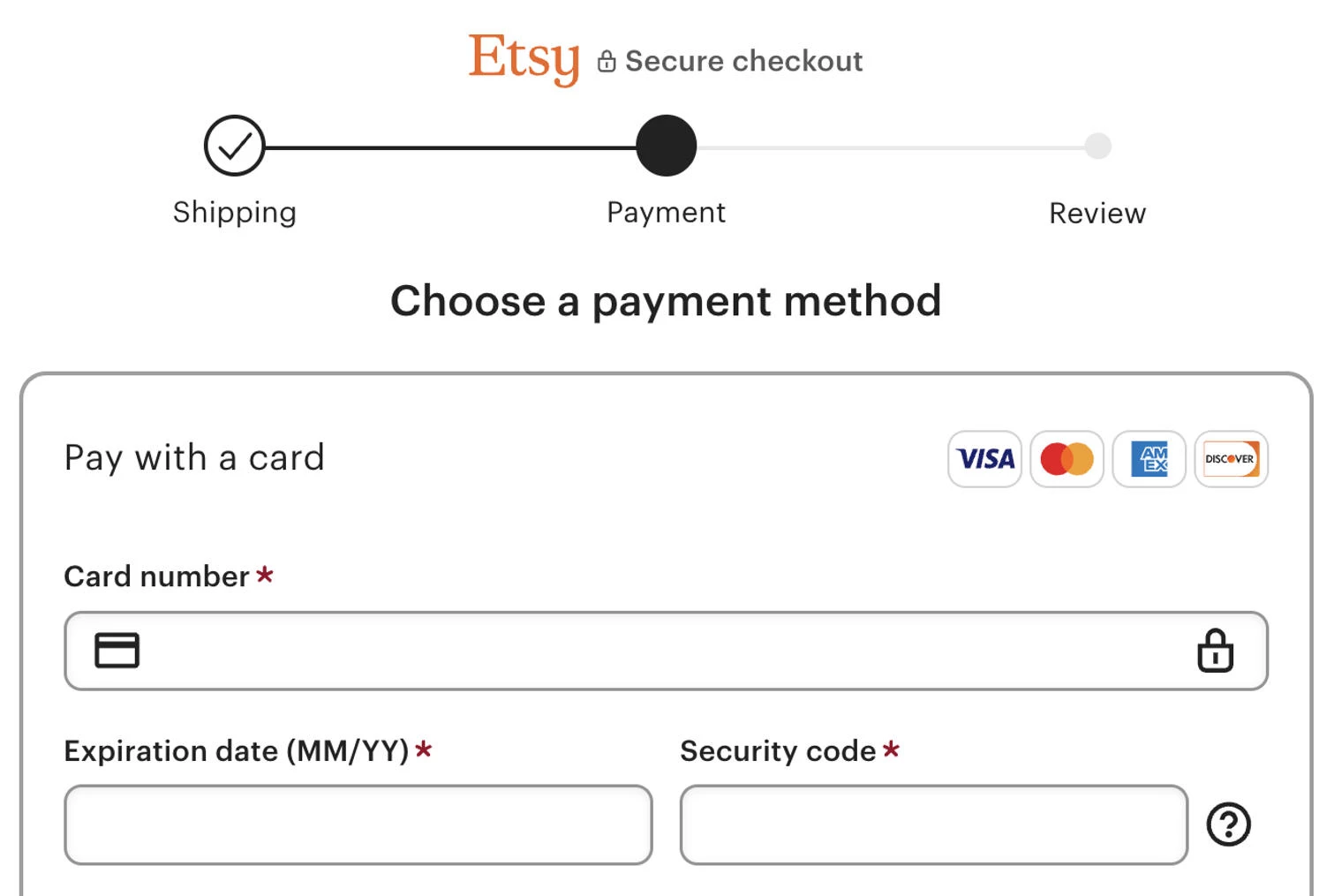
Use concise reassurance copy, such as privacy or data protection messaging, to reinforce that customer information is secure. Trust signals should be visible and relevant.
Display security badges, SSL indicators, and payment logos near form fields and the payment button, where trust concerns are highest.
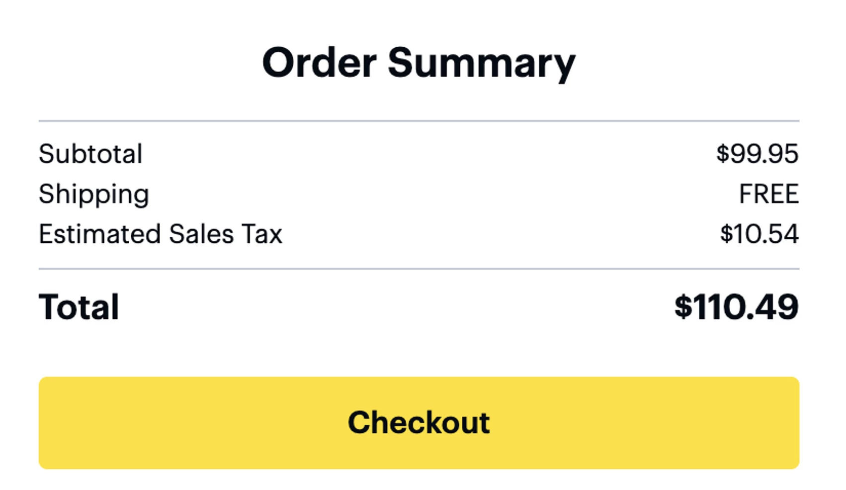
7. Reduce Uncertainty With a Clear Checkout Summary
Shoppers shouldn’t have to leave checkout to remember what they’re buying or how much they’re paying.
When customers can see items, totals, and key details at every step, they’re more likely to stay focused on completing the purchase.
Update totals in real time as shipping options, discounts, or taxes change to avoid surprises. Make it easy to edit items without forcing shoppers to leave the checkout flow.
8. Make Checkout Easy on Mobile Devices
Most online purchases now happen on mobile, but many checkout experiences are still designed for desktop first.
Small screens amplify friction: long forms, tiny buttons, and slow load times make it harder for shoppers to complete a purchase.
Optimizing checkout for mobile removes those barriers. When mobile checkout feels fast, readable, and easy to tap through, shoppers are far more likely to finish what they started.
Use mobile-first layouts with large tap targets, readable input fields, and minimal scrolling. Pages should load quickly and remain responsive, even on slower connections.
Enable autofill, mobile keyboards, and wallet-based payments to reduce typing and speed up checkout.
9. Extend Checkout to Social, Email, and Support Channels
Shoppers no longer move through a single, linear path to purchase. Today’s buying journeys often start — and finish — outside your website, making cross-channel checkout a critical part of modern eCommerce strategy.
@sailawaymedia The secret these brands are using to rake in millions each month on TikTok Shop 😏🛍️ #marketing#advertising#marketingstrategy#advertisingtiktok#ecommerce#ecommercebusiness#tiktokshop#greenscreen♬ original sound - Alyssa Ege
51% of businesses now sell directly through shoppable posts on social media platforms. Many also collect payment through marketing emails and allow service agents to place orders on a customer’s behalf.
When checkout works seamlessly across channels, shoppers can buy the moment intent peaks.
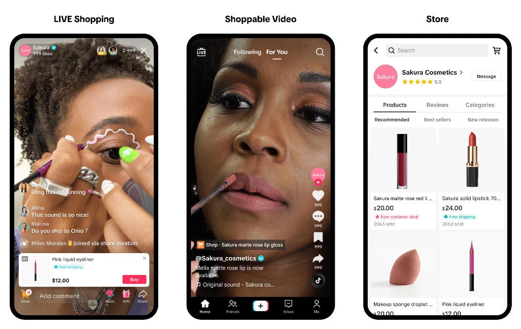
Enable checkout directly within social media ads and posts, so shoppers don’t have to leave the platform to complete a purchase.
10. Optimize Checkout Performance With Better Reporting
Optimizing checkout doesn’t stop at launch. Ongoing eCommerce checkout conversion rate optimization depends on understanding where and why shoppers drop off and fixing those issues before they impact revenue.
- By tracking abandonment rates, bounce rates, and step-level drop-offs, you can identify friction points and make targeted improvements instead of guessing.
- Monitor cart and checkout abandonment rates to spot where shoppers exit most often.
- Analyze bounce and exit rates at each checkout step to uncover usability issues, slow load times, or confusing fields.
- Test and adjust checkout elements — such as form length, payment placement, or shipping options — based on performance data, not assumptions.
Nirav Sheth, CEO of Anatta, emphasizes the importance of tracking eCommerce metrics:
"A high conversion rate will illustrate that customers enjoy shopping on your site, love your products and that acquisition efforts are paying off. Meanwhile, a high repeat purchase rate (CLTV) can illustrate that customers who convert once, are likely to convert again."
Trends in eCommerce Checkout Design
Checkout design is evolving beyond basic usability fixes as brands compete on speed, intelligence, and flexibility.
Recent eCommerce checkout news points to a shift toward adaptive, context-aware checkout experiences that respond to shopper behavior in real time.
Key trends shaping modern checkout design include:
- Deeper personalization at checkout: Promotions, shipping options, and payment methods are dynamically prioritized based on shopper history.
- Tighter integration with inventory and fulfillment systems: Real-time stock, delivery windows, and pickup availability are now reflected directly within checkout.
- Adaptive checkout flows based on user behavior: Checkout steps increasingly change based on signals like device type, order value, or returning vs. first-time shoppers.
- One-click checkout expansion beyond marketplaces: One-tap purchasing models are becoming more common across DTC sites, not just major platforms.
- AI-driven fraud prevention with fewer visible interruptions: Risk checks are moving behind the scenes, reducing false declines and unnecessary verification steps.
eCommerce Checkout: Final Thoughts
High-converting checkouts aren’t flashy. They work because they remove friction, build trust, and let shoppers finish what they came to do.
Applied correctly, these checkout best practices turn lost carts into completed purchases and sustained growth.
![]()
Our team ranks agencies worldwide to help you find a qualified partner. Visit our Agency Directory for the top eCommerce companies, as well as:
- Top eCommerce Consultants
- Top eCommerce Marketing Agencies
- Top Shopify Development Companies
- Top Shopify Marketing Agencies
- Top Shopify Plus eCommerce Agencies
Our design experts also showcase the most innovative eCommerce projects worldwide. For inspiration, visit our Awards section to explore the best and latest in eCommerce website designs.
eCommerce Checkout FAQs
1. What is a good eCommerce checkout conversion rate?
Most eCommerce sites convert between 2–4%, but optimized checkout flows can significantly outperform that benchmark, especially on mobile.
2. What checkout metrics should I track most closely?
Focus on cart abandonment rate, checkout abandonment rate, step-level exit rates, and mobile vs. desktop performance.
3. How often should checkout be optimized?
Continuously. Even small changes in payment methods, shipping costs, or device behavior can impact conversion over time.