
In 2017, mobile traffic made up 53.64 percent of global online traffic. By the end of 2018, that number is expected to rise to 79 percent. And this is just one set of numbers that shows the increasing reliance we as a society have on our mobile device experiences.
Our world is becoming increasingly mobile-first — more and more people are looking to their mobile devices to gather information, complete transactions and engage with brands whether it's via social media or directly with brands themselves through their websites.
This means that in order for brands to stay relevant, they need to grow and adapt. And the first thing they need to do is make sure they’re where their audience is — and evidently, they’re on mobile devices.
Fifty-seven percent of internet users say that they won’t recommend a brand or business if they have a poorly designed mobile website or presence. Similarly, eight out of 10 customers won’t continue absorbing or engaging with content if it doesn’t display in an efficient way on their mobile devices.
To alleviate this, mobile layouts need to be clean, images need to be scaled, the text needs to fit and loading times need to be quick. This means that brands need to create a unified, fluid, omnichannel user experience.
Consumers want a seamless experience across all devices and platforms — from desktop websites to mobile websites, to apps and even in-store.
But even with all of these statistics, you might not think that a mobile approach to marketing and sales is necessary. Maybe your desktop conversion rates are already extremely successful, and you’re not yet convinced that a presence on mobile is beneficial for you.
But you’d be wrong.
Mobile conversion rates are up 64 percent compared to desktop conversion rates. More people are turning to mobile to make a purchase or complete an action — or at least they’re starting there.
In many cases, people begin their searches for a product or service on a mobile device and continue to learn more by visiting the said store in-person. But it’s apparent that people are using their mobile devices as a starting point — and your business can’t afford to be left out of that process.
Because your competition is likely already on mobile, it’s likely that they already have a solid and expansive online presence, and they’re bound to get the traffic and the sales that you want because they were easier to find and interact with while on their bus ride home from work on a rainy Thursday afternoon.
But what is better for mobile integration? There are two options for your business. You can either work on creating a responsive website design, which allows users to look up your website on their mobile devices with ease. Or you can create an app design that users can download. Either way, you need to make sure your brand can be seen on mobile devices.
Both mobile-friendly design and app design have their pros and cons. But before we delve into those, it’s important we understand what the difference between these two types of design actually is.

The Difference Between App Design And Mobile-Friendly Web Design
It might not seem obvious the distinction between apps and mobile websites, but the differences are clear. If you’re trying to create a more in-depth, mobile-first strategy, it’s vital that you make sure you have an effective mobile presence.
We’re living in a world where everyone is on their phones. This means that in order to stay on track with the competition, you have to make sure that you too have an active presence on mobile. And there are a number of ways you can do that — through apps or through mobile-friendly design.
Ideally, your brand will utilize both methods. Your brand will have an exciting and engaging app, and it will also have a mobile-friendly website for quick and easy access on the go. But we all know that's not always possible. So what's the real difference between the two mediums?
A mobile-friendly website design is exactly what it sounds like. It’s a website created specifically for mobile devices like smartphones and tablets. These responsive designs are created exclusively for devices that aren’t desktop or laptop devices, which means that they need to have certain functionalities and capabilities in order to succeed.
What it takes to host a website on a computer is different from what it takes to host a successful website on a mobile device. Businesses need to understand this. Consumers have different expectations of a mobile-friendly website, so brands need to utilize website designers that can give this to them.
Responsiveness has become the new standard in website design which allows for adaptability and functionality across devices. This is the first step in creating a mobile-friendly website design.
Layout, orientation, images and video all need to be able to display correctly and adequately. And it’s likely that there are more clickable CTAs and features — maps that open up directly in map apps, emails that open up in email and phone numbers that dial with a click.
Mobile websites function on all devices, but they don’t look the same. In comparison, apps don’t function on all devices, but they provide a fluid and similar user experience across the devices they do work on.
There’s a reason why69% of mobile phone usersclaim that they are more likely to buy products from brands who make an effort to address customers’ questions on mobile sites.
Apps are also used on mobile platforms, but they differ in their goals and functionality. Apps are dedicated applications a brand creates for its audience. Apps are downloaded and installed instead of searched for on a search engine. Apps are created for specific operating systems and often times have additional, interactive features to keep audiences engaged and offer additional information to help inform and immerse the users. Apps can either run connected to the internet or apart from it. You can secure your mobile app using code signing certificate to show users that app is secure to use and code is not tampered.
Both apps and mobile websites have similar functions and features, even though they do differ slightly. So what makes one better than the other? Why do some brands choose app design over mobile design and vice versa? And why do some choose to allocate resources to effectively run both?
Below are several pros and cons to both an app and mobile-friendly design to help make the decision for your business and brand on where to put your design time, resources and talent.

Mobile-Friendly Website Design vs. App Design
The Pros Of Mobile-Friendly Design
Mobile-friendly website designs are a great way to raise awareness and increase brand presence. People want information about your brand at the tips of their fingers. They want answers as soon as they ask questions. Mobile-friendly, responsive website designs can give your customers this easy access and are an easy and cost-effective way of getting your brand voice heard.
1. Easy To Find
One of the biggest pros for mobile-friendly website design is how easy it is for users to find. All it takes is a quick search on Google and in moments you're on the webpage. It's fast. It's efficient. It's simple. There's no downloading or installing or onboarding.
People want easy. They don't want to waste their time and they don't want their lives to be any more difficult than they already are. A mobile-friendly website takes the stress and confusion out of navigating a brand and its content. A mobile-friendly website is responsive, straightforward and essential. When people are mindlessly searching on their phones at lunch or on the train, they're not searching through an app store. This gives website designs a leg up.
2. Search Engine Optimization
Search engines award “special points” to websites that are optimized for mobile devices. Well, not points, but better rankings. For example, even if people are searching on their desktops, the search results will rank mobile-friendly websites higher.
Mobile optimization is a strong SEO signal, which makes sense because the main goal of SEO is to provide a unified browsing experience, and if you can access something both from mobile and desktop, then you as a customer will be happy.
That, in turn, makes Google and all of the other search engines happy as well.
Speaking of Google, the brand shared some cool and valuable insights.
A staggering 89 percent of people will gladly recommend a brand after having a positive experience on a brand’s mobile website.
On the other hand,57 percent of userswon’t recommend a website with a poor mobile design.
And 46 percent of people claim that they won’t consider buying something from a brand that offers them an interruptive mobile experience.
3. Compatible Across Devices
The whole point of creating a mobile-friendly website design is to allow for full functionality across all devices -- Androids, iPhones, tablets and beyond. Responsiveness is what gives websites this all-encompassing functionality. And all it takes is a little bit of work.
There is no need for sticky app development across iPhone and Android apps. There's no worrying about how certain operating systems will affect the app UI. There's no need to test multiple versions of the same product. By creating a responsive, mobile-friendly website you're cutting down the steps that it takes to reach your audiences, and you're allowing for all users -- regardless of the device -- to gain access to your content. Some smartphones might not be able to download your app, but they'll be able to search for your website.
4. Immediately Available
People are impatient, as we've already stated. People want instant gratification. Mobile websites give that to people. There's no need to search an app store, wait for an app to download, set up an account and onboard. All they need is WiFi or access to a 3G/4G network and they can quickly and easily scope you out.
Whenever they want to engage with your brand, they can. Websites offer that instant gratification and instant availability. Think about it -- if you're looking for a website and it doesn't come up immediately, how long will you really search for it?
Similarly, if the website design you're seeking out doesn't load immediately or look the part the second you click on it, are you going to continue interacting with it? PRobably not. You want your information now, and a good mobile-friendly website can give that to your consumers.
5. Less Costly
Creating mobile apps can sometimes cost upwards of $10,000!
Does your company have that kind of money to spend?
If you do, great! If not, which is likely the case, you'll be glad to know that optimizing your website for mobile-friendliness is far cheaper, and doesn't require a whole new team or agency.
Website designs for mobile are more cost-effective than creating apps themselves. This is because websites are likely already live -- all it might take is a little bit of editing to get it mobile-ready.
You don't want to waste valuable money and time creating an app when a website can get the job done just as well. Of course, with apps, you can do more but if you're satisfied with the functionality a website design can offer, then that's where your time, money and resources should go.

The Cons Of Mobile-Friendly Design
1. Less Convenient
While a mobile website is easy to access, it's not always the most convenient application. This is because, often times, the capabilities of your smartphone aren't exactly compatible with the website design. And a website design limits the extra features that an app can give the user.
It might be harder to launch a call, email or your camera from a mobile website. This could result in lag time, phone glitches and overall lack of support by the device.
Of course, there are ways around this. And mobile websites are becoming increasingly more interactive and engaging for their users, but overall, websites can't perform as fluidly and in as engaging in a way as an app can. Websites are there more for information and aren't as handy at completing a purchase or performing an action as an app can be.
2. No Offline Capabilities
Obviously, a website you launch on your mobile device can't work offline. It's just like a computer, after all, and requires some kind of connection to WiFi or a 3G/4G network. This can be a major downside to website designs on mobile because it can be limiting for some users in some areas.
Websites won't always be available to your audience if service is poor or if the connection is weak. This can be frustrating for both you and the user. With apps, you have easy and efficient access to a brand's content at all times in most cases -- after download, the information can be accessed whether you're connected to WiFi or not.
With a mobile website, that's just not the case. And this can cause your audience to search elsewhere -- like the app store -- for brands that they can always interact with.
3. Lacking Great UX
Mobile user experiences are wildly different from desktop experiences. And when on mobile, users want different things than when they are on their laptops. This can create a jarring UX when switching from a desktop to a mobile version of a website -- even if your website design is responsive.
This is in part due to the setup of a smartphone. It's a very small screen that limits the visibility of other areas of a website. This can make it seem like there is only a limited amount of information available for the user, creating a single-page experience that leaves much to be desired.
Try as you might, designers can't fit all the information a brand wants to showcase onto one page so things will fall to the wayside and your audience will have a less than impactful experience as a result.
The Pros Of App Design
App designs are a comprehensive and engaging way to get users involved with your brand. Whether you're using an app as a marketplace or e-commerce store, or you're using it to increase your reach and brand identity, a mobile app is a perfect tool for creating an iOS or Android experience on iPhones and iPads and androids.
Today, more than 91 percent of smartphone users use apps on their devices.
Approximately 1 hour per day is spent on app usage. That’s a lot of time. And we mustn’t forget that when people scroll across their home screens, app icons remind them that they are there, so having access to a person’s mobile home screen improves brand visibility, awareness and overall engagement.
Websites are great for consuming information, but apps are perfect engagement drivers that allow people to immerse themselves in a brand experience.
1. Interactive
More often than not, apps provide users with more capabilities than just a simple e-commerce experience. They provide users with ways to interact and engage with a brand. This can be in combination with social media campaigns or other initiatives -- but with apps, users get to fully immerse themselves in the experience that the brand is providing them.
Maybe its a game that the brand gives users access to, or a daily puzzle quote or saying that the user can dissect. Maybe the app works as an accessory to a mobile site altogether, providing users with something completely different than a general informative experience.
Take Trips by Lonely Planet. This app doesn't just regurgitate the information on its site. Instead, it gives users a way to express their own thoughts and experiences in the form of travel stories and guides.
With simple mobile websites, you don't get that added dimension or depth.

2. Personalized
With a mobile app, you can easily set up your own account with your own preferences and search histories. This means that the overall process is more streamlined. You can save searches, keep wishlists and put cards on file so that the next time you go to make a purchase, you're not scrambling through the site to find the dress you loved or searching through your purse for credit cards.
With mobile websites, you don't get such an immersive level of interaction and personalization. You can still create an account, of course, but your engagement with it will be limited. With apps, they're designed with you in mind to your experience within them will be exactly the one you wanted to create.
3. Native Functionality
When working with an app, you're working with an application designed to work with the native functionality of a smartphone. Operating systems are put in place to make these distinctions and increase seamlessness in designs and capabilities.
With apps, you can expect to take photos in-app or interact in other ways without any glitches, troubles with loading or any other hiccups that can be experienced in a website design. If it says you can send an email, the app should let you fluidly send an email. Similarly, calling or texting or even chatting with a team member should be quick and easy because the native functionality allows for this user experience.
IKEA Place is an app that shows the power of native functionality. Take pictures and post to social media right from the app without hesitance of malfunction.

4. WiFi Isn't Always Necessary
With apps, once you download your app, you're often ready to go. In most cases, you won't need to access WiFi because all the information you'll need access to will already be obtained through download and installation.
This is great for people who are trying to interact with a brand through limited WiFi or cell service -- like when people are on the subway home or traveling by airplane to a new destination.
Being able to access this content whenever and wherever is a huge perk to app design that you will never be able to achieve through a mobile website.
5. Increasing CLV
Customer lifetime value represents total earning for one client, in their lifetime. That means that brands now shouldn’t just track a single purchase, but the overall span of a given consumer.
It’s seven times more cost-effective to keep an existing customer than it is to get a new one. So, having an app can increase your CLV.
People will interact with your brand more and you can push more products — you can even use personalized marketing efforts to increase conversions and brand loyalty. With machine learning, there are numerous ways you can bring your A game to your app development.
After all, 85 percent of chief officers believe AI is the right path to gaining a competitive advantage.
That path starts with data, and you guessed right — apps are a great way to get access to it.
Just make sure to follow the current GDPR rules.
The Cons Of App Design
1. More Maintenance Required
Apps require a lot of maintenance and support. You need a dedicated team to consistently fix bugs, answer user questions and update functionalities based on the current market. This means that hosting an app can be a full-time job that you might not have the capabilities for. It is also a job that can be costly.
Mobile-friendly websites are easier and less costly to maintain so it might be more beneficial for some website design companies to opt for those instead of dedicated applications.
2. Requires Multiple Versions For Multiple Platforms
When you create an app, you don't just create one version and call it a day. You have to create multiple versions for multiple operating systems -- iOS, Android and beyond.
This can take up a lot of time, energy and manpower. And then each platform must be updated and maintained accordingly. It's not just one website, it's a host of platforms that need constant upkeep.
3. Requires Search & Download
While it's great that apps are convenient and work offline, it can be frustrating having to search out and download an app to get full functionalities. Most people aren't scrolling through the app store to find new brands to engage with. It's not like they're plugging in a website URL which can lead them directly to the content they seek. No, it takes much more time and effort to download an app, install it and work through the onboarding process. And not everyone has that time or dedication.
Brands have to invest a significant chunk of their marketing efforts to market that app, send out newsletters, advertise inside stores and basically fight for every app install. And after people play around with their newly installed app, there is the risk of being forgotten.
And a quarter if iOS users never open an app after the initial 24 hours after download.
There are clearly some drawbacks to the app method, but that’s why it’s important to ensure a positive experience from download to engagement.
Interchangeable Mobile And Website Experiences
In 2018, Google pinpointed interesting behavior from consumers.
People don’t choose between websites and apps anymore – they use both interchangeably!
This might put a dent in your budget if you decide to do both, but there are plenty of reasons and evidence that corroborate this decision.
The lines are getting blurry, and according to Google’s research, mobile shopping sessions lead to approximately 5 to 6 visits to mobile sites and/or apps. And almost 50 percent of these sessions have at least one, or even more transitions between website and app.
It’s evident that people are keen on using both mobile websites and apps. And that makes sense. This lends itself to a more well-rounded journey for the buyer because they can have the same experience across devices.
According to Google, these are the main reasons why people switch from a mobile app to a mobile website
Marketers seem to think that having a mobile website is more important than an app presence, but before deciding to go into app development, people should really evaluate their mobile websites.
If people can get the whole experience, perform all actions and complete purchases via a website, they won’t even think about searching for the app on the app store.
There are numerous ways to optimize your mobile site for increased conversions, and many of those are through simple web design elements that give your e-commerce and professional websites a subtle edge.
People still have to make an effort to search and download an app, while websites are already there, online and accessible with every search.
Brands can have the best of both worlds, however, and should explore both options.

Mobile-Friendly Design, App Design & A Growing Mobile-First Society
There’s no denying that mobile usage is up, and it’s going to keep going up years into the future. Smartphones bring with them an ease of use and an availability that the world hasn’t seen before, so it’s important that your brand is taking advantage of it.
There are two ways your brand can make its presence known on mobile devices — through app design, and through mobile-friendly design. And there are pros and cons to each — because your business might not necessarily have the time, money or resources to dedicate to creating both.
The pros of a mobile-friendly website include its easy findability, compatibility across devices, immediate availability, and cost-effectiveness.
Let’s not forget better SEO rankings and the presumption that a brand has to have a mobile-friendly website. A website will always be there, while users can easily delete an app. Studies show that 66 percent of people use mobile websites to locate a store, compared to 44 percent who use an app for the same thing.
But the cons include its lack of convenience, its inability to run offline, and its lacking UX in some cases.
The pros of a mobile app include its increased interactivity, it’s personalized capabilities, its native functionality and its ability to run offline.
User’s settings are neatly stored in an app, and there is often no need to even sign-in multiple times.
When it comes to shopping, 63 percent of people think that apps are more convenient, and 57 percent think shopping is faster than on mobile websites.
Also, there are often various incentives for using an app.
Cons include the increased maintenance required, the multiple operating system variations that need to be created and the fact that it needs to be searched for and downloaded.
Also, according to studies, average interest in apps lasts less than30 days.
Of course, this depends on your business, the app design, unique functions and the engagement it elicits. There are many ways to increase its shelf life if planned properly.
What your business needs may differ — but it definitely needs a mobile presence. And these pros and cons can help you decide where your energy should go if you really can’t go with both.
Should You Choose Between A Mobile Friendly Web Design And An App Design -- Or Can You Do Both?
After completing our research, we can only say one thing: people may or may not install a mobile app. Having one can only enhance your sales, ROI and CLV. But your customers won’t readily forgive you if you make them suffer through a mobile site that isn’t actually optimized for mobile use.
That can even foster a lot of negativity towards a brand, including the inability to provide necessary information.
If you think that your mobile website experience isn’t lacking, it makes sense to invest in an app. You can offer a fun take on your brand, engaging content that would require user’s input, or even provide the opportunity for leveraging user-generated content.
Also, if users allow it, your app can send push notifications when there is some new, interesting content to absorb.
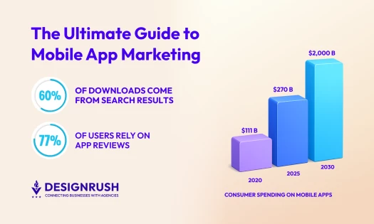
Mobile app users spend a lot of time on online shopping apps – 201.8 minutes per month compared to 10.9 minutes per month for regular web users.
So, even shopping is going mobile. More and more retail businesses invest in apps nowadays. At least 72 percent of shoppers think that mobile apps are a give-in and that they make shopping easier.
The synergy between a mobile app and mobile website can bring you amazing results and both mediums can send people to the other. The average smartphone user has approximately four to five shopping apps on their phone, and 58 percent of surveyed users claim that they use a shopping app at least once a month. With numbers like this, you better reach out to one of the best PPC agencies.
Whatever your decision might be, we believe that having both mediums can increase conversions tenfold. But if you do have to choose between having a mobile-friendly website and a mobile app, it’s better to first invest in optimizing your website and then later on investing in app development.
Our team ranks agencies worldwide to help you find a qualified partner. Visit our Agency Directory for the top app development companies, as well as:
- Top Cross-Platform App Development Companies
- Top Enterprise Mobile App Development Companies
- Top Android App Development Companies
- Top AI App Development Companies
- Top App Developers In San Francisco
Our team also highlights award-winning work on the Design Awards page, so be sure to check it out for the best and latest in app design.