-account-photo_listing.jpg)
-account-photo_listing.jpg)


Our Jury has worked with Prada, Nike, Chanel, Google, and Apple.
Best App Designs
Tapping through these app designs feels like a masterclass in what good UI actually means in 2026.
Best App Designs
4,200+ Submitted Designs- Agriculture
- Android and iOS
- Arts & Recreation
- Automotive
- Banking & Finance
- Chat
- Content & News
- Cooking
- Dating App
- Distribution
- E-Commerce & Retail
- Education
- Engineering
- Entertainment
- Fashion & Beauty
- Food & Beverage
- Government
- Health & Wellness
- Hospitality
- Luxury
- Medical & Pharmacy
- Nutrition
- Professional Services
- Real Estate
- Sports & Leisure
- Streaming
- Technology
- Travel
- Video Game
 Winner
★9.5/10
 ME 9.0
 AO 10.0
 Oİ 9.5
View Design
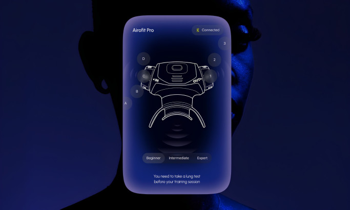
Airofit App Design
 Winner
★9.33/10
- AO 10.0
- ME 8.0
 BD 9.53
 LS 9.8
View Design
Dreamwell App
 Featured
View Design
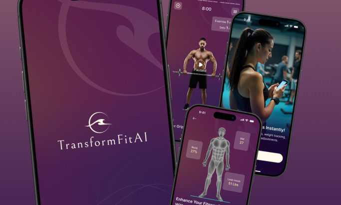
Transform FitAI App Design
View Design
Cosmic Care App Design
byJetStyle
View Design
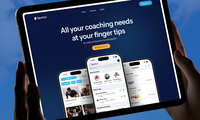
Spottyr App Design
View Design
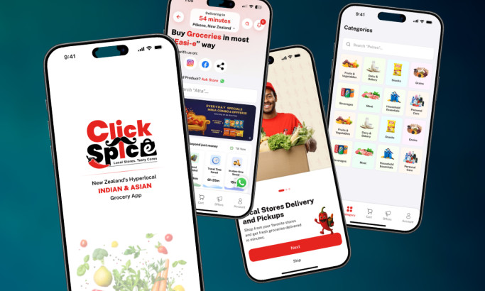
ClickSpice App Design
View Design
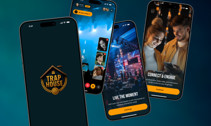
Trap House App Design
View Design
Rydeon App Design
byArounda
View Design
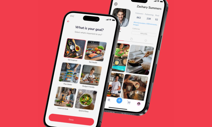
Kitchen Stage App Design
Get Connected
With The Right Agency Partner
& Receive Proposals For FREE
View Design
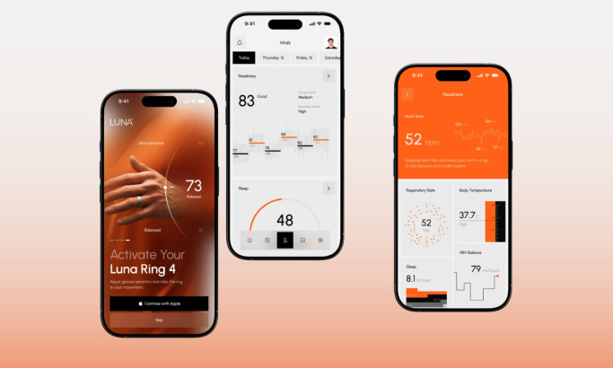
Luna Health App Design
 Winner
★9.5/10
- AO 10.0
 LB 10.0
 SH 8.5
View Design
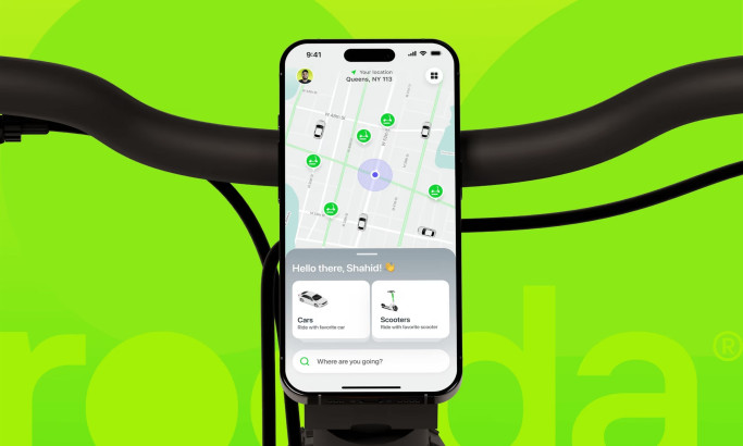
Rooda
View Design
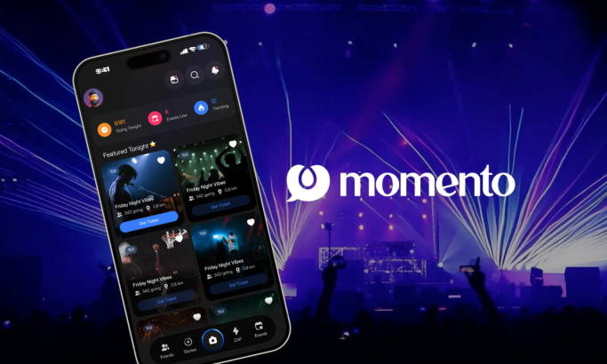
Momento
View Design
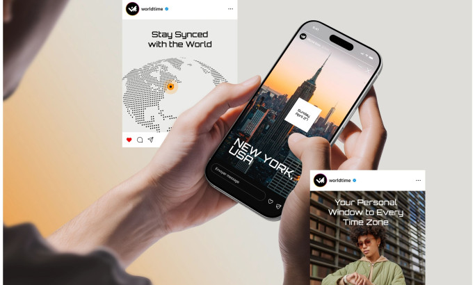
World Time App Design
byNixtio
View Design
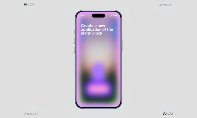
AI OS App Design
View Design
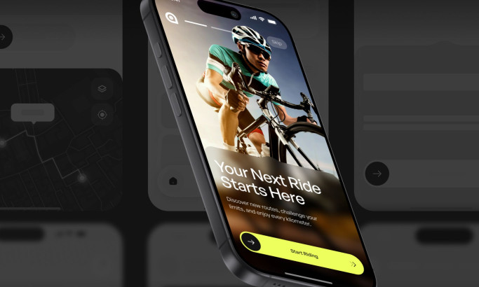
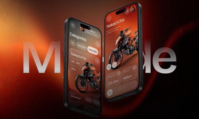
MyRide App Design
View Design
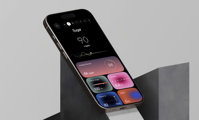
Veri Health App Design
View Design
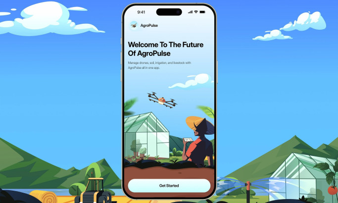
AgroPulse App Design
View Design
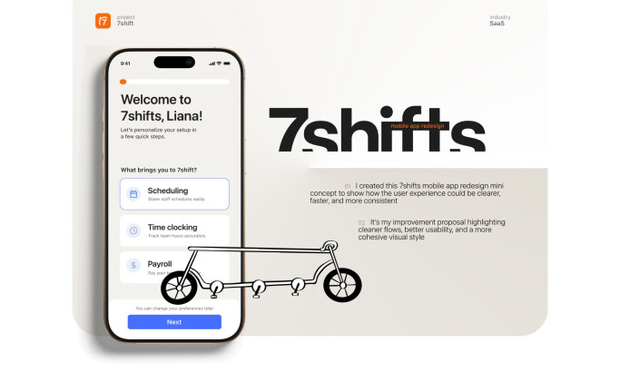
7shifts
Ready to elevate your designs?