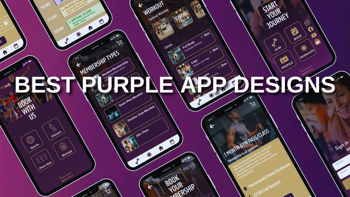
If you're a fan of all things purple, you're in for a treat!
Purple is one of the best choices for app designs, commonly associated with royalty, luxury, creativity, and power. It’s versatile and can be paired with other colors like pink, yellow, and green.
Join us as we get into the world of the best app designs with purple themes. And if you’d like an app designed like some of these great examples, connect with the best app designers on Designrush!
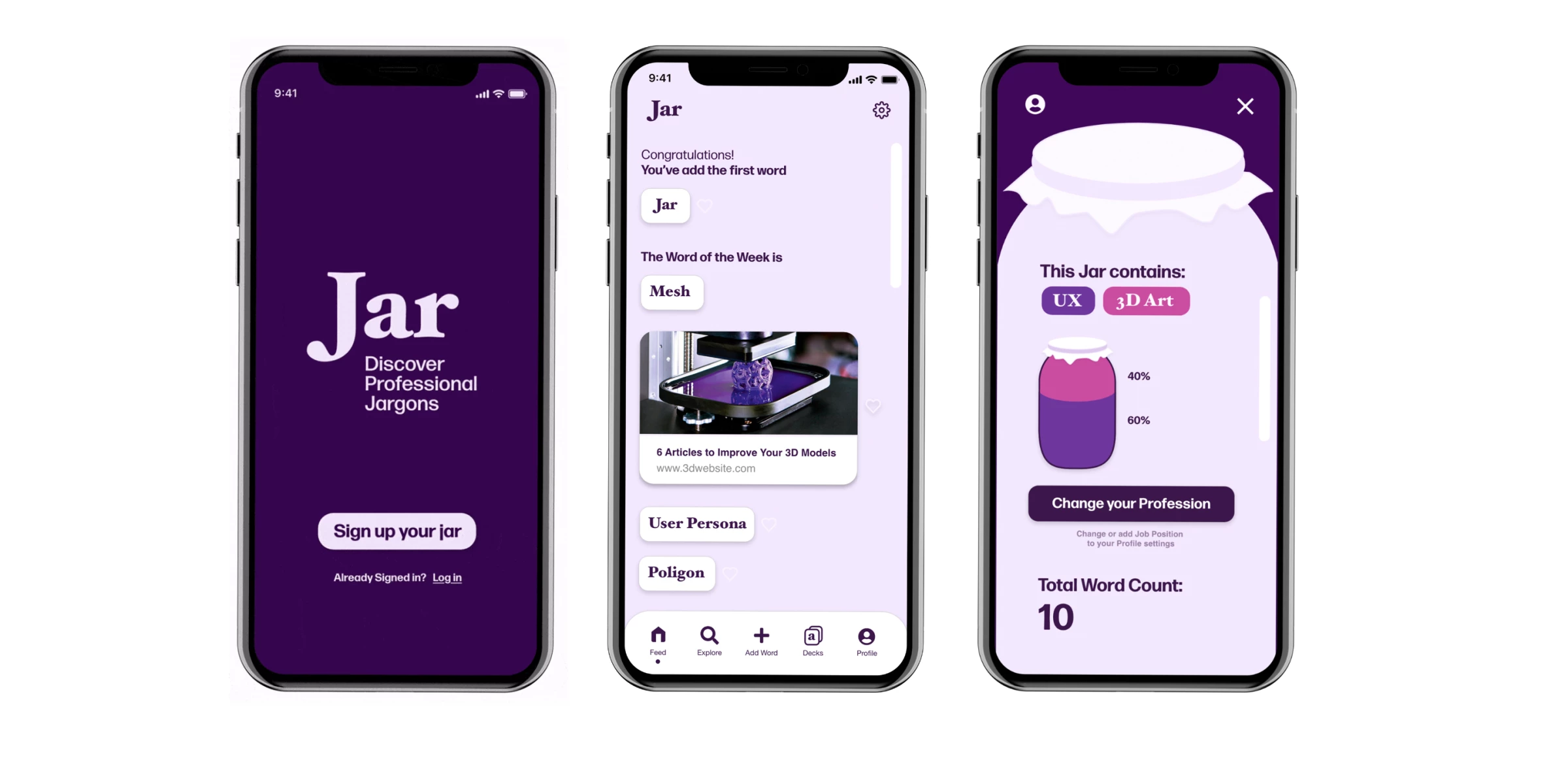
1. Jar by Tommaso Cappelletti
Standout Features:
- Different shades of purple
- Jar-like visuals
- Color-coded comprehension
The Jar app, designed by Tommaso Cappelletti, helps users discover new vocabularies and trends. This can help them with their jobs and daily lives.
The app combines serif and sans-serif fonts and a color palette with different shades of purple, making it look less dull. These colors also help pique their curiosity and motivate them to widen their vocabulary.
There are jar-like visuals within the design, representing the vocabulary ratio between two (or more) predetermined fields of work. Each industry is color-coded, so it’s easy to keep track and understand how much they’ve learned.
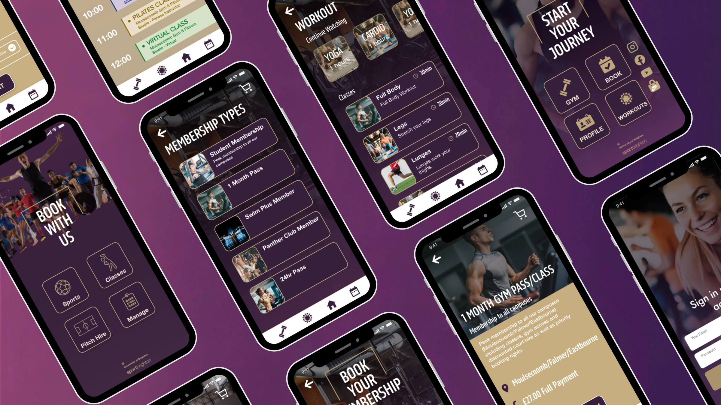
2. Sport Brighton by NeelDesigns
Standout Features:
- Well-structured layout
- Realistic photos
- New navigation bar
Sport Brighton app faced many readability and style-related issues with a messy interface that didn’t sit well with users. So, NeelDesigns was tapped to help them complete a redesign and keep the app functionally and visually up to date.
The redesign features drastic improvements in overall visibility, as the buttons are now well-structured across the layout. The typeface was emphasized through a white color compared to the brown shade from the earlier design.
The new app also has a new navigation bar that simplifies addressing various needs, with modern icons that differentiate looking for membership cards, finding workouts, and booking venues.
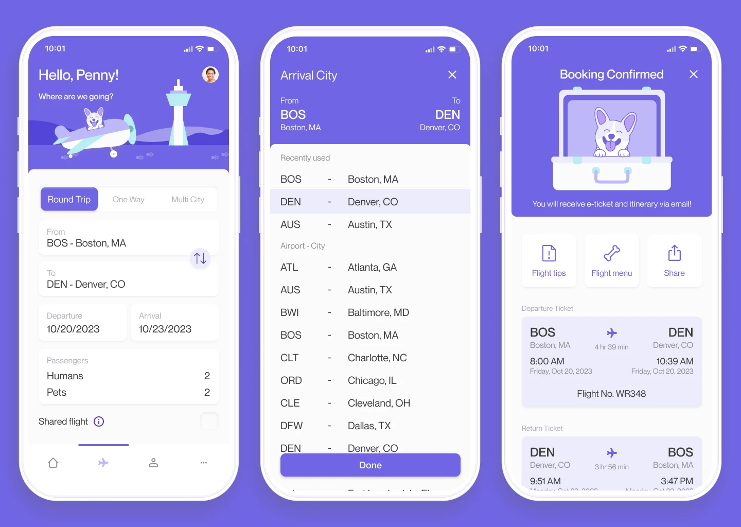
3. Pet Jet by Chandler Simental
Standout Features:
- Playful illustrations
- Sans serif font
- Location-based recommendations
Chandler Simental created a creative concept for a pet traveling app design called Pet Jet.
The app features cute illustrations in shades of purple, creating a harmonious look with the stark white sections below. Aside from your regular traveling dates and locations, you can create personalized accounts for your pets and choose them as passengers to accompany you. The app design uses a sans-serif font to keep everything clean and simple.
You also get location-based recommendations for future endeavors to inspire your next destination. Some buttons provide helpful tips and menu options to list before or after booking the flight.
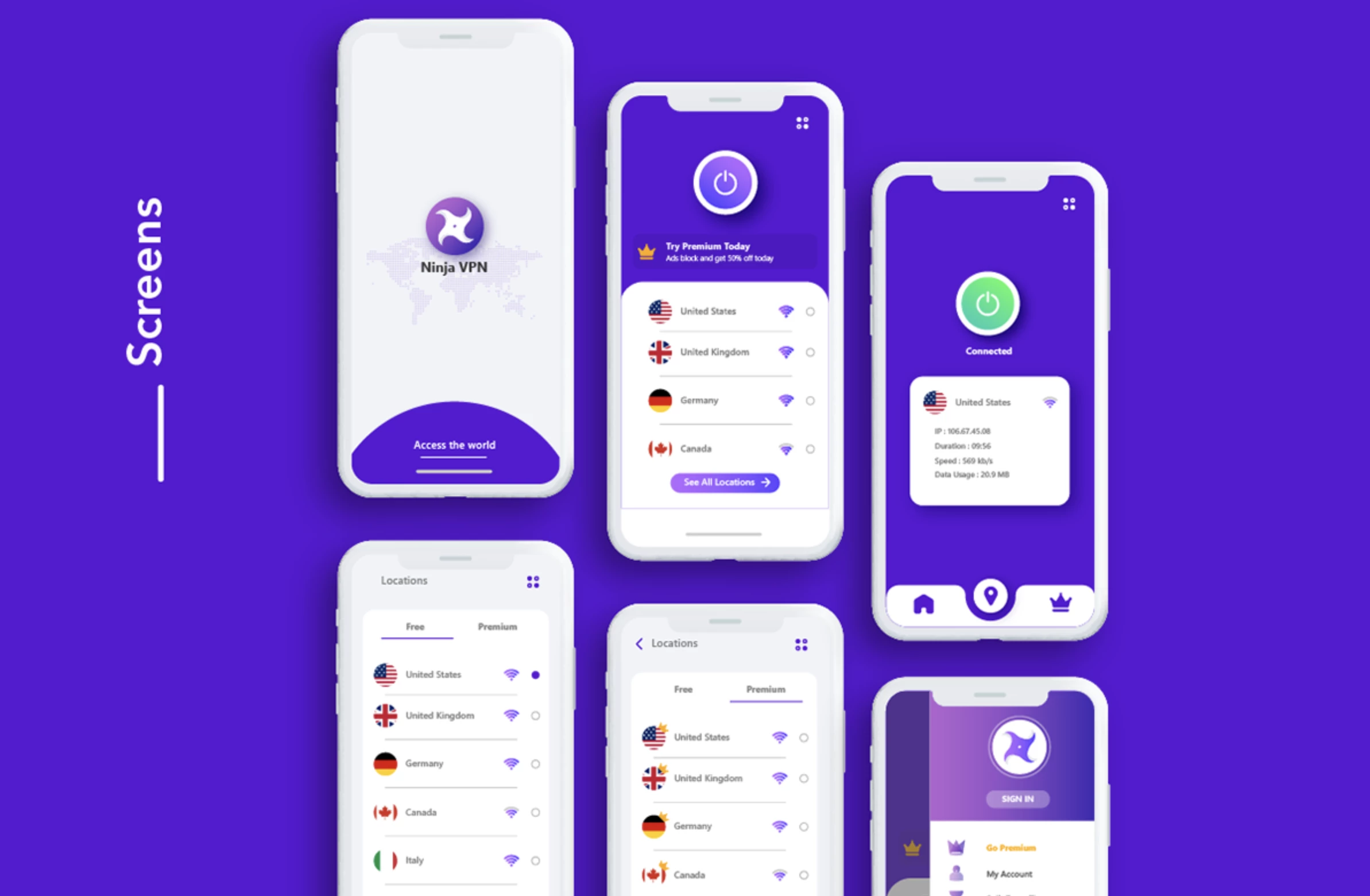
4. Ninja VPN by Primon Chowdhury
Standout Features:
- Clean and minimal
- Circular accents
- Prominent iconography
Ninja VPN strives to become one of the leading VPN service providers. And their modern app design, created by Primon Chowdhury, helps them in this positioning.
The interface is clean and minimal, with a well-balanced, simple palette of white and purple. The navigation system is simple and intuitive, and there are lots of circular accents in the buttons, flags showing the IPs’ addresses, and around the iconography. If you’re a fan of circles in design, check out the best logo design with circles.
The iconography is prominent, and all icons have a light purple hue covering their shape.
5. Purple Pouch by Sanket Temani
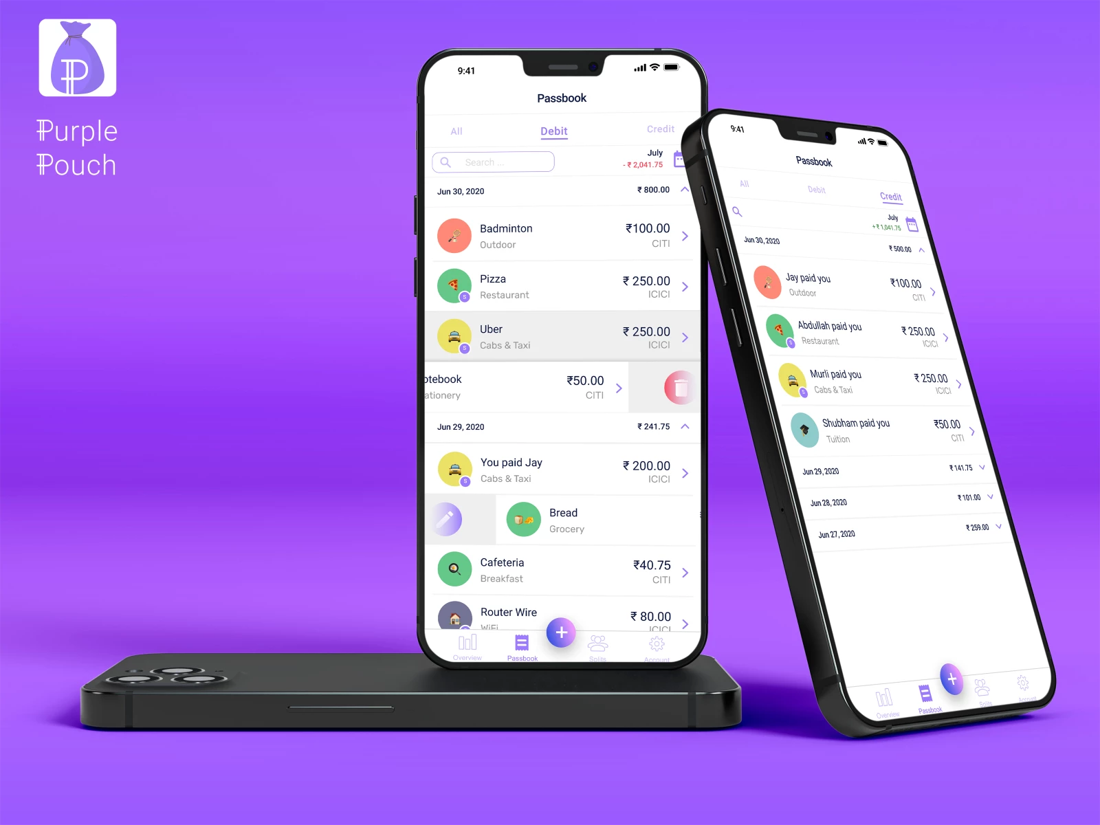
Standout Features:
- Seamless expense tracking
- Comprehensive trend graphs
- Unlimited wallets
Purple Pouch is an expense managing and tracking app designed by Sanket Temani to help split costs between several people and analyze the expense trends over a set period.
Once you set up your account and link all your cards and wallets, you can set an individual or overall expense over days, weeks, or months. Below the dashboard, there’s a color-coded donut chart that gives you a glimpse of how much you’ve spent on which category.
Users can look into these comprehensive graphs further by tapping into a particular category, where you head over to a detailed overview that tracks all the items bought from that category.
6. Sketchies by Birsu Kokturk
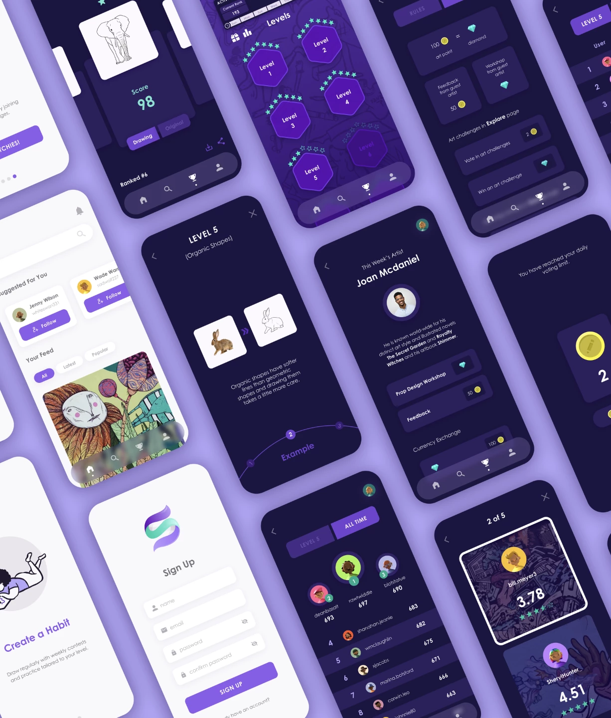
Standout Features:
- Dark purple shade
- Art challenges
- Immersive gamification system
Sketchies is an app designed by Birsu Kokturk, whose core objective is to help artists find inspiration and motivation. They do so by assisting them in forming an encouraging social network of like-minded artists who will provide hints and tips when needed.
The agency used a dark shade of purple and stark white screens to create a non-intimidating interface. The overall app design relies on various unique tools to help artists grow.
These include art challenges with unique themes and a voting system where the community picks the best work, motivating artists to keep going. There’s also an immersive gamification system that helps artists practice specific styles, rating their progress effectively. This push for new features and engaging experiences is what often earns recognition in app design awards.
7. DiVino by OT.DESIGN
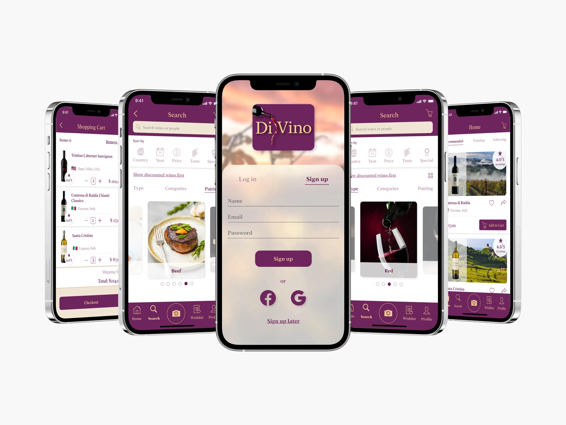
Standout Features:
- Wide variety of filters
- Modest color palette
- “Matching” feature
For wine connoisseurs who want convenient access to their favorite drink, OT.DESIGN’s DiVino app design is the perfect tool.
The app design features purple as the primary color and a lighter shade of gold as a secondary hue, evoking a sense of luxury. There’s a wide range of filters to accommodate the users’ diverse needs and wants, including the type, price, country of origin, and taste of the wine.
There’s also a special filter for foodies that matches the food you’ve got available with the wine that complements it well.
Check out more app designs with cool standout features.
8. Nora by Indira Abhyanker
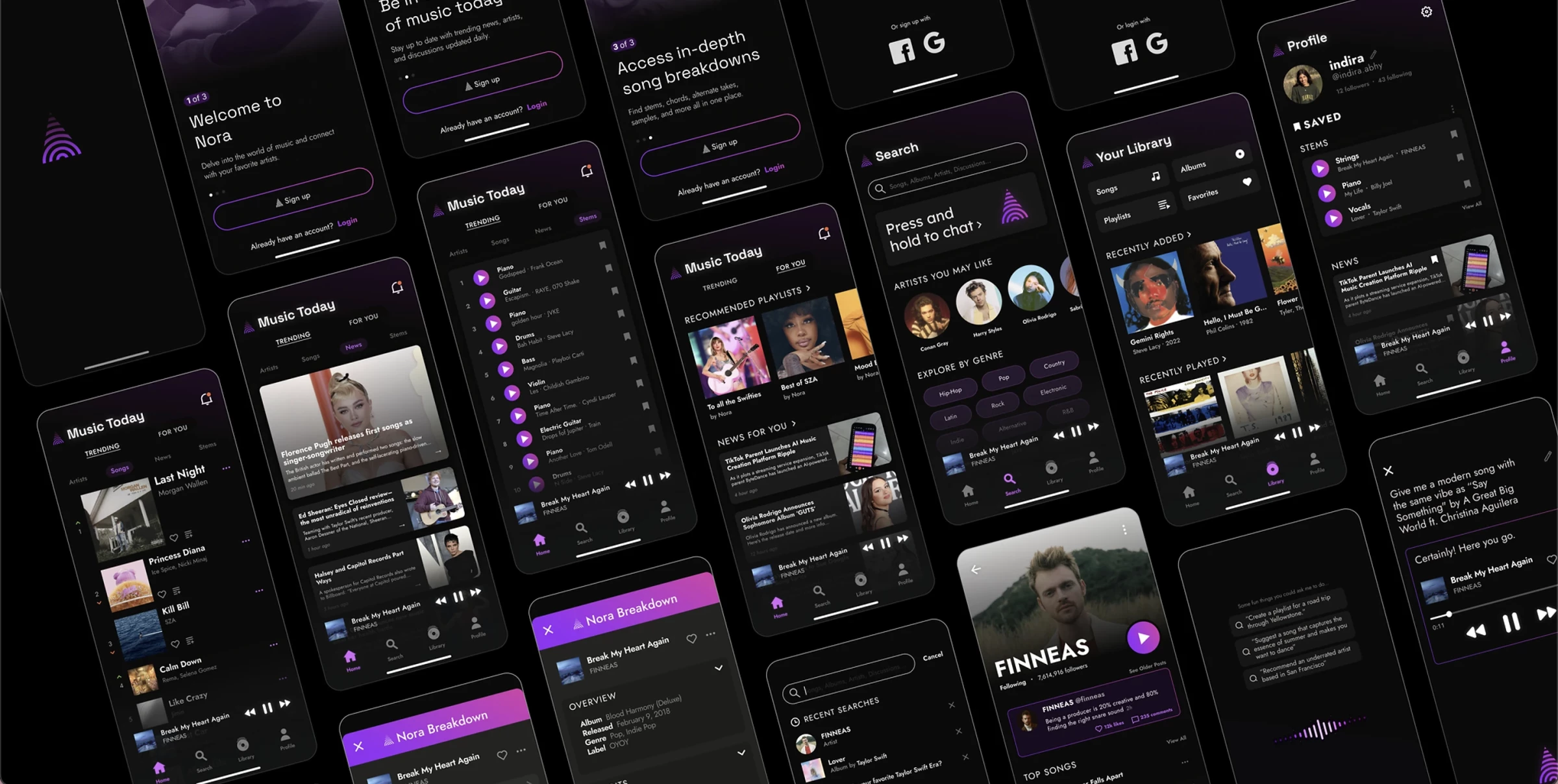
Standout Features:
- AI recommendations
- All-around trending view
- Black and purple colors
With the help of the music streaming app Nora and its modern design by Indira Abhyanker, users can remain updated on the latest music trends, interact with artists and listeners, and access detailed song breakdowns.
Once you log in, you access a two-card menu, one showing you an all-around view of what’s trending in the music world and the other insisting on your favorites.
Nora is well-branded, and its logo is a key to many doors throughout the design. One example is the Nora breakdown feature, where you listen to a song, find the brand’s small logo icon amid song options, and access detailed information about the music!
As for its design, its black and purple color palette is aesthetically pleasant, with subtle purple gradients standing out among the all-black screen.
9. Gabriel™ Crypto by Alma Estrada
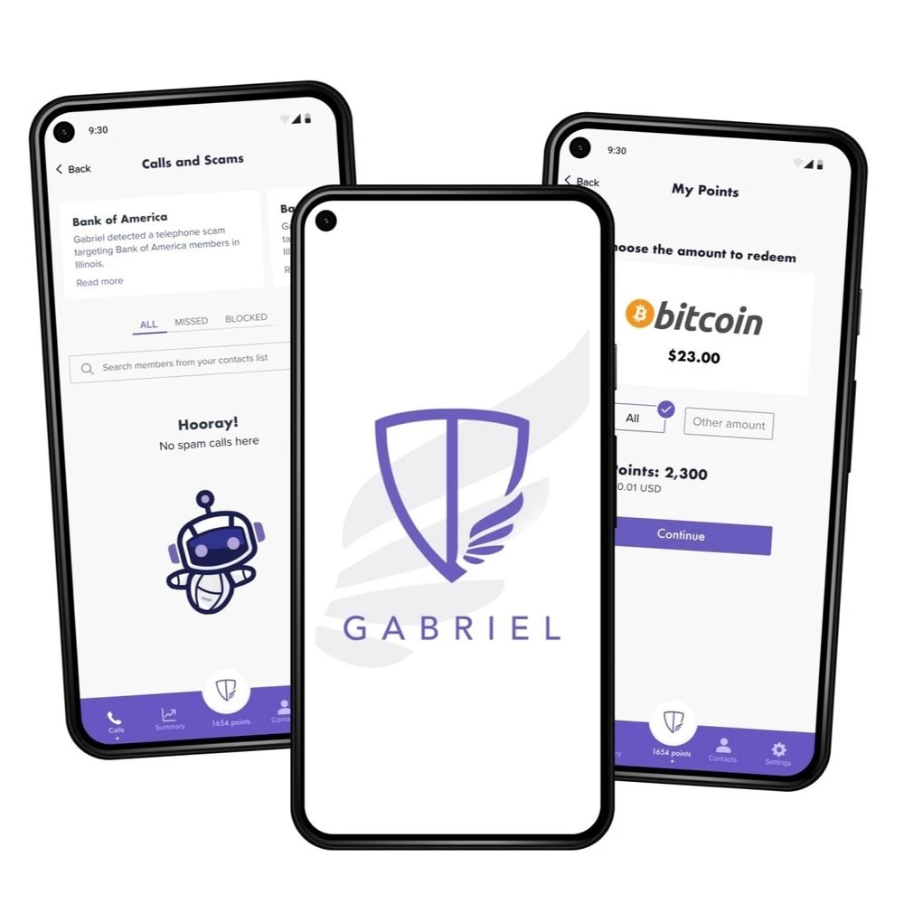
Standout Features:
- Clean interface
- Cryptocurrency rewards
- Sans-serif font
Alma Estrada redesigned Gabriel™ Crypto, an app that rewards users with cryptocurrencies while blocking spam and suspicious calls, assisting users in avoiding scam numbers.
The app features a clean interface with plenty of positive space and a bluish-purple shade for buttons, navigation, and digital illustrations. Complementing the neat interface is the sans-serif font, so all design elements are minimal and straightforward.
As for its functionality, the app encourages users to identify fake or spam calls and messages and rewards them with points. These points can then be exchanged for various cryptocurrency rewards.
10. TURN UP by YANGA
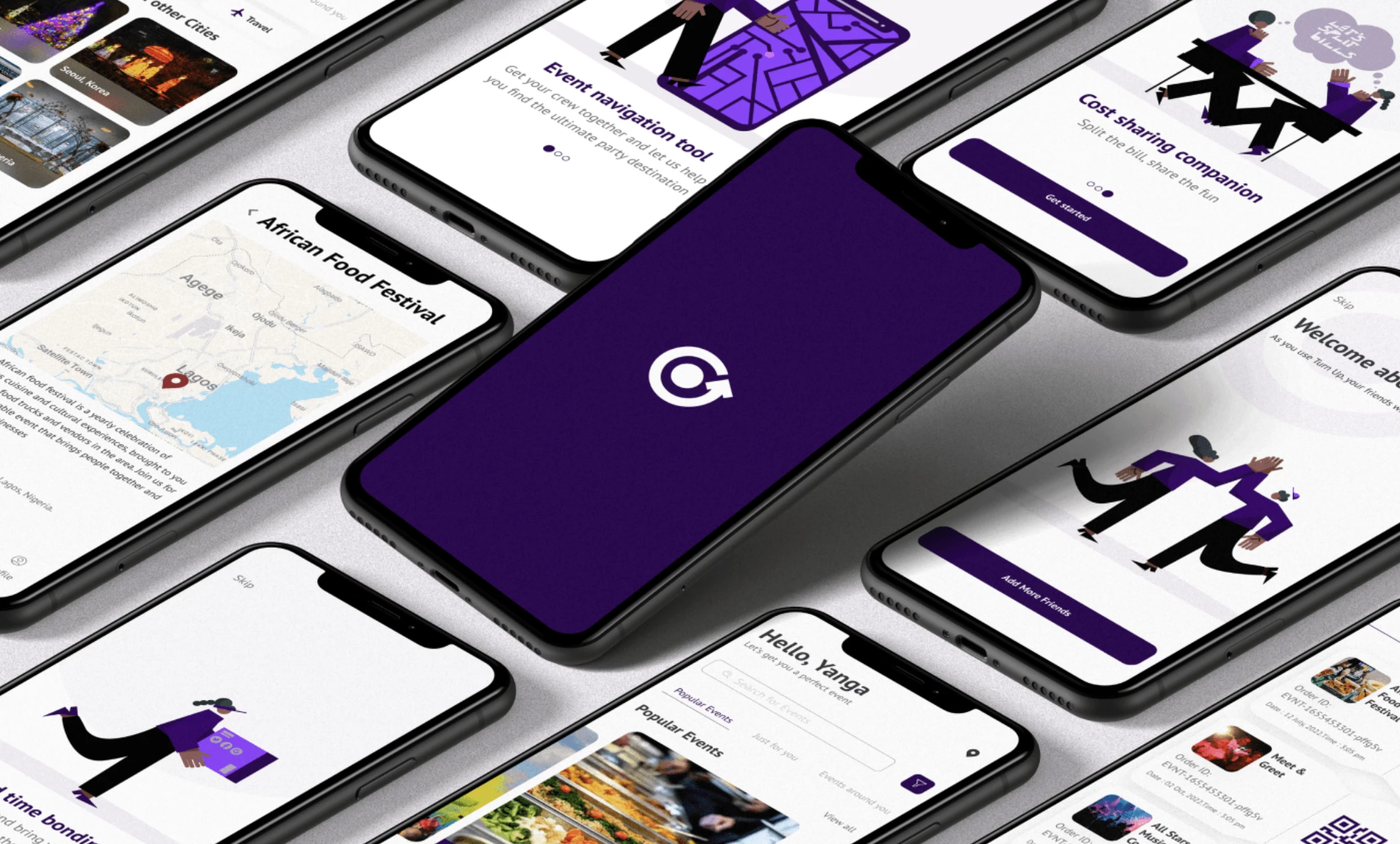
Standout Features:
- Personalized event recommendations
- Split the bill feature
- Dark purple color
TURN UP is a concept that became needed in Nigeria once the COVID lockdowns had been lifted. YANGA brought it to life with a community app design that motivates the local folks to return to their old social lives! (Explore more event and entertainment app designs.)
The app features fun and playful illustrations of people to keep things from looking dull and monotonous. These visuals accompany users and adhere to the app’s dark purple color, so it’s uniform with the overall design.
As for the recommendations, the app gathers valuable information from the users, segmenting their likes and dislikes to deliver efficient and personalized event recommendations, ensuring everyone who ends up there will have a great time!
The design also entails a cool feature that alleviates the burdens of worrying about finances: it comes with a “Split the bill” feature that makes events much more affordable!
11. Convo by Anushka Mathur
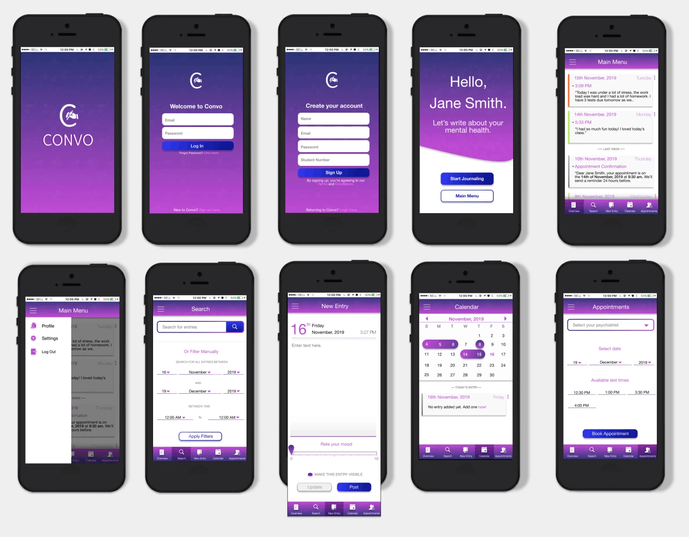
Standout Features:
- Purple gradient
- Journaling feature
- Straightforward layout
Convo is a personal project by Anushka Mathur designed to help students better grasp their mental health. This app aims to mediate between the students and their school mental health professionals.
The app uses different shades of purple, which, in color psychology, promotes harmony of the mind and emotions. This gradient effect also gives off a friendly and approachable impression.
Apart from encouraging the users to get in touch or set appointments with doctors, the app also entails features that motivate self-work and understanding of their emotional and psychological state by keeping an in-app daily journal.
Each entry is labeled by the date and exact time of writing, and there’s also a mood bar near the bottom of the screen, helping users understand their feelings better.
12. Alloy by Fleekbiz
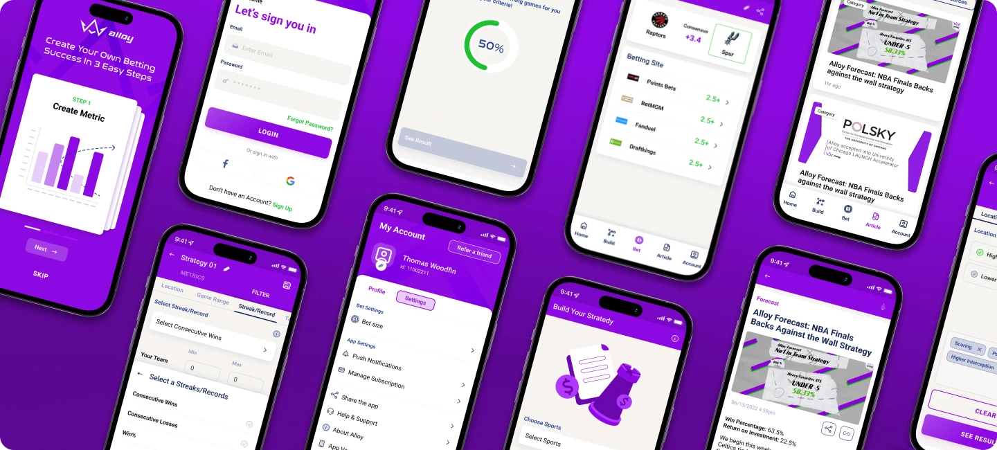
Standout Features:
- Bright colors
- Detailed analysis
- Intuitive navigation system
Alloy is a sports betting platform designed by Fleekbiz, showcasing plenty of intriguing features that await its users.
The design uses vivid shades of light purple and green, reflecting the energetic nature of sports. One of the options is building a personalized strategy that lets you consider the current market conditions, team statistics, and other vital aspects before placing your bet.
The app also features a detailed analysis of the current rankings of teams and individuals that users can rely on to make a more educated bet.
13. Fitnection by Richard Urbina
Standout Features:
- Soothing lilac theme
Functional flat icons
Coherent purple accents
In Fitnection's app design by Richard Ubina, the subtle application of a lighter purple hue shows how color can gently guide and enhance user engagement.
The app's theme revolves around a soft, muted violet hue. It blends effortlessly with white, crafting an interface that is both visually calming and distinctly uncluttered. Together, these colors create a comfortable viewing experience!
The white flat icons against the purple background balance aesthetics and functionality. Each icon is easily identifiable, making navigation through the app a breeze. Plus, the buttons and app sections come in the same shade of purple. This style choice ensures these elements stand out without disrupting the overall harmony.