The America’s Wildlife Refuges logo, designed by The Bureau of Small Projects, encapsulates the essence of nature and cultural heritage. Drawing inspiration from cairns, this logo design features abstract symbols, versatile iterations, bold yet friendly typography, and a nature-driven color story. Together, this logo effectively communicates the organization's mission to protect local wildlife and preserve natural spaces.
Key Insights for Brands:
- Abstract symbols rooted in historical context enrich brand storytelling
- Versatile logo designs ensure seamless adaptation across multiple platforms
- Nature-inspired palettes evoke emotional connections with environmental themes
The Logo Conveys Connection to Nature Through a Cairn-Inspired Emblem
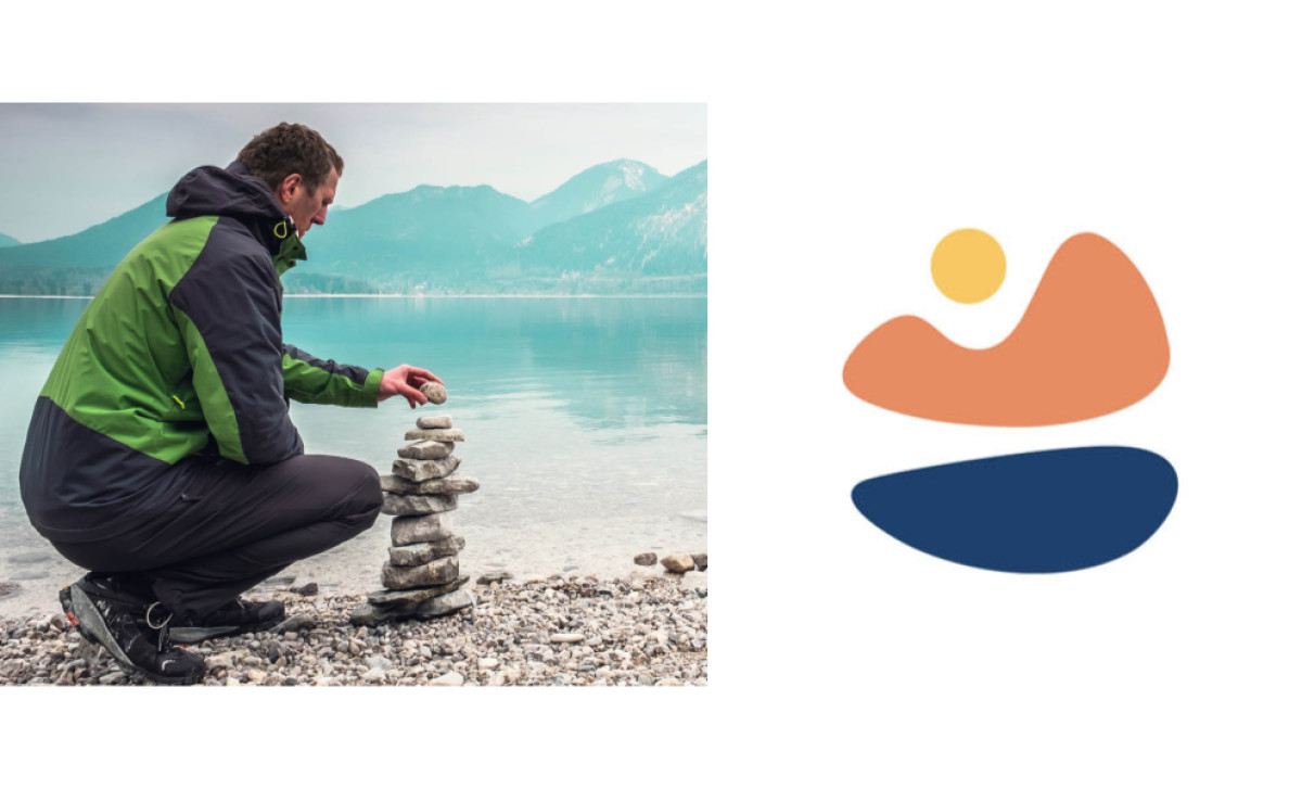
The logo design, created by The Bureau of Small Projects, draws its inspiration from cairns, man-made stacks of stones historically used by Indigenous cultures as landmarks and directional markers. These structures symbolize navigation and discovery, perfectly aligning with the mission of America’s Wildlife Refuges to guide and protect nature enthusiasts.
The logo features circular and wavy patterns that abstractly represent the sun, land, and sea, symbolizing the interconnectedness of these essential elements. This thoughtful use of symbolism in the organization’s brand logo reinforces the organization’s role in safeguarding natural spaces and fostering harmony between people, wildlife, and the environment.
By evoking the enduring legacy of cairns, the logo bridges historical depth with contemporary design, fostering a meaningful connection between the past and present.
Design Iterations Enhance the Logo’s Versatility and Adaptability

Professional logo designers often create various design iterations to ensure the logo’s adaptability and effectiveness across multiple platforms and contexts.
Here, the primary logo, with its circular wordmark that resembles a badge, functions effectively across various sizes — from compact social media icons to expansive signage. This badge-like design enhances the logo’s visual impact, fostering an approachable and recognizable brand identity.
The secondary logo iteration, which positions the emblem beside the typography, enhances the legibility and prominence of the brand name. This version is particularly useful in scenarios requiring a more restrained logo application or where the primary logo’s badge format might not be as effective.
The agency also provided a wordmark. This streamlined form is essential for marketing materials with space constraints or if specific platforms require an oversimplified logo version. This wordmark maintains the logo’s identity while offering a cleaner, minimalistic option for merchandise or decorative elements.
These thoughtful variations ensure the logo maintains its integrity and impact across diverse use cases, making it a hallmark of exceptional logo design.
Geometric, Sans-Serif Typography Conveys Utility and Friendliness
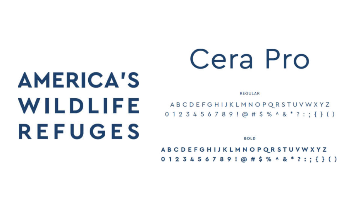
When it comes to typography, the designers employed Cera Pro, a geometric sans-serif font known for its clean lines and modern appeal.
This typeface, derived from basic shapes, balances simplicity and elegance. It’s one of the best fonts for logos, as it is suitable for various digital and print applications. Cera Pro's utility is evident in its adaptability to narrow reading environments and compressed spaces, ensuring readability without compromising aesthetic quality.
Additionally, the font’s friendly and approachable nature complements the organization’s mission of creating welcoming natural spaces. By subtly blending modernism and Art Deco, Cera Pro adds a timeless quality to the logo, bridging contemporary design with classic details.
This typography is used in top-notch logo designs to reinforce the message of approachability and utility. And in this case, it aligns with the inclusive and community-focused ethos of America’s Wildlife Refuges.
The Nature-Themed Color Palette Enhances Emotional Resonance and Brand Connection
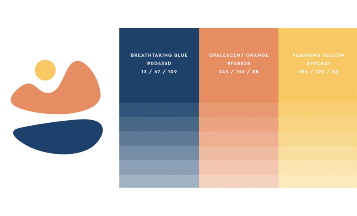
The logo’s color palette is inspired by natural elements, creating a deep emotional connection to the organization’s mission.
The primary color, Breathtaking Blue (#0D436D), echoes the original color of the U.S. Fish and Wildlife Service, fostering continuity and recognition. This shade in color psychology symbolizes trust and tranquility, highlighting the vastness of the natural landscapes that the organization aims to protect.
Meanwhile, Opalescent Orange (#F58858) brings warmth and vibrancy to the logo, reflecting the lively colors of the sky, land, and diverse wildlife. This color choice evokes energy and vitality, resonating with the organization’s dynamic efforts to safeguard wildlife. Yearning Yellow (#FFC84F) further enhances this palette, adding joy and optimism, reminiscent of sunny days in natural refuges. Together, these colors craft an eye-catching logo that represents the brand’s mission and evokes the beauty and diversity of the natural world.
Overall, The America’s Wildlife Refuges logo exemplifies the power of thoughtful design in conveying complex values and missions. The historical symbolism, versatile iterations, modern typography, and a nature-based color palette communicate the organization’s commitment to protecting wildlife and nature. Its innovative approach to blending cultural heritage with contemporary aesthetics positions it as a deserving winner of the Design Awards.
-preview.jpg)