A whopping 89% of marketers say that brand awareness is their top business objective. Designing a suitable "banner" to stand behind is therefore essential - a high-quality logo design can make or break your brand
If you want to have loyal customers, you have to make your brand authentic and memorable. And you can’t be that company if your visual identity is dull and forgettable.
We don't mean you should not let your products speak for your brand, but when thousands of competitors offer a similar service, the only thing that makes you stand out can be the eye-catching logos.
Any business that wishes to stand out from rivals and communicate its mission to the world will benefit from having an appealing logo. Using top-notch graphics can increase a brand's legitimacy and foster consumer trust. Additionally, it can convey a brand's philosophy and objectives properly.
It takes a lot of research and testing to develop a logo that accurately represents a brand's distinctive characteristics. The time and work put into this can pay off nicely. In fact, some logos are recognized worldwide, giving companies countless marketing and brand-building opportunities.
So, you better make it count! It’s no secret that the best brand logo designs are catchy logos that follow the same proven rules.
1. Originality & Authenticity
All relevant graphic design statistics show that 86% of consumers say that brand authenticity majorly affects their decisions in choosing and/or endorsing the products they desire.
Check out the Starbucks logo. It remains one of the most controversial designs, as people still guess about its background and talk about it. Is it a mermaid? And why is a mermaid on the logo? Have you ever seen any similar logo?
All these quirks entice the brand’s patrons to ask questions about it – the logo hints at a story or much more. Mermaid’s song can inspire calmness or mystery, both easily associated with the brand’s main product – coffee.
So, spend some time developing ideas for what you want your logo to represent. Try various text, form and image combinations until you discover a few potential eye-catching designs. Choose keywords that best express your ideas and create sketches to better build your vision.
Your logo should be distinctive, just like your brand. An enduring logo design can represent your company for many generations and aid in the continuity of your brand. Starbucks has relied on its mythical storyline and soothing aesthetic for many years and has stayed true to these two factors even in its logo redesigns.
2. Relevance to the Brand
Another thing to remember is that your company is represented by its logo. You must present your company in the light you want the world to see. For instance, the Starbucks logo is soothing and comforting, just like their coffee.
What would you like to say as a brand? Consider the things you provide for your clients. Create a design that helps convey the idea after that.
People should quickly connect your logo with your brand or business when they see it. But the key here is to keep things straightforward. People find it challenging to concentrate on one element of your design that makes them think of your company if you clutter it with too many features, so don’t overdo it!
An excellent and well-thought-out logo can build a company's reputation and set expectations. While the 99 Cents Only Stores logo stresses accessibility and convenience, Louis Vuitton's country club-style monogram conveys luxury and exclusivity.
Additionally, a meaningful logo allows customers to connect authentically with a business. The globe made of puzzle pieces on which letters from different languages have been written represents Wikipedia's objective to increase knowledge throughout the world.
3. Perfect Proportions
The golden ratio and proportions are used in the logo design process to produce aesthetically pleasing designs that attract the viewers' attention.
The Golden Ratio is frequently used in design projects. It is roughly equal to 1:1.618 and related to the Fibonacci Sequence. You will usually this proportion in nature, which has been employed in the arts for many years. Most eye-catching logos make use of the Golden Ratio!
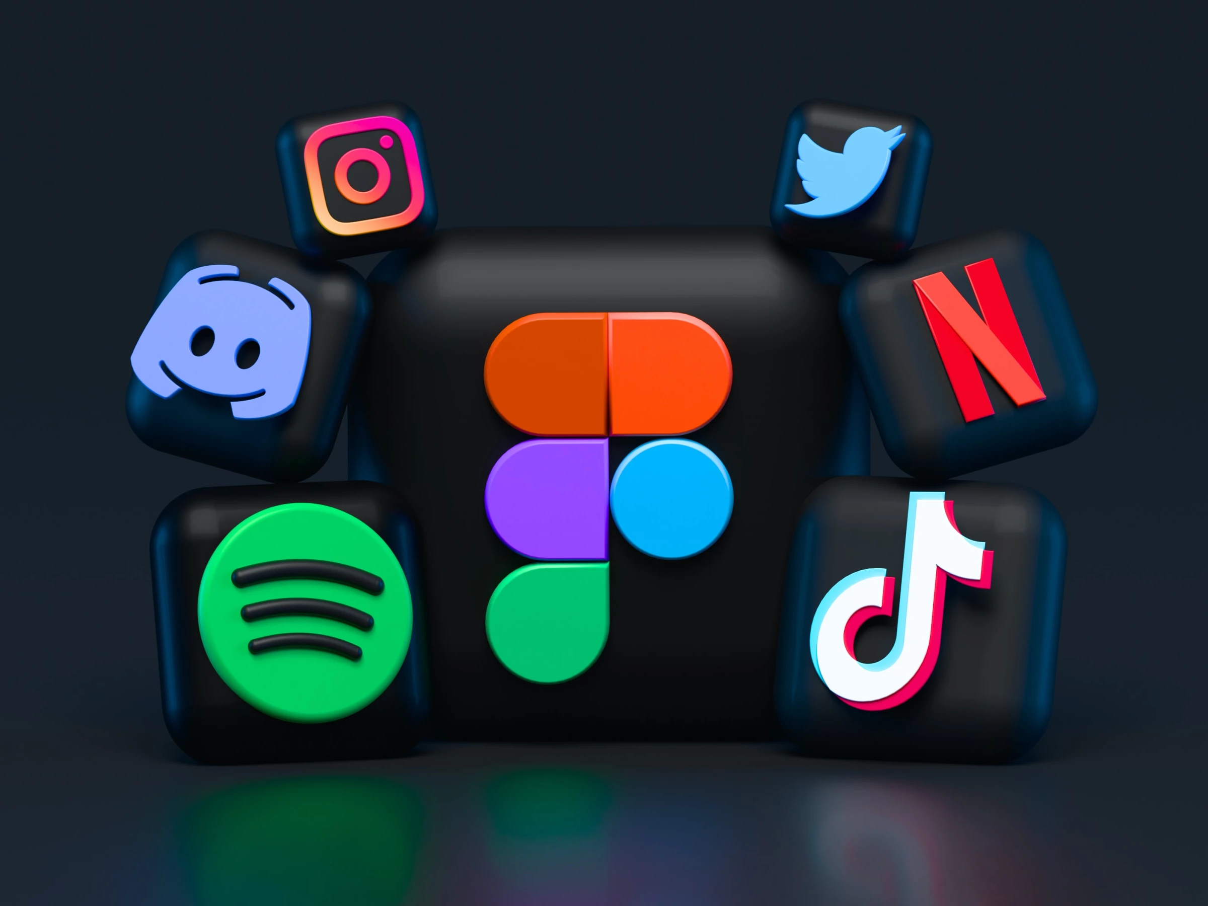
However, designers have incorporated the Golden Ratio's fundamentals into the catchy logos of the most prominent businesses. For example, the current Twitter logo may be broken into several overlapping circles that follow the Golden Ratio. Other instances include Apple, Pepsi and National Geographic.
4. Color Psychology
Black and white logos usually won't get people to stop in their tracks. But people do pay attention to color. Adding color does not mean you have to go nuts on the bright or neon shades. However, adding a splash of color to your artistic design will do wonders for expanding your clientele.
Consumers' reactions to, perceptions of, and feelings about a product or brand can be subtly and unconsciously influenced by colors. Color psychology holds that each color elicits a specific emotion and customers can sense a vibe or sensation from that color.
Orange and yellow colors imply warmth and happiness. Purple conjures up creativity or wisdom, whereas red is an intense color that inspires excitement. Green typically symbolizes nature, whereas blue usually stands for dependability. For brands that want to highlight balance, white is a traditional choice.
Use this information to craft your eye-catching design based on the needs of your target audience and the brand story you want to convey.
5. Design Flow
Some of the best minimal logo designs prove that less is usually more with logo design. However, simple isn’t always possible.
If your logo consists of two or more elements, you must keep up the coherence between them. You can only have eye-catching designs with two objects standing next to each other with something to connect them into a slick, unified whole. This means that you need to make your logo design flow.
While you can integrate words and other elements into your design, they need to be in unison with the drawing, or the logo will feel out of place. So, pay attention to how you combine colors, shapes and fonts when developing your eye-catching logos.


-preview-webp.webp)