Mirzam’s Packaging Designs Creatively Showcase A Bean-To-Bar Chocolate Brand
Mirzam is a bean-to-bar chocolate brand that focuses on a transparent process of chocolate making to create clean, exciting and sensational chocolates. Inspired by the original spice route, these cocoa beans are crafted to accentuate these diverse and exciting flavors.
This brand chose their beans well, capitalizing on authentic and rich flavors that pack a punch. And the simplicity in their production is powerful, enigmatic and captivating.
To create sensual chocolates, Mirzam uses granite wheels that ground beans down for days, slowly and sensually to create a smooth chocolate bar.
This is a brand that cares about being real. They care about being authentic. They care about being honest and wholesome and true.
There’s a solid maritime theme to this brand and its roots. Following the spice route path, Mirzam creates chocolates that not only inspire and tantalize but create a mood that is beyond words, capitalizing on the nautical nature of the spice trade.
But the brand needed some help when it came down to creating a packaging that combined all of these elements into one fluid, exciting design. They turned to creative agency Backbone Branding to create the packaging for a line of chocolates called the Origins Collection. These five chocolate bars represent a single destination along the trading routes and call back to the natural flavors of the areas.
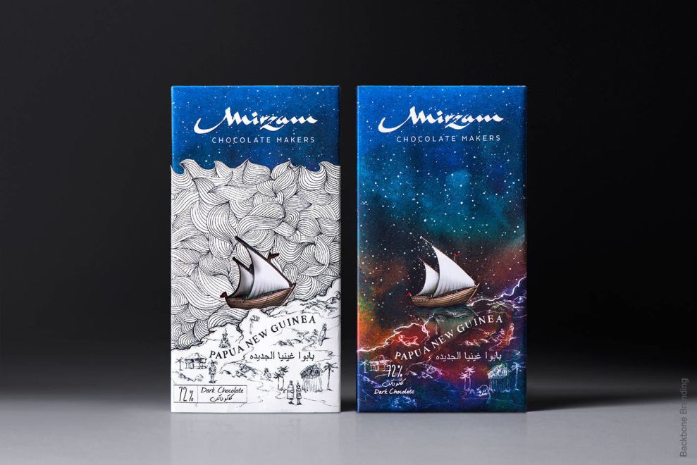
These five destinations include Vietnam, Madagascar, Indonesia, Papua New Guinea and India.
These chocolates take you on a journey, and so do these packaging designs which are historic, moody and dreamy.

Mirzam’s Paper Packaging Connects To Its Product's Roots With Mesmerizing Illustrations
These Mirzam chocolates are created to highlight spots on the spice route. It’s these destinations that gave inspiration to the chocolate as a whole and gave inspiration to the flavors beneath this paper packaging.
These designs are drawn out to honor these destinations, and little boats with maps are used to bring them to life. These maps standout against the dreamy background and truly pop in comparison.
There’s a simplicity to these designs in their appearance — they look hand drawn, artistic and stunning.
There’s an ethereal quality to these designs thanks to these intricate yet minimal illustrations. They stand out. They pop. They excite and amazing and enlighten. They connect with the roots of the chocolate brand and pay homage to a history that shouldn’t be forgotten.

Mirzam’s Chocolate Packaging Design Entices Customers With Intricate, Moody Design Elements
These illustrated maps are exciting and engaging, but they’d fade into the background if it weren’t for the design that makes up the backsplash.
It’s like looking through a telescope — this background consists of airy and bright blues, greens and purples. It’s the perfect image of space, fit with an array of bright white stars and subtle clouds that make it look like you’re staring into the galaxy.
The depth of this design is dark, moody and dreamy. It puts you at ease and makes you feel like you’re on a cloud ready to uncover the secrets of the universe.
It also drives the brand and its goals home. The spice route shouldn’t be forgotten, and it should be remembered as something that made a major impact on the world as we know it. It’s universal and all-encompassing.
This use of color sets the mood and entices you to dive in and take a big bite.

Mirzam Demonstrates An Authentic Brand Identity Through Their Chocolate Product Packaging
Mirzam’s ethereal design is full of life and energy. There’s a dreamy vibe to these designs that are clearly visible in their packaging.
These chocolate bars pack a punch. There’s an outer space theme that matches perfectly with the nautical theme of the chocolate line and the brand as a whole. These bars are wrapped in an interstellar packaging, with the night sky on clear display. There are blues, greens, and purples that dance across the design.
Stars twinkle in the background. They add a serene and peaceful vibe to the design that puts you an almost sedated state that is pleasing and serene. The Mirzam logo sits at the top in a curly and rich font.
But the real star of the design is the little boat and map that is illustrated at the bottom of the packaging. Depending on the origin this design relates to, you see a different destination and map. These are drawn out in clear, bright and white writing. It’s bold and enigmatic. It’s simple, yet equally creative and complex.
There’s a depth created thanks to these illustrations and the strong attention to detail that’s used.
Similarly, there’s a packaging that’s made up up black and white illustrations. Waves are created using black and white swirls, and the land sits bright and clean at the bottom with illustrations that depict specific markers and icons relating to the destination.
These swirls also match the designs etched onto the chocolate itself, bringing this design full circle.
Overall, these designs are creative, exciting and breathtaking. They’re full of color, illustration, and wonder. They’re dreamy and interstellar. They add depth and heritage and a purpose to the chocolate overall.


