The best packaging designs in the world do four things that make them rise above all others:
- They can be seen (impact).
- They engage consumers (relevance).
- They communicate key messages or differences (advantage).
- They sell (conviction).
The process for great packaging design begins long before the designer places pixel to screen or pen to paper. It begins with finding out the background of the company. A conversation with the client. What are we challenging? What do we want the product to communicate? The designer and client have to agree on what the design needs to do.
Enter VOLTA, the company that designed gorgeous packaging for wine company Sandeman. The company released new bottles and labels in 2017 and was in dire need of a talented design team to communicate this change and create a trade presenter.
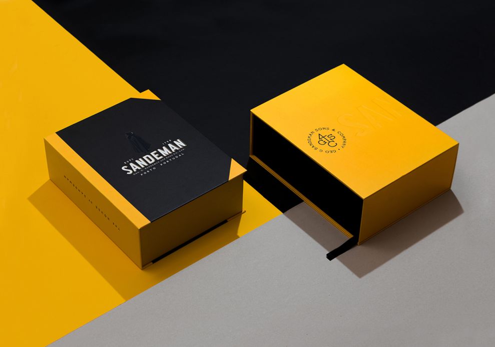
First, we have an impact through the use of two distinct features: the book shape and the colors. Sandeman is a brand of history that spans over two centuries. Think about that amount of time. This company was around before the great depression. They were around before gasoline-powered cars and before Charles Eastman invented the plastic photographic film.
How does one communicate this? It sounds like a story. What better way to make a design impact than by shaping the trade presenter like a book. Within this book, one can find Sandeman’s past, present, and future.

But alas, the book is a box. Inside the box are two of the new bottles of wine and a brochure to learn about the company’s history and product line.
Look at the lush yellow color. The yellow and black combine to create a wonderful color contrasting powerhouse of visual glory. This is impactful. This is engaging the customer with relevance.

The brochure utilizes premium finishings that feel like textured stock paper. Volta used foil stamping and spot gloss varnish with leather straps. But wait, they did not stop there.
They used singer-sewn binding and a large debossed Sandeman logo.
Do you see the big picture? They are adding a big idea here. Big ideas sit at the heart of the best package designs in the world. That idea is craftsmanship. Sandeman pours their blood, sweat, and dedicates their lives to make fine wines.
This packaging design reflects that.

Here we can witness the utilization of communication in the packaging design. This brochure contains the company history with gold foil text on the left side. Look at the quality of this packaging.
It looks like it could last over two centuries like the brand it represents. The brochure is beautiful. The text is condensed and simple.

A close-up view so that we can admire this craftsmanship. My word. This is glorious. Thou must see the glory in thy view. For it is within this realm of packaging design that we can study.
We can analyze. We can learn. We can follow the greats. We have the path sprawled out before our very feet and on this path, will be the inspiration to elevate your next projects.
Volta, you have a stellar packaging design.
Sandeman Trade Presenter is a bold packaging design in the Food & Beverage industry.
-preview.jpg)


