


-account-photo_listing.jpg)
-account-photo_listing.jpg)


Winner
Print Design Awards
Print
Award Winners
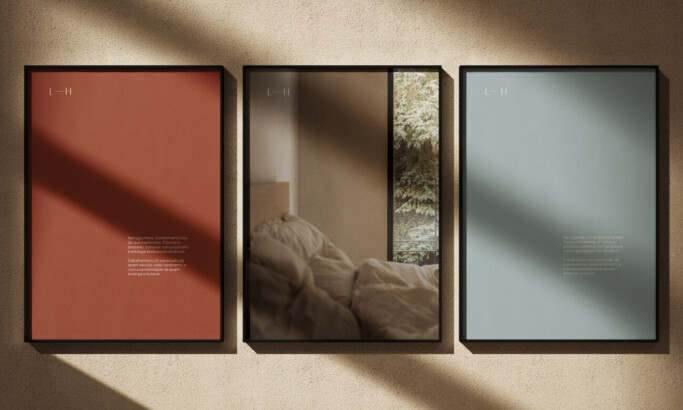
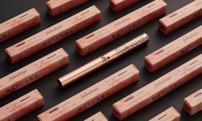
Lugre Haus
Designed by
Flávia Jackeline Design
award winnerMARCH 2026
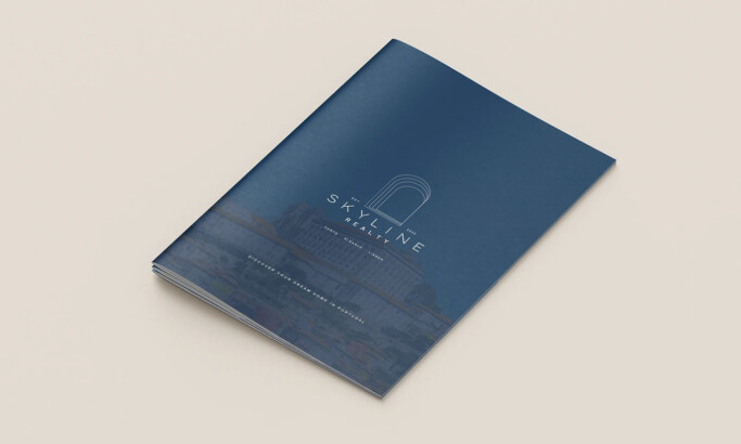
Skyline Realty
Designed by
Graceful Studio
award winnerMARCH 2026
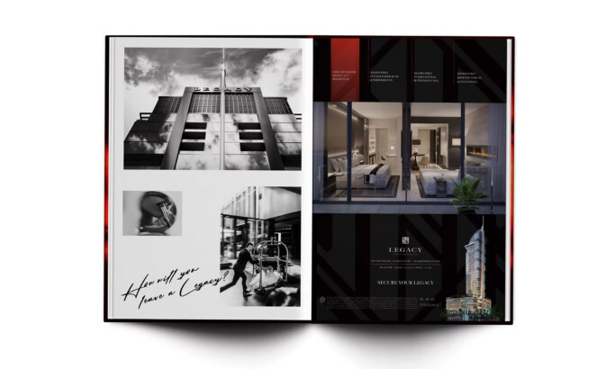
Legacy Hotel & Residences
Designed by
UFO Suarez LLC
award winnerMARCH 2026
Visit website
View Design
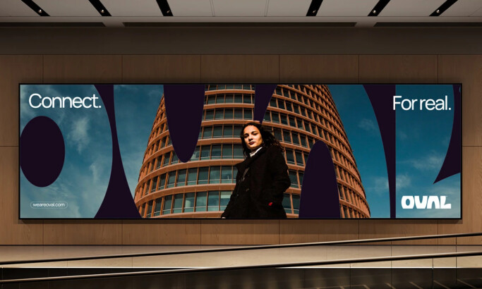
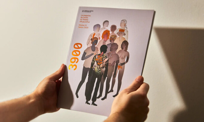
3900 — Volume 13 Magazine
Visit website
View Design
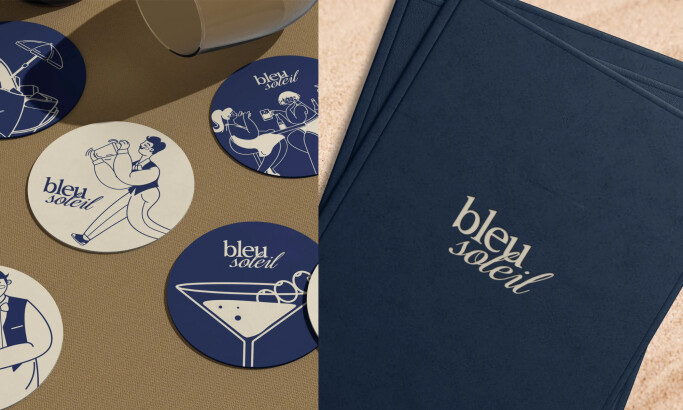
Bleu Soleil
Ready to elevate your designs?
Monthly Competition Countdown
Submission are still open
0 Designs Submitted
Industries
- Advertising
- Architecture
- Arts & Recreation
- Banking & Finance
- E-Commerce & Retail
- Education
- Engineering
- Entertainment
- Environmental Ads and Brand Designs
- Fashion & Beauty
- Food & Beverage
- Government
- Health & Wellness
- Hospitality
- Legal & Insurance
- Luxury
- Manufacturing
- Medical & Pharmacy
- Non-Profit
- Professional Services
- Real Estate
- Sports & Leisure
- Technology
- Travel
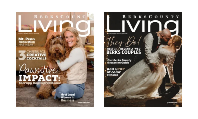
Berks County Living
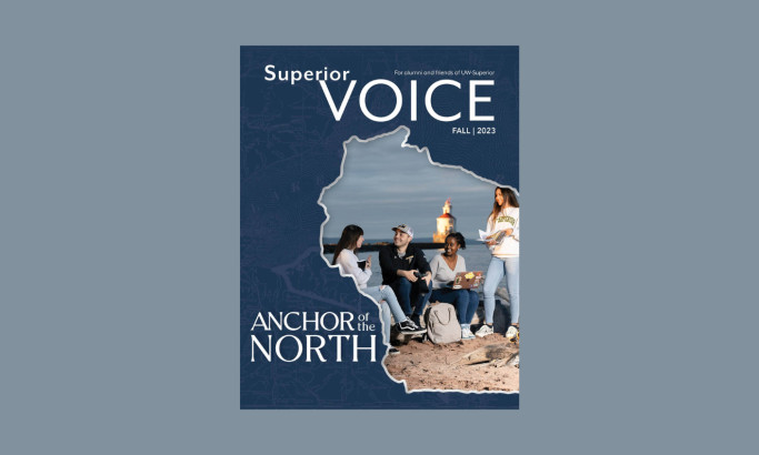
University of Wisconsin Superior

Seat Comfort Systems
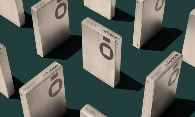
Nóvace
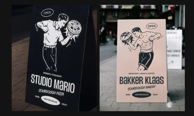
Bakker Klaas
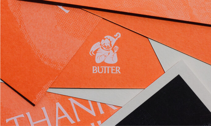
Butter Pastry

Shop 'N Save Tailgate Zone
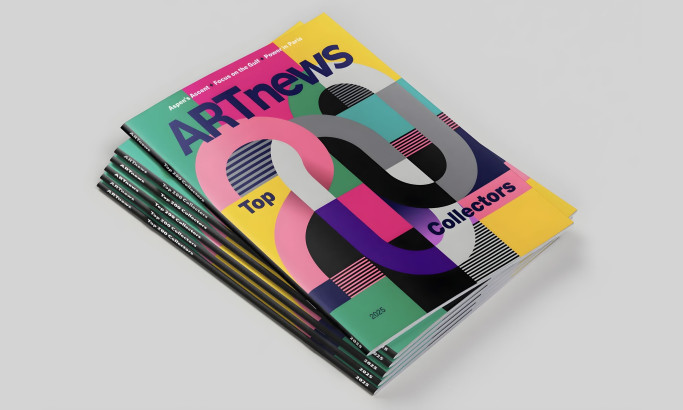
ARTnews Magazine
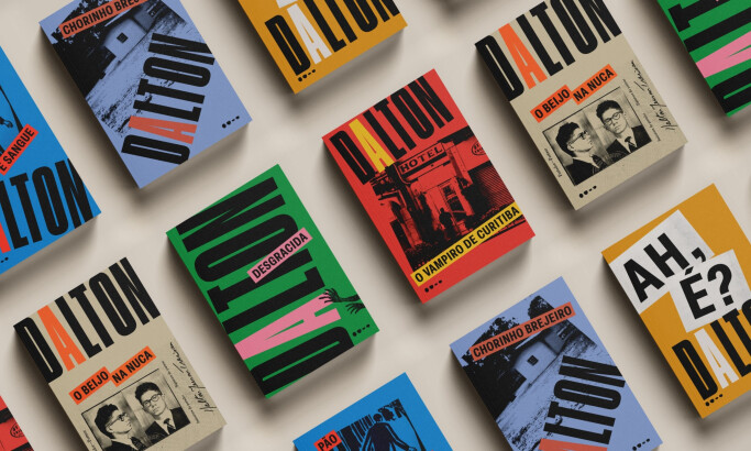
Todavia | Coleção Dalton Trevisan
Ready to elevate your designs?
Each juror is selected for their expertise in areas such as branding, digital design, illustration, and user experience, ensuring every entry is reviewed with fairness and insight.
Our Jury has worked with Prada, Nike, Chanel, Google, and Apple. Can you join them?
Design Awards Evaluation Criteria
Impact
- How well does the design command attention and elicit a response from the user?
Creativity
- Was the design unique and resourceful in its techniques, tools, concepts, and materials?
Functionality
- Was the design able to achieve its purpose and improve the user's experience?
Execution
- Was the design detail-oriented in its execution process and final presentation?
Branding
- Was the design effective in reflecting the brand it represents?
See the measurable business impact our winners achieved after receiving recognition
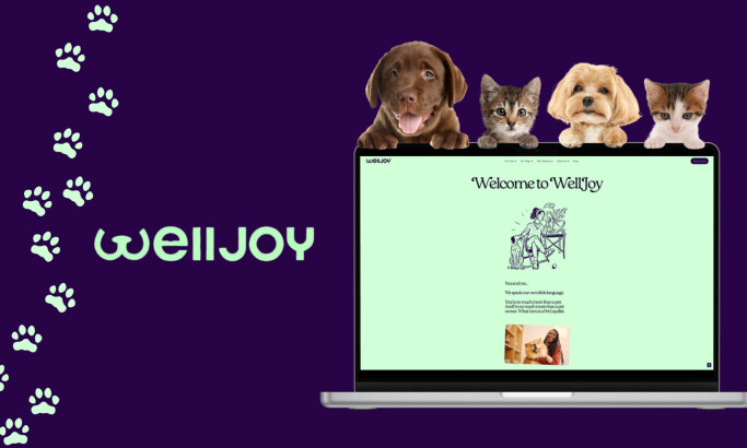
gold
Winner
Winner
WellJoy
by Codal
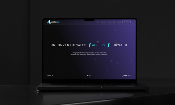
silver
Winner
Winner
Apollo Care
by Starfish
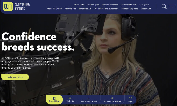
bronze
Winner
Winner
County College of Morris
by eDesign Interactive
View All Best Website Designs
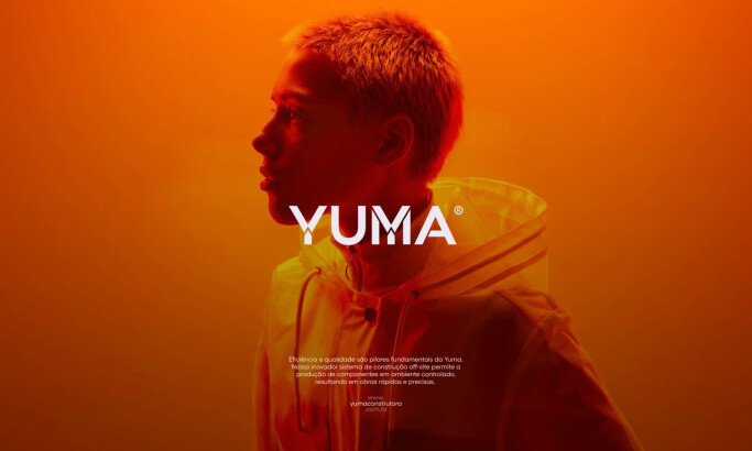
gold
Winner
Winner
Yuma
by Estúdio 017
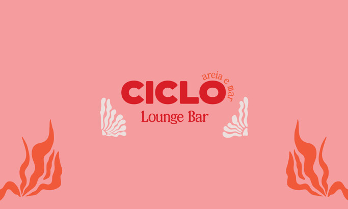
silver
Winner
Winner
Ciclo Lounge Pop Up Bar
by Carolina Sattie
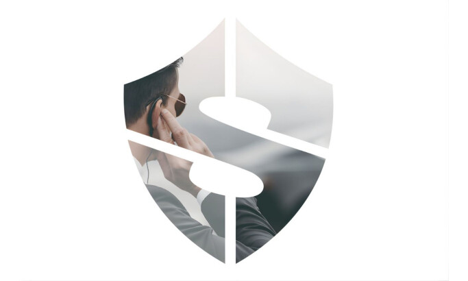
bronze
Winner
Winner
Spencer Security
by Ascend Design, LLC
View All Best Logo Designs
gold
Winner
Winner
Lugre Haus
by Flávia Jackeline Design
silver
Winner
Winner
Skyline Realty
by Graceful Studio
bronze
Winner
Winner
Legacy Hotel & Residences
by UFO Suarez LLC
View All Best Print Designs
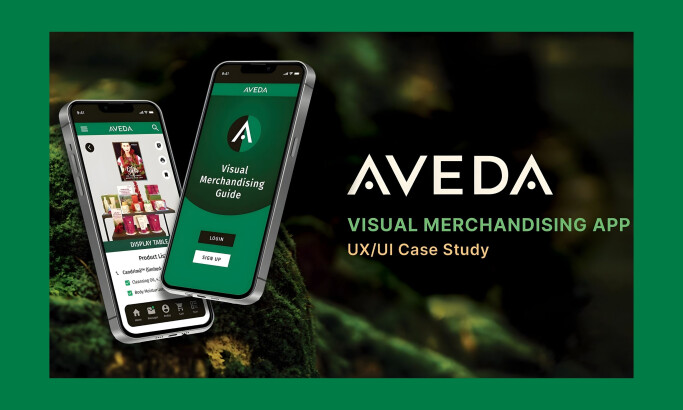
gold
Winner
Winner
Aveda
by Dasha Wagner
silver
Winner
Winner
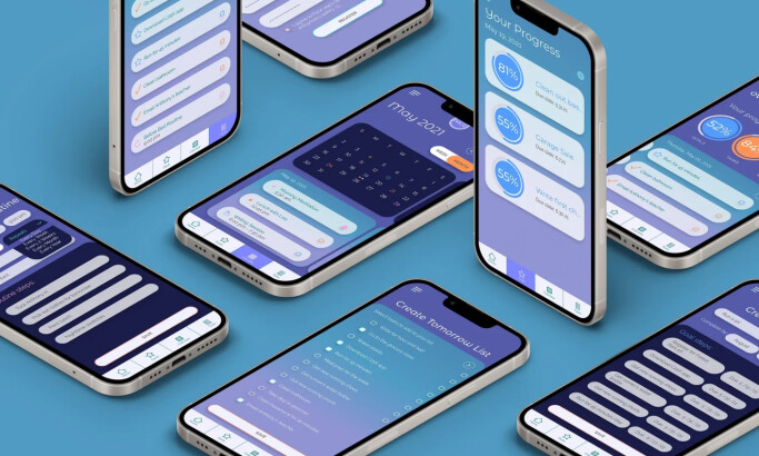
The Pace App
by Erin Moore
bronze
Winner
Winner
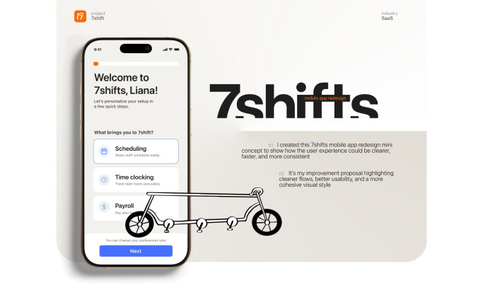
7shifts
by Liana DROZD
View All Best App Designs
gold
Winner
Winner
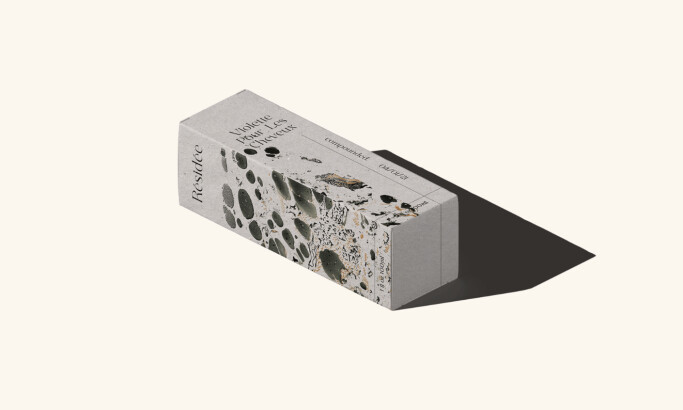
Résidée
by Ata Berkol
silver
Winner
Winner
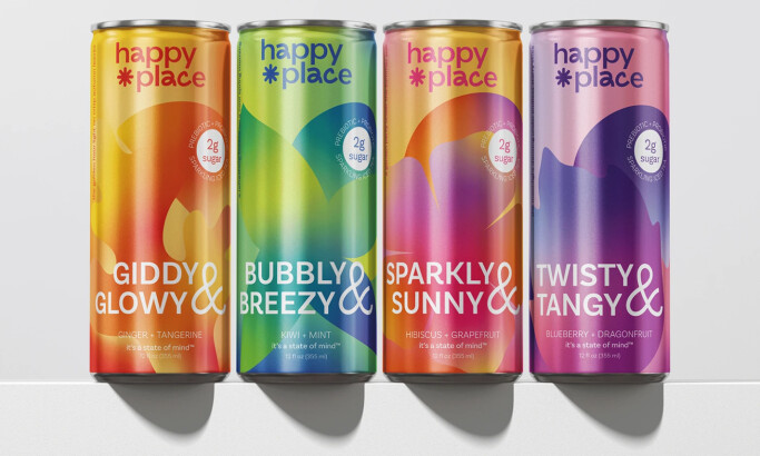
Happy Place
by Emily Norris-Jones
bronze
Winner
Winner
Sandra Glynn
by Puree Fantastico
View All Best Packaging Designs

gold
Winner
Winner
Minecraft - Shape Your World
by Dan French

silver
Winner
Winner
MICF
by Tandem Media

bronze
Winner
Winner
Wealthfront "French Toast"
by Jack Turits
View All Best Video Designs
Frequently Asked Questions
Click on a question to expand and see the answer
What is the ROI of winning a DesignRush Award?
Winning is a trust and conversion asset you can reuse everywhere. With DesignRush Awards, the ROI typically shows up in:
- Sales enablement: winner status + laurels/badges strengthen proposals, pitch decks, and “why us” sections, helping reduce friction in late-stage deals.
- Visibility inside DesignRush: winners get stronger positioning on category and awards-related pages, which can support inbound interest from businesses browsing agencies.
- Marketing content: winner announcement + shareable assets give you ready-to-publish social, newsletter, and PR angles to keep your work circulating beyond the campaign window.
How does the voting process work?
DesignRush Awards can include public voting windows for eligible competitions. When voting is enabled, visitors vote directly on the competition page and those votes contribute to the final result for voting-based outcomes.
Some formats (for example finalist showcases) may be displayed without voting. The page will clearly indicate whether voting is active and the exact voting dates for that cycle.
Some formats (for example finalist showcases) may be displayed without voting. The page will clearly indicate whether voting is active and the exact voting dates for that cycle.
What do winners receive?
DesignRush Awards winners receive:
- Winner recognition on the platform (winner status displayed on the awards experience)
- Digital laurels/badges for website, proposals, and social
- Winner announcement visibility during the awards cycle (shareable winner feature you can circulate)
- Stronger placement opportunities tied to awards and community exposure as the program pushes winners and top projects
How are entries judged?
DesignRush Awards entries are reviewed with a focus on both design excellence and effectiveness. In practice, evaluation is based on criteria like:
- Concept and originality
- Visual craft and consistency
- Clarity, usability, and execution quality (especially for web and digital)
- How well the work solves the stated problem for the intended audience Judging is category-aware, so what matters most depends on whether it’s branding, web, product, digital, etc.
Is there a fee to submit?
Yes. To enter the DesignRush Awards, you submit through an active subscription. The subscription is what unlocks your entry, your competition placement, and the related winner assets/visibility if you place.
Ready to elevate your designs?