Clover Capital’s website, designed by Net-Craft.com, transforms the traditional look of lending and real estate sites into a visually refined experience.
The project balances utility and aesthetics, proving that high-performing websites in finance don't need to feel templated. From its cinematic opening visuals to a structured, brand-forward layout, Clover Capital is a standout example of strategic web design.
Industry Insight: Websites with video on the homepage see up to 82% longer dwell time, making this a proven tactic for elevating engagement and signaling quality.
Want to see it in action? Net-Craft.com’s work for Clover Capital expertly illustrates this approach. Let's take a closer look.
Key Findings for Brands:
- Use high-quality visuals to convey brand identity and positioning
- Apply color psychology to signal expertise and credibility
- Integrate smart tools to enhance functionality and user value
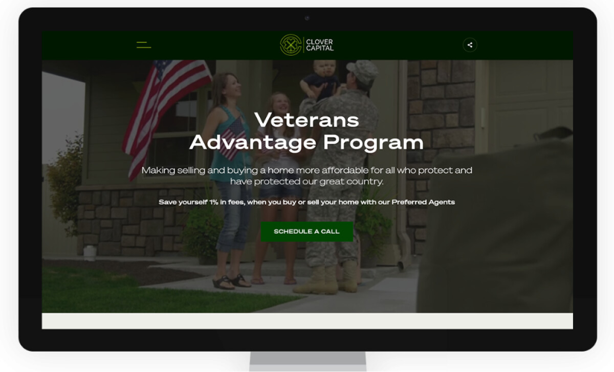
Cinematic Visuals Solidify the Brand’s High-end Positioning
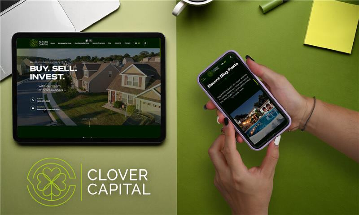
Clover Capital's homepage opens with a full-screen background video featuring a luxury property, immediately establishing a sense of aspiration and exclusivity.
This approach mirrors successful visual strategies used by top real estate brands, where lifestyle-driven imagery builds emotional engagement.
See more examples of websites with videos here.
As visitors scroll, Clover Capital continues the narrative through high-resolution photography paired with clear, concise copy.
Visual overlays such as short headlines and callouts are used intentionally to guide attention without clutter.
The key strategy? The site avoids distracting elements like excessive animations or effects.
Instead, it delivers a smooth and visually grounded experience that supports the content.
The result is a website that feels immersive and polished while remaining user-friendly and navigable.
Green and Neutral Colors Signal Progress and Reliability
According to a study by CCICOLOR - Institute for Color Research, people make subconscious judgments about a product within 90 seconds of initial viewing, and up to 90% of that assessment is based on color alone.
Clover Capital’s palette plays directly into this influence, encouraging trust and engagement through its consistent and calming color story.
The palette features:
Deep forest green conveys stability, heritage, and financial security, aligning with industry trust signals.
Neon green accents introduce energy and modernity without overwhelming the core aesthetic.
Soft creams and beiges add spaciousness and improve content readability.
Net-Craft.com's decision to use green as the primary brand color is strategic.
In color psychology, it is often associated with money, growth, and reliability. It also carries emotional weight in the finance world, reinforcing Clover Capital as a trustworthy partner in high-stakes financial decisions.
Balanced Typography Elevates the User Experience
Typography on the Clover Capital website plays a key role in shaping user perception.
The designers chose a bold, wide sans-serif typeface for headlines, giving each page an authoritative and confident voice.
This is paired with smaller, highly legible paragraph text that supports accessibility across devices.
- Bold, wide sans-serif headlines provide clarity and authority.
- Smaller paragraph text ensures readability across screen sizes.
- Generous spacing and smart alignment offer visual comfort and ease of use.
These decisions reflect the best practices from Google’s Material Design Guidelines, which emphasize clarity, hierarchy, and ease of reading as central pillars of effective typography in digital environments.
Integrated Tools Improve the Web Experience
Professional web designers often incorporate smart tools that turn the site into a valuable resource.
On Clover Capital’s website, these features stand out:
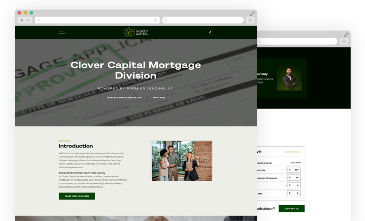
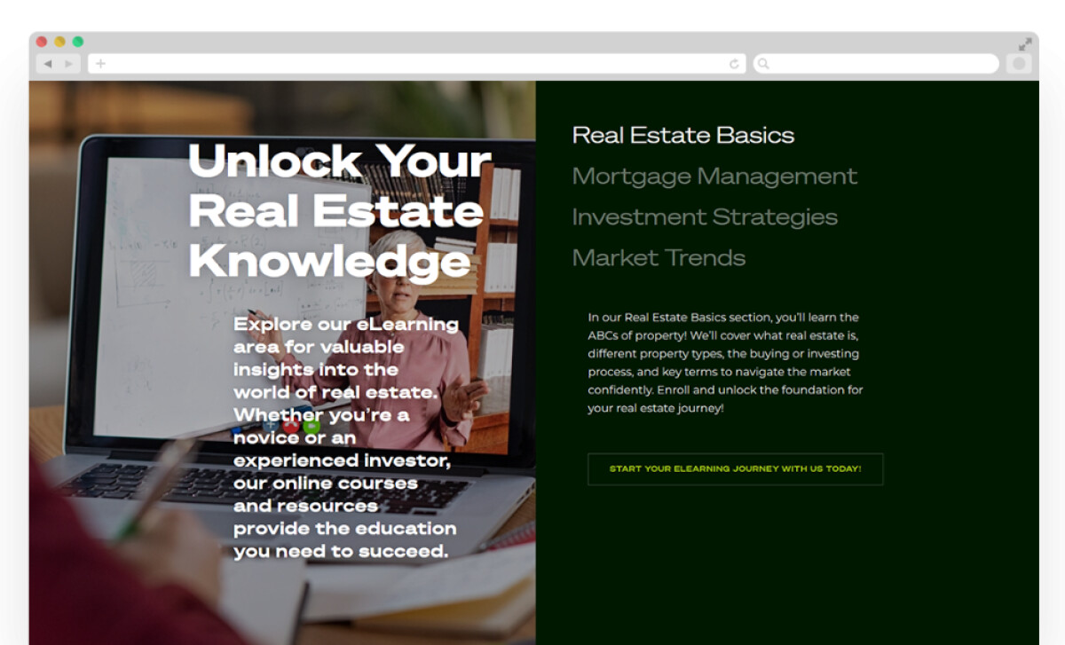
- Password-protected eLearning area that gives clients secure access to financial education materials in a user-focused environment.
- Custom mortgage calculator that enables users to input variables and get instant, personalized estimates, helping streamline complex decisions directly on-site.
These tools reflect a growing trend. Interactive content generates 52.6% more involvement than static pages, underscoring their strategic value in driving deeper engagement.
Since launch, the site has elevated client engagement, enhanced tool usability, and strengthened Clover Capital’s digital presence.
Its seamless blend of visual clarity, functionality, and performance creates a high-performing, user-first, responsive platform, earning it recognition as one of the best website designs in the finance industry.
What Agencies Can Learn from Net-Craft
Clover Capital’s site reflects broader design trends that raise the bar for digital partners. For agencies, it’s a clear signal: clients expect more than clean visuals — they want strategy, usability, and performance built in.
To meet rising expectations, agencies should focus on:
Decision-first UXSimplify services with intuitive, purpose-driven interfaces.
Confidence-building designUse visuals, video, and brand cues to shape perception.
High-value toolsPortals, calculators, and gated content increase engagement and credibility.
Clover Capital’s success shows that when agencies combine these elements, the result is a digital experience that feels both elevated and user-first — a standard today’s clients now expect.
Clover Capital’s site proves that financial services websites can be both functional and visually compelling, combining trust-building design with user-first tools.
If you're looking to elevate your digital presence with similar clarity and sophistication, our team ranks agencies worldwide to help you find a qualified partner. Visit our Agency Directory for the top web design companies, as well as:
Our experts also recognize the most innovative digital projects across the globe. Visit our Design Awards section to see the best in website design.