DiLuigi Foods is a meat manufacturer, specializing in gourmet sausage, beef, pork, and poultry items. Their website shows the exceptional quality of their products while maintaining brand identity with large, full-width images. Check out our article on best meat packaging designs.
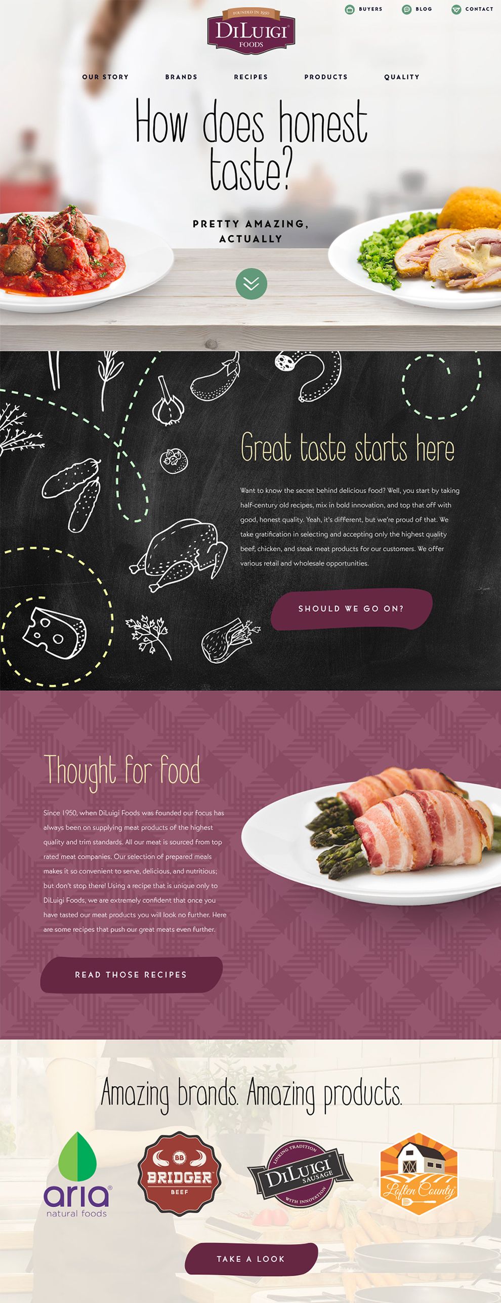
The homepage has a full screen header that adjusts to the screen monitor's height and width. This keeps the design clean, allots plenty of space for the content to breathe, and helps users easily identify the main header. As they scroll down the page, users will clearly see links to "Our Story," "Brands," "Recipes," Products," and "Quality." There is not a very long deep-scroll, but it is very effective from a design and branding point of view.
Typography plays a vital role in developing a visually strong brand identity, and the handwriting-like font used gives DiLuigi Foods a pop of personality while adding another dimension to the company as a lifestyle brand. There are additional design elements of hand-drawn icons and beautiful background patterns that remind the user of a kitchen tablecloth.
The overall design of the product pages match the homepage; both feature hand-drawn typography and background patterns that resemble kitchen tablecloths. However, the product page includes a full-width grid.
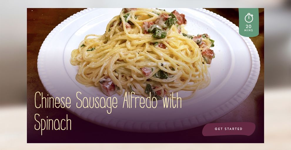
The products page has an interesting header design that pairs with a clean background and bright color. Beneath the header, there is a recipe suggestion, which helps users engage further with the Diluigi's website.
The three columns host large, absorbing food photography, which ensures users are captivated by the content. Another unique feature is the nutrition lightbox that appears when a user clicks the view the details of the photo.
Diluigi Foods is a best website design in the Food & Beverage industry.
-preview.jpg)


