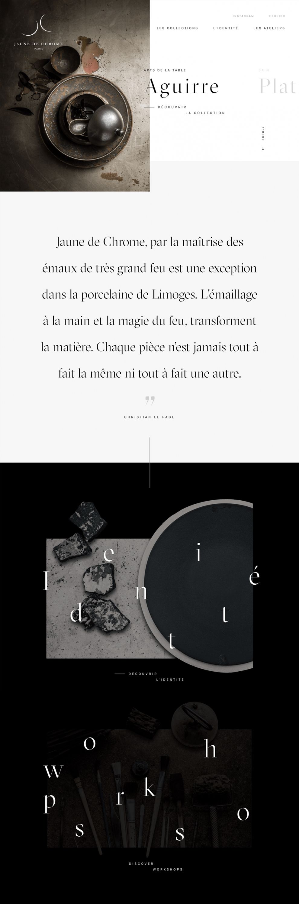
Sleek, chic, and revolutionary—three words that describes Jaune De Chrome’s web design. The luxury home decor company’s minimalist concept, stunning imagery, and use of parallax scrolling enhances the UI and UX for each viewer.
The home page is welcoming and easy to navigate, with asymmetrical lines that pull the page together and draw attention to the product image on the left. Across the website, every picture is thematic and adds an artistic quality to the overall feel.
The white backdrop assists in the transition between pages, helping to keep the content on the page in visual focus. Each page features phenomenal typography, thanks to condensed typeface width and weight.

Jaune De Chrome’s “About” page is whimsical and elegant. Its parallax-inspired side-scroll browses through a timeline of the company's history. The minimal content and faded, blurred background images correlates with their story. The black backdrop encourages UX application by pulling everything forward, making it appealing to the eyes.
An important thing to mention is Jaune De Chrome’s use of wordplay. Although the initial page is in French, it doesn’t use a traditional “About” page label. The French version of the title page is “L'identité,” which translates to “The Identity” in English.

Jaune De Chrome’s product page follows the site’s brilliant design by using a gallery-style format. Each description includes a high-resolution image and a title, avoiding flowery syntax. It enhances the UI by allowing users to explore each individual piece, staying true to the site’s minimal concept.
Jaune De Chrome’s website reflects their unique design and ability to think outside of the box. Its bold, experimental, and attractive, and it brings visual artistry to the digital realm.
Jaunedechrome is a beautiful website design in the Arts & Recreation and Luxury industries.