Philips, a global leader in health technology and consumer electronics, has a website that perfectly aligns with its image of precision and care. The website’s minimalist layout emphasizes functionality, seamless navigation, and intuitive organization. It integrates immersive videos, meaningful images, and subtle gradients to humanize the brand and maintain a modern, professional aesthetic.
Key Insights for Brands:
- Using ample white space and a clear structure ensures users can navigate content effortlessly
- Clean navigation menus in the header and footer sections provide easy access to key areas
- Incorporating videos and meaningful imagery creates emotional connections with users
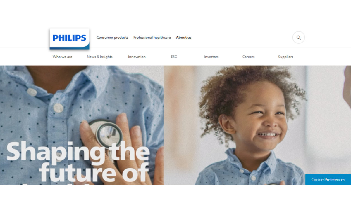
Philips’ Website Reflects Professionalism Through a Minimalist, Functional Layout
The Philips website presents a sleek, modern design with ample white space, reinforcing the brand’s commitment to organization and precision. The structure emphasizes simplicity, ensuring visitors can easily focus on content without distractions. Each section flows seamlessly into the next, creating a harmonious user experience that feels intuitive and elegant.
Philips' minimalist layout projects a sense of cleanliness and mirrors the professionalism associated with the brand’s products and services. This thoughtful design ensures every interaction with the site reflects the high standards the company upholds.
The Design Provides Efficient Navigation Through Organized Header and Footer Menus
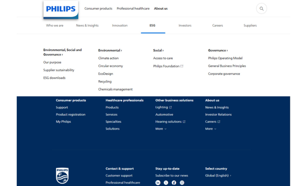
Philips' website boasts an excellent navigation system. It features header and footer menus designed to provide straightforward and seamless navigation.
The menu’s text-based approach shies away from excessive icons, graphics, or intrusive buttons, making them easy to explore. Links that lead to external pages are marked with subtle "new tab" symbols, informing visitors that their original browsing session will remain intact.
This clear structure, utilized in some of the best website designs, ensures efficient and user-friendly navigation. Each element serves a purpose, guiding users precisely to the content they seek while maintaining a calm and orderly browsing environment.
Dive into our list of the best tech website designs to get inspired!
Search Features and Recommendations Enhance the Philips Website’s Usability and Engagement
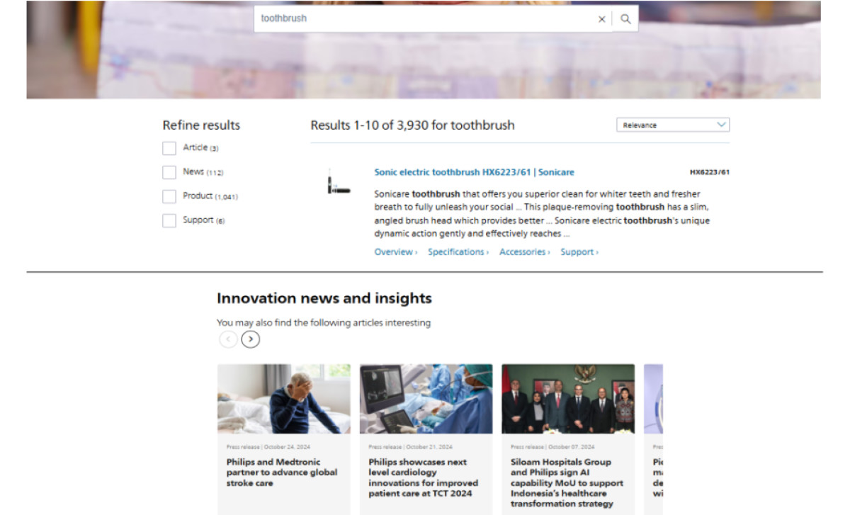
The Philips website incorporates a powerful search feature that allows users to explore content across all its platforms. Users can refine search results by categories such as products, news, or articles, helping them locate specific information quickly.
Coupled with the website’s well-structured menus, the search feature contributes to delivering a seamless browsing experience where users feel in control. It also saves their time and effort in finding specific content, a handy option for people who prefer a fast and efficient way to browse.
Below the search results are recommended articles and resources based on the user’s query. Professional website designers use thoughtful recommendations like these to encourage further exploration, subtly enhancing engagement by directing users to content they might find valuable and enjoyable.
The Philips Website Strengthens the Brand’s Identity With Immersive Videos and Meaningful Images

A captivating full-width hero video greets visitors on the homepage, showcasing touching moments of children and elders experiencing happiness and comfort.
Whether lying in flower fields, embraced by loved ones, or interacting with healthcare professionals, the imagery communicates warmth and reassurance. Throughout the site, other short videos provide quick, informative overviews, keeping users engaged without relying on lengthy text.
High-quality images are used strategically to humanize the brand and showcase high-end equipment — ranging from satisfied customers to sleek product photography and corporate portraits. These visuals build trust by showcasing Philips’ dedication to customer care and professionalism.
The on-brand purple and light blue gradient adds a creative touch to the website. This gradient evokes inspiration and calm, appearing on backgrounds, text elements, and icons. It reinforces the brand's visual identity while maintaining a modern and inviting aesthetic throughout the site.
In conclusion, the Philips website balances simplicity, efficiency, and engagement, delivering a seamless user experience. With minimalist layouts, intuitive navigation, immersive videos, and curated visuals, it reflects the brand’s professionalism and care. Together, these elements create a welcoming space that builds trust and leaves a lasting positive impression.


-preview.jpg)


