ShopSkin’s Website Design Focuses On Skincare
ShopSkin is a skincare brand that focuses on empowering its customers to be proactive about their skin. Their goal is to help people achieve their version of perfect skin — whether that be eliminating crows feet, brightening skin or removing blemishes.
The brand focuses on the top 10 skin concerns for average people and provides solutions that are specifically catered to these problems. They want people to be more confident and comfortable with their skin. They don’t want people to focus on hiding their blemishes but focus on taking an active approach to resolving them.
This team of industry experts is dedicated to creating products that heal and transform. They provide their customers with a short list of products to ease confusion and maximize results. Their products are vetted and they take customer concerns seriously.
This friendly and focused brand wanted to create a website that made finding and buying these products easy and efficient. They needed a design that was light, bright and clean like the products themselves.
The resulting website embodies this brand and their mission while simultaneously creating a user experience that was seamless and stylish.
ShopSkin’s Online Platform Uses Stunning Imagery To Push Proactivity
This online destination focuses heavily on imagery — from photographs of models, to product shots and creative illustrations on the menu bar.
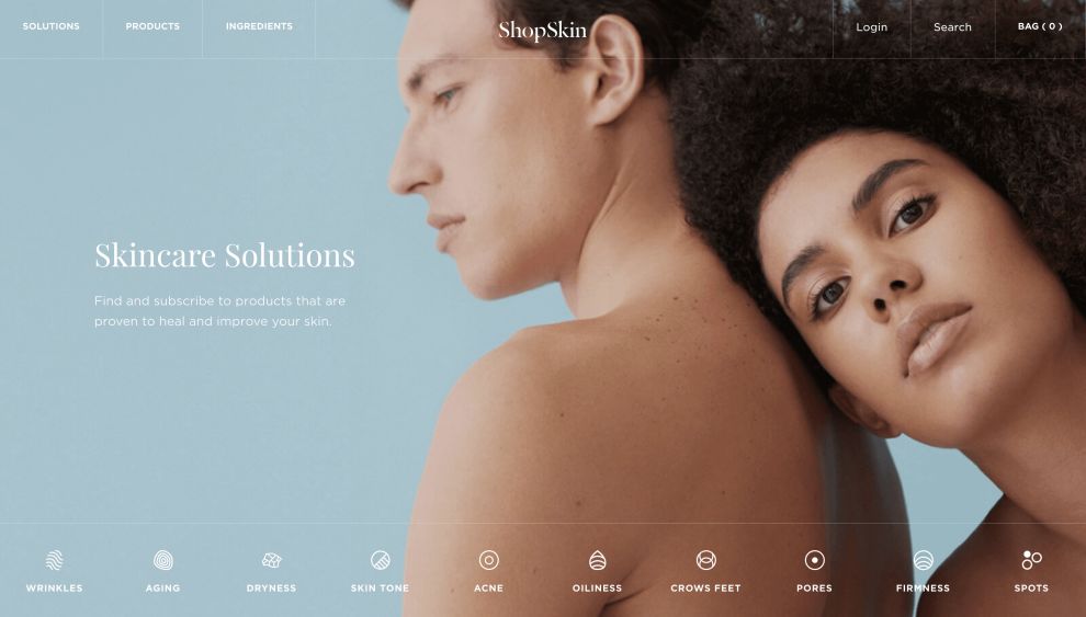
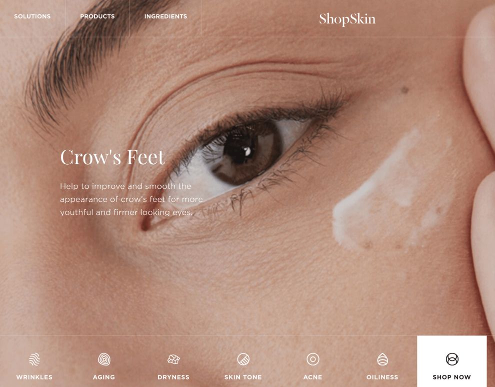
The homepage is made up of a photograph that takes up the entire page. The images change depending on the illustration in the menu bar you rollover. These illustrations correlate to a skin concern that can be resolved using their products. As you hover over, a rollover effect changes the icon and changes the main homepage image.
These photos and illustrations are light, bright and airy. They are high-def, engaging and impactful. They focus on the skin, making it very clear the purpose of this brand and their products.
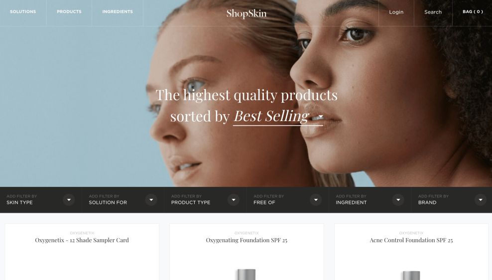
Product pages make use of similar photographs, and the product shots included are clear, focused and big. They are surrounded by plenty of white space that emphasizes a cleanliness and a refreshing nature to the design.
The imagery used within this web design is engaging, impactful and strong. These images stand on their own, and quite literally create almost the entire design. These images are the biggest design elements in this website, and they give users a sense of excitement and energy. These images show users that this brand knows exactly what it’s doing.

The ShopSkin Website Keeps Simplicity Key
Photographs and illustrations are the most intricate aspects of this design, but even they are modern and minimal. There is limited copy on the webpage, and even the illustrations are small and straightforward.
Product pages include a comprehensive filter bar that gives clear and bold options to search through. But the easiest things for users to do is to hover over one of the 10 illustrations on the bottom menu bar. These display clear calls to action that take users to the product page that matches that skin concern.
There is a modernity and simplicity to this design in its lack of extensive text, focus on images and emphasis on a clean, white layout.
ShopSkin’s Intuitive Website Design Plays With Interactivity
This website design for ShopSkin is highly intuitive and interactive thanks to its rollover effects, comprehensive search and filter bar and simple navigation.
There’s also an option for users to search through products by ingredients. There’s a page dedicated to this entirely, with a layout that’s created in an alphabetical, dictionary-style design and orientation. This gives users exactly what they want and answers questions for them they didn’t even know they had.
Rolling over the clever illustrations that line the bottom menu bar, users are swiftly directed to the product page that matches that concern. Whether they’re working on brightening their skin, eliminating acne or reversing the effects of aging, this intuitive and interactive menu bar gets people involved and gives them the answers they’re looking for.
The overall simplicity, matched with the focus on imagery and subtle movement in this design engage users and get them interacting with the site and its content with ease.

The ShopSkin Website Design Is Bright, Clean And Modern
ShopSkin’s website is intuitive, interactive and exciting.
The design team made great use of photography, product shots and an illustrative product and solution bar to give people a quick and clever look at the products and the skin concerns that they treat.
Users can search by skin problem, and calls to action make the choice clear. Product pages are organized and clean, with bright white space that adds an airiness to the overall design.
Typography is kept to a minimum, with short phrasings and single word descriptions. This puts the focus more on the products and the skin concerns.
Searching for solutions to common skin problems can be exhausting. It can feel like the pursuit is never-ending. But ShopSkin simplifies the process and creates a user experience that is both pleasing and effective.
The rollover effects and intuitive search and filter bars are extremely exciting and interactive. They make the process a breeze.
This entire website is seamless and fluid. Bright, vivid photography, product shots and illustrations add a modern and minimal vibe to the design, and the user-friendly navigation adds a freshness that can’t be beaten.


