-account-photo_listing.jpg)
-account-photo_listing.jpg)


Our Jury has worked with Prada, Nike, Chanel, Google, and Apple.
Best Architecture Website Designs of 2026
View the Top Architecture Website Designs Below
Best Architecture Website Designs of 2026
4,200+ Submitted Designs
- Advertising
- Aerospace
- Agriculture
- AI
- Architecture
- Arts & Recreation
- Automotive
- Banking & Finance
- Community
- Construction Company
- Content & News
- Digital Agencies
- Distribution
- E-Commerce & Retail
- Education
- Engineering
- Entertainment
- Fashion & Beauty
- Film Production Company
- Food & Beverage
- Games and Entertainment
- Government
- Health & Wellness
- Hobby
- Hospitality
- Jewelry
- Legal & Insurance
- Luxury
- Manufacturing
- Medical & Pharmacy
- Museum
- Music
- News Magazine
- Non-Profit
- Professional Services
- Real Estate
- Restaurant
- Roofing
- Sports & Leisure
- Startup Business
- Tech Startup
- Technology
- Travel
- Wedding Planning
- Zoo
- 3D
- 404
- About Page
- Artisan
- Artistic
- Black and White
- Blog
- Bold Color
- Bold Font
- Book App
- Check Out Page
- Chinese
- Clean / Minimal
- Colorful
- Contact Page
- Corporate
- Custom
- Experimental
- Flat
- Footer
- Form
- Fullscreen
- Futuristic
- Green
- Horizontal Layout
- HTML5
- Illustrated
- Images / Gallery
- Innovative
- Inspiring
- Interactive
- Landing Page
- Menu
- Microinteractions
- Mobile Websites
- Motion Effects
- One-Page
- Parallax Effects
- Personal
- Pet Store
- Photographer
- Playful
- Podcast
- Pop Ups
- Portfolio
- Pregnancy
- Pro-loaders
- Product Listing Page
- Purple
- Retro
- Services Page
- Simple
- Slider / Module
- Small Business
- Soft Colors
- Sound / Music
- Storytelling
- Tech Online Store
- Typography
- Unusual Layout
- Use of Infographics
- User-Friendly
- UX Designs
- Virtual Reality
- Visible Borders
- Visually Striking
- Webflow
- Welcome Page
- WordPress
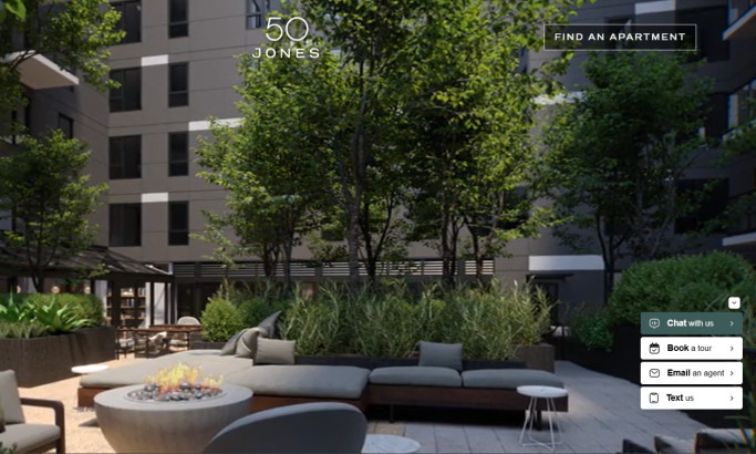
View Design
50 Jones Apartments
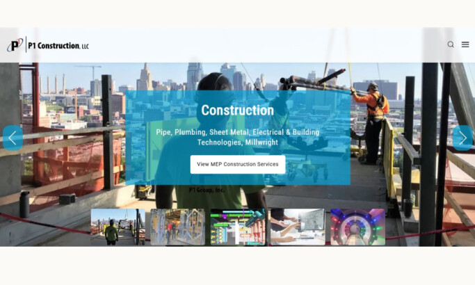
View Design
P1 Construction
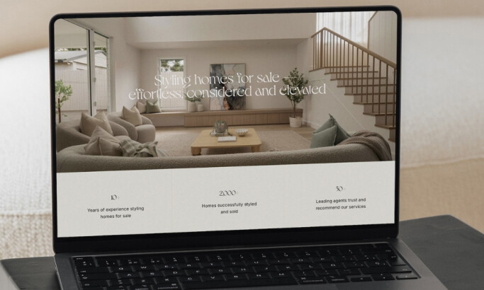
View Design
Tailored Interiors

View Design
Desires Tram

View Design
Canal Park Cambridge

View Design
Nenad Zivojinovic

View Design
Maztri

View Design
Ortiz Leon

View Design
Rob Mills
Get Connected
With The Right Agency Partner
& Receive Proposals For FREE

View Design
Tom Cole Architect

View Design
Govaert Vanhoutte

View Design
Hill West Architects

View Design
Golden Center

View Design
Klokhuis Interior

View Design
Caever

View Design
Windows of New York

View Design
Little Workshop

View Design
KPS
Ready to elevate your designs?