
Immerse yourself in a symphony of colors, shapes, and imagination as we present the best artistic website designs, where each site is a prime example of digital art. These websites combine aesthetics and substance, offering more than meets the eye.
Browse DesignRush for other best website designs, or connect with skilled website design companies!
Table of Contents
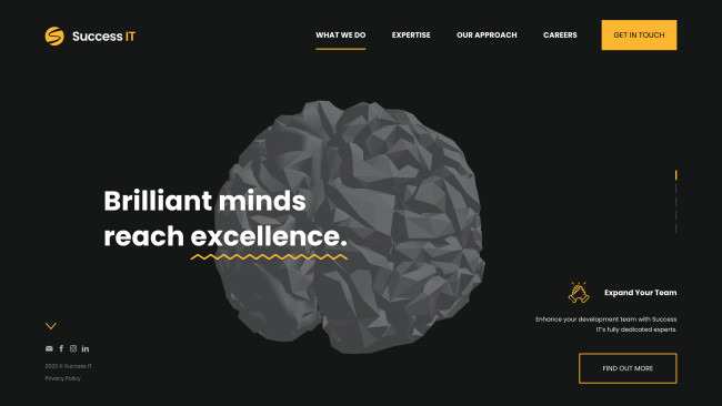
1. Success IT by Fabricca
Standout Features:
- Stunning scrolling effects
- Theme switches
- Yellow outlines
Fabricca’s approach to Success IT's website design portrays how art is in the eye of the beholder, showcasing that beauty and substance vary from your perspective.
Each main menu option showcases a central 3D model resembling a brain that disperses and reconnects depending on your cursor’s movement. As you start scrolling, the visuals remain the same, but the theme changes, providing a completely different aesthetic each time you scroll.
As the shifting theme ends, the visuals finish with the stylish black-and-yellow color scheme. In addition, yellow outlines clearly emphasize the testimonials inside the square outlines. Check out best 3D websites designs here.
2. Boba Talks Website by The Creative Folks

Standout Features:
- Soft color palette
- Cute, minimal illustrations
- Distinctive “About” section
The Boba Talks website is an artistic website design developed by The Creative Folks. The team created a gentle and bubbly visual identity that will melt you away with its aesthetics.
The dark blue headings easily stand out against the combination of soft shades in the background. Meanwhile, the content sections are accompanied by delightful minimal illustrations that decorate the transitions and fill the empty spaces.
The “About” section will make you smile as you scroll past custom avatars representing the team behind the brand, each sipping their own boba tea.
Find more intriguing “About” sections.
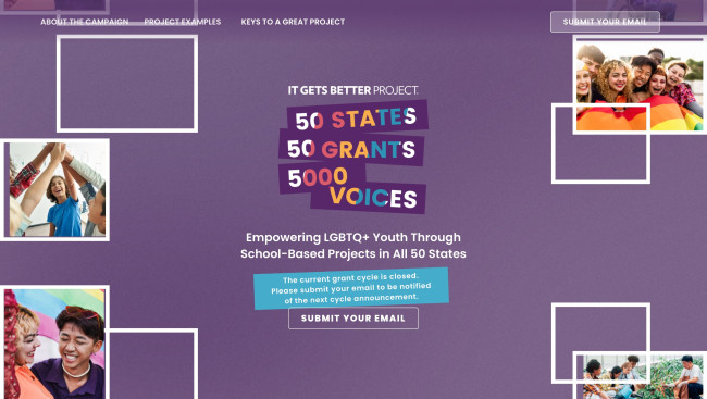
3. 50 States. 50 Grants. 5000 Voices. by Media Cause
Standout Features:
- Single-page design
- Moving pictures
- Colorful layout
50 States. 50 Grants. 5000 Voices. One artistic website design (by Media Cause) to communicate the message and help the cause of supporting LGBTQ+ students in schools across the country.
Aside from a colorful layout, this single-page design uses purple accents to set an empowering tone. It also highlights specific phrases, ensuring they stand out among other elements on the page. (Check out more single-page website designs.)
There’s also a gallery of horizontal and vertical moving pictures that showcase past successful projects and allure to the possibilities of future ones.
Further down is an extensive FAQ section elaborating on the project and all its nooks and crannies. This helps the browser gain a deeper understanding of how it works.
4. HYPER DREAMS by NAUGHTYDUK

Standout Features:
- Immersive and interactive
- Gritty visuals
- Creative artist profiles
HYPER DREAMS represents top artists across Berlin. To effectively represent them, they wanted an impactful website design. Enter creative studio NAUGHTYDUK, who ensured a memorable journey for each site visitor.
The main highlight of this web design is the full-screen images of artists portrayed in gritty visuals that get distorted as you move your cursor around. There’s also a vertical bar resting on the right side of the screen, while the list of signed artists is emphasized through bold white typeface on the left. (Check out more impactful website designs with bold fonts.)
A pop-up window appears in the center as you click on an artist’s name with essential details about them in a futuristic typeface, including their representative, location, and a brief bio. Check out some of the best website designs for 2024 here.
5. VoyaLabs

Standout Features:
- Small dynamic icons
- Noticeable, card-based case studies
- Delightful showreel
VoyaLabs is a team of exceptional designers that developed an eye-catching website design featuring monochromatic aesthetics with pops of color.
The simple layout is decorated with dynamic effects and icons that move around, creating a fun browsing experience.
Scrolling past the services offered, you’ll find card-based case studies with rounded color-coded elements to indicate which services the projects required.
Finally, there’s a delightful short showreel that captures the essence of the design agency and call to action that entices potential clients to work with them.
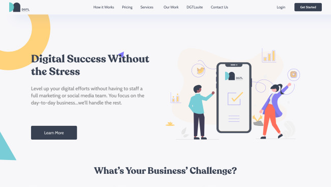
6. DGTL Agency by Striped Horse Digital
Standout Features:
- Large images
- Pleasing color palette
- Color-coded tools representation
DGTL Agency is a Swiss Army knife of digital tools applicable to various industries, business, and professional needs. To illustrate it well, Striped Horse Digital used colorful geometric visuals that mimic missing pieces to workplace puzzles.
Since there are various complex tools, there’s also lots of information to be digested. The design agency uses minimal pastel-colored illustrations to do so straightforwardly and efficiently.
The toolbox is presented visually with six overlapping circles and a central element centered on the screen. On the left side of the illustration is a list of tools, while the right side briefly explains the service and a recommendation. They are color-coded to make each tool distinguishable, making it easy to understand.
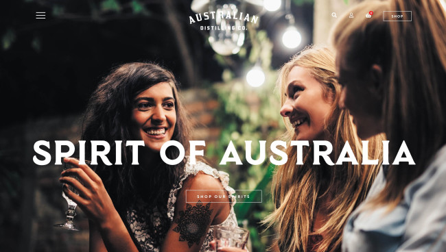
7. AUSTRALIAN DISTILLING CO by Annix
Standout Features:
- High-quality images
- Text juxtaposition on photos
- Bold typography
For the Australian Distilling Co., web designer Annix turned to using high-quality photos they have to come up with a reassuring message to its consumers about the Spirit of Australia celebrated in their products as part of their brand identity.
They used images of actual people that give off that human feeling of connection and warmth, that is often celebrated in events where Australian Distilling Co. products are present. They also used bold typography to add a sense of security, and the juxtaposition of the photos is made in such a way no visual element gets overshadowed by another.


