-account-photo_listing.jpg)
-account-photo_listing.jpg)


Our Jury has worked with Prada, Nike, Chanel, Google, and Apple.
Best Restaurant Website Designs of 2026
View the Top Restaurant Website Designs Below
Best Restaurant Website Designs
4,200+ Submitted Designs- Advertising
- Aerospace
- Agriculture
- AI
- Architecture
- Arts & Recreation
- Automotive
- Banking & Finance
- Community
- Construction Company
- Content & News
- Digital Agencies
- Distribution
- E-Commerce & Retail
- Education
- Engineering
- Entertainment
- Fashion & Beauty
- Film Production Company
- Food & Beverage
- Games and Entertainment
- Government
- Health & Wellness
- Hobby
- Hospitality
- Jewelry
- Legal & Insurance
- Luxury
- Manufacturing
- Medical & Pharmacy
- Museum
- Music
- News Magazine
- Non-Profit
- Professional Services
- Real Estate
- Restaurant
- Roofing
- Sports & Leisure
- Startup Business
- Tech Startup
- Technology
- Travel
- Wedding Planning
- Zoo
- 3D
- 404
- About Page
- Artisan
- Artistic
- Black and White
- Blog
- Bold Color
- Bold Font
- Book App
- Check Out Page
- Chinese
- Clean / Minimal
- Colorful
- Contact Page
- Corporate
- Custom
- Experimental
- Flat
- Footer
- Form
- Fullscreen
- Futuristic
- Green
- Horizontal Layout
- HTML5
- Illustrated
- Images / Gallery
- Innovative
- Inspiring
- Interactive
- Landing Page
- Menu
- Microinteractions
- Mobile Websites
- Motion Effects
- One-Page
- Parallax Effects
- Personal
- Pet Store
- Photographer
- Playful
- Podcast
- Pop Ups
- Portfolio
- Pregnancy
- Pro-loaders
- Product Listing Page
- Purple
- Retro
- Services Page
- Simple
- Slider / Module
- Small Business
- Soft Colors
- Sound / Music
- Storytelling
- Tech Online Store
- Typography
- Unusual Layout
- Use of Infographics
- User-Friendly
- UX Designs
- Virtual Reality
- Visible Borders
- Visually Striking
- Webflow
- Welcome Page
- WordPress
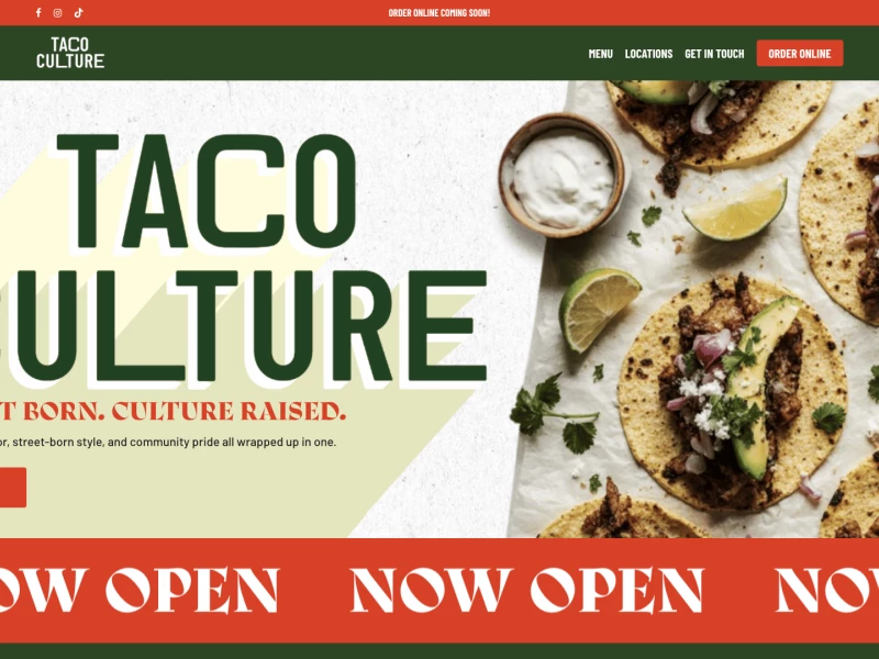
View Design
Taco Culture
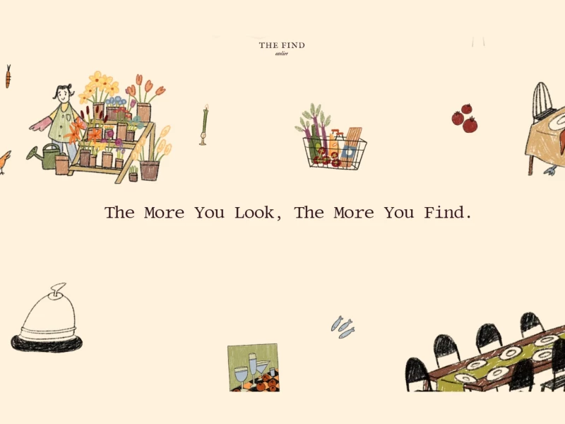
View Design
The Find - Atelier
 Winner
★7.7/10
 AO 8.0
 BS 7.5
 JS 9.0
 KT 9.0
 LB 5.0
View Design
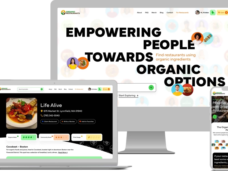
Organic Restaurants
View Design
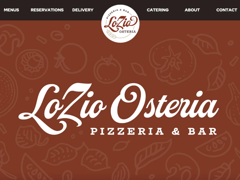
LoZio Osteria
View Design
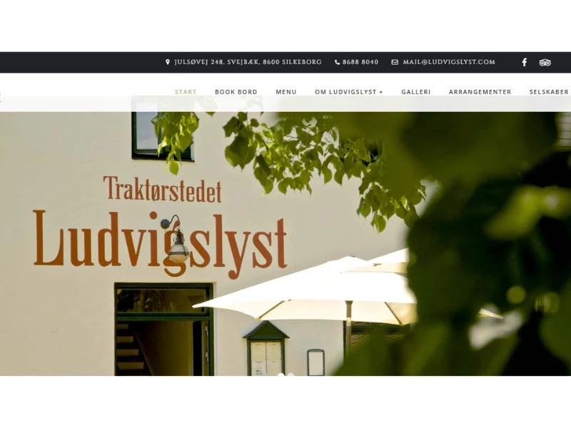
Traktørstedet Ludvigslyst
View Design
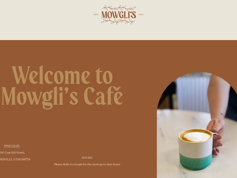
Mowgli's Cafe
View Design
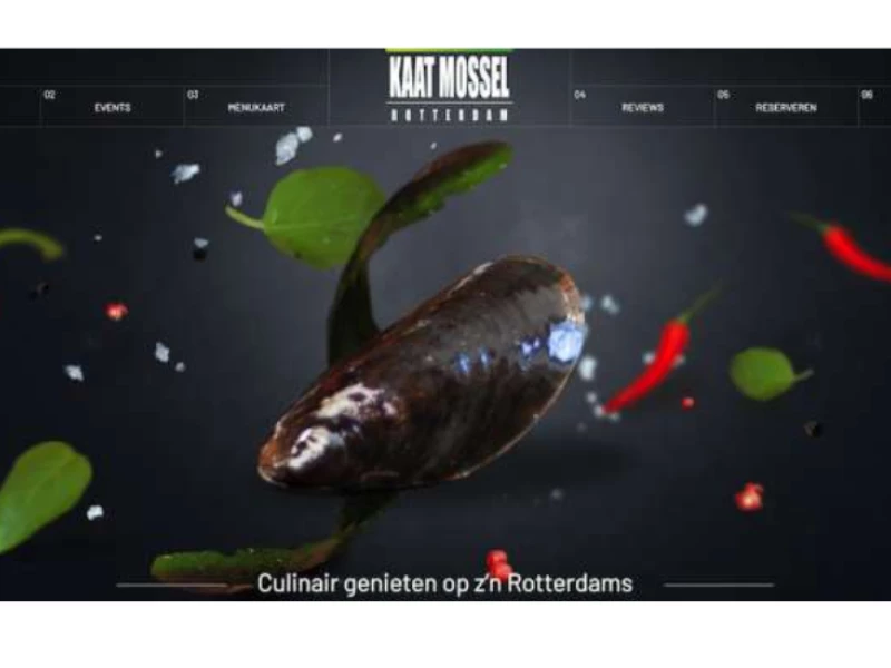
Kaat Mossel
View Design
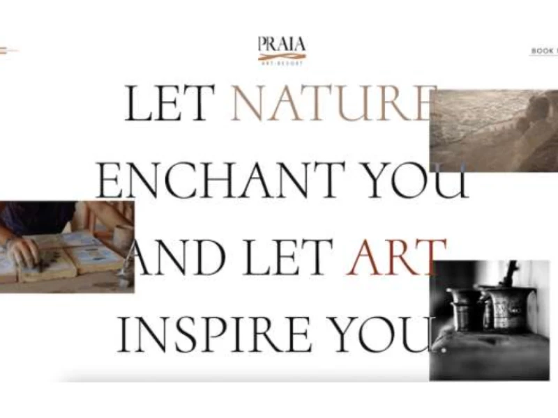
Praia Art Resort
View Design
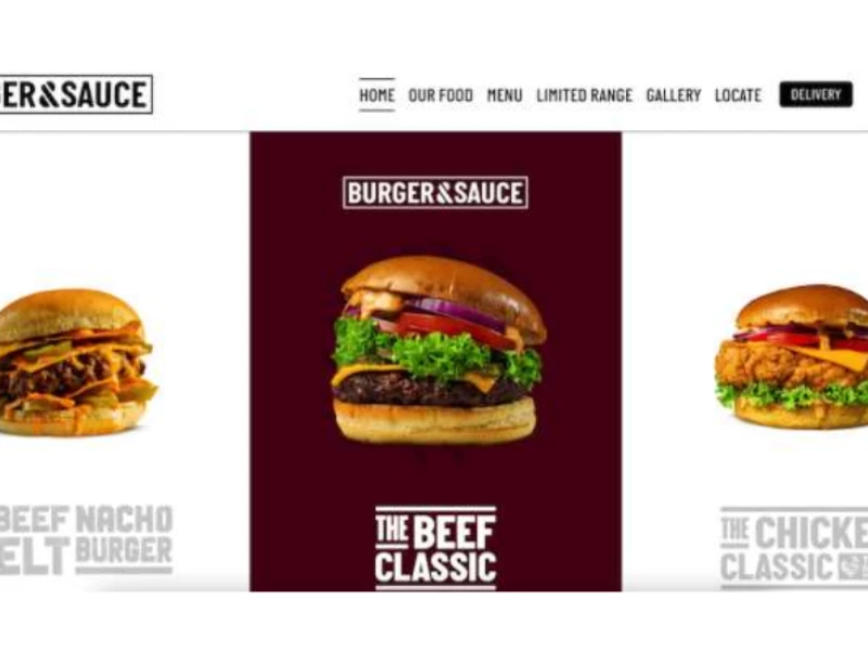
Burger & Sauce
Get Connected
With The Right Agency Partner
& Receive Proposals For FREE
View Design
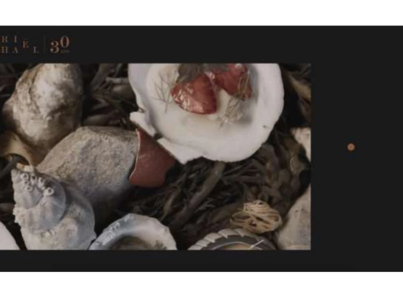
Laurie Raphaël
View Design
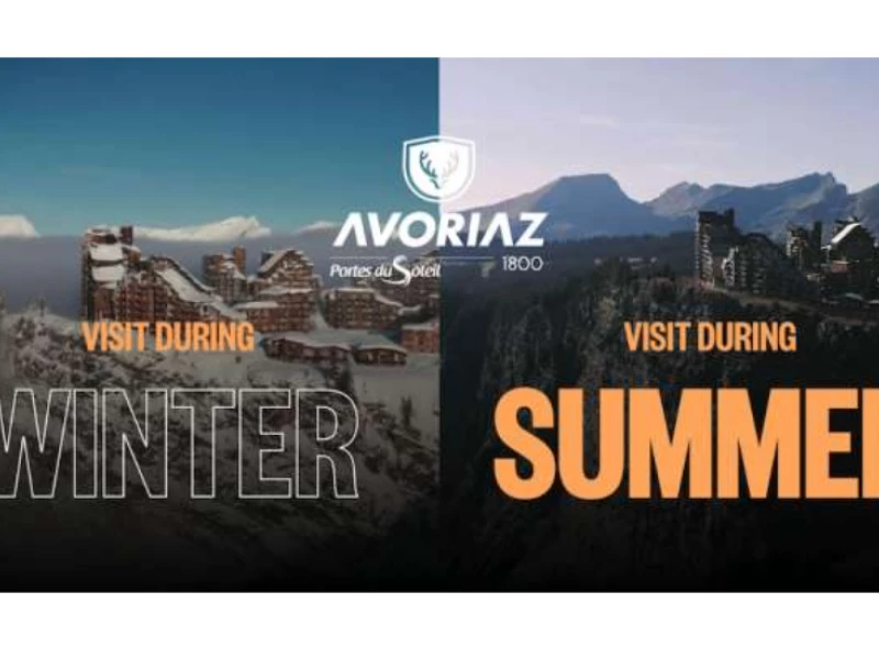
Avoriaz - Visite Virtuelle
byPoppr
View Design
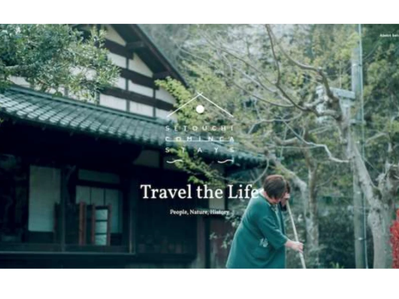
Setouchi Cominca Stays
Ready to elevate your designs?