A brand’s website is its online business card — but it shouldn’t end there. Aside from informing your site visitors about the products and services you offer, the end goal is to transform curious viewers into buying customers.
The secret lies in visually satisfying and engaging website designs. In this post, we’re discussing nine of the best product and catalog website designs that aim to drive more sales and succeeded in doing so. Join us and get inspired as we list and deconstruct the masterful online catalogs, courtesy of some of the best website design companies worldwide!
1. InHaus Cooking by Azuro Digital
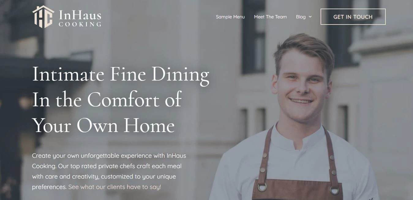
[Source: InHaus Cooking]
Standout Features:
- Inviting, personalized hero image
- Simple, intuitive navigation
- Well-placed, action-driven buttons
The InHaus Cooking website, brought to life by Azuro Digital, is a true reflection of the brand’s commitment to providing a top-tier, personalized experience. Right off the bat, you’re greeted by a striking hero image of a smiling chef, effortlessly building that personal connection with visitors. It’s the perfect visual cue for the brand’s promise of a fine dining experience in the comfort of your own home, combining professionalism with warmth.
The website design feels refreshingly simple, with a clean layout that makes navigating a breeze. The top navigation bar clearly points to key areas like the sample menu and the team behind the service, allowing users to find what they need in seconds without feeling lost in a maze of links.
What really stands out are the strategically placed call-to-action buttons — specifically the “Get in Touch” button, which is bold but not overbearing. It’s easy to find, making it simple for visitors to reach out or book a chef for their next event.
All in all, the InHaus Cooking stands as one of the best product catalog website designs, balancing luxury with approachability. Its clean visuals, smart use of space, and clear calls to action keep things straightforward but engaging, giving users the right nudge to connect with the service and experience it firsthand.
2. Aria Vent by pb+j
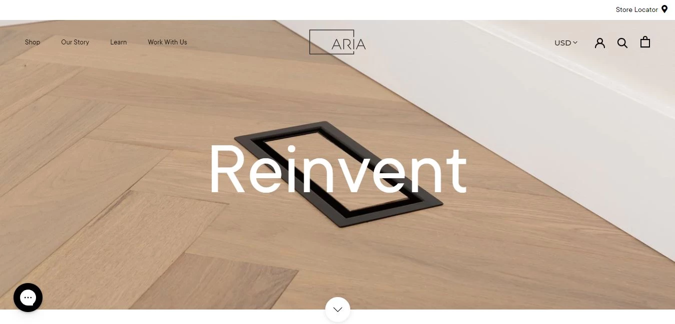
[Source: Aria Vent]
Standout Features:
- Sleek, minimalistic design
- Clear product focus
- User-friendly interface with seamless navigation
The Aria Vent website by pb+j is a striking example of how less can be more. With its minimal approach, the design effectively puts the spotlight on the product while offering a simple and efficient user experience.
The clean, uncluttered layout keeps the focus entirely on the brand's offerings, showcasing their innovative air vent solutions in an elegant and simple way. This approach helps create a premium feel while keeping the user experience streamlined and efficient.
The design places the product front and center. High-quality images of the air vents are displayed clearly, allowing users to immediately understand what the brand is offering. With minimal text and large visuals, it’s easy for visitors to connect with the product without any distractions. This design strategy not only showcases the product but does so in a way that’s both approachable and professional.
Navigation is kept simple, ensuring users can find what they need without hassle. The top navigation bar is unobtrusive, offering quick access to key sections like product details and contact information. This smooth, straightforward user journey ensures that visitors never feel lost or overwhelmed, making the website both effective and easy to use.
In short, the Aria Vent website is a fine example of how a product catalog website design can combine visual appeal with functional simplicity. The design is direct, intuitive, and visually appealing without overcomplicating things, making it a great reference point for anyone looking to create an aesthetically pleasing and user-centric platform.
3. Mara Home by weboperater
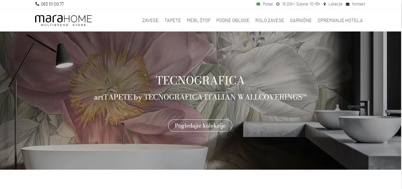
[Source: Mara Home]
Standout Features:
- Large, elegant product imagery
- Simple navigation
- Luxurious and clean design
Mara Home's website by weboperater elevates the brand’s image with a clean, luxury-driven design. The layout is crisp and sophisticated, using high-quality imagery to showcase the brand's exquisite Italian wall coverings. The extensive hero images immediately pull you into the world of luxury home design, giving users a visual taste of the beauty and craftsmanship Mara Home represents.
The seamless blending of visual elements and simplicity in design helps ensure that Mara Home’s premium identity is felt with every click. Each visual is carefully chosen to showcase the brand’s products in their best light, reinforcing the company’s high-end appeal. These images are not just decorative but strategic, placed to guide users through the journey of learning about and engaging with the products.
The combination of images and text creates an experience that feels personal, inviting users into the story of the brand rather than just displaying the product in isolation. Navigation is simple yet refined, with a well-organized menu that makes finding information quick and intuitive. There’s no clutter or confusion, just straightforward access to what matters most: product details and brand information. This ease of use is critical in keeping the luxury feel intact without detracting from the user’s experience.
In conclusion, Mara Home's product catalog website design shines with its luxurious, user-centric approach. Weboperater highlight the beauty of the brand’s products while maintaining a straightforward and intuitive experience for users.
4. Nepeta by RT Studio
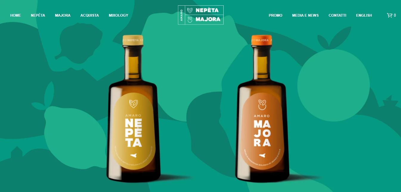
[Source: Nepeta]
Standout Features:
- Bold color palette
- Engaging lifestyle video
- Whimsical background art
Nepeta, an artisanal brand known for its unique Amaro liqueur, has partnered with RT Studio to deliver a website that mirrors the brand's creative spirit. This collaboration blends bold design choices with seamless user experience, perfectly capturing Nepeta’s essence.
An engaging lifestyle video takes center stage on the homepage, offering a glimpse into the world of Nepeta. This immersive feature showcases the product in use, helping users visualize how the liqueur fits into real-life experiences. By placing the video prominently, RT Studio allows the brand to tell its story visually, establishing an emotional connection that resonates with visitors.
Further into the website, bright and energetic colors, such as yellows, greens, and oranges, create a lively atmosphere that reflects the brand’s playful and artisanal character. These colors infuse the website with personality, giving it a modern, yet welcoming feel that connects with users right away. The thoughtful use of these bold hues brings a sense of warmth and creativity without overwhelming the viewer.
Nepeta's website design cleverly blends whimsical, painting-like backgrounds with ample white space. The colorful, abstract shapes complement the brand’s playful, artistic spirit, creating a lively and engaging atmosphere.
The bold, bright colors are balanced by the generous use of white space, ensuring the design remains striking without feeling cluttered. This thoughtful combination results in a beautifully balanced layout that is both fresh and charmingly straightforward.
In conclusion, Nepeta’s product catalog website design blends vibrant visuals, playful art, and strong brand storytelling. With this, RT Studio not only showcases the product but connects users to the brand’s unique narrative.
5. Hunter&Gather by noughts & ones
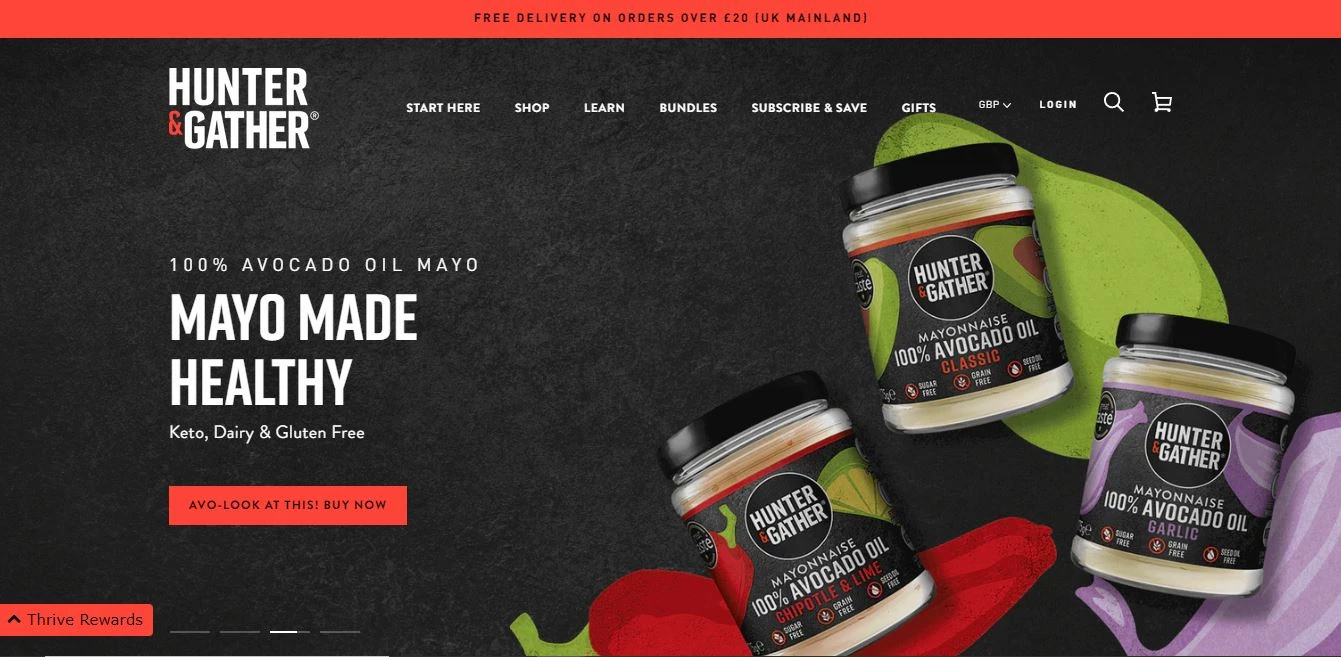
[Source: Hunter&Gather]
Standout Features:
- Bold, vibrant color scheme
- Clear, concise messaging
- Strong e-commerce functionality
Hunter&Gather, a UK-based producer of healthy, oil-free products, teamed up with noughts & ones to create a website that embodies the brand’s health-conscious ethos. The collaboration brings a dynamic yet user-friendly e-commerce experience to life, ensuring both visual appeal and practical functionality.
The website stands out with its bold, vibrant color scheme. The vivid red and green tones are striking and immediately communicate the brand’s fresh, clean values. These colors radiate vitality, reflecting the brand's commitment to fresh, wholesome ingredients and a healthy lifestyle. This energetic palette reinforces Hunter&Gather's focus on clean, nutritious products in a way that feels both vibrant and grounded.
Messaging is kept concise, ensuring that users can quickly grasp what Hunter&Gather stands for. Each product page is direct and to the point, clearly showcasing the benefits of each item. Whether it's the health benefits or product features, the copy on the site is simple yet effective, reflecting the brand's focus on transparency and quality.
The website excels in its eCommerce functionality, with a streamlined shopping experience that guides users effortlessly from browsing to checkout. The intuitive interface and well-organized categories make it easy to find products, and the smooth navigation ensures users are never lost. The website also features clear calls to action, prompting visitors to make purchases with minimal effort.
Ultimately, Hunter&Gather’s product catalog website design stands out with its bold color scheme, clear messaging, and seamless eCommerce functionality. noughts & ones has created a design that not only attracts users but also ensures a smooth, engaging shopping experience.
6. FreshCut Barbershop by BLACKT
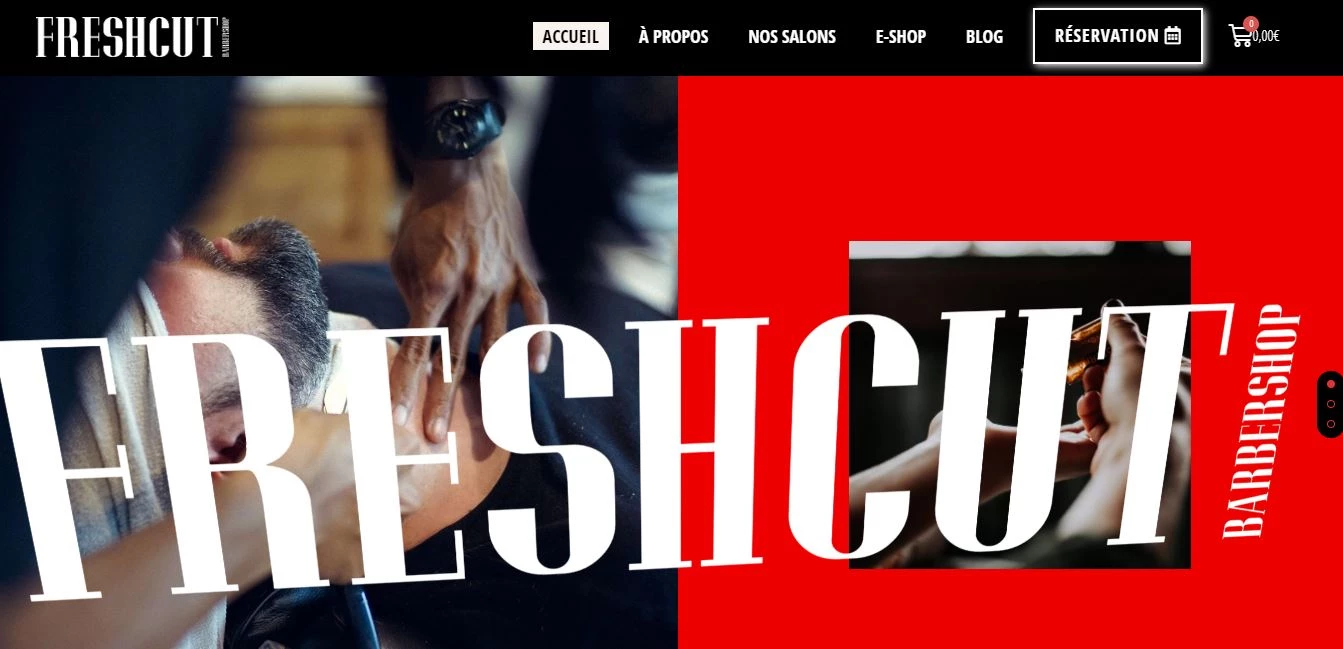
Standout Features:
- Bold, high-contrast visuals
- Strong, attention-grabbing typography
- Smooth booking integration
FreshCut Barbershop, a stylish and energetic grooming brand, teamed up with BLACKT to create a website that embodies the barbershop's modern, edgy personality. The result is a high-impact design that stands out, reflecting the vibrant culture of the barbershop while providing a user-friendly experience.
The bold, high-contrast visuals immediately capture attention. With a color palette of red, black, and white, the design feels edgy and contemporary, perfectly aligned with the brand’s youthful vibe. These visuals give the website a strong sense of identity and help the brand stand out in a crowded marketplace.
Typography plays a crucial role in the site’s design, using large, bold fonts that demand attention. The strong text contrasts with the visuals, reinforcing the barbershop's bold, no-nonsense approach to grooming. The typography works seamlessly with the design, guiding users through the site while reinforcing the overall high-energy feel.
The website also excels in user experience, particularly with its smooth booking integration. The booking system is intuitive and easy to use, allowing visitors to schedule their next haircut without hassle. This efficient process makes the site functional and user-centric, ensuring that customers can easily navigate the site and book their appointments in a few simple steps.
FreshCut Barbershop’s website is a perfect example of a product catalog website design, with its bold visuals, dynamic typography, and seamless booking system. BLACKT has created a design that not only looks striking but also ensures an effortless, engaging user experience.
7. &TEA by ES design
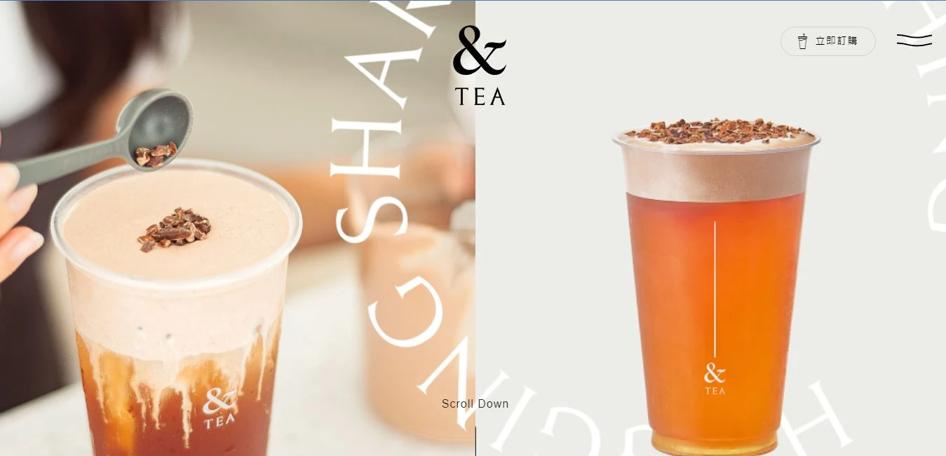
[Source: &TEA]
Standout Features:
- Sleek, minimal design
- Engaging product visuals
- Smooth user experience
&TEA, a brand offering refreshing tea-based beverages, worked with ES Design to create a website that reflects the brand’s simple, fresh approach to drinking tea. The collaboration focuses on providing an intuitive and engaging user experience with a clean, modern design.
The website's sleek, minimal design ensures a straightforward browsing experience. The clean layout, with ample white space, creates a sense of calm and focus. By removing unnecessary elements, the design allows users to interact with the key content without distractions. The minimalism makes the site feel spacious and easy to navigate, perfectly mirroring the brand’s pure and natural approach to tea.
Product visuals take center stage throughout the site. High-quality, well-composed images of the tea drinks help create an inviting, sensory experience. These visuals engage users, drawing them in and allowing them to visualize the products in real life. The imagery also reinforces the brand’s focus on freshness and quality, making it easy for visitors to connect with what’s being offered.
The website ensures a smooth user experience by prioritizing easy navigation and fast load times. Visitors can quickly find information and make purchases without unnecessary steps or confusion. The layout is intuitive, with a clear path from product discovery to checkout. This design simplicity enhances the user journey, allowing them to enjoy the website without any friction.
In the end, &TEA’s website delivers one of the product catalog website designs: a no-fuss, sleek experience that doesn’t just look good but works like a charm. ES Design has turned simplicity into art, giving visitors a seamless, engaging ride through the brand’s essence. It’s clean, it’s sharp, and it sticks with you — just the kind of design that does its job and leaves you impressed.
8. The Deli Society by Klinical
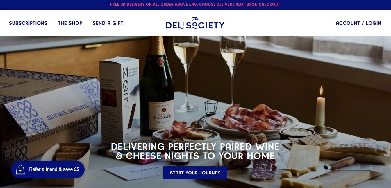
[Source: The Deli Society]
Standout Features:
- Strategic content blocks
- Colorful patterns
- High-resolution and creative food display
The Deli Society, a brand that brings gourmet wine and cheese subscriptions to your doorstep, teamed up with Klinical to craft a website as rich in experience as their offerings. The design is a delightful mix of vibrant creativity and clean functionality, making the browsing experience as enjoyable as a well-paired charcuterie board.
One standout feature is the use of strategic content blocks, which organizes the website’s information in a way that feels natural and engaging. These blocks aren’t just about neatness — they’re designed to guide users through the brand’s story and products. This smart use of content ensures that visitors always know where to go next, making the website both informative and visually engaging without overloading the senses.
Colorful patterns bring the site to life with playful and lively designs. These patterns don’t just fill space — they inject personality into the layout, capturing the brand’s fun yet sophisticated vibe. The mix of bold, vivid colors balances out the clean white space, creating a dynamic visual flow that doesn’t feel chaotic. It’s a refreshing way to keep the site visually engaging while still keeping things classy and organized.
Of course, it wouldn’t be The Deli Society without showcasing food, and the high-resolution, creatively styled food displays steal the show. The photos are beautifully lit and artfully composed, making each cheese and wine pairing look as indulgent as it tastes. These visuals create a mouth-watering experience that draws visitors in, almost as if you could reach through the screen and grab a bite.
In conclusion, The Deli Society’s website is a shining example of product catalog website design. Klinical has woven elegance, functionality, and seamless e-commerce into one smooth package, delivering a luxurious, effortless experience that leaves visitors feeling like they’ve just had a taste of the high life.
9. Dr. LEVY Switzerland by ROYALTRI
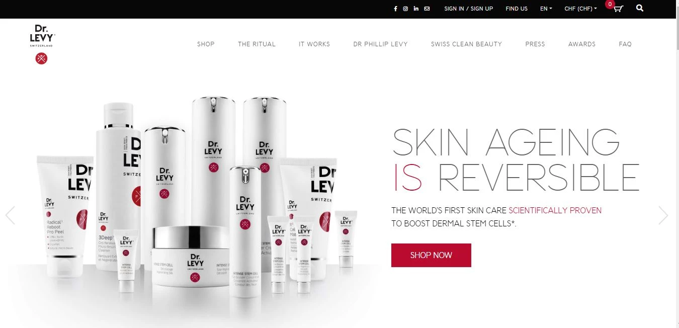
[Source: Dr. LEVY Switzerland]
Standout Features:
- Textured background
- Embedded video banner
- Sticky menu navigation
Dr. LEVY Switzerland, a premium skincare brand known for advanced anti-aging treatments, teamed up with ROYALTRI to design a website that combines luxury with functionality. The outcome is a sophisticated digital space that feels as high-end as the brand’s products, while maintaining an intuitive and seamless user experience.
One of the standout design features is the textured background, which adds depth and visual interest to the website without overwhelming the content. This subtle use of texture enhances the brand’s luxurious feel, providing a rich backdrop that complements the sleek design. The backdrop isn’t just decorative; it sets the tone for the entire user experience, making the site feel refined and polished while still being approachable.
The embedded video banner takes center stage on the homepage, showcasing the brand's products and philosophy in motion. This video element provides a dynamic and engaging experience that pulls visitors in. It offers a window into the world of Dr. LEVY, adding an interactive layer that lets users connect with the brand on a deeper level. The video banner creates a visual narrative, reinforcing the premium quality and scientific innovation that Dr. LEVY represents.
Navigating the site is made effortless thanks to the sticky menu navigation. No matter how far down a user scrolls, the menu remains easily accessible, offering quick access to product categories, brand details, and customer support. This feature enhances usability, making the browsing experience efficient and smooth — no unnecessary clicks or confusion.
In conclusion, Dr. LEVY Switzerland’s website stands tall as one of the product catalog website designs: a perfect blend of luxury and usability. With its textured background, captivating video banner, and slick sticky navigation, ROYALTRI has crafted an experience that not only oozes high-end sophistication but also makes it feel as effortless as a morning routine.