A good pagination design effortlessly guides users, making their journey smoother and more enjoyable. The best examples of pagination blend functionality with flair, keeping navigation intuitive and frustration-free.
In this article, we highlight clever pagination designs that do it right. These examples show how smart design, from creative layouts to user-focused features, can turn simple navigation into a seamless experience.
Types of Pagination
Pagination designs come in various forms, each tailored to different user needs and content structures. Let’s break down the most common types, their standout examples, and their strengths and drawbacks.
Numbered Pagination
Pros
| Cons
|
The classic pagination approach features numbered links for pages, allowing users to jump to a specific section. It’s a tried-and-true method, famously used in Google search results, where clarity and control are paramount.
"Load More" Buttons
Pros
| Cons
|
This method progressively loads content as users click a button, often seen in product listings like Amazon. It’s a modern solution that balances control and simplicity.
Infinite Scrolling
Pros
| Cons
|
In this design, content loads continuously as users scroll down the page. Platforms like Pinterest and YouTube rely on infinite scrolling for their highly visual and discovery-driven interfaces. Combining this method with patterns seen in the best design system examples ensures that visual elements like loading indicators and scroll stops enhance user engagement without overwhelming them.
Horizontal Scrolling
Pros
| Cons
|
Horizontal scrolling organizes content in rows or carousels. It's often found on visually rich platforms like Netflix and is a go-to choice for showcasing media-heavy content.
10 Best Pagination Website Examples
In this section, we’re diving into 10 brilliant pagination designs from some of the most popular platforms out there. Whether it’s Amazon’s clever "load more" button or Airbnb’s map-based navigation, these examples are packed with ideas to help you create smoother, more user-friendly experiences.
1. Amazon: Best "Load More" Functionality with Filtering and Sorting Features

Key Features
- "Load More" button
- Extensive filtering options
- Multiple sorting options (featured, price, customer rating)
Amazon’s "Load More" button is a great example of how to handle large amounts of data. Instead of overwhelming users with endless pages, it lets them load more products as they go. This approach improves the initial page-loading speed, which is crucial, as a site that loads within a second converts 2.5x more visitors than one that loads in 5 seconds. With robust filtering and sorting options, Amazon makes navigating its vast product catalog easy.
2. Google: Best Minimalist Numbered Pagination with Jump to Page

Key Features
- Simple numbered links
- Clear "Previous” and “Next" buttons
- "Jump to page" input field
Google’s pagination is all about efficiency. Their clean design keeps the focus on the search results, while features like the "jump to page" option let users quickly navigate through large sets of results. It's a perfect example of how effective pagination design can be without unnecessary bells and whistles.
3. Etsy: Best Visually Integrated Pagination

Key Features
- Numbered buttons styled to match site aesthetic
- Clear visual separation of pages
- Integrated with filtering options
Etsy’s pagination design is a charming example of seamlessly integrating this element into your website's design. Their handcrafted page buttons perfectly complement the platform's overall aesthetic. Most importantly, the clear visual separation between product listings and the intuitive filter integration makes browsing a breeze.
4. YouTube: Best Infinite Scrolling with Automatic "Load More" Trigger

Key Features
- Continuous scrolling
- Visual "loading" indicator
- Optimized for extended browsing sessions
YouTube’s infinite scrolling makes content discovery seamless and engaging. New videos load automatically as users scroll, with a clear "loading" indicator ensuring smooth transitions. This design keeps users focused on exploring content while maintaining an intuitive browsing experience — perfect for a platform centered on discovery.
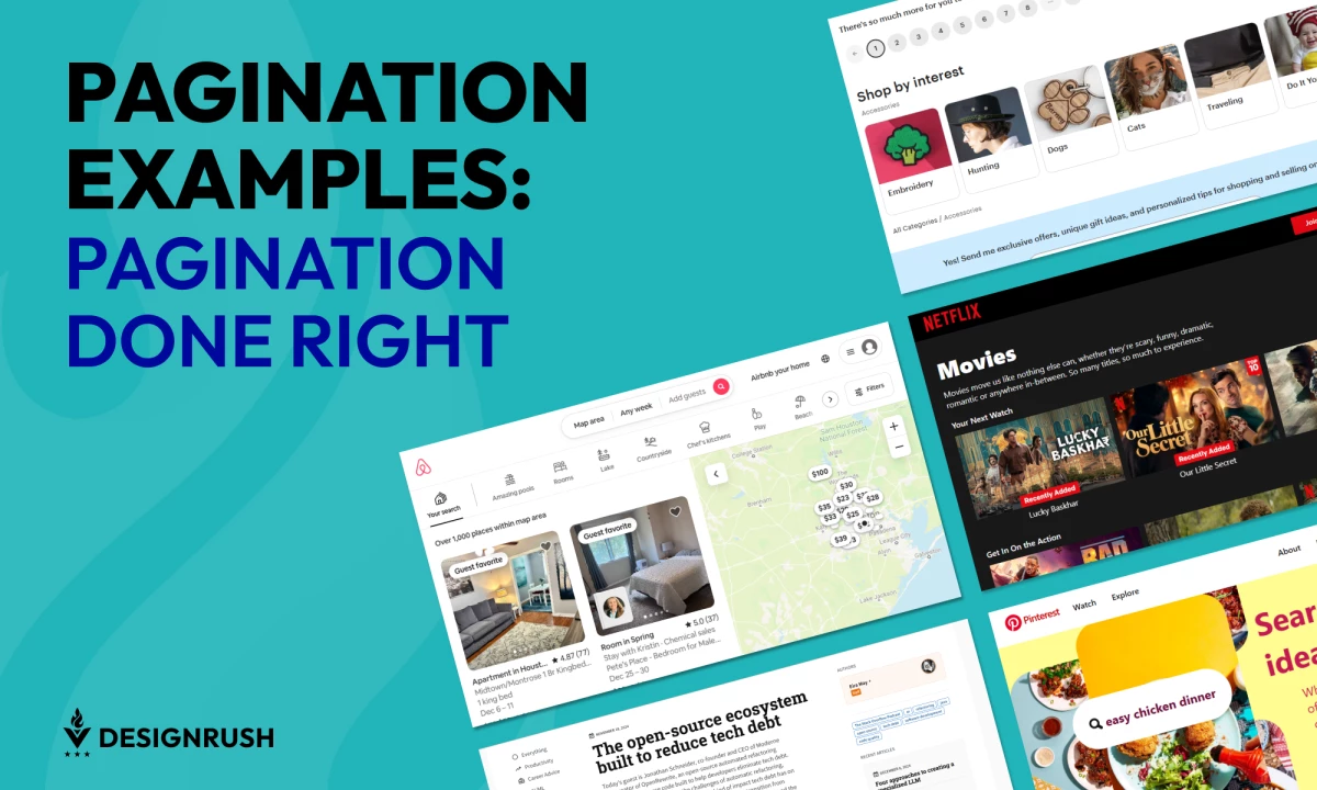
5. Pinterest: Best Masonry Grid Infinite Scrolling

Key Features:
- Dynamic grid layout
- Images load as you scroll
- "Pinned" position indicator
Pinterest has mastered infinite scrolling for its unique masonry grid layout. Images load seamlessly as you scroll, and the layout dynamically adjusts, creating a visually engaging experience. Their clever "pinned" position feature helps users maintain their place if they leave and return to the page, preventing that "lost in the scroll" feeling.
6. Netflix: Best Horizontal Scrolling with Content Previews

Key Features:
- Horizontal content rows
- Scrolling "carousels"
- Preview images/videos on hover
Netflix takes a unique approach with horizontal scrolling, guiding users through diverse content categories. Each row features carousels packed with options, and hover previews offer a quick glimpse of what to expect. This design encourages exploration and helps users discover new shows and movies within their extensive library.
7. GitHub: Best Compact Pagination with Contextual Information

Key Features:
- Small, unobtrusive numbered links
- "First/Last" page buttons
- Display of total items and pages
True to form, GitHub's pagination is clean and functional. Its compact design perfectly complements its code-heavy interface. The "First" and "Last" buttons allow for quick navigation within the site’s extensive repositories while displaying the total number of items and pages, providing valuable context for users. This no-nonsense approach prioritizes efficiency and a clear overview of the content.
8. Substack: Best "Next/Previous" Buttons with Prominent Engagement Features

Key Features:
- Clear "Next/Previous" buttons for navigating between articles
- Prominent engagement buttons, such as like, comment, and share
- Integrated newsletter subscription form to capture reader interest
Substack's pagination is designed to keep you hooked. A big "Next" button encourages you to keep reading. You'll also find a handy newsletter signup form, which is an inspiring campaign design example that can help you stay updated on new content. This approach helps writers build a loyal audience and helps readers discover more of what they love.
9. Stack Overflow: Best Sidebar Navigation with Tag-based, Recent Articles, and Author Filtering

Key Features:
- Allows users to narrow down content by specific topics
- Displays a dynamic list of relevant and recent content
- Enables users to find and follow experts in specific areas
Stack Overflow offers more than simple pagination — it provides a comprehensive navigation system. In addition to traditional page numbers, its feature-rich sidebar lets you filter by tags, browse recent articles, and even follow specific authors. This multifaceted approach empowers users to explore Stack Overflow's vast knowledge base and connect with experts in their field.
10. Airbnb: Best Map-Based Pagination

Key Features:
- Interactive map
- Listings appear as you pan/zoom
- List view with traditional pagination
Airbnb understands that location is key. Their primary pagination is map-driven, allowing users to explore listings by navigating directly on the map. As you pan and zoom, results dynamically load, creating a truly immersive experience. For those who prefer a more traditional approach, Airbnb also offers a list view with standard pagination. This dual approach caters to different browsing preferences while keeping the focus on finding the perfect place to stay.
Best Practices for Effective Pagination
Users value easy navigation as the top factor for website usability. By using intuitive pagination, you can ensure your audience can explore content seamlessly, increase engagement, and boost conversion rates. These best practices lay the foundation for creating a pagination design that stands out and embodies the most inspiring visual communication examples.
- Enhance Clarity:
Pagination controls should be straightforward and easy to find. Use clear labels, intuitive icons, and distinguishable buttons to guide users seamlessly. For example, a well-crafted landing page design can have contrasting colors or hover effects to highlight active or clickable elements to reduce confusion. - Ensure Consistency:
Consistent pagination designs ensure users know what to expect across your website. Keep pagination styles uniform — whether it’s button shapes, fonts, or placement — so users don’t need to relearn navigation as they move between pages. - Streamline Efficiency:
Streamline navigation by minimizing the number of clicks or actions required. Features like "Load More" buttons or jump-to-page options can help users reach their destination faster without unnecessary friction. - Provide Context:
Give users a sense of orientation by providing helpful information, like page numbers or the total number of results. A simple "Page 2 of 10" or "Showing 20 of 100 items" helps manage expectations and enhances the browsing experience. - Optimize for Mobile:
Pagination should adapt gracefully to smaller screens. Use touch-friendly buttons with adequate spacing and ensure controls remain visible without overlapping content. It’s also recommended to design for one-handed use, especially for "Load More" buttons or scroll-heavy interfaces. - Prioritize Accessibility:
Inclusive design is key to reaching all users. Use proper ARIA labels (Accessible Rich Internet Applications), ensure adequate contrast for text and buttons, and make pagination controls navigable via keyboard. Screen reader users should receive clear guidance on their position within the pagination sequence.
By focusing on these core principles, designers can create pagination systems that look great and deliver a seamless, accessible experience for every user.
Best Pagination Design Examples: The Bottom Line
Good pagination serves as both a navigation tool and a bridge between users and the content they seek. The best examples combine functionality, clarity, and creativity, ensuring users can move through content effortlessly without feeling overwhelmed or lost.
What sets great pagination apart is its ability to balance simplicity with context, offering just enough information and control to keep users engaged. Whether it’s the familiarity of numbered links, the streamlined flow of infinite scrolling, or the efficiency of "Load More" buttons, each approach succeeds when it aligns with user expectations and platform goals.
Ultimately, effective pagination is about empowering users — giving them control, minimizing friction, and creating a seamless journey through content. By focusing on clarity, consistency, and accessibility, designers can turn this small but mighty feature into a standout element of their user experience.
Best Pagination System Examples FAQs
1. How do you properly paginate?
To properly paginate, ensure controls are clear, intuitive, and accessible. Provide context like page numbers or total results, minimize clicks, and adapt the design for mobile devices. Balance functionality with user experience, aligning the pagination style with the platform's content and audience needs.
2. Which pagination is best?
The best pagination depends on the use case:
- Numbered Pagination is ideal for content-heavy platforms needing clear navigation (e.g., search results)
- "Load More" Buttons work well for casual browsing and reducing load times
- Infinite Scrolling is best for visual or discovery-driven platforms.
- Horizontal Scrolling suits media-heavy content like videos or images
3. How do you format pagination?
Format pagination by keeping it consistent in style and placement. Use touch-friendly, accessible buttons with adequate spacing, clear labels, and visual indicators like highlighting the current page. For smaller screens, simplify the layout and use responsive designs to maintain usability.