Did you know that 48% of people count a web design as the top component in determining a business’s credibility?
That means strategic and beautiful website design is particularly crucial for companies who conduct all of their business online – namely eCommerce brands.
There’s no better way to learn how to optimize your own eCommerce site for long-term growth than by examining the most effective eCommerce features of truly successful retail websites.
Today, we will be analyzing two leading online businesses: Amazon and Jet.com.
Amazon accounts for 44% of all eCommerce sales, proving that it is a near eCommerce monopoly.
But Jet.com is a retail force to be reckoned with, too. Jet.com was acquired by Walmart in 2016. Since the acquisition, Walmart’s overall eCommerce sales have increased by 63%.
Luckily, each business’s path to eCommerce success can be tracked through their website design elements strategically implemented to increase onlines conversions and keep consumers coming back for more. The best part? You can integrate them and reap the rewards, too.

1. Successful eCommerce Sites Have Great Deals & Promotions
Frequent sales, promotions and consumer benefits can increase customer retention. This is crucial for long-term business growth.
According to Stitch Labs, returning consumers make up 22% of a business’s revenue on average – but they only comprise about 11% of a brand’s overall consumers.
However, loyalty programs and repeated deals can both attract new consumers and transform them into brand loyalists.
To showcase the value of your website through promotions:
- Clearly show any savings your customers will receive if they shop with you
- Work with the marketing team to identify any opportunities for sales
- Design beautiful banners for your homepage and web pages that will showcase your promotions
- Work with your business development team to identify possible customer loyalty programs
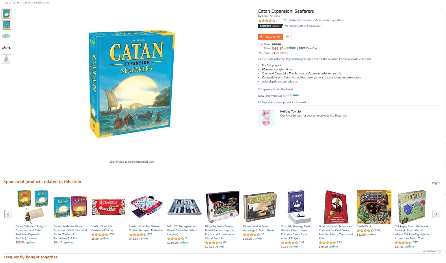
How Amazon’s eCommerce Platform Shows Valuable Promotions
Amazon notably demonstrates their ability to provide high-value deals through their subscription program, Amazon Prime. Prime products are clearly labeled, receive free and speedy shipping, and often receive additional discounts throughout the year (Prime Day, anyone?)
In addition, Amazon highlights its access to affordable products through its messaging. Products showcase the dollar amount and percentage saved by purchasing on Amazon as opposed to directly from the retailer.
Plus, the platform highlights seasonal deals on their homepage and recommends bundles and bulk ordering as applicable to help visitors save even more.
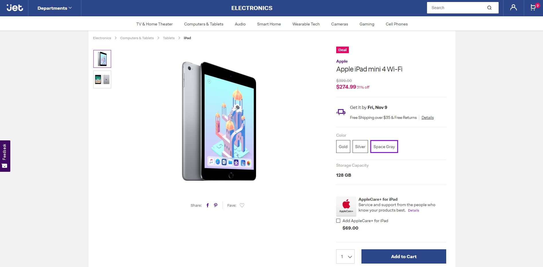
How Jet.com’s eCommerce Website Demonstrates Custom-Centric Deals
Jet.com smartly highlights their special sales and deals in a bright pink hue. A small icon reading “Deal” and a dramatic yet minimalistic percentage off – presented in the same color – draw visitors’ eyes to the price of the product and emphasize the money saved.
In addition, Jet.com showcases additional deals throughout the platform. They gather applicable bundles and deals that will allow users to save money. These include adding another relevant product to your cart, buying in bulk or signing up for repeat delivery to lower costs.
2. Professional eCommerce Websites Utilize Intuitive Navigation
86% of visitors want information about your products as soon as they land on your website.
In addition, 36% of users want to use your logo to navigate back to the homepage as they travel deeper into your website.
As such, the best eCommerce websites invest in great user experience, helpful design and simple navigation. This helps customers discover the products they are looking for more easily, which makes them more likely to actually convert, as well.
To create effective navigation on your website:
- Ensure you have a sticky logo design in the top left corner of every web page that leads to the homepage when clicked.
- Ensure your site has a comprehensive search bar.
- Don’t overcrowd your web design with too much text or design elements, which can reduce conversions by 95%.
- Create a simple menu that helps customers just to main sections of your website.
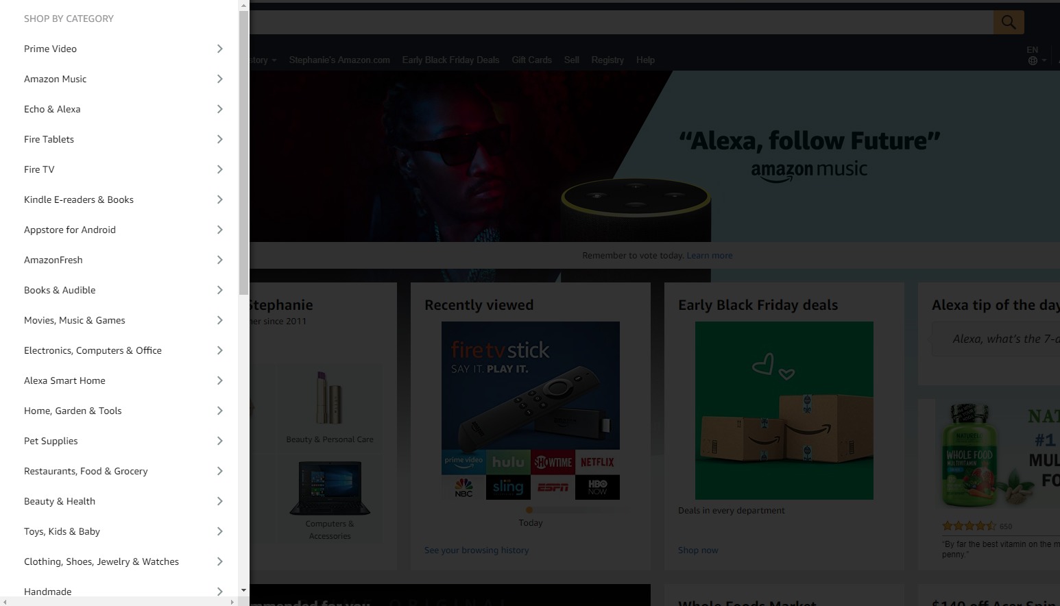
How Amazon’s Website Allows Users To Navigate Easily
Amazon employs a large yet simple menu on the left-hand side of their site. When users click the hamburger menu in the upper left side (located next to the logo which always leads to the homepage) the menu expands, allowing visitors to jump to their desired department.
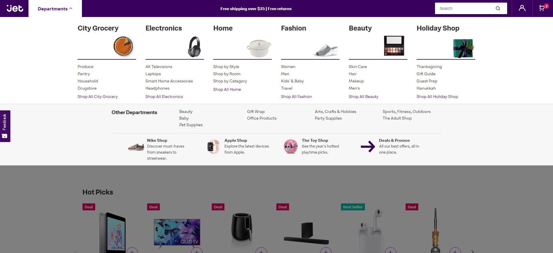
How Jet.com’s Site Empowers Visitors To Explore The eCommerce Platform
Jet.com also uses a sticky responsive logo that leads to the homepage and a hamburger menu. However, their menu pops up at the top of the page. This menu is a little more visual and beautifully designed, featuring little icons and small images to guide users.
Jet.com also smartly highlights their deals and promotions within the menu, driving home their brand value and encouraging users to convert.
3. Top-Rated eCommerce Web Designs Ensure That Their Site Features Customer Reviews
According to Salesforce, 54% of customers trust online reviews and personal recommendations. However, only 20% will explicitly trust a business on its own.
In addition, 52% of consumers explicitly search for product reviews on eCommerce websites.
Therefore, incorporating a functionality that allows your customers to easily post and read product reviews will foster an authentic brand experience and create trust between your consumers and your business.
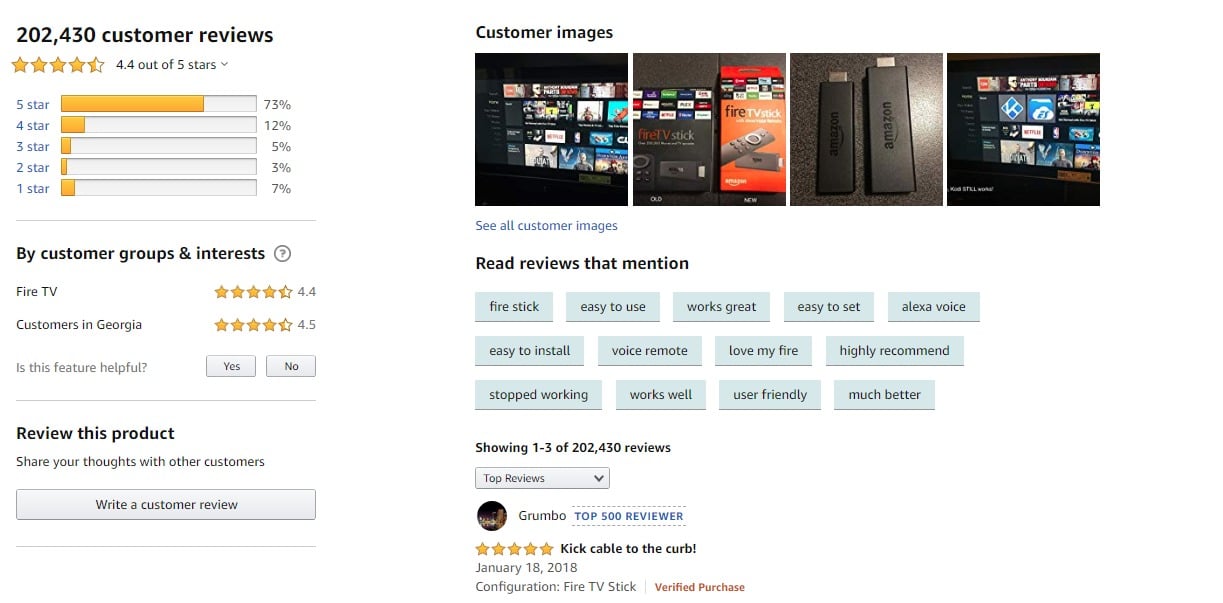
How Amazon Features Testimonials
Amazon has a robust review functionality. Consumers can rank the project, title their review, add photos, and leave short answer reviews that provide detailed descriptions. Amazon notably marks verified purchases to further trust with customers.
As an added layer, Amazon allows potential consumers to ask questions about the product. This helps them gain more information and make a more informed purchasing decision.
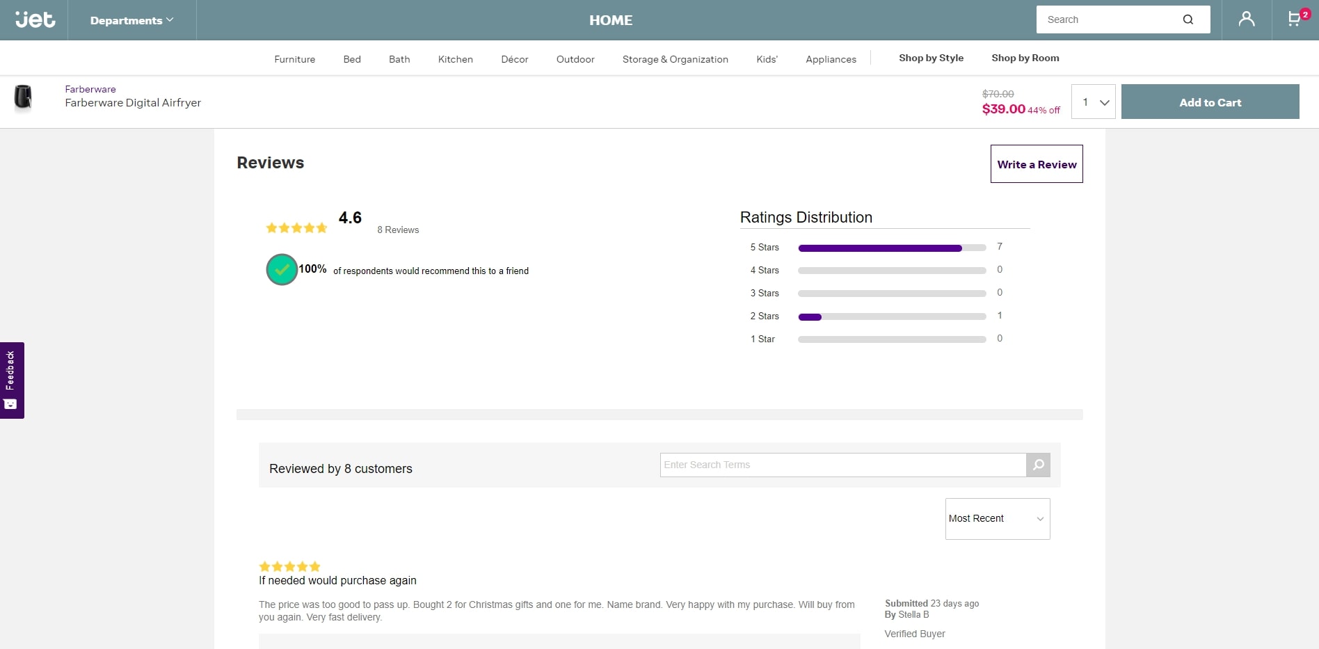
How Jet.com Displays Customer Reviews
Jet.com showcases their product reviews in a simple layout. At the top of the section, users can see an overview of the product, including how many people ranked the product, its overall standing, and how many would recommend it to a friend.
If they want to learn more about the product, users can scroll to see each personalized review. Much like Amazon, Jet.com provides usernames and verifies official purchases to empower informed purchasing choices.
4. The Best eCommerce Websites Are Mobile-Friendly
Mobile eCommerce sales account for nearly 40% of all online transactions. However, it is slated to expand to nearly 54% by 2021.
Thus, it is imperative that eCommerce businesses make a mobile optimization a priority when designing their website.
In fact, 62% of businesses who made their website mobile-friendly noticeably increased their sales. This is due to the fact that a poor presence on mobile indicates a less trustworthy site and a lack of consideration for consumers.
In fact, 48% of consumers believe that a website that performs poorly on mobile is a clear signal that the brand doesn’t care enough about the consumers’ experiences. Plus, 40% of customers will simply navigate to another website on a search listing if the first isn’t optimized for mobile.
To ensure your website is mobile-friendly:
- Create a similar brand experience to your desktop website
- Ensure it loads quickly
- Make navigation easy to find and intuitive
- Ensure buttons are large, easy to click, and easy to read
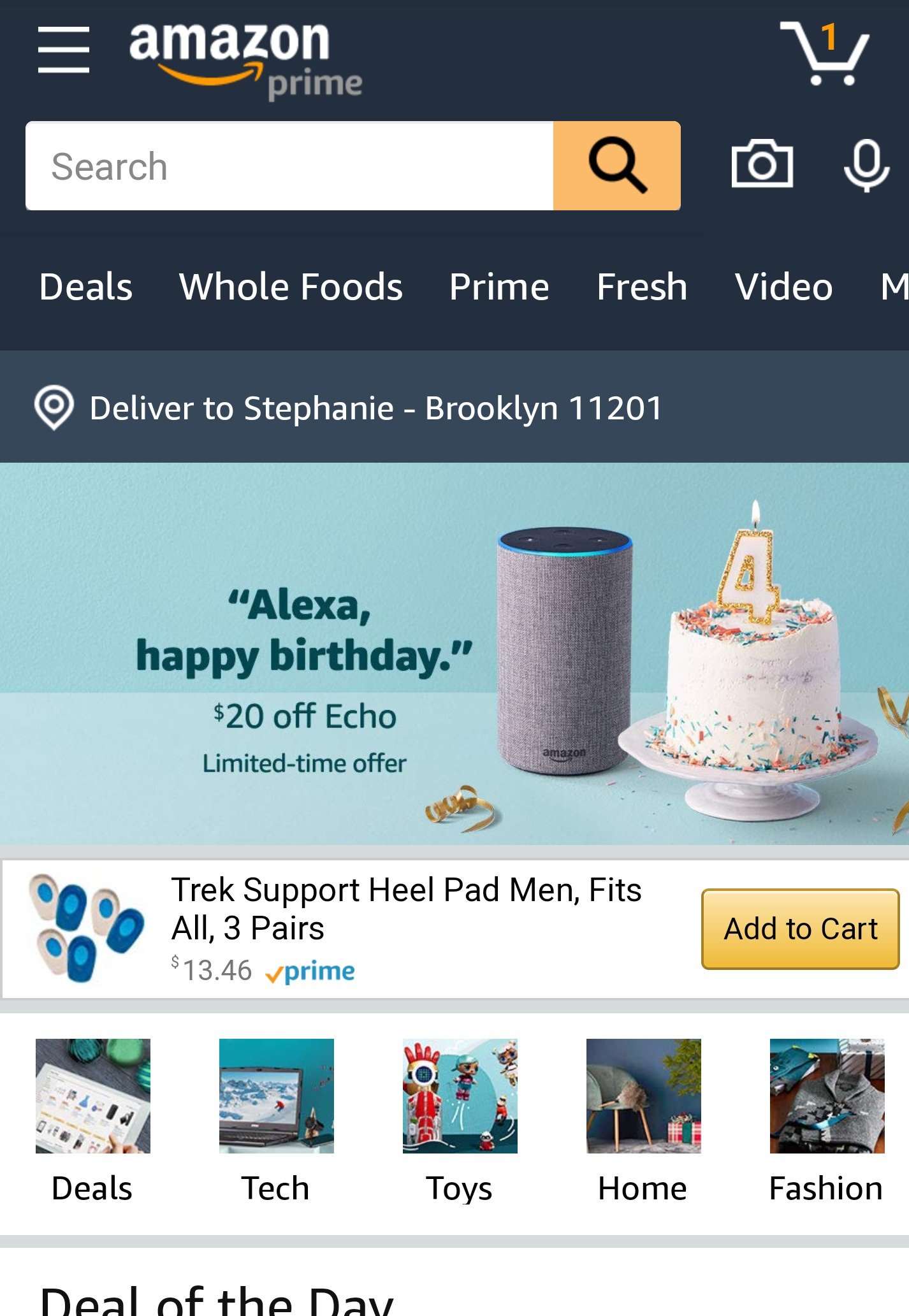
How Amazon Optimized Their Website For Mobile
Amazon created a mobile platform that mirrors their desktop web design. A prominent logo acts as a navigational North Star that can lead visitors back to the homepage at any time.
Meanwhile, a hamburger menu in the top left corner expands when clicked, allowing users to quickly visit departments.
In addition, users can easily access their cart and see how many they items they have inside. This truly makes the key function of the website – shopping online – easy to do.
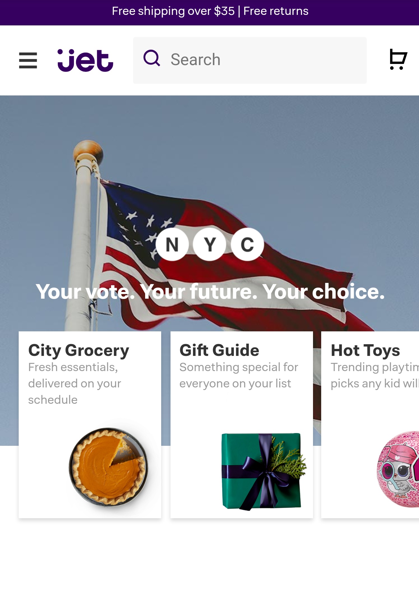
How Jet.com Built A Web Design Fit For Mobile Devices
Jet.com’s mobile-friendly site is quite similar to Amazon’s website. They fostered a similar brand experience, and many of their key desktop features – such as the promotional banners – can be easily scrolled through and read on mobile.
Like Amazon, Jet.com has a prominent shopping cart, navigational logo design, and menu. Visitors can search on their own or through the departments quickly and still receive a recognizable Jet.com brand experience.
5. Top eCommerce Interfaces Integrate Machine Learning & Personalization
Personalization and machine learning are imperative for successful eCommerce websites – especially global platforms that are hoping to break into hundreds of markets.
According to BCG, incorporating personalization into your website can increase sales by up to 10% -- but only 15% of brands are truly utilizing personalization effectively.
Plus, studies show that 59% of people think that they can find products quicker on eCommerce sites that offer personalized suggestions.
In addition, 56% of consumers are more likely to become returning customers at eCommerce sites that provide product recommendations.
This form of artificial intelligence doesn’t have to be complicated. In fact, effective eCommerce websites simply gather information about the pages that visitors frequently view and products that they purchase. Then, they serve them similar products that gathered data shows they will likely be interested in.
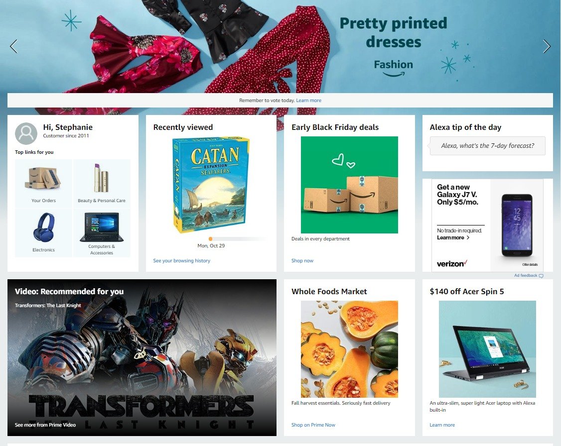
How Amazon Implemented AI In Their eCommerce Web Design
Upon landing on Amazon’s homepage, visitors are served with dozens of personalized recommendations. Just take a look at our editor’s recommendations above.
Amazon gathered data from her Prime account, online grocery delivery purchases, recent views, and frequent shopping patterns. The platform then aggregated that content into a comprehensive homepage that can allow her to quickly visit any area of Amazon’s platform proven to interest her.
Amazon also provides suggestions throughout the entire website, from industry landing pages to product pages. These suggestions often include ratings, customer reviews, consumer profiles, and more to help customers make an informed decision that they will likely be happy with.
This ultimately improves a customer’s experience with a brand and betters consumer satisfaction.
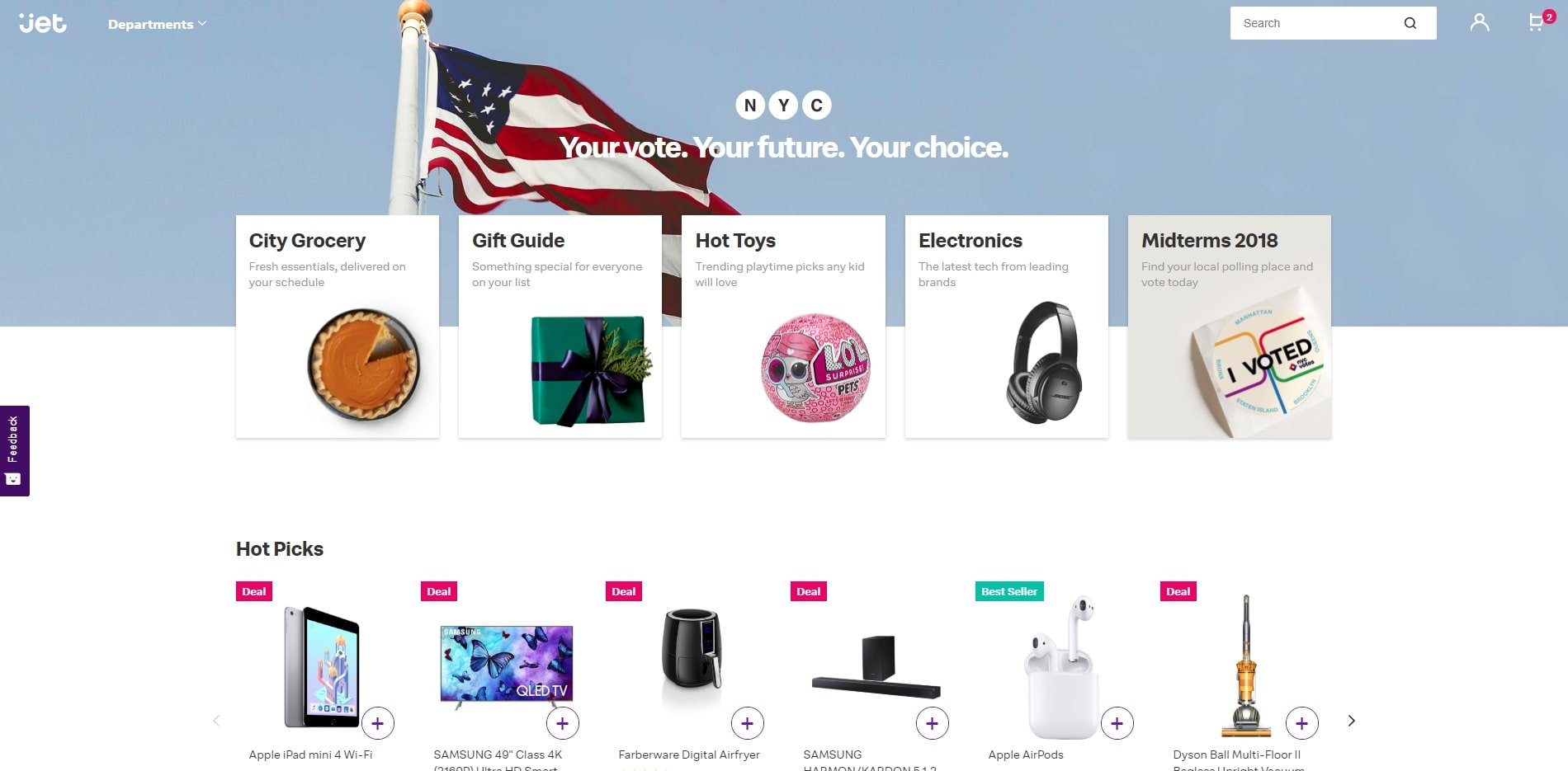
How Jet.com Built A Personalization eCommerce Platform
Jet.com took a different, more localized approach to their personalization. Upon landing on their homepage, Jet.com suggests products and experiences tailored to the consumer’s location and time of year.
As visitors are viewing a product, Jet.com also suggests products based on what other consumers purchased – adding a small review-like aspect to the experience. In addition, they plainly offer product suggestions based your browsing history – which they readily cop to.
By honestly sharing how they aggregate these suggestions, Jet.com creates an honest and authentic relationship with customers.
6. Effective eCommerce Website Designs Invest In A Simple Checkout Process
A study from the Baymard Institute found that nearly 70% of all shopping carts were abandoned before a purchase could be completed. However, a user-friendly checkout process can reduce this bounce rate.
62% of customers want to see shipping details clearly outlined when engaging with an eCommerce website.
But they don’t want to fill out too much information, either. In fact, Crazy Egg recommends checkout forms as small as 7 fields. This will keep users engaged and increase the likelihood they will actually complete a purchase.
To create an effective checkout process:
- Include shipping details
- Walk users through the steps
- Ensure the interface is clean, uncluttered and beautiful
- Minimize the number of fields users need to fill out
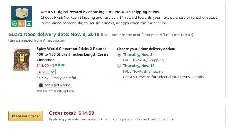
How Amazon Created A User-Friendly Checkout
Amazon (mostly) follows the rule of less is more with a step-by-step three-part checkout process. Although users, of course, add more than three pieces of information throughout checkout, simplifying it into three main buckets wisely makes consumers feel as though they are doing less work.
Amazon also empowers users to make customized shipping and delivery choices for all of their products individually (seen above). By providing them with all of the shipping information – which we know consumers request – users feel a sense of control over this completely digital transaction, which builds trust.
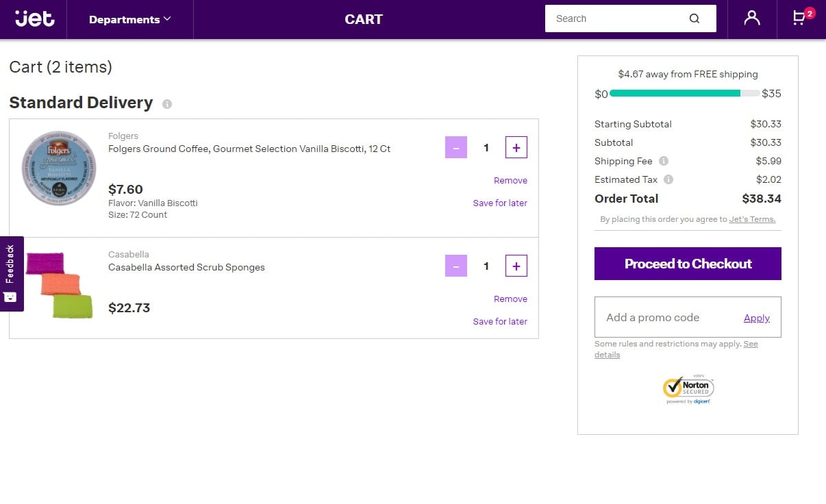
How Jet.com Built An Easy-To-Use Checkout
Again, Jet.com employs a similar checkout design to Amazon.
The entire checkout process is broken down into three easy steps. The site clearly outlines where the products will be delivered to, which card will be charged, and the shipping options and delivery dates a consumer can check for each item they are purchasing.
One edge Jet.com has over Amazon is an overall more beautiful design. Amazon is extremely functional – which works to its advantage – but it is not a particularly stunning or edgy design. Although Jet.com has a similar foundation and minimal aesthetic, it is objectively a bit more beautiful to look at that Amazon.
7. Great eCommerce Sites Have A Global Reach
According to The Enterprise Guide to Global Ecommerce, global e-commerce sales are projected to increase by 246.15% to $4.5 trillion in the year 2021. But those sales aren’t shouldered on U.S. consumers alone.
By 2020, U.S. e-commerce sales are expected to decrease to 16.9%.
Therefore, in order to maximize online sales, eCommerce websites should invest in a web design, product pages, checkout and shipping process that creates an easy and enjoyable user experience for users around the world.
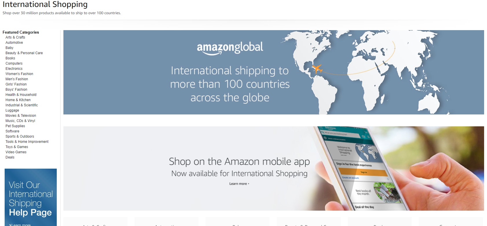
Amazon Offers eCommerce Shopping Globally
Amazon has a robust international online retail program. This is smartly available in more than 100 countries and on their traditional website and mobile app.
In addition, Amazon invested in a consistent brand experience across all global interfaces, which creates a cohesive brand experience across all Amazon platforms. What’s better? A recognizable brand identity can boost revenue by up to 23%.
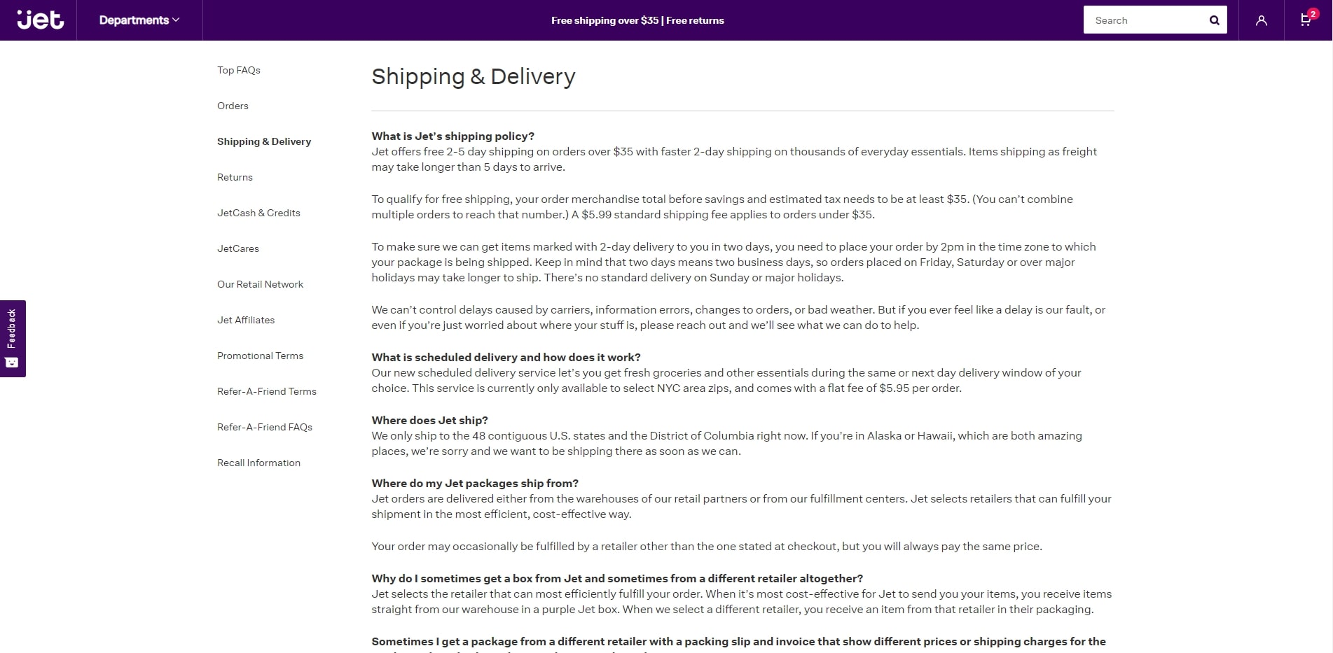
But Does Jet.com Ship Internationally?
Jet.com only ships throughout the contiguous 48 states and Washington, D.C. as of right now – which is perhaps why Amazon still edges them out by a landslide.
8 Tips To Build The Best eCommerce Website Design To Grow Your Business Online
At the end of the day, an eCommerce shop’s success hinges completely on its online presence. A web design will effectively communicate trustworthiness, brand value and worthwhile products – or not.
To create a long-term relationship with consumers, brands need to strategically include elements, features and functionalities that attract visitors and transform them into repeat customers.
Follow the tips below to improve your own eCommerce website design and foster meaningful growth:
- Highlight deals and promotions
- Clearly communicate pricing and shipping information
- Ensure your site loads quickly
- Create intuitive navigation and positive user experience
- Optimize for mobile devices
- Allow consumers to post reviews and ensure they are easy for others to read
- Incorporate personalization and machine learning to generate suggested products for users
- Ship products internationally if possible


-preview.jpg)
-preview.jpg)


