Clear Navigation Icons Make It Easy To Peruse The App Catalog
The North Face is a well-respected brand in the outdoor gear and clothing space. Their products are known for performance and high-quality design -- both of which also happen to be reflected in the brand’s mobile app as well.
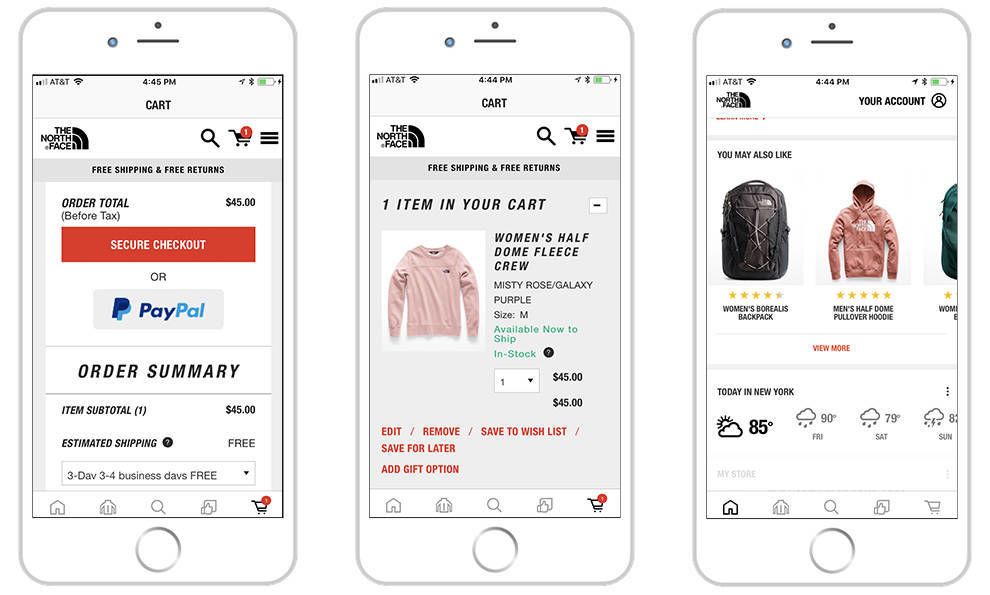
The app’s main navigation is done via a set of icons that run along the top of the screen.
Shopping navigation is done through a set of expanding menus collapsed in the left rail. The navigation loads quickly, rapidly directing the user closer and closer to their desired product.
These icons are clean and crisp, offering concise and straightforward instructions for the user to follow, leading them to the appropriate landing page.
These app tools make it easy to get from place to place, but these tools and features are extremely intuitive as well.
A live chat feature is there for customers who have questions or concerns about a specific product. And it sits right on the screen so users constantly have easy access to it.
Beyond shopping features, the North Face app also integrates featured events and a robust rewards program known as VIPeak Rewards. The app uses geolocation to link users to their local store, and offer weather updates in their area.
These areas of the app are clearly displayed so they require no searching. And they make it even easier to interact with the app and find what you're looking for.
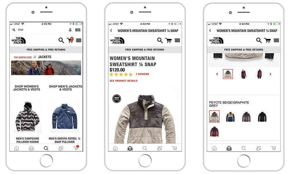
Another exciting feature that aids in navigation is the toolbar scanner. This lets users take a picture of a barcode and scan it, leading them immediately to that product page so they don't have to waste time searching and scrolling.
This app is packed with helpful tools to guide users along their journey efficiently and effectively.

Large Images Make Products Easy To Find
But the real stars of this design are the products, of course. With any e-commerce platform, it’s important to see how a brand can showcase its offering considering the size of the screen and the limitations phones and tablets put on interfaces.
But here, these products really do stand out and make for a serene platform to buy from.
Product category pages feature large images and many filtering options to help users find the right products for their needs.
The images are bold and clean, utilizing stunning photography to gives users access to every angle and every thread.
And these pages themselves are clean, with the products lining the screen in some instance in a row at the top that you can easily swipe through, to a grid of products that are similarly easy to navigate.
When it comes to an e-commerce app, consumers want to be able to see the products they are potentially buying. And some brands forget about the size differences, cluttering their platforms with too many images for the consumer to absorb.
But in the case of The North Face, the products take up plenty of space to let the user really get a feel for what they’re potentially buying, and makes sure that there is no confusion when it comes time to checkout.
And even at checkout, these products are easy to see and edit before users make their final purchase.

The North Face Mobile App Uses Filter & Sort Systems To Help Users Find The Products They Want
Not only are these product images and product pages themselves robust and efficient, but the added extra filtering and sorting features really streamline the process and give users a customized experience.
Product pages have large images and include the ability to easily toggle between different color options and product views. Cross-selling is prominently featured towards the bottom of the page, with average reviews linked to every product.
These pages are packed with additional features to help you make an informed decision. First, you see the many different options to choose from when it comes to the product itself — the size, the color, etc. These make for a cohesive experience that is similar to the website, providing that same intuitive flexibility that consumers know and love.
And further down, reviews are blatantly laid out so that users can get first-hand knowledge about these products. And this transparency on the part of The North Face is a vital tool that shows consumers that the brand is proud of its products and genuinely wants users to tell them any problems or concerns so that they can be quickly fixed.

A Dark Aesthetic Adds Fluidity To The Buyer’s Journey
There’s a mood and an authority that emanates from this design. It exudes excellence, authenticity and strength. And that comes from the overall aesthetic and layout of the app as a whole.
Much of the app is set against a dark background with prominent touches of The North Face red. Navigation text is rendered in an italicized block typography that is used across many different elements of North Face branding. The app feels at once recognizable and thoroughly integrated with other brand properties.
It keeps branding consistent, creating a cohesive and engaging platform that is familiar to users because it resembles their website as well. And the overall clean, subdued and bright nature of the design leads users on a journey and puts them immediately in the mindset to buy.
This fluidity makes users feel more comfortable and at ease. That, in turn, makes it easier for them to make a purchase and feel confident in their decision to do so.

What Is The North Face?
The North Face is an American retailer that specializes in outdoor equipment, clothing and footwear. Their tough, cutting-edge materials are created for young, outgoing and daring professionals ready to hit the slopes and set out on an adventure of a lifetime.
Founded in 1966 in San Francisco, the brand first started out selling climbing equipment. Two years later, the family-run operation was acquired by Kenneth Klopp and the offerings began to expand.
The name was also finalized around this time, with the brand name meaning the coldest side of a mountain to give the brand a strong, robust and authoritative edge.
Today, the brand has 100 store locations including outlets in the United States, Canada and the United Kingdom.
According to The North Face:
The North Face® fundamental mission remains unchanged since 1966: Provide the best gear for our athletes and the modern day explorer, support the preservation of the outdoors, and inspire a global movement of exploration. We are named for the coldest, most unforgiving side of a mountain. We have helped explorers reach the most unfathomable heights of the Himalayas. But The North Face® legend begins, ironically, on a beach. More precisely, San Francisco's North Beach neighborhood, at an altitude of only 150 feet above sea level. It was here in 1966 that two hiking enthusiasts resolved to follow their passions and founded a small mountaineering retail store. From the beginning, the brand committed to serving all those who desired to explore and to serving our natural wild lands by helping to conserve them. At our core, we believe exploration creates an indelible bond with the outdoors, inspiring people to protect our land and pass these beliefs down to the next generationThe North Face is a talented and professional brand that offers top-of-the-line equipment and materials for travelers, adventurers and explorers across the world. And even though its offering is extensive, the brand doesn’t sacrifice style and ease — especially in its app platform.

What Makes This E-Commerce App So Robust And Successful?
The North Face app is a powerful e-commerce platform that makes it easy for users to find the products they're looking for and make a quick and easy purchase all the while knowing that the products they're buying are made with quality and care.
This is thanks to the consistent branding embedded in this app in its clean, dark and moody interface which matches the overall layout of the website as well. And this organization and layout add to the brand’s credibility and resilience in the industry.
Creative and simple navigation tools also make it clear how users can look for new products, scan barcodes and make purchases with the help of clear icons so that there is no confusion along the buyer's journey.
Large, bold and crisp product images also steal the show and show these products in action in a stunning way. These high-resolution photographs really capture the pride that goes into their creation and gives users easy access to the items they want to buy.
Not only that, but when they get to these product pages and products, they can easily customize them to their heart’s content without having to scroll endlessly or maneuver a complicated interface.
The North Face App is clean, simple and comprehensive, giving users another easy-to-use platform to buy their outdoor goods.
Create a powerful app like this one with the help of DesignRush's list of top app design and development agencies!

-preview.jpg)


-preview.jpg)
