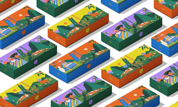
Moving Fruity's Packaging Design Illustrates Fruits and Vegetables as Pleasure Icons
People have used fruits and vegetables for artistic expression. Over the years, additional contexts have been placed on these fruits, including sexual innuendos. For example, eggplant and peach emojis have different meanings depending on how they are used in online communication. But despite its commonly accepted use in messages, sexual health is still taboo.
From that notion, Moving Fruity has made this otherwise taboo topic more mainstream-friendly with its line of sex toys shaped after fruits and vegetables. They enlisted the help of the design agency Kindly Made Studio to create packaging designs that would fit their products and make them even more attractive to their target market.
The result is a simple yet impactful packaging design, adding a playful element and making it a conversation starter. The vibrant illustrations of fruits and vegetables aim to reduce the taboo associated with sexual health without being too explicit.
Check out more modern packaging designs.
These make the product stand out among the competition, where products are often disguised or packaged vaguely to avoid scrutiny.
Products like these are challenging for most packaging designers, but Kindly Made Studio created impressive packaging in the end.
Moving Fruity's Packaging Design Features Straightforward Labels with Detailed Product Information
Transparency and clarity are essential qualities in product labeling. This is because customers need to know what they are buying and what they will be spending their money on.
Moving Frutiy's straightforward description in their packaging design informs consumers about the product without being too explicit. Its short yet catchy descriptions provide unique qualities about each variant, perfect for curious buyers who want to know more.
Meanwhile, the back of the packaging includes more information about the product. This includes instructions on how to use the product, care instructions, and benefits. This comprehensive layout ensures that the consumers are well-informed about these products to gain maximum satisfaction.

Moving Fruity's Packaging Design Mixes Pastel and Deep Hues for Visual Impact
Some pleasure products don't pay much attention to the packaging design. Their priority is to make the products look like everyday products to avoid unwanted attention and intrusive questions.
Moving Fruity aims to shed the stigma by creating colorful and informative product packaging designs. They want to empower women to learn more about themselves, increase their confidence, and promote sexual exploration.
That's why they used pastel colors to add a touch of femininity, including light yellow, lavender, and lilac. These colors are pleasing to the eye while being eye-catching.
On the other hand, the deep hues balance the packaging design and help the product stand out.
Discover more colorful packaging designs.
Colors are essential in branding because people typically associate these colors with your brand. People remember your color palette, which translates to brand recall, revenue, and profit. This is a reason why big brands keep and copyright their colors, with Mattel copyrighting the iconic Barbie Pink as an example.
In the same vein, Moving Fruity's pastels and dark hues aim to achieve the message of women empowerment in their products.

Moving Fruity's Packaging Design Uses Contemporary Typography to Balance Whimsy with Clarity
Moving Fruity also used playful and minimalist fonts for their packaging design. Combining these fonts helped Moving Fruity gain the personality they need: a woman who knows what she wants and how she gets it.
They used a whimsical typeface in the headings, representing the brand's unique nature and whimsical take on an otherwise taboo topic.
On the other hand, they used a more streamlined font style on the supplementing text and product information, which significantly helped with the consumers' ease of understanding.
More legible text for product information would help the consumers learn more about the product and how to use it to their satisfaction.
Fuel your creativity with these packaging design inspirations.
The Moving Fruity packaging design is a prime example of how products can empower people and break stereotypes. While many people still shy away from talks on sexual health, Moving Fruity helps ease the stigma around it by treating it how it should be.