-account-photo_listing.jpg)
-account-photo_listing.jpg)

Our Jury has worked with Prada, Nike, Chanel, Google, and Apple.
Best Food & Beverage Package Design of 2026
View the Top Food & Beverage Package Designs Below
Best Packaging Designs
4,200+ Submitted Designs- Advertising
- Arts & Recreation
- Automotive
- Bread
- Chocolate
- Condiment
- Condom
- Dairy Product
- E-Commerce & Retail
- Eco and Sustainable
- Entertainment
- Fashion & Beauty
- Food & Beverage
- Frozen Food
- Health & Wellness
- Honey
- Hospitality
- Jewelry
- Luxury
- Manufacturing
- Medical & Pharmacy
- Medicine
- Olive Oil
- Pet Food
- Skincare
- Soap
- Spirit
- Sports & Leisure
- Technology
- Toys and Games
- Travel
- Watch Branding
- Wine
 Winner
★9.67/10
 BS 10.0
 KL 9.0
 DH 10.0
View Design
I AM ITALIANO Packaging Design
View Design
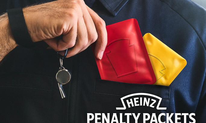
Heinz Penalty Packets Packaging Design
View Design
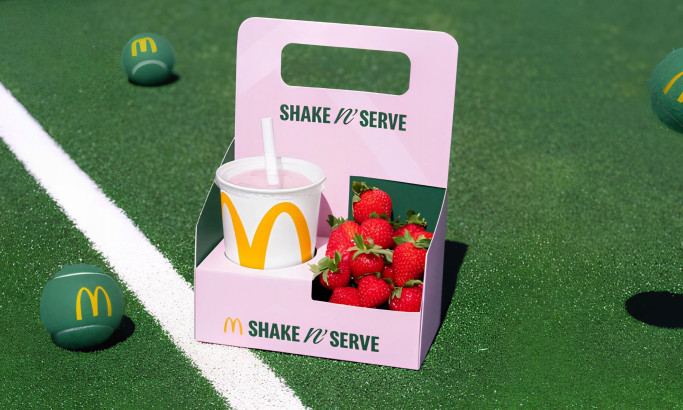
McDonald's UK – Shake n' Serve Packaging Design
byLeo UK
View Design
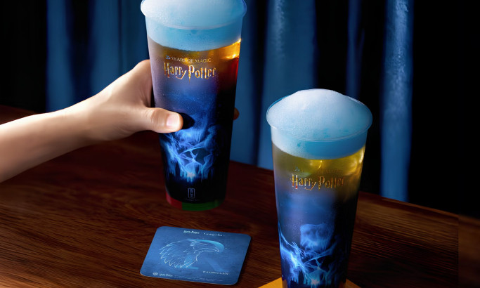
Gong Cha – Patronus Elderflower Powder Lime Teas Packaging Design
View Design
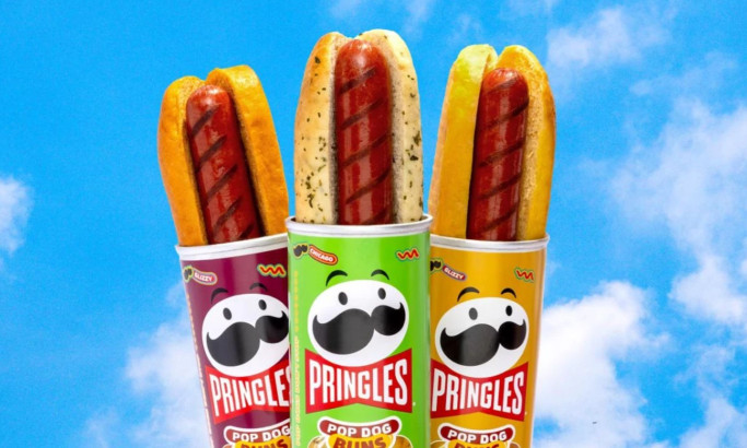
Pringles Pop Dog Buns Packaging Design
View Design
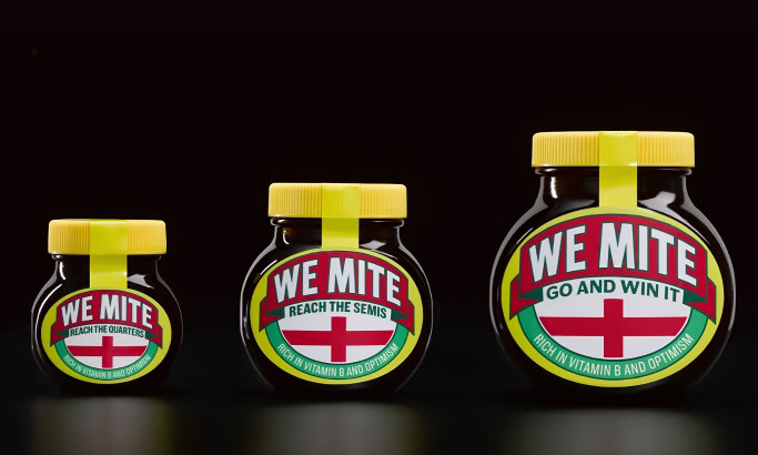
WeMite Packaging Design
View Design
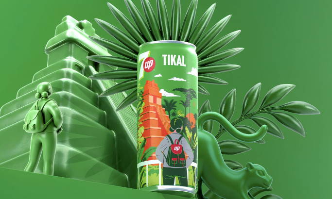
7UP Destinos Guatemala Collection Packaging Design
View Design
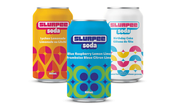
7-Eleven Canned Slurpee Soda Packaging Design
View Design
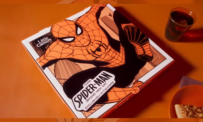
Webberoni Pizza Packaging Design
byMcKinney
Get Connected
With The Right Agency Partner
& Receive Proposals For FREE
View Design
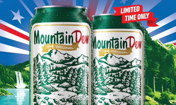
Mountain Dew 1948 Commemorative Can Packaging Design
View Design
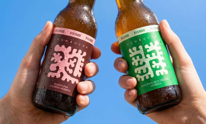
Fooshi Packaging Design
byMotyw
View Design
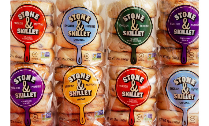
Stone & Skillet Packaging Design
byWedge
View Design
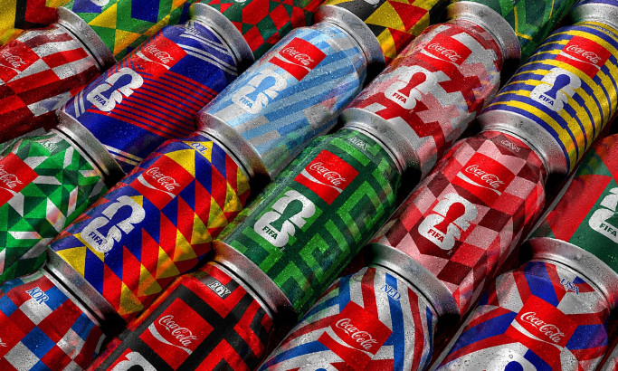
Coca-Cola FIFA World Cup 26 Collectible Country Cans Packaging Design
byGOLDEN
View Design
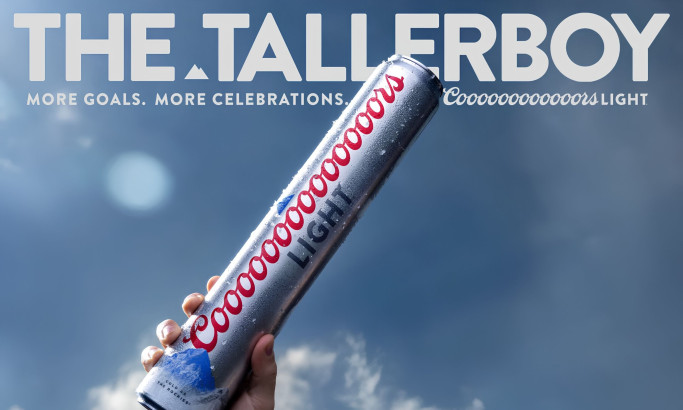
Coors Light Tallerboy Packaging Design
byDroga5
View Design
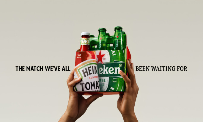
HEINZ x Heineken® Limited Edition Six-Pack Packaging Design
byLePub
 Winner
★9.4/10
 AO 10.0
 AO 9.5
- BS 9.0
 KS 9.0
 LB 9.5
View Design
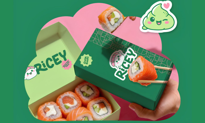
Ricey
 Winner
★8.7/10
- AO 10.0
- AO 9.5
- BS 10.0
- KS 5.5
- LB 8.5
View Design
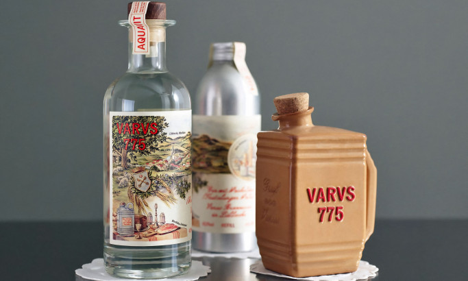
Varus 775
View Design
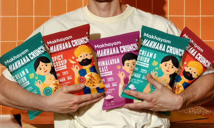
Makhyam Crunch
Ready to elevate your designs?