Best Colorful Packaging Designs of 2026
All time Best Colorful Packaging Designs of 2026
Select
- Advertising
- Arts & Recreation
- Automotive
- Bread
- Chocolate
- Condiment
- Condom
- Dairy Product
- E-Commerce & Retail
- Eco and Sustainable
- Entertainment
- Fashion & Beauty
- Food & Beverage
- Frozen Food
- Health & Wellness
- Honey
- Hospitality
- Jewelry
- Luxury
- Manufacturing
- Medical & Pharmacy
- Medicine
- Olive Oil
- Pet Food
- Skincare
- Soap
- Spirit
- Sports & Leisure
- Technology
- Toys and Games
- Travel
- Watch Branding
- Wine
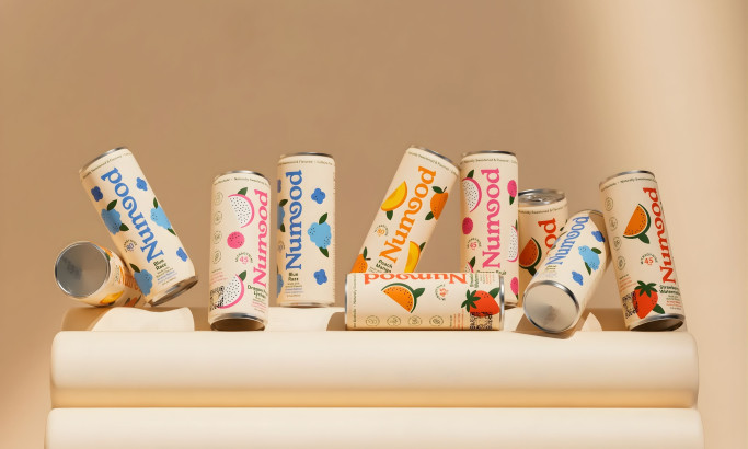
Numood
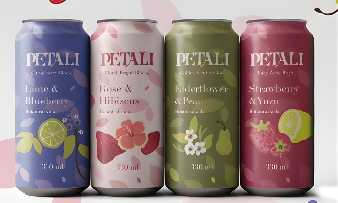
Petali
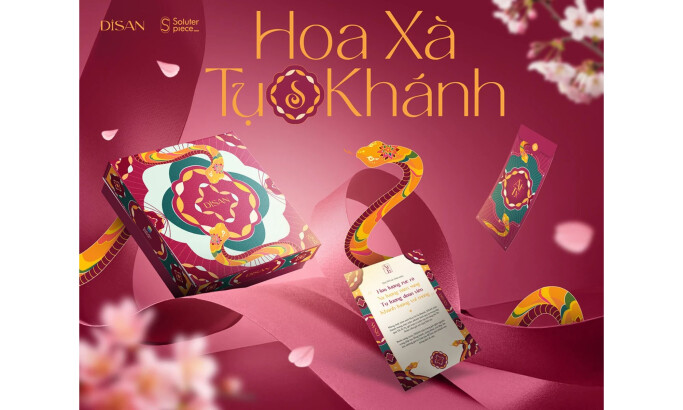
Hoa Xà Tứ Khánh
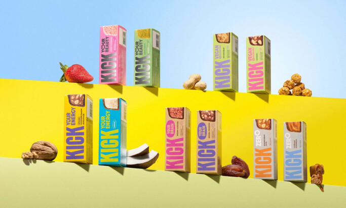
KICK
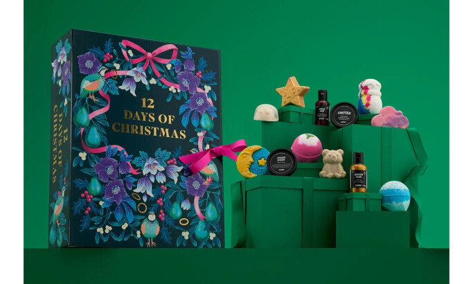
12 Days of Christmas
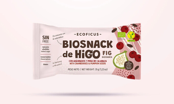
Biosnacks de Higo
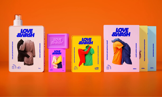
Love&wash
-preview.jpg)
Waterdrop · Advent Calendar Christmas 2024
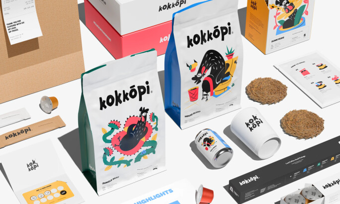
Kokkōpi
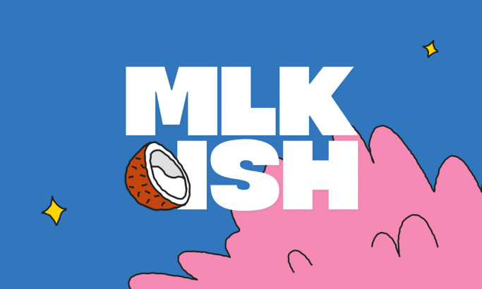
MILK’ISH
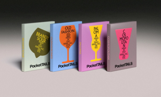
PocketTAILS
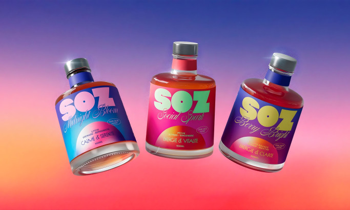
SOZ
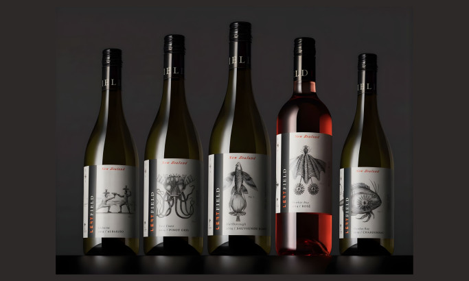
Left Field Wines
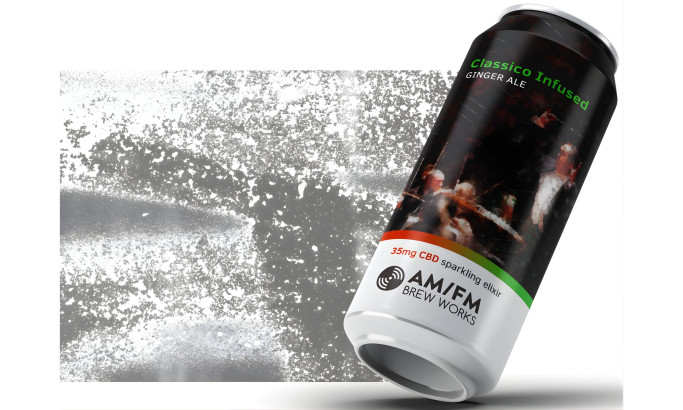
AM/FM Brew Works
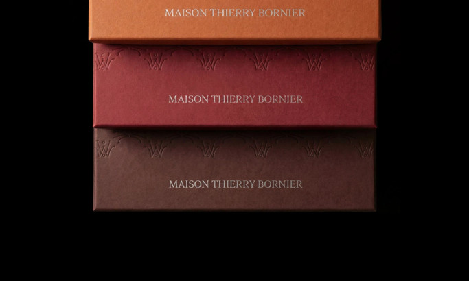
Maison Thierry Bornier
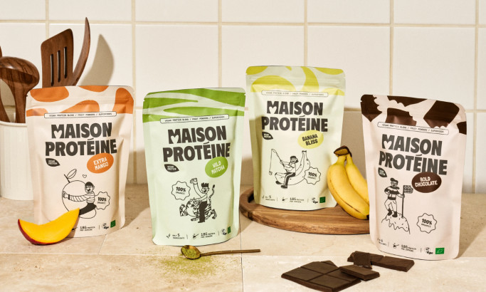
Maison Protéine
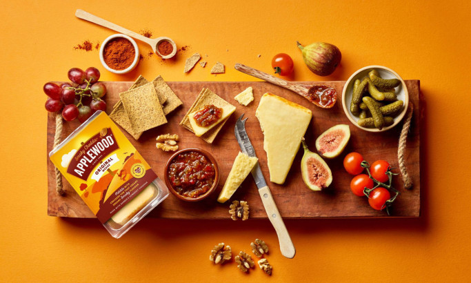
Applewood
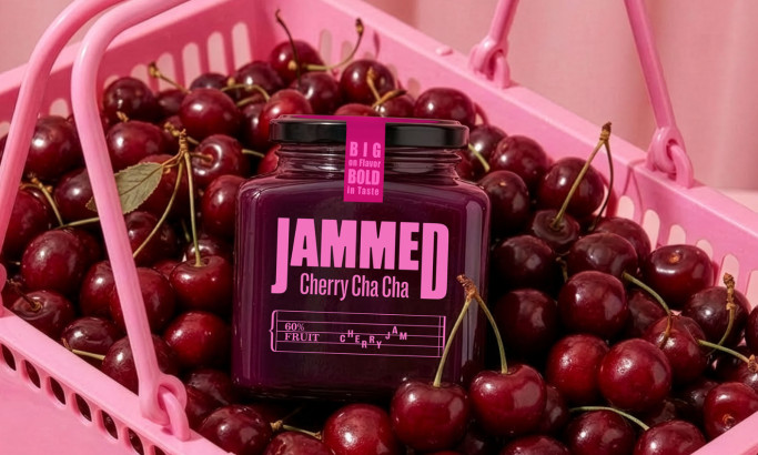
Jammed
The Design Research Process
Our design research process is a dynamic journey in the ever-evolving landscape of packaging design. We search the web, contact brands and agencies, and evaluate the designs worthy of being part of our collection. To be acknowledged among the best packaging designs, one must master innovation, trends, impact, functionality, user experience, and even branding.
Designs that manage to transcend expectations and take packaging aesthetics to the next level gain recognition, and the finest among them may advance further and compete for the title of Design Award winner.
If you believe your design embodies these principles, you too can submit it for consideration, contributing to the vibrant tapestry of packaging design excellence.


-account-photo_listing.jpg)
-account-photo_listing.jpg)