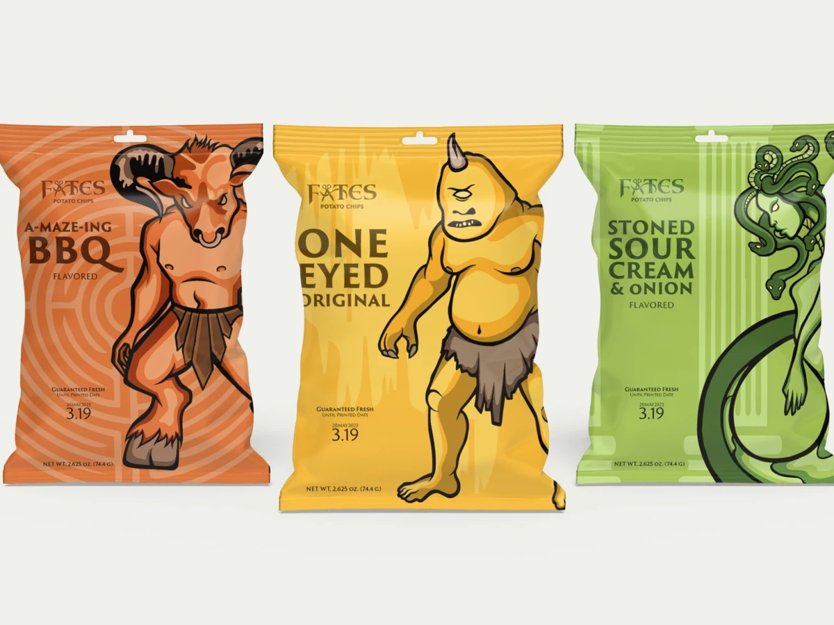
Fates Potato Chips Packaging Design Brings Mythical Characters to Life With Its Illustrated Visuals
Designer Natalie Lincalis has masterfully created a striking packaging design for Fates Potato Chips, intertwining elements of Greek mythology.
This design stands out with its illustrations of mythical creatures like Medusa, the Minotaur, and the Cyclops.
These illustrations make the packaging stand out and attract new consumers, broadening their appeal to a diverse consumer base. It also departs from traditional potato chip packaging and incorporates detailed patterns that echo Greek elements like labyrinths and columns.
This fusion of mythical iconography delivers a distinctive and memorable visual experience, distinguishing Fates Potato Chips in the competitive snack food market.
Such imagery sets the product apart on retail shelves and resonates with customers seeking more than flavor in their snack choices. It further enhances consumer engagement and enriches their perception of the brand.

The Fates Potato Chips Packaging Design Balances Strong Illustrations With Muted Yet Lively Colors
The Fates Potato Chips packaging makes a smart move by using a color scheme of muted yet lively hues, like yellow, green, and orange, to set apart different product varieties.
Vibrant colors ensure the packaging is lively and eye-catching, complementing the detailed illustrations without overshadowing them. These hues are crucial in the overall visual appeal, striking a harmonious balance with the featured mythical characters.
Discover more colorful packaging designs.
The color selection also evokes warmth, freshness, and energy, perfectly matching the snack's playful and adventurous brand personality.
By carefully choosing these colors, the design stands out in product differentiation and adds to cohesive and visually appealing packaging.

The Product Labelling on Fates Potato Chips' Packaging Design Balances Artistry With Utility
This packaging doesn't just rely on stunning mythical characters. It weaves its essence into every detail! From "One-eyed Original" and "Stoned Sour Cream & Onion," this naming strategy adds a creative touch and draws consumers deeper into the brand's narrative inspired by Greek myths.
While showcasing intricate illustrations, the packaging ensures that essential product labels are neatly incorporated. This balance is necessary to avoid overshadowing the main elements while providing consumers with the information needed for an informed purchase.
Despite the minimalist approach to text, these well-placed labels serve a dual purpose. It aids consumers and ensures transparency in product details.
This packaging technique isn't just visually appealing; it's a testament to how established packaging designers skillfully marry minimalism with functionality!
Fuel your creativity with these packaging design inspirations.

The Bold Typography in the Fates Potato Chips Packaging Design Showcases Product Variations Clearly
Bold typography plays a crucial role in Fates Potato Chips' packaging, perfectly balancing artistic flair and consumer convenience. With its size and prominence, the chosen typeface becomes a central focus, efficiently directing attention to essential details like flavor and ingredients.
When shoppers move quickly and decisions are made on the fly, clear, easily accessible information should be the top priority. These small yet significant details often sway a shopper's choice at the moment.
Also, the typography style complements the mythological theme and enhances the packaging's narrative quality.
This thoughtful combination of form and function in the typography showcases a comprehensive design strategy where each aspect of the packaging fulfills both aesthetic and practical needs.