-preview.jpg)


-account-photo_listing.jpg)
-account-photo_listing.jpg)


Our Jury has worked with Prada, Nike, Chanel, Google, and Apple.
Best Dairy Product Packaging Designs of 2026
View the Top Dairy Product Packaging Designs Below
Best Dairy Product Packaging Designs
4,200+ Submitted Designs- Advertising
- Arts & Recreation
- Automotive
- Bread
- Chocolate
- Condiment
- Condom
- Dairy Product
- E-Commerce & Retail
- Eco and Sustainable
- Entertainment
- Fashion & Beauty
- Food & Beverage
- Frozen Food
- Health & Wellness
- Honey
- Hospitality
- Jewelry
- Luxury
- Manufacturing
- Medical & Pharmacy
- Medicine
- Olive Oil
- Pet Food
- Skincare
- Soap
- Spirit
- Sports & Leisure
- Technology
- Toys and Games
- Travel
- Watch Branding
- Wine
View Design
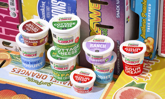
Cabot Creamery
View Design
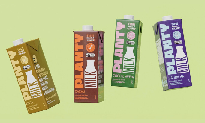
Planty

View Design
Jean Cheese
-preview.jpg)
View Design
Gardlyoo Shakes
-preview.jpg)
View Design
Blackburn
byAlizes
-preview.jpg)
View Design
Schonfeld
byid BRAND

View Design
Molokiya

View Design
Milgrad
-preview.jpg)
View Design
Cheesevill
Get Connected
With The Right Agency Partner
& Receive Proposals For FREE

View Design
Schroeder Milk
byCAPSULE
-preview.jpg)
View Design
Multipro
-preview.jpg)
View Design
LÄTTA
-preview.jpg)
View Design
Dalia Sabor da Fazenda

View Design
Queijaria Licinia
-preview.jpg)
View Design
MONKI
byBrantt
Ready to elevate your designs?