Best Medical & Pharmacy Print Designs of 2026
All time Best Medical & Pharmacy Print Designs of 2026
Medical & Pharmacy
- Advertising
- Architecture
- Arts & Recreation
- Banking & Finance
- E-Commerce & Retail
- Education
- Engineering
- Entertainment
- Environmental Ads and Brand Designs
- Fashion & Beauty
- Food & Beverage
- Government
- Health & Wellness
- Hospitality
- Legal & Insurance
- Luxury
- Manufacturing
- Medical & Pharmacy
- Non-Profit
- Professional Services
- Real Estate
- Sports & Leisure
- Technology
- Travel
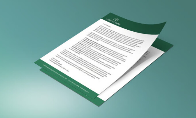
Virginia Lung
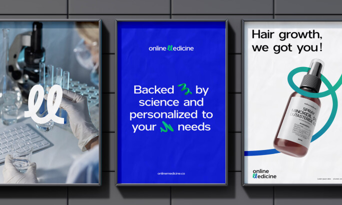
Online Medicine
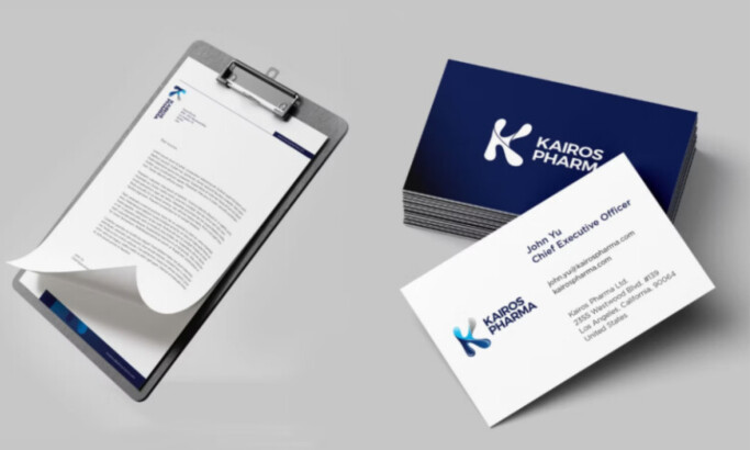
Kairos Pharma
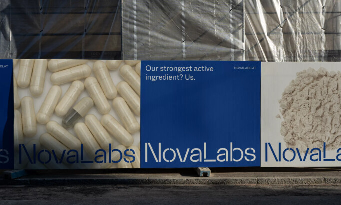
NovaLabs
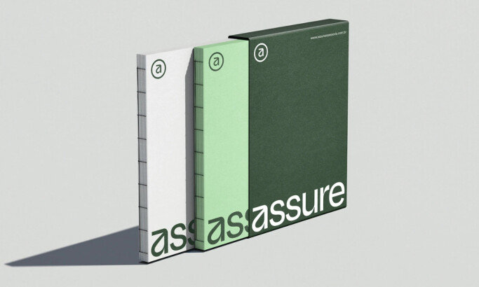
Assure

Bridgewater Community Healthcare NHS FT

South Tees Hospitals NHS Foundation Trust

Small Is Mighty
-preview.jpg)
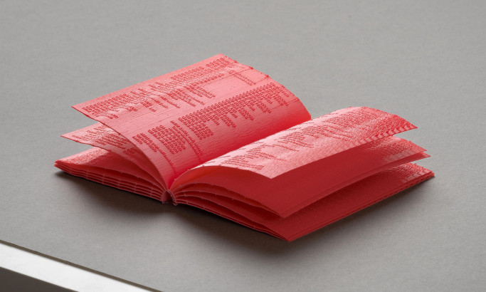
Croatian Medical Journal
Manual
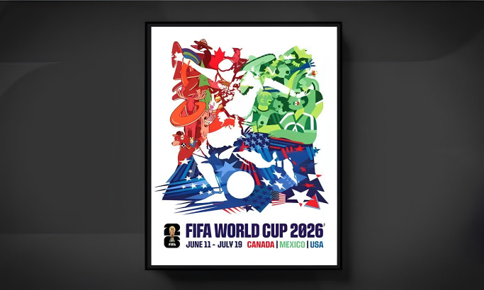
FIFA World Cup 2026 Official Tournament Poster
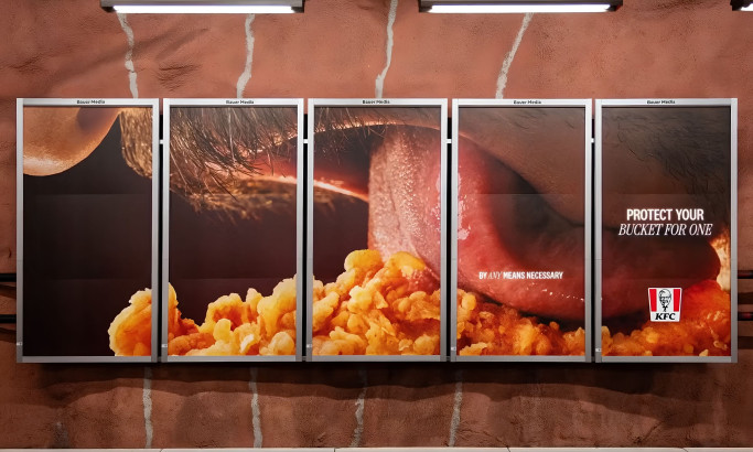
KFC - Bucket For One
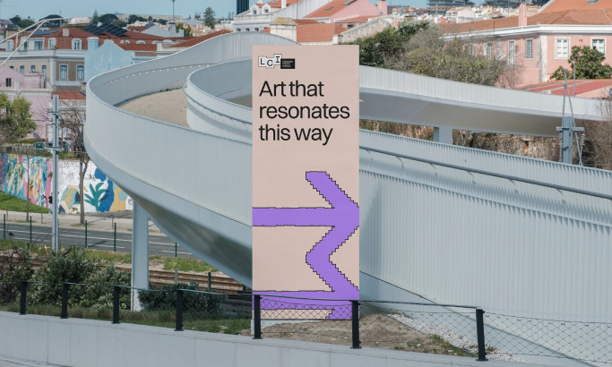
Lithuanian Culture Institute
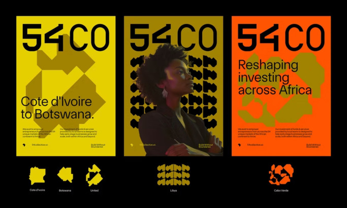
54 Collective
The Design Research Process
Our design research process is a dynamic journey in the ever-evolving landscape of print design. We search the web, contact brands and agencies, and evaluate the designs worthy of being part of our collection. To be acknowledged among the best print designs, one must master innovation, trends, impact, functionality, user experience, and even branding.
Designs that manage to transcend expectations and take print aesthetics to the next level gain recognition, and the finest among them may advance further and compete for the title of Design Award winner.
If you believe your design embodies these principles, you too can submit it for consideration, contributing to the vibrant tapestry of print design excellence.


-account-photo_listing.jpg)
-account-photo_listing.jpg)