-preview.jpg)


-account-photo_listing.jpg)
-account-photo_listing.jpg)


Our Jury has worked with Prada, Nike, Chanel, Google, and Apple.
Best Olive Oil Packaging Designs of 2026
View the Top Olive Oil Packaging Designs Below
Best Olive Oil Packaging Designs of 2026
4,200+ Submitted Designs
- Advertising
- Arts & Recreation
- Automotive
- Bread
- Chocolate
- Condiment
- Condom
- Dairy Product
- E-Commerce & Retail
- Eco and Sustainable
- Entertainment
- Fashion & Beauty
- Food & Beverage
- Frozen Food
- Health & Wellness
- Honey
- Hospitality
- Jewelry
- Luxury
- Manufacturing
- Medical & Pharmacy
- Medicine
- Olive Oil
- Pet Food
- Skincare
- Soap
- Spirit
- Sports & Leisure
- Technology
- Toys and Games
- Travel
- Watch Branding
- Wine
View Design
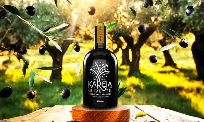
Karela
-preview.jpg)
View Design
Travitana
-preview.jpg)
View Design
Azeite de Abacate – Origen
-preview.jpg)
View Design
Terre di Capitanata
-preview.jpg)
View Design
EYZA
-preview.jpg)
View Design
Dzafaran
-preview.jpg)
View Design
Quinta do Nobre
-preview.jpg)
View Design
Monakrivo Olive Oil
Get Connected
With The Right Agency Partner
& Receive Proposals For FREE
-preview.jpg)
View Design
Asopia
-preview.jpg)
View Design
Almador
byGetbrand
-preview.jpg)
View Design
L'uliveto delle ore felici
-preview.jpg)
View Design
AOVE 1490
-preview.jpg)
View Design
Lady Olive Oil
-preview.jpg)
View Design
Thavma

View Design
Verde DiOliveira
-preview.jpg)
View Design
deFuroner
byMr
-preview.jpg)
View Design
Extra Istrian
Ready to elevate your designs?