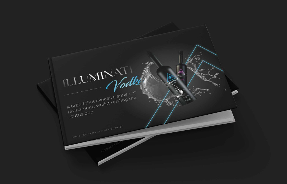
The Illuminati Vodka Print Design Delivers Premium Brand Positioning Through Luxurious Design Elements
The print design for Illuminati Vodka by Puneet Sakhuja combines luxury and creativity, masterfully executed to reflect the brand's ultra-premium positioning.
The agency has successfully captured the brand's essence using high-resolution imagery and graceful typography with a refined color palette.
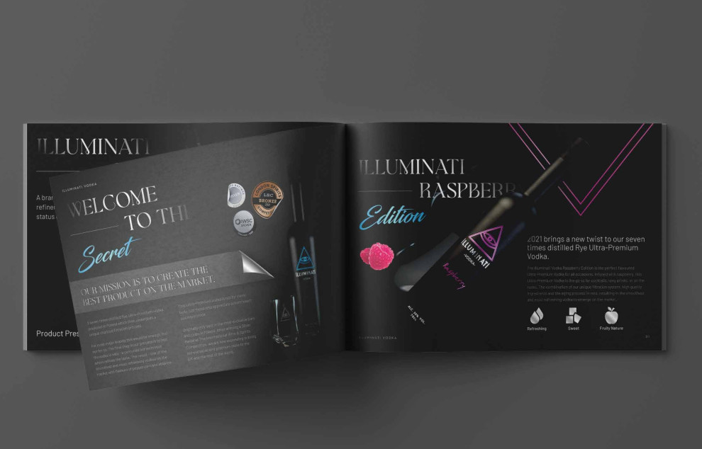
The design also showcases the seven-times-distilled rye vodka's journey through evocative imagery. This organized design allows the layout to narrate the brand's exclusivity while offering viewers a visual tour of the product's creation process.
Attaching a luxurious image like this to a brand is no easy feat; only the best print designers, like Puneet Sakhuja, can achieve this.
The Print Design Highlights the Product’s Best Qualities Through Alluring Color Scheme
The print design for Illuminati Vodka sports a captivating black background as the design's primary color. This color choice accentuates the brand's premium qualities. Following the color's attributes, such as strength, power, class, and elegance, the agency further solidifies its vision of conveying luxury. (Marvel at these black packaging designs with the same opulence as this brochure!)
Aside from this, the color also complements the visual elements present in the brochure. The agency went for white-colored texts, elegantly popping atop the matte blank background.
Flipping through the brochure, you'll see the brand colors decorate the pages. Rays of neon blue and purple add character to the exquisite background. (Explore some of the best two-color print designs.)

The Agency Delivers Concise Product Information by Incorporating High-End Typography
Typography is a powerful tool in print design and can change the mood of any visual. In the case of the Illuminati Vodka print design, using serif typography elevates the design's elegance and sophistication.
Serif fonts, known for their small lines or embellishments at the ends of characters, are often associated with tradition, respectability, and formality, which align with the brand's image.
The agency excellently delivers essential product information. The page headings are in a classy font style similar to the brand logo, while the subtexts are in legible sans-serif fonts. Occasionally, the agency uses script serifs to decorate the page.
Want to know which typeface fits your brand best? Check out our article on brand typography!
Illuminati Vodka’s Print Design Enhances Brand Recognition Through Attractive Product Placement on the Cover
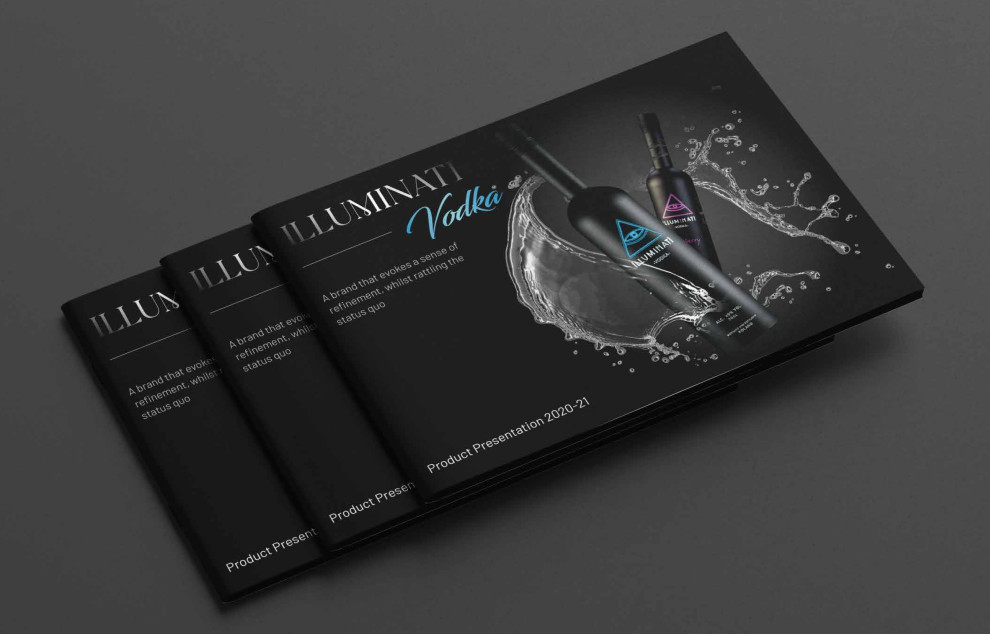
The product placement on the cover, with two bottles surrounded by liquid splashes, ingeniously adds a touch of character to the brand.
This strategic placement underscores the brand's identity and serves as a subtle invitation to the audience, drawing them into the luxurious-looking brochure.
All these elements create the perfect harmony for the brand, earning Puneet Sakhuja's print design for Illuminati Vodka its well-deserved Best Designs Award.