
Annual print reports provide a glimpse of what the year was like for companies and brands. The designs should balance presentation and creativity since they contain plenty of data, statistics, and other information. The best print designs for these reports are not overwhelming or dull.
We've compiled some of the best annual report print designs created by talented print designers today. See how they presented information artistically here!
Table of Contents
1. Glencree by Journey Arrive Inspired
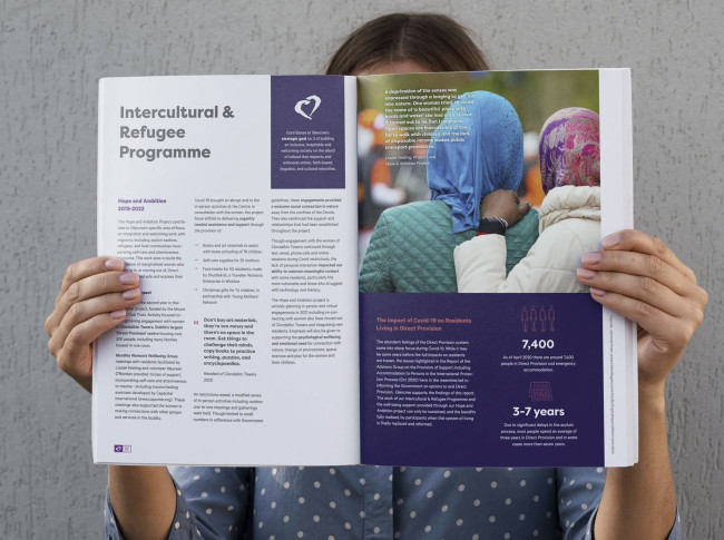
Standout Features:
- Vivid images
- Images as backgrounds
- Informative statistics and graphics
Print design agency Journey Arrive Inspired's design approach for Glencree's annual report is visually captivating yet informative. The vivid images capture the essence of the year marked by the COVID-19 pandemic.
The image backgrounds amplify the design's visual appeal, blending images and text seamlessly. This also provides short breaks between heavy data and information. The content is visually striking and informative. Overall, the design makes the annual report readable and comprehensive to its readers, communicating Glencree's key objectives and achievements successfully.
2. Natura & Co by Danki

- Nature-inspired colors
- Excellent use of images
- Informative graphs and tables
Digital design agency Danki took on designing the 2021 annual report for Natura & Co, a cosmetics company. The print design is contemporary and visually engaging, featuring fresh and bold typography, infographics, and data visualizations.
These elements effectively communicate the performance and goals of Natura & Co's four sustainable cosmetics brands: Aesop, Avon, Natura, and The Body Shop. Large images, informative graphs, and color blocks are added to keep the annual report from being text-heavy.
3. Sari Pacific Jakarta - Laporan Tahunan by Sooca Design

Standout Features:
- Colorful accents
- Lifestyle magazine look
- Bright layout
For Sari Pacific Jakarta, print design company Sooca Design created an annual report that captures the hotel's highlights in 2020. With a bright layout and excellent photo-text ratio, the print design for this report is reminiscent of most lifestyle magazines.
The agency decorated the design with accents on the cover, image borders, and all over the layout for uniformity. They used yellow, green, orange, and blue to complement the bright design.
4. SOS Children's Villages International by Leland

Standout Features:
- Large images
- Highlighted statistics
- Sans-serif typography
Design agency Leland crafted an eye-catching annual report for SOS Children's Villages International, mainly featuring photos of smiling children.
Some photos have blocks of colors that overlap them, enhancing their visual appeal and adding a pop of color. As a break from text-heavy sections, some statistics are highlighted to make them stand out. Modern sans-serif typography gives the report a contemporary feel, ensuring readability.
Check out these best nonprofit organization print designs.
5. PT Adaro Energy 2019 by DNA Komunika

Standout Features:
- Readable text blocks
- Bold sans-serif typography
- Eye-friendly color scheme
Design agency DNA Komunika created the 2019 Annual Report for PT Adaro Energy. They focused on readability and easy understanding since the report is relatively text and information-heavy.
In the report, the emphasis is on clarity and readability of information. The highly readable text blocks facilitate easy digestion of complex data, making the report user-friendly and practical. This is complemented by bold sans-serif typography, lending a modern, professional touch. Lastly, the nature-inspired color scheme ties everything together and ensures comfortable reading. (Discover the best print designs with bold fonts.)
6. 1001fontaines by SOMA Digital Agency

Standout Features:
- Realistic images
- Text-photo balance
- Minimalist color scheme
For the second consecutive year, 1001fontaines entrusted SOMA Digital Agency with designing an elegant annual report. The outcome? A tailor-made landing page that's minimalist and refined, with a yearly print-ready report summarizing the NGO's activities for the year.
The chosen visuals forge a profound connection, bringing the viewer closer to 1001fontaines' mission and accomplishments. The design balances text and imagery, ensuring a cohesive blend of information and aesthetics.


