
We've collated the best billboard print designs reigning supreme in the vast advertising landscape, capturing attention from afar. These towering canvases combine creativity and brand message in large, unmissable prints. As such, they help strengthen brand awareness and are great ways to expand your reach.
Feast your eyes on more attention-grabbing designs in our Best Print Designs catalog.
And if you want to create a billboard print design that stands tall among the competition, connect with seasoned print designers today!
Table of Contents
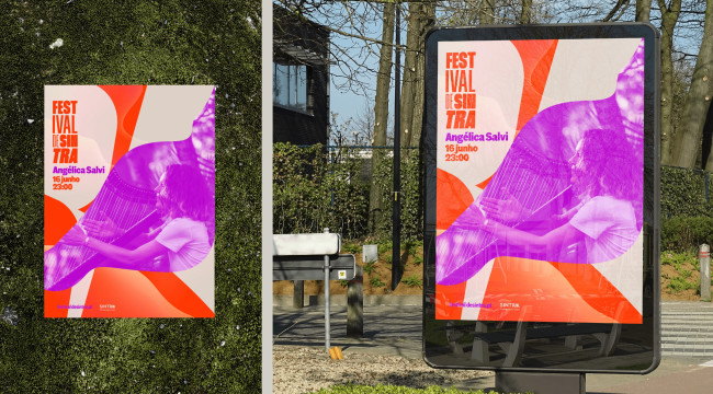
1. FESTIVAL DE SINTRA by NOSSA™
Standout Features:
- Huge, bold letters
- Colorful palette
- Dates clearly stated
The FESTIVAL DE SINTRA billboard design by NOSSA™ was part of a rebranding and communication project when Martim Sousa Tavares took over the artistic direction of the Sintra Festival. This rebranding aimed to attract more people by offering a broader and more diversified experience.
The print design captures the vibrant energy of Sintra, featuring a bright red and purple color palette and fluid lines. It also has legible dates to attract interested parties.
The design embodies an original, dynamic, and engaging tone that transcends the formality of classical music, allowing it to resonate with the landscape.
Check out these eye-catching poster and print designs.
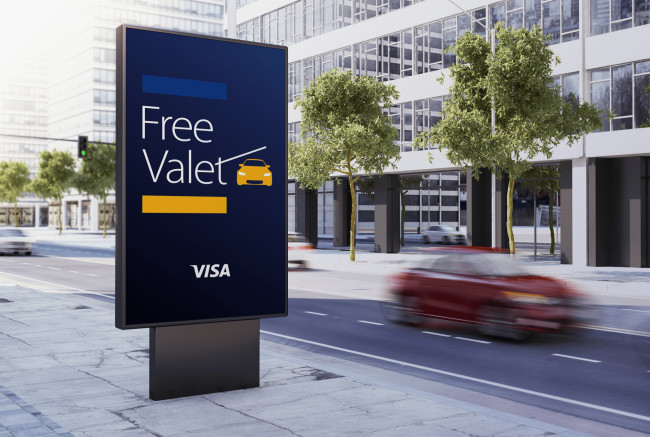
2. Visa - Free Valet by Lucas "Luke" Faccini
Standout Features:
- Stylized "T"
- On-brand color story
- Legible typography
In the Visa - Free Valet billboard design by Lucas "Luke" Faccini, the T in "valet" is cleverly stylized as a parking barrier, aligning with the theme of complimentary valet service.
The on-brand color story of blue, gold, and white keeps the design cohesive with Visa's brand identity and makes it visually striking. Furthermore, the legible typography ensures clear message communication to the viewers, making this billboard design an innovative and impactful advertising piece.
Discover more print designs with bold fonts.
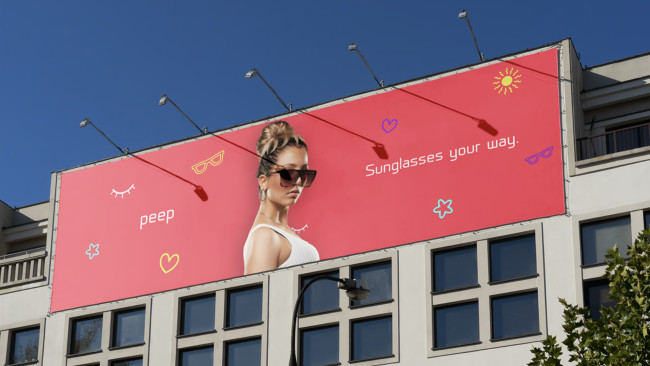
3. Peep by Dax Yves
Standout Features:
- Minimalist and playful icons
- Bright color story
- Catchphrase printed legibly
The Peep billboard design by Dax Yves features fun and feminine photos that reflect the brand's cheerful and fashionable image. The bright pink, purple, and yellow colors with the minimalist and playful icons add a lively and inviting vibe.
In addition, the legible printing of the catchphrase effortlessly communicates the brand message. This design attracts attention and generates a positive connection with the viewers, encouraging them to explore the brand's offerings.
4. CeeBee Care by Belinda Gillies Art & Design

Standout Features:
- Realistic photos
- Legible catchphrases
- Minimalist layout
Belinda Gillies Art & Design created a series of billboard designs for CeeBee Care on display in Fortitude Valley, Brisbane.
The design features realistic photos of a child, a child's hand playing with toys, and a child's hand covered in paint. The images and legible catchphrases effectively convey the brand's message.
Using realistic photos evokes warmth and trust, effectively capturing viewers' attention and conveying the nurturing essence of CeeBee Care's services.
5. Heri by Shari Brews

Standout Features:
- Relaxed photo of a woman
- Bold typography
- Warm and earthy colors
Print designer Shari Brews created a billboard for Heri, a property development and investment company based in Johannesburg, South Africa.
The billboard print design includes a relaxed photo of a woman looking up and a short yet sweet tagline. The warm and earth colors invoke a calming and inviting feeling. The bold typography stands out against this serene backdrop, ensuring the message is clear and engaging.
Each element complements the other, contributing to a well-balanced and effective billboard design that resonates well with the intended audience while remaining aesthetically pleasing.
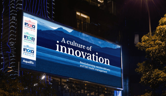
6. Aqualife by The Lost Line
Standout Features:
- Vivid photo background
- Bold typography
- Eye-catching visuals
Aqualife's billboard print design by The Lost Line creatively employs a vivid photo background showcasing a scenic mountain and ocean view. This inviting visual immediately brings a refreshing and natural aura. The bold typography stands strong against this vibrant backdrop, ensuring the texts are easily readable.
The eye-catching visuals enhance brand identity and encapsulate the essence of Aqualife: to revolutionize fish health management and vaccine delivery to the Mediterranean region.


