


-account-photo_listing.jpg)
-account-photo_listing.jpg)


Our Jury has worked with Prada, Nike, Chanel, Google, and Apple.
Best Poster Print Designs of 2026
View the Top Poster Print Designs Below
Best Poster Print Designs
4,200+ Submitted Designs- Advertising
- Architecture
- Arts & Recreation
- Banking & Finance
- E-Commerce & Retail
- Education
- Engineering
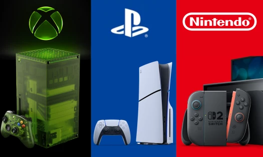
- Entertainment
- Environmental Ads and Brand Designs
- Fashion & Beauty
- Food & Beverage
- Government
- Health & Wellness
- Hospitality
- Legal & Insurance
- Luxury
- Manufacturing
- Medical & Pharmacy
- Non-Profit
- Professional Services
- Real Estate
- Sports & Leisure
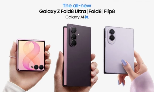
- Technology
- Travel
 Winner
★9.47/10
 GS 10.0
 BS 8.8
 VO 9.6
View Design
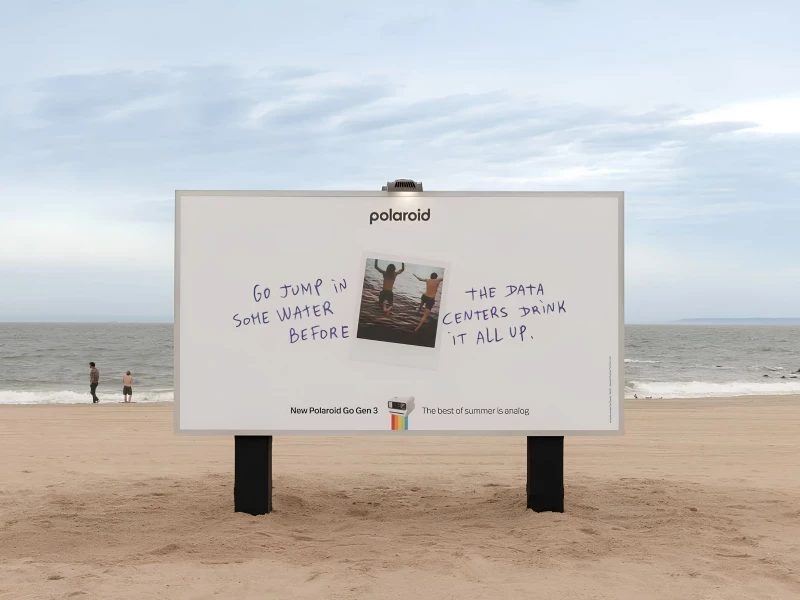
Polaroid - The Best of Summer Is Analog Print Design
View Design
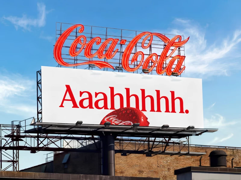
Coca-Cola – Iconic Everywhere Print Design
View Design
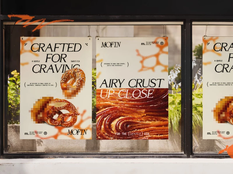
MOFIN Print Design

View Design
ACE Resource Network Print Design
byNuminous
View Design
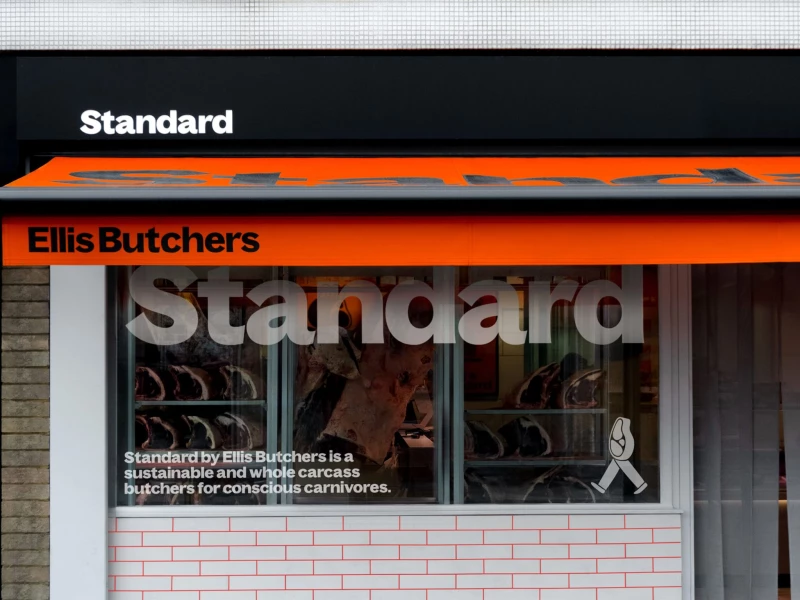
Ellis Butchers Print Design
View Design
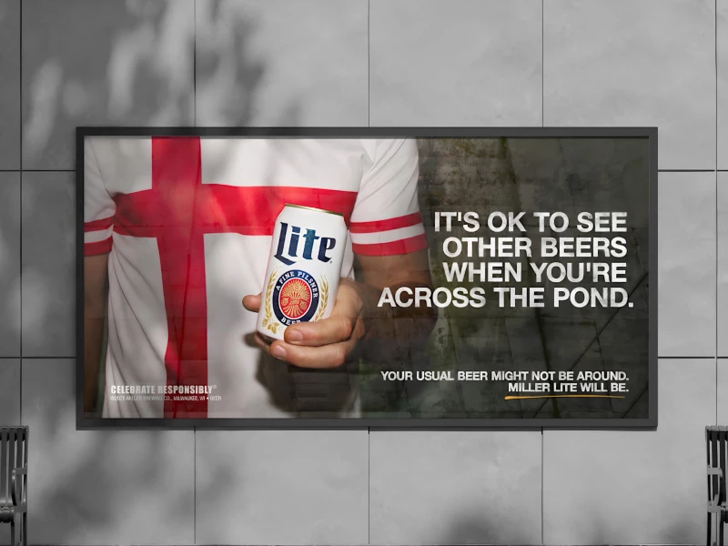
Molson Coors - The Beer Fling Print Design
View Design
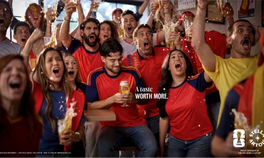
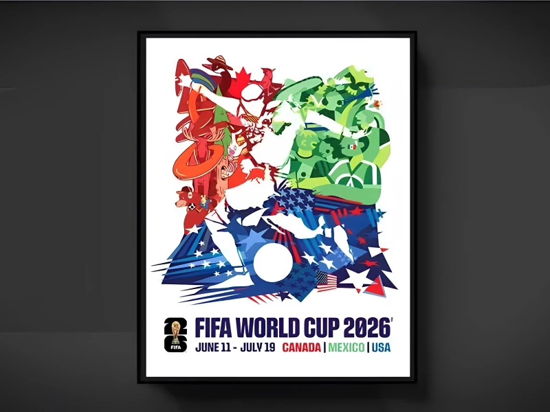
FIFA World Cup 2026 Official Tournament Poster Print Design
View Design
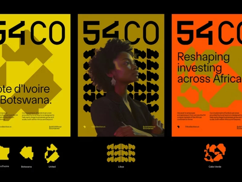
54 Collective Print Design
byBCKRDS
View Design
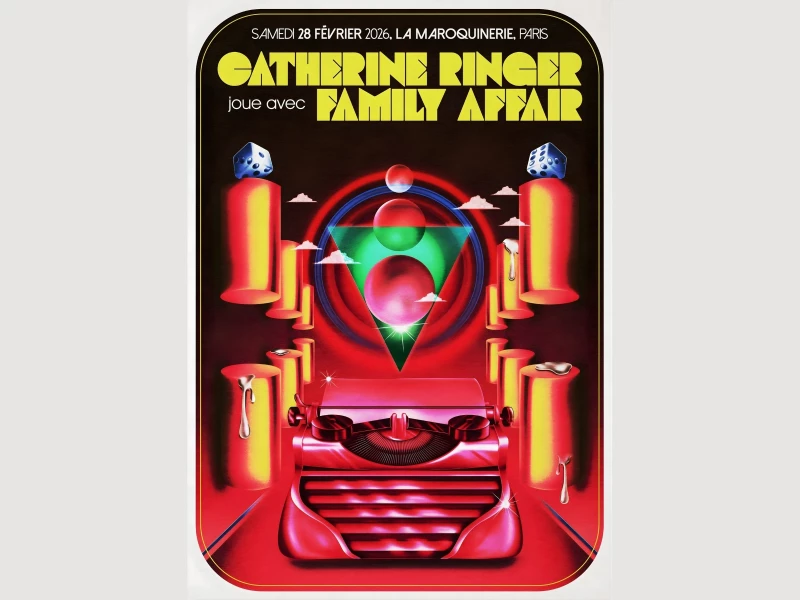
Catherine Ringer & Family Affair Show Poster
byLiorzh
Get Connected
With The Right Agency Partner
& Receive Proposals For FREE
View Design
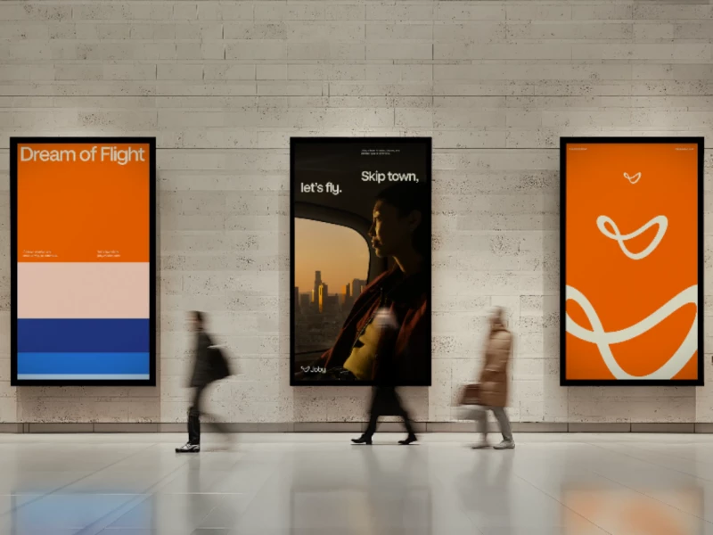
Joby
byTinyWins
View Design
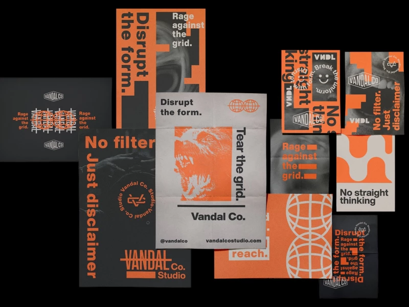
Studio Vandal Co.
View Design
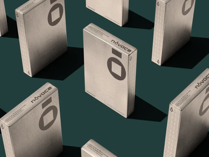
Nóvace
byGhostID
View Design
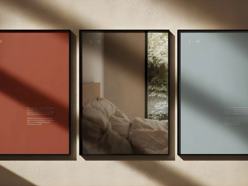
Lugre Haus
View Design
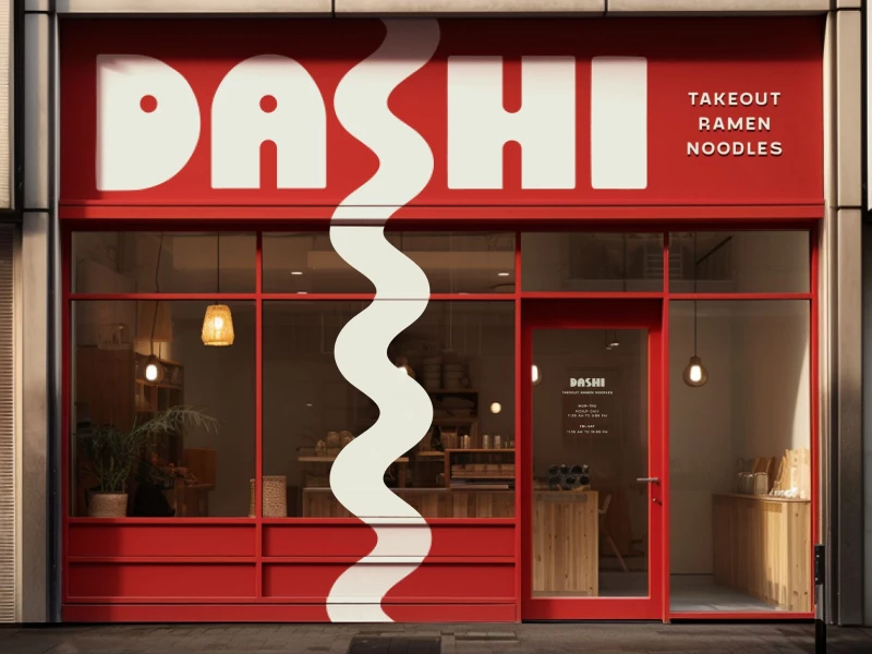
DASHI Ramen
View Design
Open Sails
View Design
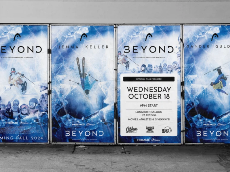
HEAD
View Design
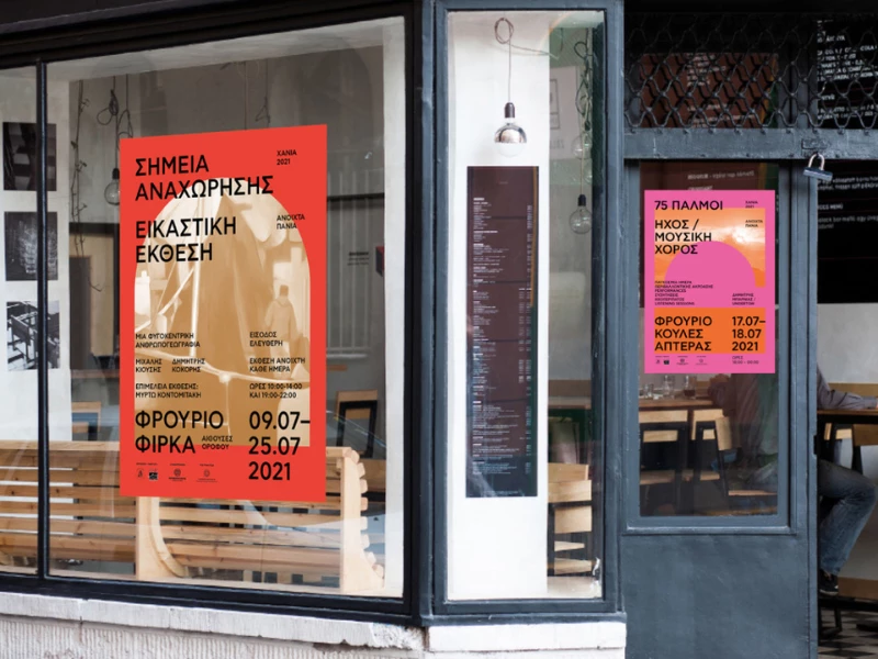
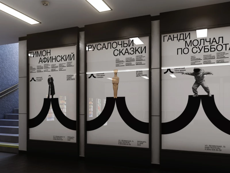
Kamchatka Theater
Ready to elevate your designs?