-account-photo_listing.jpg)
-account-photo_listing.jpg)


Our Jury has worked with Prada, Nike, Chanel, Google, and Apple.
Best Business Cards Print Designs of 2026
View the Top Business Cards Print Designs Below
Best Business Cards Print Designs
4,200+ Submitted Designs- Advertising
- Architecture
- Arts & Recreation
- Banking & Finance
- E-Commerce & Retail
- Education
- Engineering
- Entertainment
- Environmental Ads and Brand Designs
- Fashion & Beauty
- Food & Beverage
- Government
- Health & Wellness
- Hospitality
- Legal & Insurance
- Luxury
- Manufacturing
- Medical & Pharmacy
- Non-Profit
- Professional Services
- Real Estate
- Sports & Leisure
- Technology
- Travel
View Design
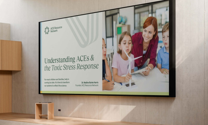
ACE Resource Network Print Design
byNuminous
View Design
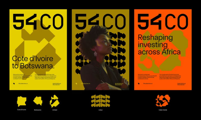
54 Collective Print Design
byBCKRDS

View Design
Cure8

View Design
Hey, Barb
View Design
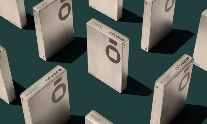
Nóvace
byGhostID
View Design
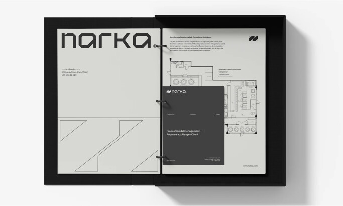
NARKA
View Design
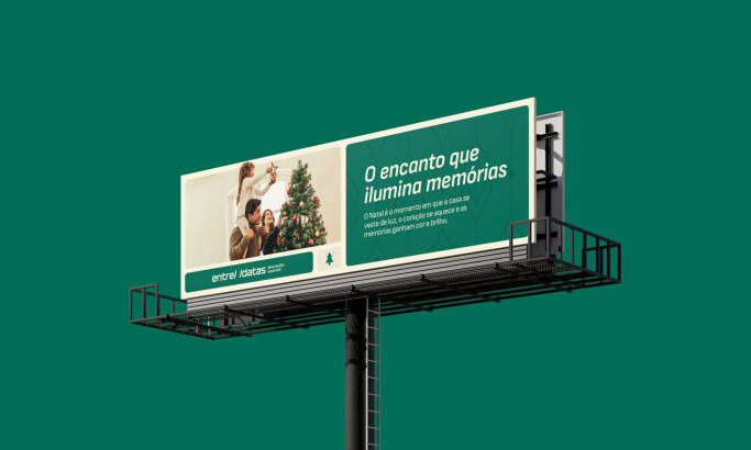
Entre Datas
View Design
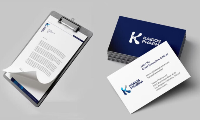
Kairos Pharma
View Design
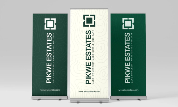
PIKWE ESTATES
Get Connected
With The Right Agency Partner
& Receive Proposals For FREE
View Design
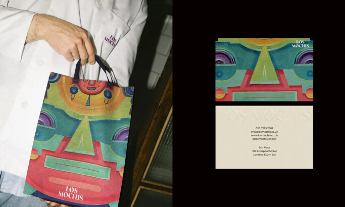
Los Mochis
View Design
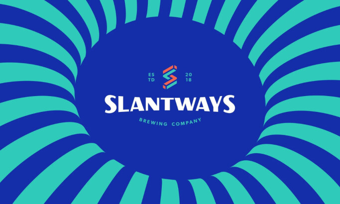
Slantways Brewing
View Design
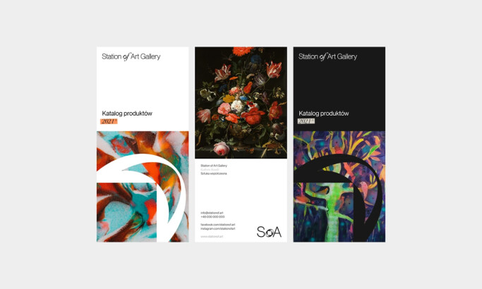
Station of Art — SoA®
View Design
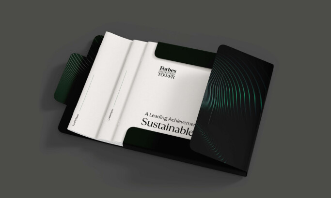
Forbes Middle East — Tower
View Design
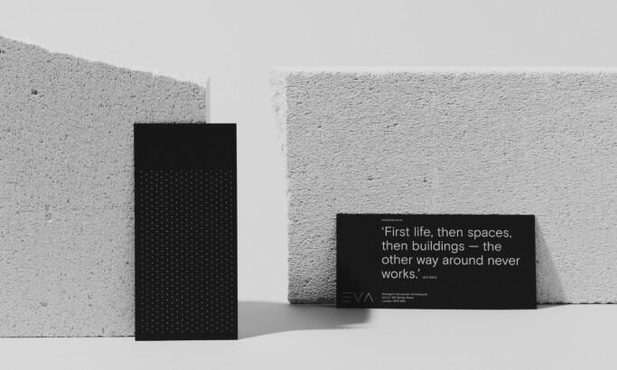
Emergent Vernacular Architecture
View Design
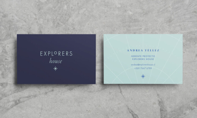
Explorers House
View Design
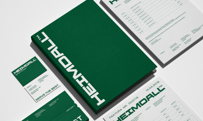
Heimdall
View Design
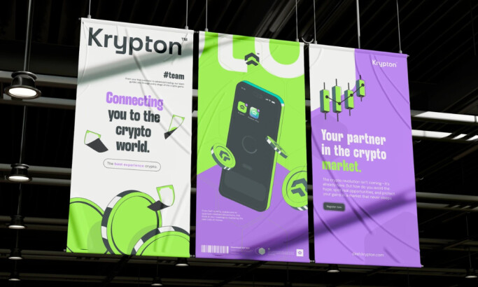
Krypton
-preview.jpg)
View Design
Sautor
Ready to elevate your designs?