-account-photo_listing.jpg)
-account-photo_listing.jpg)


Our Jury has worked with Prada, Nike, Chanel, Google, and Apple.
Best Education Print Designs of 2026
View the Top Education Print Designs Below
Best Education Print Designs of 2026
4,200+ Submitted Designs
- Advertising
- Architecture
- Arts & Recreation
- Banking & Finance
- E-Commerce & Retail
- Education
- Engineering
- Entertainment
- Environmental Ads and Brand Designs
- Fashion & Beauty
- Food & Beverage
- Government
- Health & Wellness
- Hospitality
- Legal & Insurance
- Luxury
- Manufacturing
- Medical & Pharmacy
- Non-Profit
- Professional Services
- Real Estate
- Sports & Leisure
- Technology
- Travel
View Design
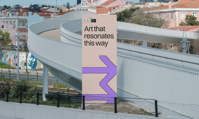
Lithuanian Culture Institute Print Design
★9.36/10
 AO 10.00
 BS 7.20
 BS 10.00
 KS 9.60
 LB 10.00
View Design
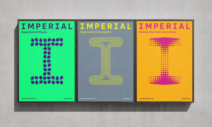
Imperial College London
View Design
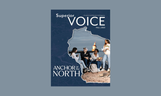
University of Wisconsin Superior
View Design
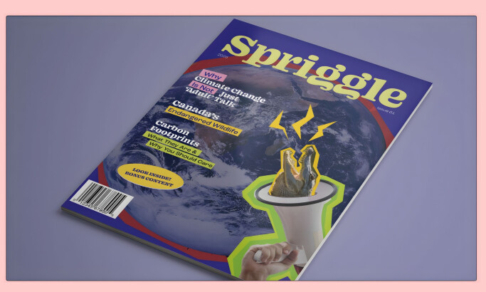
Spriggle

View Design
Pelican Shakespeare

View Design
HKSC

View Design
Private Lomonosov School

View Design
Cazador Cookbook

View Design
Book Covers By Janet Hansen
Get Connected
With The Right Agency Partner
& Receive Proposals For FREE

View Design
The School Of Visual Arts Book

View Design
Tata&friends

View Design
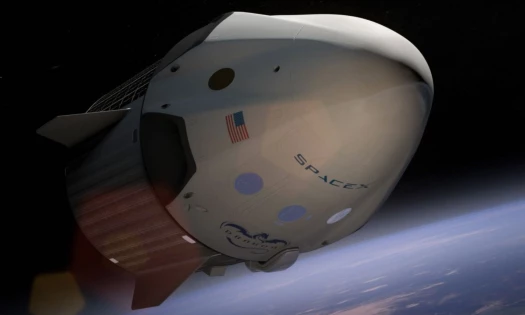
Nasa Visions Of the Future

View Design
Mr Marcel School

View Design
FNE

View Design
Umberto Eco Book Cover

View Design
The United Way X Pantone

View Design
The Little Larva

View Design
My Beads & Me
Ready to elevate your designs?