-account-photo_listing.jpg)
-account-photo_listing.jpg)


Our Jury has worked with Prada, Nike, Chanel, Google, and Apple.
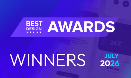
Best Singles Cover Designs of 2026
View the Top Singles Cover Designs Below
Best Singles Cover Designs
4,200+ Submitted Designs- Advertising
- Architecture
- Arts & Recreation
- Banking & Finance
- E-Commerce & Retail
- Education
- Engineering
- Entertainment
- Environmental Ads and Brand Designs
- Fashion & Beauty
- Food & Beverage
- Government
- Health & Wellness
- Hospitality
- Legal & Insurance
- Luxury
- Manufacturing
- Medical & Pharmacy
- Non-Profit
- Professional Services
- Real Estate
- Sports & Leisure
- Technology
- Travel

View Design
Tipau Tavares
byKAPUZE

View Design
Make It Easy

View Design
Halko - Yanıla Yanıla

View Design
Artem Pivovarov

View Design
Fresh Wind

View Design
Linde — "Mi Última Noche"
bycosmos

View Design
LO SHELI

View Design
Esse Verao
Get Connected
With The Right Agency Partner
& Receive Proposals For FREE
Ready to elevate your designs?