
Caution is a fashion company that operates across a variety of associated media. They sell clothes and magazines across the same site, and do so through exquisite branding and high quality content. This homepage is indicative of everything a user can expect from the company’s site and product. It’s fun, colorful, and young but also extremely professional. This is a necessary balance to strike because above all things, this site is a store.
It’s not just about promoting a style or exploring burgeoning aesthetics, it’s about moving product. This homepage is a great reminder that design is meant to reinforce a company’s bottom line. The page immediately lulls users into a specific mood, but then after only a single click, they are thrust right into the online store.
By setting a thematic milestone right up top, the designer is creating a need, making users say, “I want to look like her”. But then, the designer immediately satisfies this need when the customers are most ripe for the picking, and pushes them through the doors of their digital marketplace.
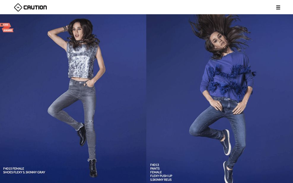
This product page provides a complimentary insight to the design principles interrogated on the home page. Now that you’ve pushed viewers into a marketplace, you have to try and maintain the unspoken brand information communicated on the home page.
Essentially, the designer wants to try and maintain the appearance of the homepage, but now with a complimentary sense of salesmanship. The last thing users want, especially young ones, is to feel like they’re being manipulated. As such, the designer has chosen a color scheme and photo selection that still exude the same fun and energy as the home page.
This product page is indicative of how design can be used to mask otherwise unappreciated intentions. The design of this page leaves users feeling like they truly made the decision to buy, as opposed to being manipulated into doing so.

The very last slider at the bottom of the site’s final page is used to push real world sales. This slider prompts users to utilize a feature of the site that helps them find a storefront where Caution clothing is sold. This is yet another way that Caution’s site creates a highly sales oriented space for users. At the very end of a user’s experience, just before the close the page, they’re given the option to find a store before they go. This is an excellent finale to selling powerhouse that has been Caution’s site, motivating consumers to go beyond their keyboards and continue the shopping experience offline.
Caution is a beautiful website design in the Fashion & Beauty industry.


