IG Design’s website is an ingenious play on imagery and user interface. The dark colors and high-resolution photographs make the website sultry, sexy, and simple.
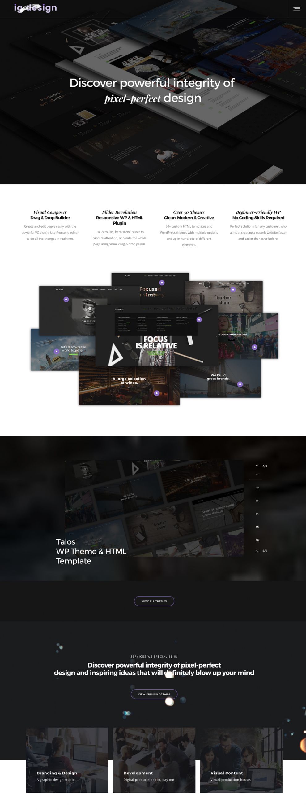
Right away, the home page grabs the user’s attention with its black, transparent background. Its presentation is stunning, thanks to the behind-the-scenes effects and the automated side-scroll. The banner comprises two things, the company logo and a hamburger menu, which add to the site’s overall minimalist theme.

IG Design uses a deep scroll method across the entire website. Each section is simplistic, and they don’t add too much content or imagery, which can pollute the UI and UX. For example, the “About” page is very straightforward. It features a white backdrop, with a few images from IG Design’s portfolio. The content is minimal but impactful, and it uses the same typeface manipulation as the home page to create a consistency within the user experience.

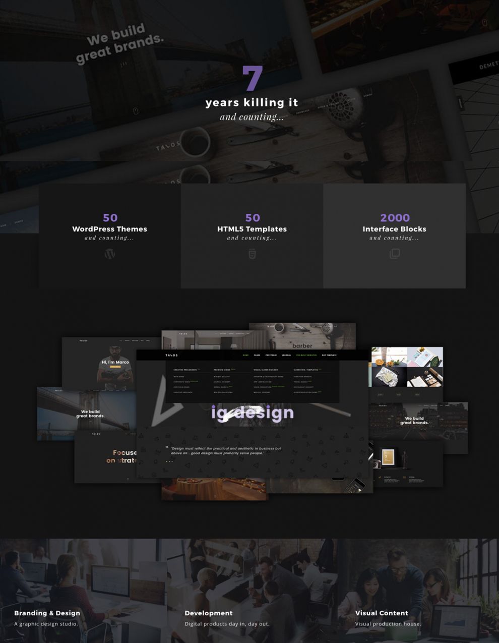
IG Design’s portfolio page works in conjunction with the company's products. It opens with a counter and uses a deep scroll, allowing users to interact with the content without having to click all over the page.

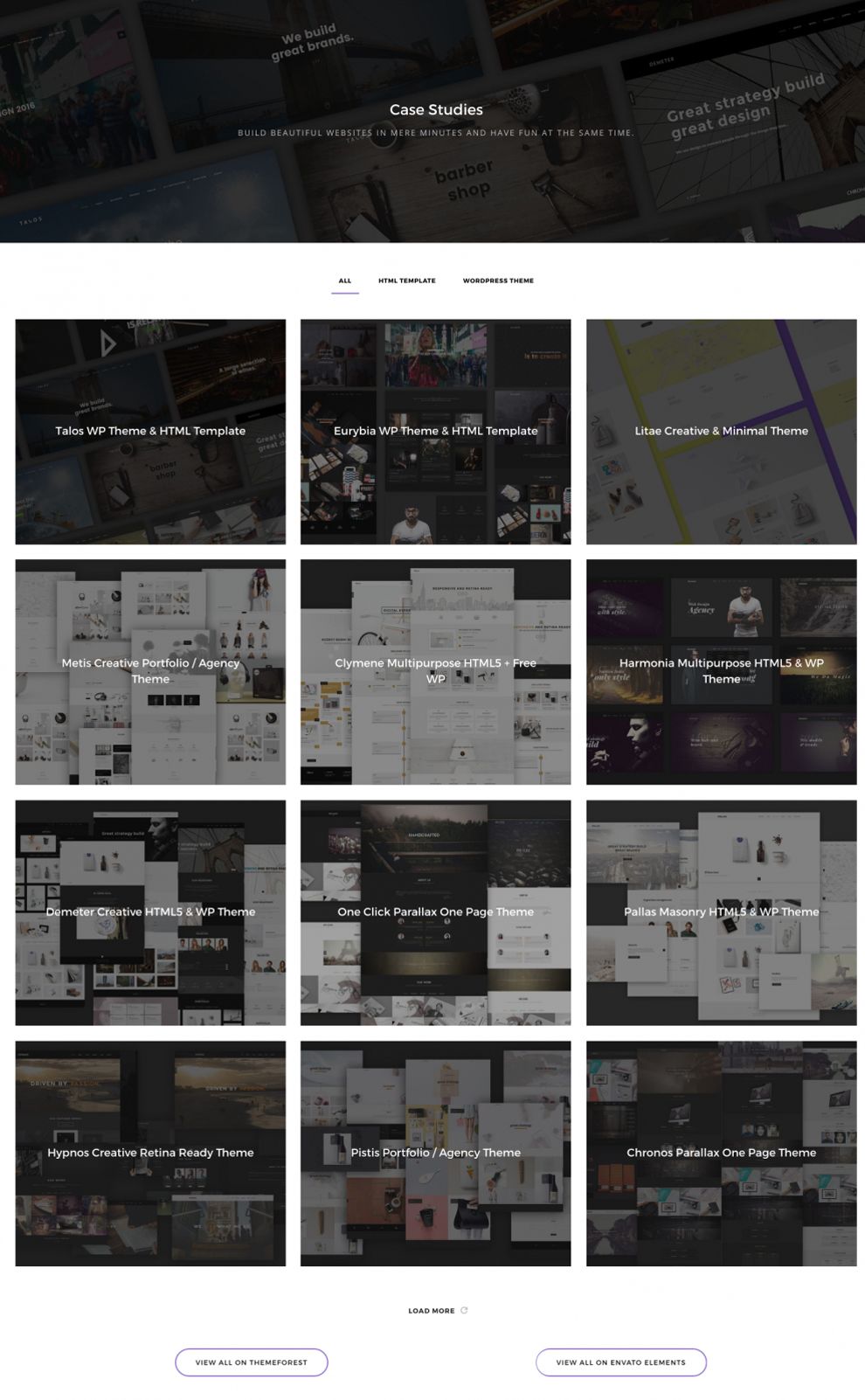
Their 3x3 gallery grid is fanciful, equipped with transparent images and bold, white typography. A user can click on the thumbnail image to be hyperlinked to that product’s page, learn how it works, and view samples.
IG Design’s phenomenal web design speaks to the company's ability to create. It’s innovative, simplistic, and easy to use, offering users a glimpse of what true web design should look like.
IG Design is a top website design in the Advertising and Professional Services industries.


-preview.jpg)