Creative design agency Six Potatoes takes minimalism and visual concepts to the next level. Their website showcases their talents within a playful portfolio of the agency’s work. The home page opens with a bold orange backdrop, dramatizing the image of a crocheted “S” in the middle of the page. The bold serif typography on the left shifts focus to the arrow underneath, encouraging users to scroll through the site.
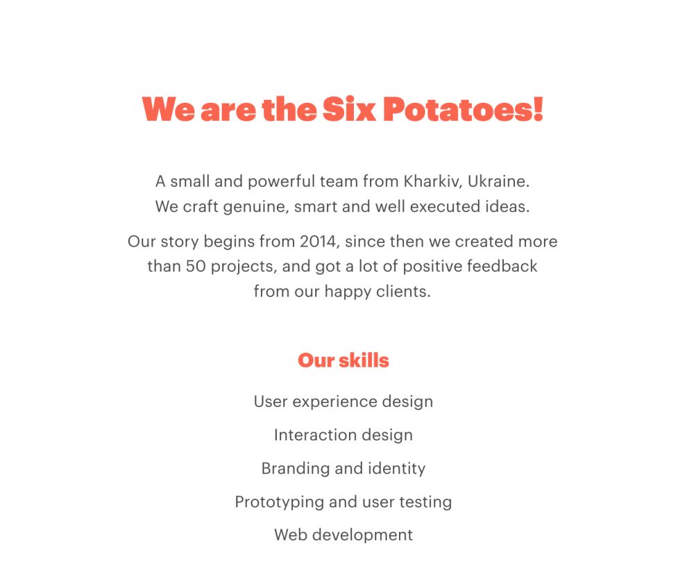
The website uses a parallax scroll system, keeping each page short and straightforward. An example of this concept at work is Six Potatoes’ “About” page. The “About” page uses a white background that draws the bold, orange typeface to the forefront. It offers little content that is well-written and informative, but it doesn’t take away from the minimal concept of the website.
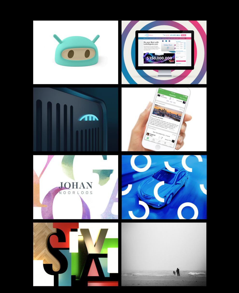
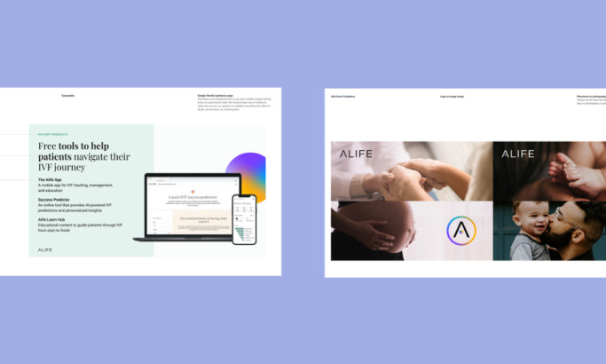
Six Potatoes’ portfolio is a magnificent display of imagery and simplicity, by using a basic 2x2 image grid against a black backdrop. Their project page mimics the colors of a company’s logo or theme as the backdrop for the page. Users can scroll down to see an asymmetrical gallery format, which grabs their attention. Every project page is different, further enhancing the UX and UI applications because no one page is the same.

Six Potatoes’ website is a refreshing, playful design that uses minimalism and high-quality images to attract users to their brand. Its use of UI and UX application may be subtle, however, it's impactful, proving that their skills will satisfy clients.
Six Potatoes is an awesome website design in the Advertising and Professional Services industries.