
Squaredot Web Design Leans On Unconventional Homepage Messaging
Squaredot is a Dublin-based B2B marketing agency that helps technology companies go to market with on-point messaging on a contemporary and striking website that converts.
Their goal is presented through the agency’s website, which uses unconventional design and messaging. Given their specific field of expertise, the Squaredot website looks and feels different from those of industry competitors.
Gone are the cold corporate approach and the stiff copy of the past. Squaredot utilizes original, key messaging points and flashy yet minimalistic motion effects.
Subtle animation illustrates the agency’s logo, introducing and highlighting the unusual intro copy that focuses on the client’s needs and plans for the future, rather than jumping straight into selling points.
This revolutionary approach plays with conventions as it keeps the general layout and all the design elements in line with user expectations, giving them a new twist with an authentic aesthetics feel.
Upon landing on the homepage, the visitor is met with messaging that incentivizes action. The animations complement the concise, almost “street talk” copy, leaving the user with the impression of both highly technical, precise efficiency and accessibility.
Squaredot’s website design achieves several key objectives right from the get-go: it keeps users engaged, provides a unified UX and conveys its commitment to excellence.
The Website’s Minimalistic Micro Animations Breathe Life Into Both Squaredot’s Logo And The Duality Of Its Brand
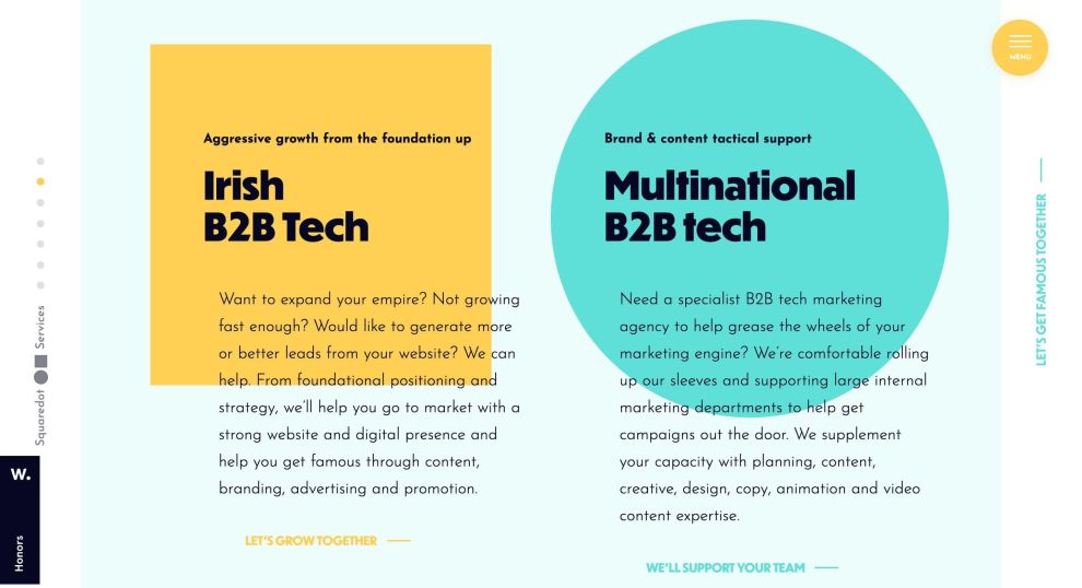
Squaredot’s cutting-edge homepage benefits from the aforementioned animations in two ways: Stunning, two-color palette effects provide another dimension, encompassing the copy and guiding the visitor’s attention, as well as embedding the company logo into their psyche.
Since Leonardo da Vinci’s “Vitruvian Man,” the square and circle have been proven to be two of the most aesthetically appealing shapes. Squaredot’s website design embraces them fully, painting them with complementary primary colors adding to an outstanding user experience.
Scrolling down the homepage funnel, it feels as if the company’s promise: “Fame beckons, leads await” is visually split into two types of services (growth and support), highlighted by these distinctive shapes.
Minimalistic animations do not loop as their primary purpose is being the canvas upon which specific services are presented.
Squaredot Website’s Main Menu Ensures Intuitive And Seamless Navigation
Simplicity and user experience. Squaredot understands and uses them to the fullest. The main navigation is easily noticeable upon landing.
A simple menu points to five sections, without any dropdown subcategories. It stands above the fold, expertly inviting prospective customers into the conversion funnel.
Even though the main navigation is not sticky, it instantly morphs into a hamburger menu as soon as the user scrolls down and consistently stays on the page. Clicking on it opens a new colorful and expanded menu that presents even more features.
The “efficiency” feeling is embodied by hovering a mouse cursor over it, as each menu element is crossed with a fine blue line as if ticking off a “to do” list.
The user journey is improved even further, as speedy page loading is hidden behind a seamless, fade-out/in transition to the desired location.
Having in mind the minimal, yet abundant animated visuals, this illusion achieves the impossible – it appears as if the transition to a new page didn’t even happen.
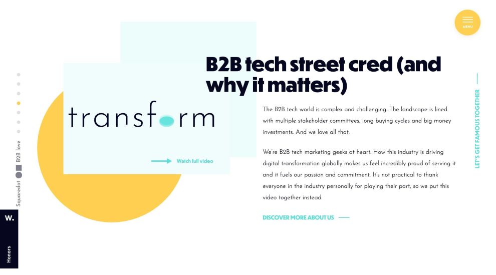
Smooth In-House Videos Push Users Closer To Conversion
Professional web designers employ various techniques to ensure that videos blend harmoniously with the design elements and principles of the website.
On Squaredot’s website, videos are seamlessly integrated into the design.
In order to mitigate potential confusion, the copy doesn’t try to be smart or witty. “Watch full video” is enough.
There are several videos scattered throughout the entire website, each relevant to sections they appear in, nudging users closer to conversion points while adding to the overall UX.
Squaredot’s CTAs Are Seamlessly Blended Into Their Surroundings
Since the whole website is either interactive, or it gives the illusion of interactivity, the CTAs can neglect the placement and general outlook conventions.
Even though there are more than a few of them, scrolling down any page, the user encounters call-to-action buttons that are extremely well integrated into the overall website design.
Despite going against CTA best practices (bold, contrasting colors that stand out), Squaredot created highly effective CTA buttons that don’t stick out like a sore thumb and more importantly, they don’t misguide the prospective user.
Squaredot Website Design Combines Minimalism, A Promise Of Success In Their Messaging And Striking Social Proof
Squaredot’s website design is sleek, fast and easy to use. It uses traditional elements of minimalistic design, giving them a twist with engaging messaging and simple animation. It follows a key principle that most branding specialists live by, which is, "less is more."
However, the overall impression is that it is more complex. It walks down that fine line of feeling rich, but welcoming and user-friendly.
The word “fame” is strategically interwoven within the copy, subconsciously announcing to the readers what awaits them at the end of their user journey.
The website is dynamic, the pages have a uniform feel that give the brand consistency and the only element that “fittingly doesn’t fit” is the so-called “hall of fame” (Squaredot’s successful past projects) and the Award section.


