Studies show that 38% of visitors will stop browsing if the website layout is unattractive, while the average user needs less than 50 milliseconds to form an opinion about the website.
Minimal website design is becoming somewhat of an art form. We’ve all heard the famous “less is more”, but it’s a design principle that’s easier said than done.
Although minimalistic tendencies are still the most favorable, the tech advances open a slew of fancy possibilities that are getting harder and harder to resist.
Being attractive, however, is not the only goal as the minimal website designs benefit the users with faster page load times, seamless responsiveness, and a smooth and simple UI design. A reputable web design company understands the importance of these elements and strives to create websites that not only look visually appealing but also offer excellent user experience.
With that said, here are the top 11 best minimal websites that are both inviting, eye-pleasing and most importantly, easy to use.
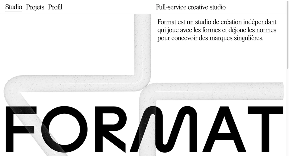
1. Studio Format
Standout Features:
- Streamlined navigation
- Generous use of negative space
- Bold, oversized typography
Studio Format, a Paris-based independent design agency, specializes in crafting distinctive brand identities and tailored digital experiences. Its website is a prime example of minimalist design trend done right — striking a balance between aesthetics and usability.
The site features an intuitive, no-frills navigation system that ensures a seamless user journey. A carefully structured layout, enhanced by ample white space and bold typography, creates a refined and sophisticated user experience.
What sets Studio Format apart is its ability to merge functionality with a touch of creative flair. A custom cursor and a sleek sidebar add subtle dynamism without overwhelming the user. The result? A minimalist yet engaging interface that makes exploration effortless while maintaining a strong visual identity.
By prioritizing clarity and efficiency and ensuring users can access any page within two or three clicks, Studio Format demonstrates that minimalist web design doesn’t have to be dull. Instead, it can be an elegant, engaging experience with just the right amount of personality.
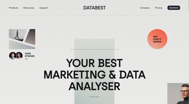
2. Databest by Halo Lab
Standout Features:
- Seamless transition effects
- Muted multicolor palette
- Clean, modern sans-serif typography
Databest is an AI-driven marketing platform focused on delivering precise, data-backed insights; and its website, designed by Halo Lab, reflects that commitment with clarity and intention, making it one of the best minimalist websites of 2025. Every design choice communicates the brand’s core values: accuracy, credibility, and relevance.
The user experience is smooth from the start. Fluid transitions and seamless scrolling create an intuitive journey, mirroring Databest’s promise of streamlined performance. These interactions aren’t just decorative, they enhance navigation and keep users engaged.
Visually, the site embraces a muted multicolor palette (greens, blues, reds, and yellows set against a white canvas). Combined with modern sans-serif typography, the design feels professional and approachable, avoiding visual clutter while still feeling vibrant and current.
Together, the clean fonts, subtle motion, and thoughtful color choices create a unified, minimal aesthetic that doesn’t compromise on character. Databest’s landing page is a strong example of how AI and UX can align beautifully when design is driven by purpose.
3. Atomle by Ethan Suero
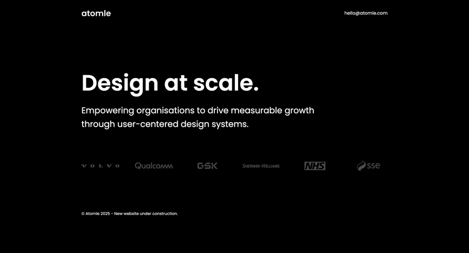
Standout Features:
- Sleek monochromatic palette
- Modern, geometric typography
- Streamlined, single-page navigation
Atomle is a design agency with a concept-driven brand that embraces order, structure, and atomic design principles. Its website, designed by Ethan Suero, is a masterclass in minimalist web design, where every element is purposeful and deeply connected to the agency’s philosophy.
Built on the Greek concept of "kosmos" (which signifies universal order), the website reflects this ideology through a structured, harmonious layout. Circular motifs dominate the design, from the typography’s rounded letterforms to the intuitive call-to-action at the footer. These elements reinforce Atomle’s commitment to precision and seamless design architecture.
A monochromatic gradient color scheme further enhances the site’s futuristic aesthetic, evoking themes of both cosmic vastness and subatomic energy. The clean Avant Garde Gothic-inspired typography, with its bold, geometric structure, adds a contemporary edge, reminiscent of modern tech branding.
This modern minimalist website design flaunts a simple yet unique navigation: a single-page format with four fixed menu items guiding users through a smooth-scrolling experience. Overall, it is a sleek, engaging interface that proves simplicity can be just as impactful as complexity.
4. Mandy Aileen Photography by Brander & Brander
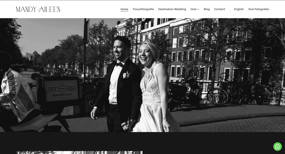
Standout Features:
- Retro-inspired visuals
- Elegant serif typography
- Clear, purposeful desig
More than just a portfolio, Mandy Aileen’s minimalist website design is a seamless visual extension of her artistic approach to wedding photography. Co-founded with her sister Linsey under the Brander & Brander design agency, the site embodies timeless romance and refined simplicity.
Instead of relying on bold colors or flashy design elements, the site embraces subdued, neutral tones that conjure a vintage aesthetic. This subtle, retro vibe enhances the dreamy, nostalgic quality of Aileen’s photography, which in turn creates a cohesive and immersive experience.
Typography plays a crucial role in the design. A classic serif font adds sophistication, while the magazine-style layout gives the homepage an editorial feel. The navigation is effortless, allowing visitors to focus entirely on the imagery without distractions.
One of the site’s biggest strengths is its clarity of purpose. Visitors instantly understand its essence without excessive text. The images take center stage, telling a story beyond just visual appeal. This site proves that minimalism, when executed thoughtfully, can make a powerful and memorable impact.
5. The Quake by Yoni Kessler & Yehuda Bruck
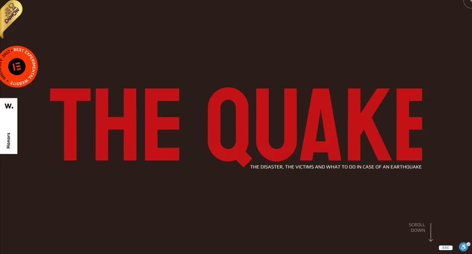
Standout Features:
- Bold, heavy typography
- Dynamic shaking effect
- Striking color palette
The Quake’s website, designed by Yoni Kessler & Yehuda Bruck, is a fine execution of thematic storytelling through design. From the moment you land on the page, the experience is immediate and immersive: two large, bolded words command attention against a simple earthy brown background, setting the tone for what’s to come.
As you scroll, the site’s name begins to shake, splitting the screen into two halves. This is a creative way to provide a direct visual metaphor for an earthquake. This clever interactive effect not only adds movement but also deepens user engagement, making the website feel more alive and immersive rather than just another static landing page.
Complementing the motion is the high-contrast color palette. The deep brown background paired with intense red typography creates a visual jolt that mirrors the intensity of the subject matter. It’s bold, attention-grabbing, and emotionally resonant without overwhelming the user.
This design choice also serves a functional purpose: it ensures information retention by tying content to a memorable, dynamic experience. The Quake’s site proves that the best minimal websites can still be bold, experimental, and deeply impactful when executed with creativity and precision.
6. Herbertus
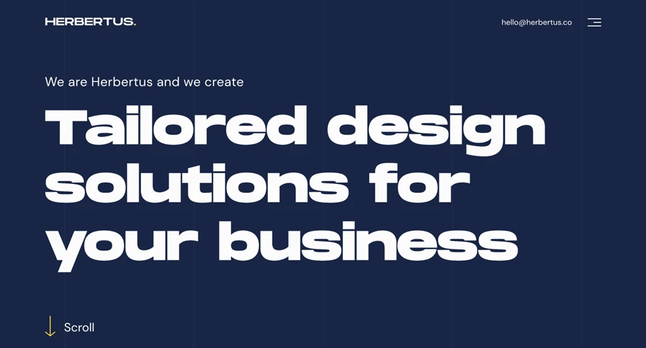
Standout Features:
- Sleek flat minimalism
- Dynamic dark-to-light mode transition
- Bold typography & seamless navigation
Herbertus, a Vilnius-based digital agency, takes a refined approach to web design: balancing simplicity with creative depth. Its website is a prime example of flat minimalism, where clean lines, solid colors, and subtle animations replace cluttered visuals and unnecessary effects.
Rather than relying on flashy imagery, Herbertus uses selective preview shots as windows into their portfolio. Clicking on them reveals the agency’s full creative potential, made even more striking against the deep blue background. The result is a thoughtfully restrained design that allows their work to speak for itself.
One of the most compelling features is the dark-to-light mode transitions, which dynamically shifts as users scroll. This not only enhances readability but also reinforces the site’s structured, user-focused approach.
The homepage is likewise intentionally copy-driven, presenting Herbertus' unique value propositions in a way that directly addresses client needs. With its bold typography, smooth transitions, and purposeful design, Herbertus proves that minimalism isn't about limitation — it’s about precision and impact.
7. Function & Form
Standout Features:
- Dark and light mode toggle
- Animated portfolio showcase
- Thoughtful use of negative space
Function & Form, a London-based creative studio, lives up to its name by striking the perfect balance between aesthetics and usability. Its modern minimalist website design isn’t just a showcase of their work; it’s also a seamless experience that reflects their agile and collaborative approach to design.
Each case study is carefully curated and prominently displayed, ensuring that both functionality and creativity take center stage. The microanimations in their portfolio make exploring their work captivating, while the generous use of negative space directs the user’s attention to key content.
One of the site’s standout features is the dark/light mode toggle, positioned above the fold for instant accessibility. This simple yet effective addition enhances user comfort, catering to younger, mobile-first audiences who favor dark mode, while also accommodating those who prefer a clean, paper-like aesthetic.
By combining minimalist design principles with intuitive interactivity, Function & Form creates a website that not only highlights their expertise but also delivers a fluid and engaging user journey; proving that great design is as much about usability as it is about style.
8. Lupus Art Net
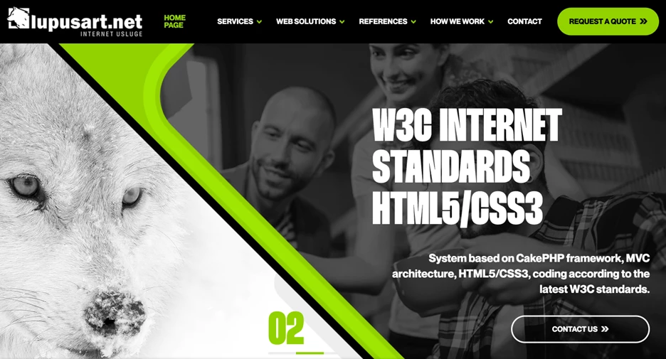
Standout Features:
- Sticky menu
- Thoughtful color selection
- Playful, Bauhaus-inspired typography
Lupus Art Net, a Zagreb-based digital agency, specializes in web design, development, SEO, and digital marketing. Its website is a testament to the agency's expertise, combining clean aesthetics with a smooth, conversion-driven user experience.
Navigation is a strong standout feature, with a sticky menu that ensures users can easily explore the site without losing their place. Despite offering multiple sections and dropdown categories, the layout remains uncluttered, thanks to a carefully chosen color scheme that maintains visual harmony. A lime green hover effect adds consistency, reinforcing the brand’s bold yet balanced approach.
The wolf-inspired branding aligns perfectly with Lupus Art Net’s mission: symbolizing strength and strategic growth in the digital landscape. This theme extends to the site’s typography, where the Blippo sans-serif font and its Bauhaus-style geometric forms, create a perfect harmony of functionality and visual appeal.
By integrating smart navigation, cohesive branding, and engaging design elements, Lupus Art Net delivers a minimalist yet impactful web experience — one that mirrors their commitment to optimizing websites for performance and usability.
9. ECLIPSE Event by CHYRKOV studio
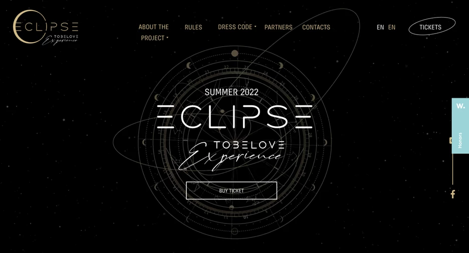
Standout Features:
- Immersive animation and parallax effects
- A seamless fusion of minimalism and luxury
- Theatrical storytelling through content and visuals
Eclipse is more than a run-of-the-mill event. It is an exclusive, highly immersive experience, and its minimalist landing page reflects that from the very first interaction. Designed by CHYRKOV studio, the site captures the mystique and grandeur of the Eclipse, making it feel like a once-in-a-lifetime spectacle rather than just another gathering.
Rather than simply showcasing Eclipse’s luxury and exclusivity, the design goes deeper, drawing inspiration from celestial events and ancient festivals. The result is a dramatic, high-impact experience that transports users into a world of opulence and mystery.
The black background, gold typography, and rich parallax effects create a striking contrast, ensuring key elements stand out while reinforcing the event’s ultra-modern, theatrical aesthetic. This interplay between minimalism and extravagance makes the site sleek and visually arresting.
Aside from its cinematic presentation, the site is also highly functional and allows users to easily purchase tickets while experiencing a preview of Eclipse’s mystique. The combination of evocative storytelling, bold visuals, and interactive design builds an undeniable sense of exclusivity and urgency, tapping into the audience’s FOMO and making attendance feel like a rare privilege.
10. Boomex Agency
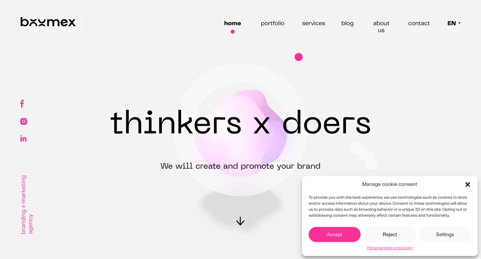
Standout Features:
- Fluid motion graphics and parallax effects
- Bold and modern color palette
- Clean typography with a futuristic touch
Boomex, a Slovakia-based branding and marketing agency, merges minimalism with dynamic design to showcase its versatility and strategic approach. Its website is an elegant exercise in “brandformance” — a portmanteau that means balancing aesthetics with performance-driven storytelling.
At the heart of the design is a fluidly animated circle, a visual metaphor for wholeness, continuity, and innovation. This ever-moving shape isn’t just a stylistic choice; it subtly reinforces Boomex’s ability to create smooth, cyclical brand experiences. Even more intriguing is how the amorphous form casts a shadow, grounding the abstract visuals in real-world, results-driven solutions.
As users scroll, the subtle circular motif continues, but it’s the color palette that truly stands out. The site’s predominantly white background is punctuated with soft yet commanding shades of pink, adding an aura of playfulness and warmth without sacrificing professionalism. This strategic use of color is especially impactful in key interactive elements, such as the sticky CTA and menu navigation, drawing attention without overwhelming the design.
11. Boutique Medical by ZERO NEGATIVE
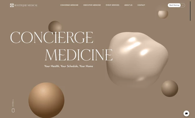
Standout Features:
- Minimalist luxury aesthetic
- Abstract 3D visuals
- Soft, earthy color palette
Designed by Zero Negative, the Boutique Medical website delivers a minimalist and refined digital presence that mirrors the exclusivity of its concierge healthcare services. From the start, the experience is both calming and elevated: minimalist interface layered with abstract 3D visuals that sets a new standard in medical web design.
Instead of relying on generic medical imagery, the site takes a conceptual approach, using soft, fluid shapes and a taupe-toned color palette to evoke care, trust, and discretion. It’s a refreshing departure from the clinical blues typical of the healthcare space, and it sends a clear message: Boutique Medical is anything but traditional.
Functionality remains central to the experience. Navigation is stripped to the essentials, guiding visitors to core services and booking options without distraction. White space and elegant serif typography reinforce a sense of quiet sophistication while keeping the focus on content that matters.
This is a site where design meets intent: every element contributes to a premium, personalized user journey. Zero Negative’s ability to merge artistic restraint with usability makes Boutique Medical’s website a standout example of how healthcare design can be both luxurious and intuitive.