-account-photo_listing.jpg)


Our Jury has worked with Prada, Nike, Chanel, Google, and Apple.
Best Website Designs
Great websites in 2026 don't just load fast - they think, adapt, and convert. Here's the work proving what's possible.
Best Website Designs
4,200+ Submitted Designs- Advertising
- Aerospace
- Agriculture
- AI
- Architecture
- Arts & Recreation
- Automotive
- Banking & Finance
- Community
- Construction Company
- Content & News
- Digital Agencies
- Distribution
- E-Commerce & Retail
- Education
- Engineering
- Entertainment
- Fashion & Beauty
- Film Production Company
- Food & Beverage
- Games and Entertainment
- Government
- Health & Wellness
- Hobby
- Hospitality
- Jewelry
- Legal & Insurance
- Luxury
- Manufacturing
- Medical & Pharmacy
- Museum
- Music
- News Magazine
- Non-Profit
- Professional Services
- Real Estate
- Restaurant
- Roofing
- Sports & Leisure
- Startup Business
- Tech Startup
- Technology
- Travel
- Wedding Planning
- Zoo
- 3D
- 404
- About Page
- Artisan
- Artistic
- Black and White
- Blog
- Bold Color
- Bold Font
- Book App
- Check Out Page
- Chinese
- Clean / Minimal
- Colorful
- Contact Page
- Corporate
- Custom
- Experimental
- Flat
- Footer
- Form
- Fullscreen
- Futuristic
- Green
- Horizontal Layout
- HTML5
- Illustrated
- Images / Gallery
- Innovative
- Inspiring
- Interactive
- Landing Page
- Menu
- Microinteractions
- Mobile Websites
- Motion Effects
- One-Page
- Parallax Effects
- Personal
- Pet Store
- Photographer
- Playful
- Podcast
- Pop Ups
- Portfolio
- Pregnancy
- Pro-loaders
- Product Listing Page
- Purple
- Retro
- Services Page
- Simple
- Slider / Module
- Small Business
- Soft Colors
- Sound / Music
- Storytelling
- Tech Online Store
- Typography
- Unusual Layout
- Use of Infographics
- User-Friendly
- UX Designs
- Virtual Reality
- Visible Borders
- Visually Striking
- Webflow
- Welcome Page
- WordPress
 Featured
View Design
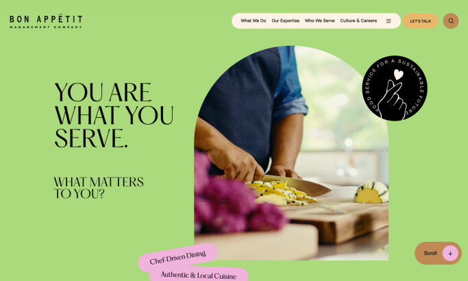
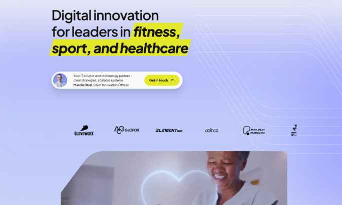
Bon Appétit Management Company
 Featured
View Design
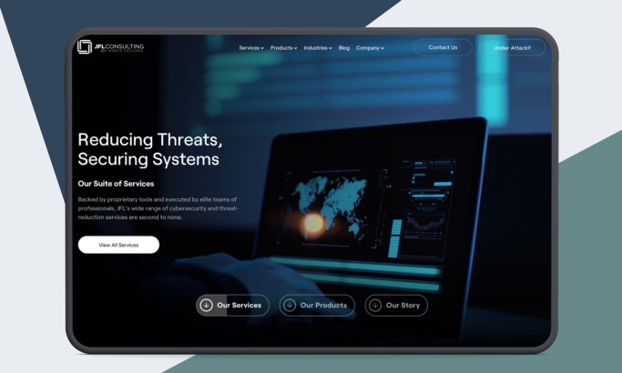
JFL Consulting
 Winner
★9.17/10
 LB 9.5
 PS 9.0
 TF 9.0
View Design
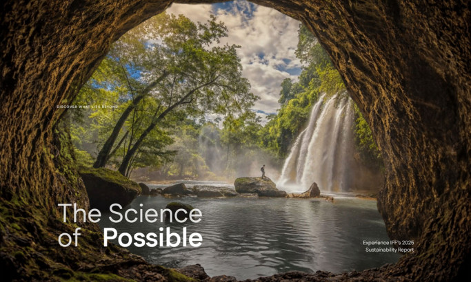
IFF 2025 Sustainability Report Website Design
 Winner
★9.38/10
 AO 9.0
-account-photo_listing.jpg) IS 10.0
IS 10.0 LS 9.0
 BD 9.5
View Design
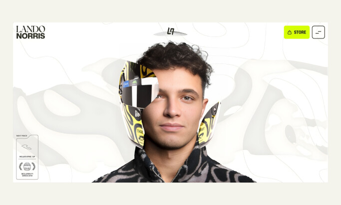
Lando Norris
 Featured
View Design
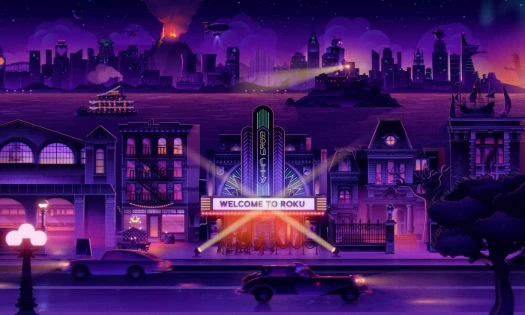
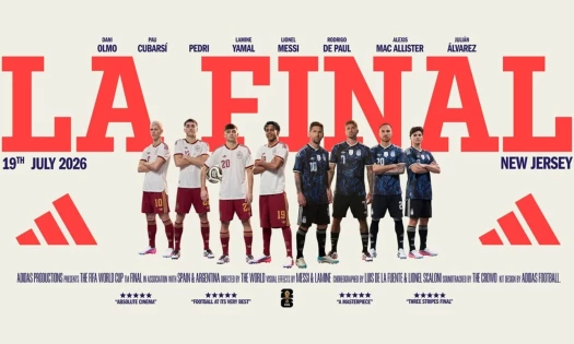
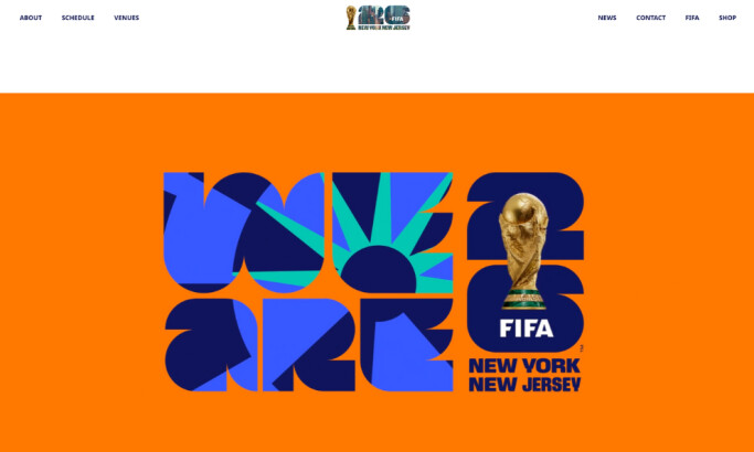
FIFA World Cup 2026™ NYNJ Website Design
byDD.NYC®
 Featured
View Design
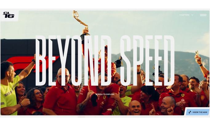
Charles Leclerc
 Winner
★9.67/10
 KT 9.5
 AO 9.5
- LB 10.0
View Design
Qodeca
byQodeca
 Featured
View Design
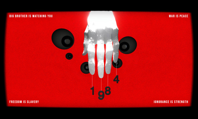
What If Orwell Had a Website? Website Design
byHolm
 Featured
View Design
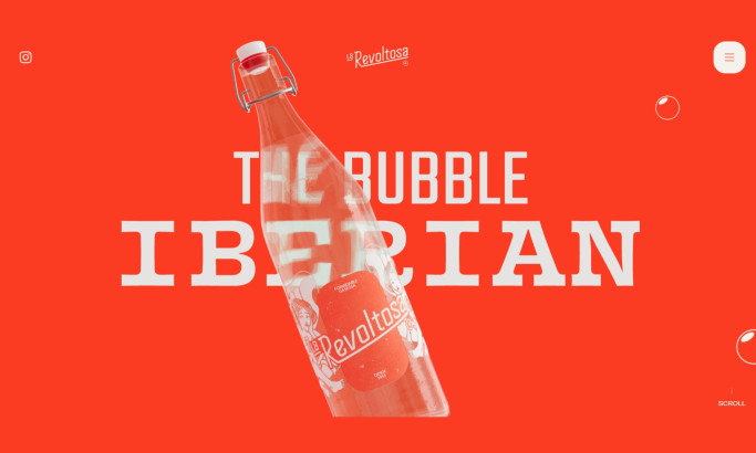
La Revoltosa Website Design
byWaka
Get Connected
With The Right Agency Partner
& Receive Proposals For FREE
View Design
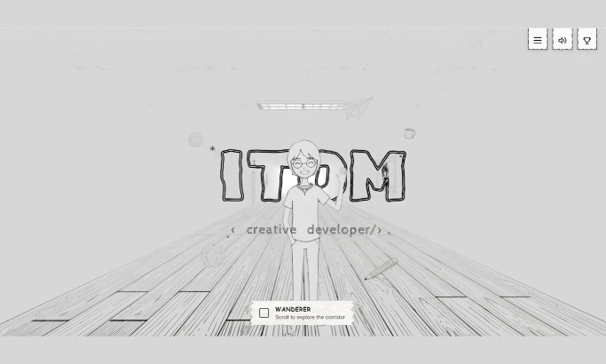
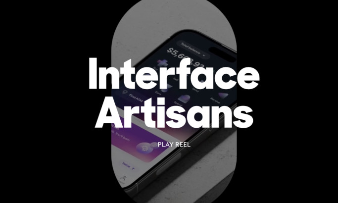
ITom Dev Website Design
View Design
ANML Studio Website Design
byANML
View Design
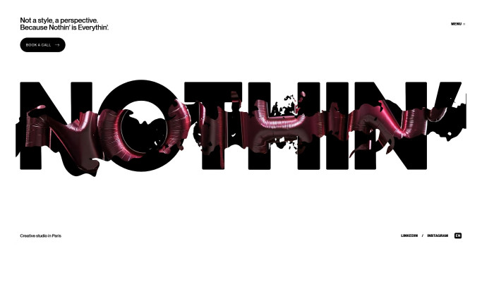
Nothin' Website Design
View Design
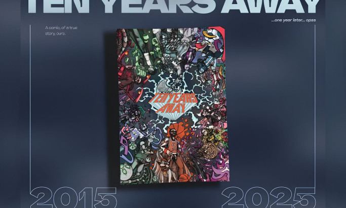
Ten Years Away Website Design
View Design
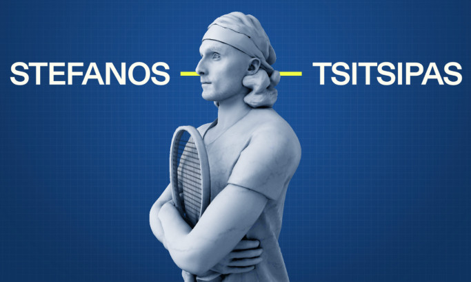
Stefanos Tsitsipas Website Design
View Design
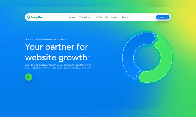
GoingClear Website Design
View Design
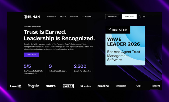
HUMAN Security Website Design
byBaunfire

View Design
Magnolia Dermatology Website Design
View Design
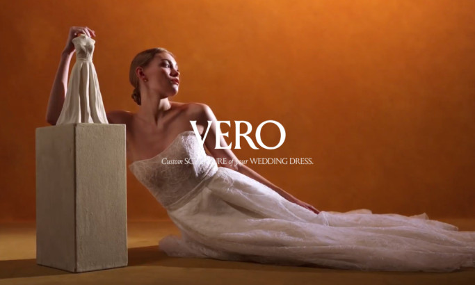
VERO Website Design
Ready to elevate your designs?