The most beautiful website designs captivate users through exceptional creativity, innovation, and meticulous attention to detail. These sites use striking visuals, intuitive layouts, and engaging interactions to create memorable digital experiences.
With the help of our experts, we present 13 stunning examples where top website designers seamlessly merge aesthetics and functionality. Explore how these websites push design boundaries, ensuring both beauty and usability for an impactful online presence.
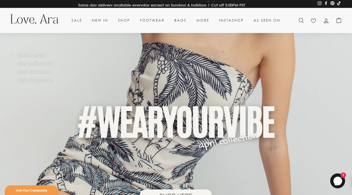
1. Love, Ara by Petruth IT Solutions
Standout Features:
- A holistic, clean design
- Testimonial section in a carousel
- A lovely, feminine About section
Petruth IT Solutions is behind one of the most beautiful website designs today, the exquisite Love, Ara revamp. The redesign improved the user experience with a functionality boost while strengthening the brand’s recognition through a thoughtfully adapted theme.
Generous white space highlights each product image and allows the layout to breathe. Every element, from the crisp headlines paired with vivid imagery to the dynamic carousel of testimonials, is crafted with meticulous attention to detail.
The pièce de résistance is the About Us page — a perfect blend of chic and femininity. Its soft, rounded pink visuals and empowering content blocks invite visitors to connect with the brand’s story, transforming the website into an inspiring visual journey.
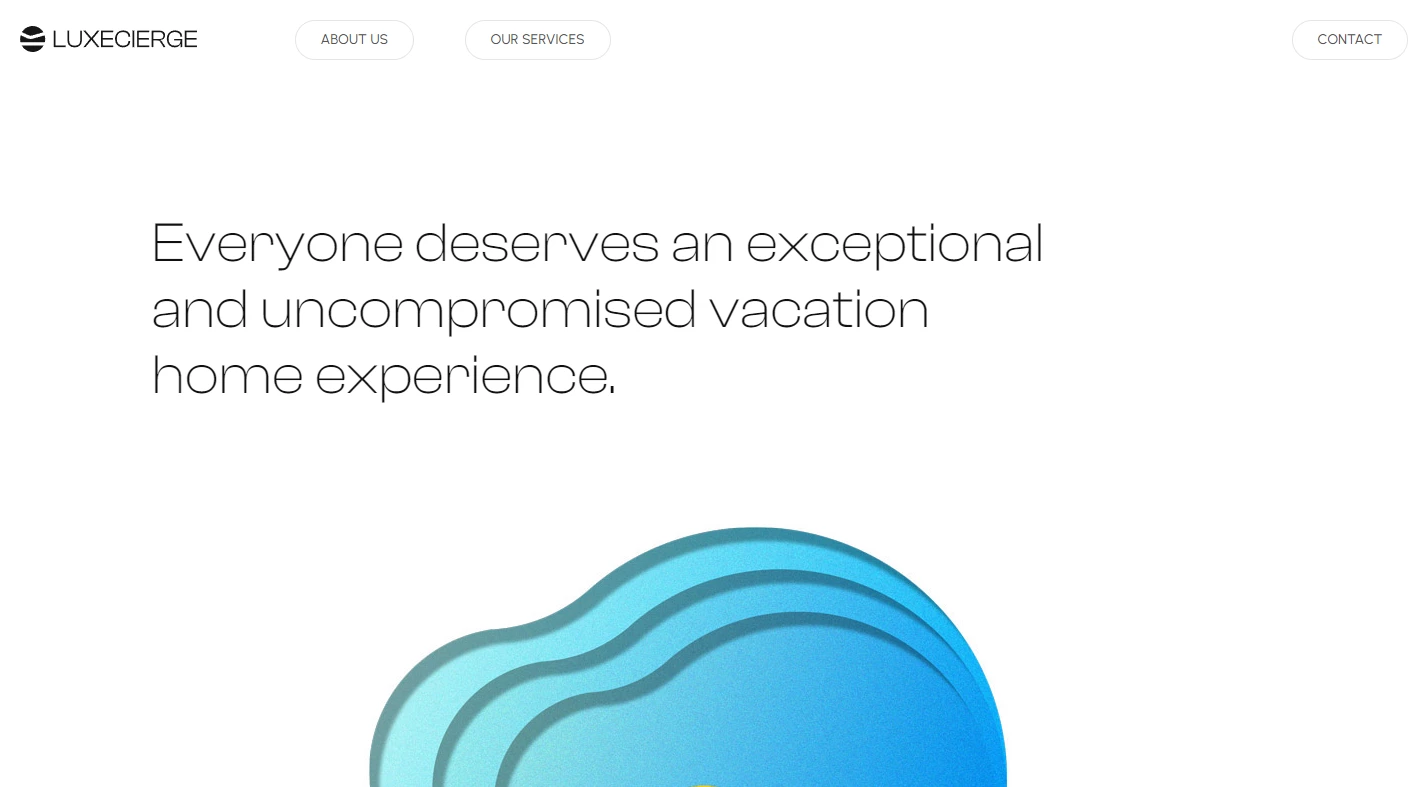
2. LUXECIERGE by be++er
Standout Features:
- Clean and relaxing
- Laid-back, edgeless design
- A “show, don’t tell” approach
LUXECIERGE website, built by Be++er, turns trip planning into a stress-free experience with a clean, minimalist layout. The design's generous negative space removes distractions, while short, inviting copies create a sense of ease.
The single-page design maintains a calming flow, punctuated by three striking visual moments. A bold digital artwork — an orange cross-section on an abstract blue background — draws intrigue, followed by real-life resort imagery. This thoughtful “show, don’t tell” approach immerses visitors in the brand’s promise, ensuring a seamless and relaxing browsing experience.
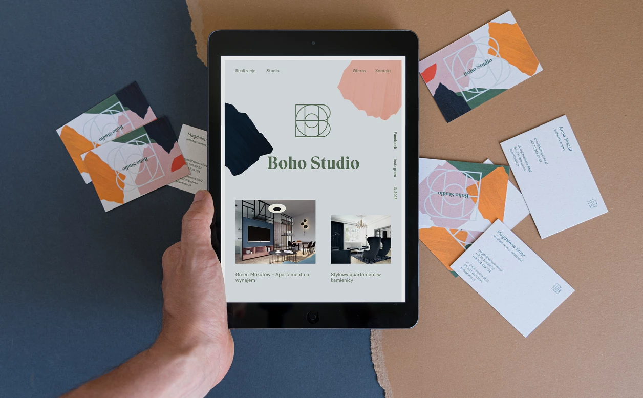
3. Boho Studio by Uniforma Studio
Standout Features:
- A modern design
- A stylish palette
- Distinctive typography
Uniforma Studio revitalized Boho Studio’s branding with a modern website design that enhances visibility while staying true to its artistic identity.
A soft teal background sets a soothing foundation, accented by pastel and bright hues that frame the layout. The homepage welcomes visitors with a freely arranged gallery of team portraits and portfolio pieces, embracing a dynamic, unconventional aesthetic.
By breaking away from structured layouts, the design reflects the studio’s creative spirit, signaling a bold approach to architecture. The typography further reinforces this uniqueness, replacing the industry’s typical monochrome text with a distinctive green typeface drawn from the brand’s logo.
If you liked this one, here are some of the best modern designs you might enjoy browsing!
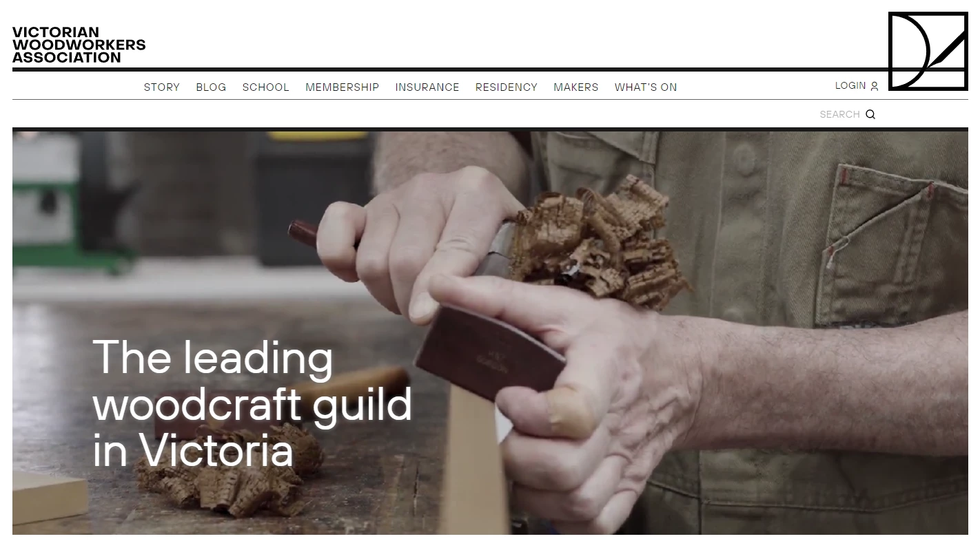
4. Victorian Woodworkers Association by Hue Studio
Standout Features:
- Thick black squares and rectangles
- Community galleries
- A well-branded design
Hue Studio’s well-structured website for the Victorian Woodworkers Association was designed to support the company in nurturing generations of carpenters and woodwork enthusiasts.
The design follows the structure of the logo, with thick black lines segmenting content into geometric sections. A natural color palette — wood tones and deep greens — evokes the artisans’ materials, enhancing the organic aesthetic. The site’s symmetry and clean organization make it visually pleasing while ensuring effortless navigation.
Several galleries showcase communal activities, while a cool blog section introduces new members and announces events. Lastly, enhanced functionality allows users to manage profiles and payments, blending practicality with a beautifully crafted digital presence.
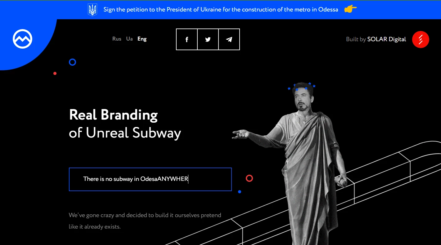
5. Odesa Subway by Solar Digital
Standout Features:
- Ingenious and ironic
- Built on the meme culture
- Using humor to point out a serious issue
Solar Digital’s Odesa Subway website is a masterclass in blending satire with bold, unconventional design to cover a civic issue. Its chaotic yet purposeful layout, filled with vibrant meme culture, GIFs, and surreal imagery, captivates users while cleverly delivering a message. The absurd visuals — like a statue of Robert Downey Jr. rolling its eyes — balance humor with critique, making the issue impossible to ignore.
Despite the playful tone, the design remains polished, with clean typography and intuitive navigation ensuring a seamless experience.
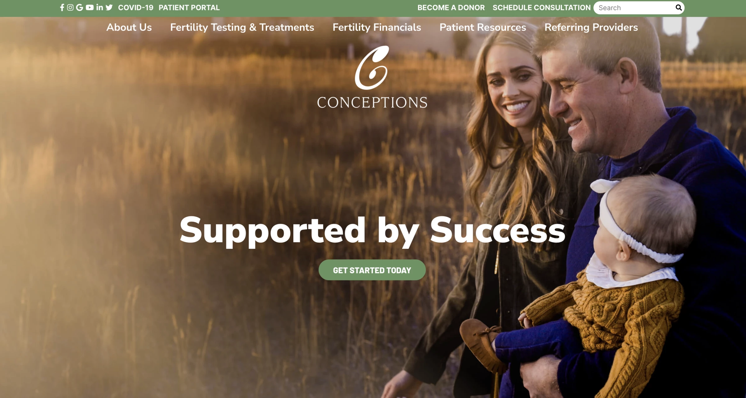
6. Conceptions Reproductive by The 215 Guys
Standout Features:
- Aspirational and aesthetically pleasing imagery
- Fresh color scheme
- Intuitive navigation with dropdown menus
The 215 Guys designed Conceptions Reproductive’s website to be as inviting as it is informative for users exploring fertility care, using visual harmony to build trust.
A clean white-and-green color scheme symbolizes renewal and clarity, while heartfelt images of families and medical professionals establish an emotional connection. The structured layout ensures readability, with bold sans-serif typography guiding users through key content without visual clutter.
Intuitive navigation, sleek dropdown menus, and elegant data visualizations enhance accessibility, making complex fertility information digestible. This balance of warmth, professionalism, and visual clarity makes the design both beautiful and highly functional.
7. Elk Ridge Resort by Proof Digital
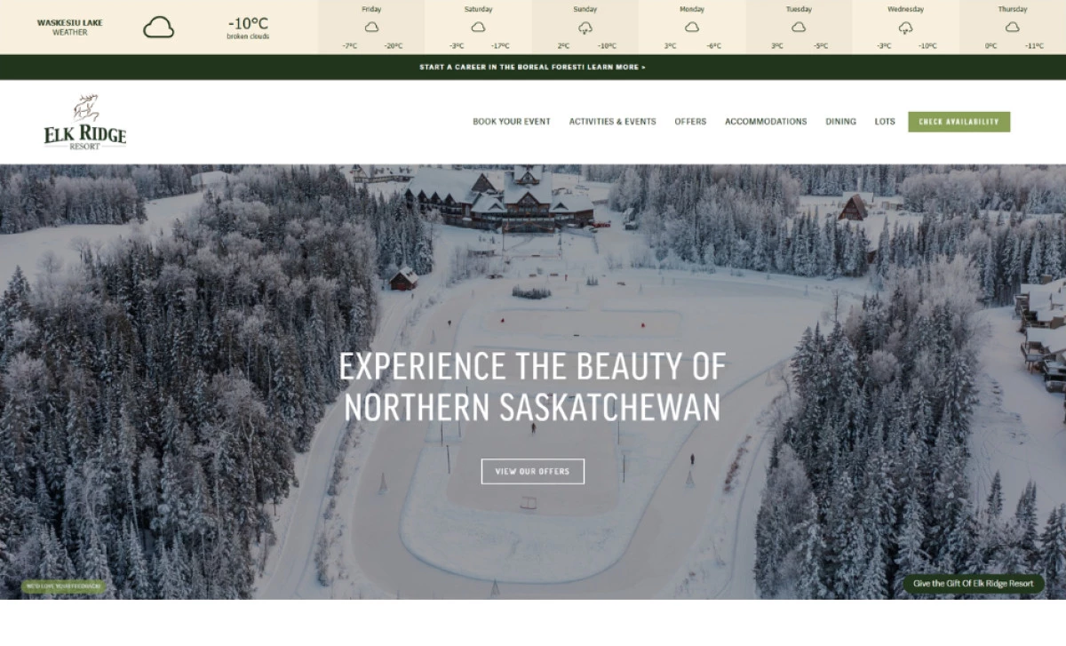
Standout Features:
- Immersive home page gallery
- Enticing one-liner copy
- Informative features
The Elk Ridge Resort’s site, crafted by Proof Digital , captures the resort’s luxurious setting, providing visitors with a comprehensive view of its offerings. Expansive full-screen imagery captures the resort’s scenic beauty, from lush golf courses to tranquil lakes. Striking typography paired with short, impactful phrases like “Venture into the boreal forest” also amplifies the sense of adventure.
Thoughtful UX elements — like an interactive map, event calendar, and real-time weather updates — enhance functionality without disrupting the clean, sophisticated design. For brands in the hospitality industry, this site showcases that seamless blend of aesthetics and practicality can make your site both visually compelling and highly effective.
8. Dream Wellness by HMDIA
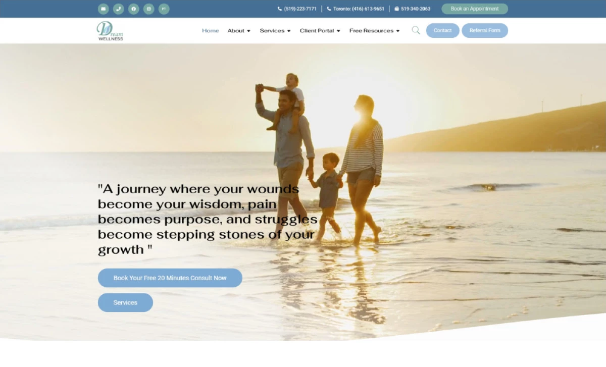
Standout Features:
- Serene video backgrounds
- Clear and accessible navigation
- Soft, calming color palette
HMDIA’s design for Dream Wellness, a health and wellness center focused on mental health services, transforms the digital space into a calming retreat, perfectly aligned with its mental health focus. Soothing video backgrounds of tranquil landscapes set an immediate sense of peace, while a soft color palette of blues and neutrals reinforces serenity.
The minimalist layout avoids visual stress, guiding visitors effortlessly to key resources. Additionally, prominent call-to-action buttons ensure accessibility, while the overall aesthetic fosters trust and relaxation. This delicate balance of elegance, clarity, and emotional resonance makes the design both visually stunning and deeply reassuring.
As one of the best health & wellness websites, it truly excels in engaging and guiding users toward the help they need.
9. Emily Martin Design by Roen Creative Studio
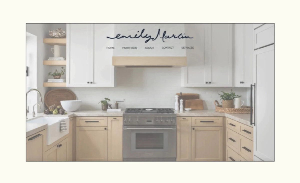
Standout Features:
- Clean, sophisticated aesthetic
- Intuitive navigation
- Seamless portfolio presentation
Roen Creative Studio’s website for Emily Martin Design captures the brand’s refined aesthetic with a minimalist yet elegant approach. The generous white space and neutral tones create a sense of calm sophistication, ensuring that the interior design projects remain the focal point. This visual restraint allows visitors to fully appreciate the craftsmanship without distractions while contributing to an overall polished and inviting feel.
A fixed, simplified menu ensures effortless navigation, while the portfolio’s grid layout offers a balanced and visually engaging display of Emily Martin’s work. In conclusion, this site’s seamless design embodies professionalism and warmth, making it an exquisite digital representation of the brand’s ethos.
10. Evolving Forests by Southstik Studio
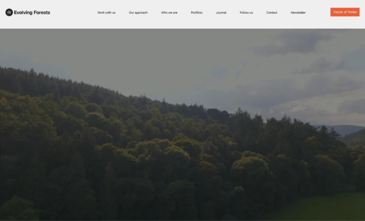
Standout Features:
- Interactive, engaging navigation
- Large-scale videos for immersive storytelling
- Clean, user-friendly layout
Southstik Studio’s website design for Evolving Forests is a stunning fusion of storytelling and sustainability, using immersive visuals to bring the brand’s mission to life.
Expansive video backgrounds immediately capture attention, drawing visitors into the world of timber and conservation. These moving visuals, paired with ample white space and structured content, create a striking balance between depth and clarity. The restrained yet impactful design ensures that the message remains the central focus.
Thoughtful navigation enhances accessibility, making exploration intuitive and engaging. This seamless experience, combined with the evocative imagery, results in a visually captivating and informative site that embodies the beauty and importance of sustainable forestry.
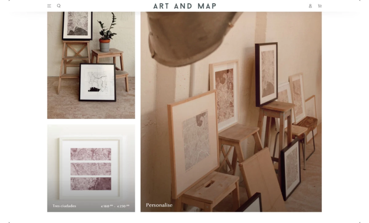
11. Art and Map by Andesany
Standout Features:
- Minimalist, art-focused design
- Streamlined eCommerce functionality
- Personalization options for custom maps
The eCommerce website website for Art and Map, an online store that allows users to create unique, custom map art, is a masterclass in minimalist elegance.
For this website, Andesany design agency used a neutral color palette and clean typography to create a sophisticated backdrop that enhances the intricate map designs. The balance of simplicity and artistic detail allows each piece to shine, making the site feel like a curated gallery.
The intuitive layout and fluid eCommerce experience further elevate the design, offering a seamless and visually delightful journey from browsing to customization. This refined approach makes the website not just functional but a beautiful extension of the artistic brand itself.
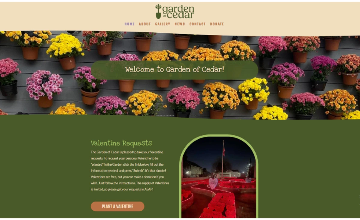
12. Garden of Cedar by Luckychair
Standout Features:
- Engaging, nature-inspired design
- User-friendly layout for community interaction
- Warm, inviting color palette
Luckychair’s design for the Garden of Cedar website captures the warmth and vitality of this community garden with a visually rich, nature-inspired aesthetic.
Earthy greens and warm browns create an immediate sense of connection to the land, reinforcing the garden’s organic mission. The inviting color scheme, combined with full-width imagery of thriving plants and engaged volunteers, makes the site feel alive and welcoming.
Parallax scrolling and seamless navigation enhance engagement, allowing visitors to explore volunteering, donations, and community stories effortlessly. This thoughtful design transforms the site into more than just an informational platform — it becomes an immersive reflection of the garden’s heart and spirit.
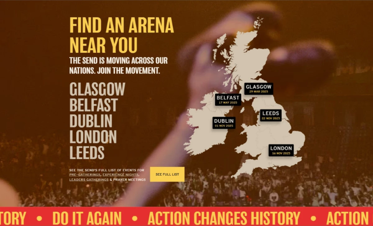
13. The Send UK & Ireland by Design & Narrative
Standout Features:
- Bold, vibrant visuals
- Engaging, dynamic layout
- Gen Z-targeted messaging
Design & Narrative’s website for The Send UK & Ireland electrifies the digital space with bold visuals and high-energy design, perfectly capturing the movement’s passion to inspire young people to take radical action for their faith.
Large, impactful typography and vibrant background colors create an immediate sense of urgency and excitement, reflecting the momentum of the youth-led mission. The dynamic layout ensures every section feels alive, with strategic placement of event details and call-to-action buttons maintaining a compelling visual rhythm.
Interactive elements, from the event map to animated transitions, further amplify engagement, making the site as immersive as the movement itself. This high-intensity, visually striking design ensures that The Send’s digital presence is as powerful as its real-world gatherings.
How To Design a Beautiful Website
Beyond stunning visuals, designing a beautiful website is about creating a digital experience that drives real growth. By combining strategic insights, effective tools, and actionable strategies, you can build a site that captivates but also converts.
Here’s a step-by-step guide to help you craft a website that reflects your brand’s identity and delivers measurable results:
- Define your brand identity
- Prioritize user experience
- Leverage visual hierarchy and aesthetics
- Incorporate immersive imagery and storytelling
- Optimize functionality with strategic tools
- Invest in professional expertise
- Continually evolve and optimize
1. Define Your Brand Identity
Before diving into design, clarify what your brand stands for. Understand your mission, values, and unique selling points. Your website should tell your brand’s story with authenticity. Then, develop a visual identity that includes a cohesive color palette, typography, and imagery that resonates with your target audience.
2. Prioritize User Experience
A beautiful website is as much about function as it is about form. Focus on creating an intuitive user journey by:
- Designing clear navigation paths that guide visitors seamlessly.
- Using ample white space to create a calm, inviting environment.
- Implementing responsive design to ensure a flawless experience across all devices.
3. Leverage Visual Hierarchy and Aesthetics
Make strategic design choices that draw attention to what matters most:
- Use bold headlines and engaging visuals to capture interest right away.
- Employ a balanced layout with plenty of white space to let your content breathe.
- Integrate dynamic elements like interactive galleries, subtle animations, or video backgrounds to keep users engaged without overwhelming them.
4. Incorporate Immersive Imagery and Storytelling
Visual storytelling can elevate your brand’s message. Here are some tips to do this successfully:
- Use high-quality, relevant images that align with your brand identity.
- Consider immersive elements like full-width banners or digital artwork to create an emotional connection.
- Ensure that every visual element reinforces your overall message and encourages visitors to explore further.
5. Optimize Functionality with Strategic Tools
Aesthetics must be supported by functionality. Here are some effective ways to achieve both:
- Use intuitive navigation menus, dropdowns, and call-to-action buttons that guide users to key areas of your site.
- Incorporate practical features such as integrated maps, calendars, or data visualization tools to enhance user engagement.
- Streamline processes like online payments or profile management to improve the overall user experience.
6. Invest in Professional Expertise
While DIY tools can be tempting, nothing beats the expertise of a professional design agency. Hiring a professional web design agency is a crucial step that:
- Brings fresh perspectives and proven strategies tailored to your brand.
- Ensures the integration of the latest design trends and technologies.
- Saves you time and resources while delivering a polished, high-performing website that drives real growth.
7. Continually Evolve and Optimize
Treat your website as a dynamic asset. Use analytics and user feedback to:
- Monitor user behavior and engagement.
- Regularly update content, visuals, and functionality.
- Test new design elements and strategies to stay ahead of industry trends and continuously enhance the user experience.

Our design experts recognize the most innovative and creative designs from across the globe. Visit Design Awards to see the:
- Best Logo Designs
- Best Website Designs
- Best Video Designs
- Best Print Designs
- Best Packaging Designs
- Best App Designs
Our team also ranks agencies worldwide to help you find a qualified agency partner. Visit our Agency Directory for the top Logo Design Companies, as well as:
- Top Web Design Agencies
- Top Video Production Companies
- Top Print Design Companies
- Top Packaging Design Companies
- Top Mobile App Development Companies