Storybook is a versatile tool that empowers developers to craft UI component libraries and design systems with ease. Its ability to isolate components and create modular, reusable elements streamlines front-end workflows, fostering consistency and quality in user interfaces (UI).
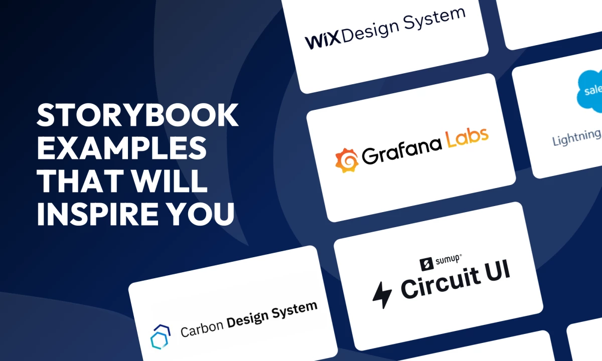
Let’s dive into eight Storybook examples that each showcase a unique approach to organization, design, and functionality. These examples also provide invaluable inspiration for developers and designers seeking to create or refine their own systems.
Grafana Labs: Best for Inclusive UI Development
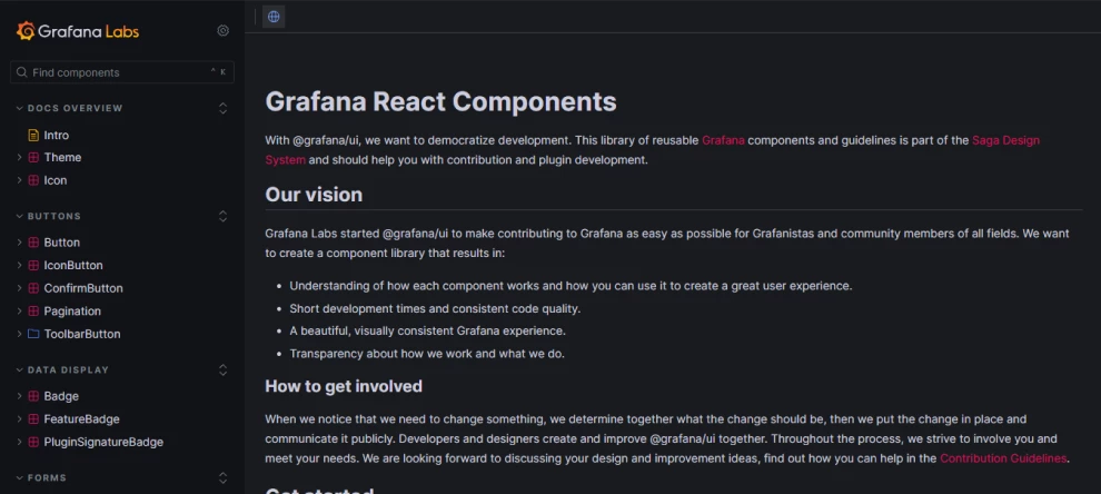
Standout features:
- Explanatory intro section
- Approachable Control, Actions, Accessibility, and Code features
- Organized component-by-component menu
Grafana Labs, part of the Saga Design System, exemplifies an open, inclusive approach to UI development. Storybook for Grafana serves as a library of reusable components and guidelines aimed at facilitating contribution and plugin development.
This Storybook focuses on fostering a deeper understanding of how each component functions and how developers can leverage them to create exceptional user experiences. By prioritizing modularity and clarity, it achieves shorter development times and ensures consistent code quality.
Its standout features include an explanatory intro section that simplifies navigation, allowing users to quickly grasp the system's structure. Additionally, its approachable Control, Actions, Accessibility, and Code features empower developers with tools to adapt and refine components effectively.
Lastly, the organized component-by-component menu ensures a logical flow, making it easy to locate and interact with each element.
Circuit UI: Best for Consistent, High-Performance Web Applications
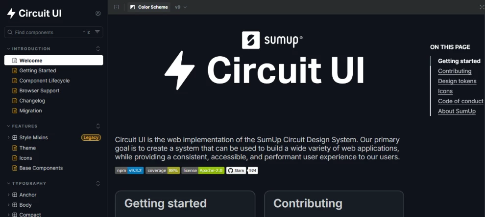
Standout features:
- Tags informing users on component’s development stage
- “Docs” tabs that streamline navigation
- Multiple variations of each component
Circuit UI, the web implementation of the SumUp Circuit Design System, focuses on delivering a consistent, accessible, and high-performance user experience, catering to the needs of both developers and end-users.
One of its defining features is the tags that inform users about each component's development stage. These labels, such as “Stable,” “Under Review,” and “Deprecated,” provide valuable insights into the component's readiness and evolution.
The system's “Docs” tabs streamline navigation, offering detailed information about components, including their usage and technical specifications. This structure ensures users can easily explore and understand the functionalities of each element.
Furthermore, Circuit UI presents multiple variations of each component, allowing developers to customize and adapt them to meet specific requirements while maintaining a unified design language.
Actyx Industrial UI: Best for Modular Industrial UI Design
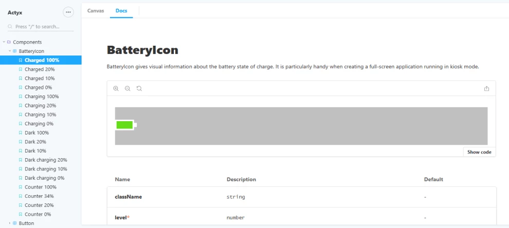
Standout features:
- Canvas and Docs fragmentation
- Sleek, easy-scrollable layout
- Straight-to-point navigation
Actyx Industrial UI provides a simple, yet highly modular framework of UI components tailored specifically for shop floor applications. The system is designed to support developers in creating efficient and effective interfaces that meet the rigorous demands of industrial environments.
Its Canvas and Docs fragmentation separates the design and code perspectives. The Canvas view highlights the aesthetic and functional aspects of components, while the Docs section provides detailed insights into the code and instructions for crafting variations. This dual approach ensures that developers can seamlessly bridge design and implementation.
Its sleek, easy-scrollable layout emphasizes the components as the focal point of the interface. This thoughtful design choice enhances visual clarity and usability. Complementing this is the system’s straight-to-point navigation, which eliminates unnecessary elements and focuses solely on presenting the core components.
By prioritizing simplicity and efficiency, Actyx Industrial UI creates a streamlined experience that supports the rapid development of high-quality industrial applications.
Carbon Design System: Best for Versatile and Scalable Design Solutions
Standout features:
- On-page, easy-to-navigate menus
- A wide array of design elements, from simple fonts to detailed graphs
- Library that goes far beyond design elements
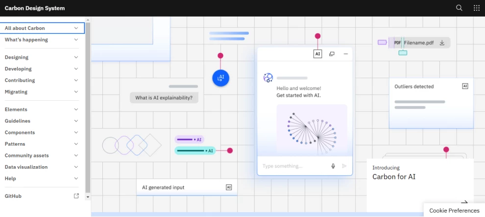
Carbon, IBM’s open-source design system, offers a versatile framework for creating products and digital experiences. Rooted in the IBM Design Language, it provides a comprehensive suite of working code, design tools, and human interface guidelines, bolstered by a vibrant community of contributors.
Central to Carbon’s appeal is its on-page menus that provide intuitive navigation. These menus streamline access to essential sections like “Overview,” “Design,” and “Usage,” decluttering the primary navigation while offering a seamless user experience. This empowers developers and designers to quickly find the information they need.
Carbon’s offerings extend to a wide array of design elements, from minimalist fonts to intricate graphs, which all ensure adaptability across various use cases. Beyond just design elements, the system includes resources like guidelines, migration strategies, and a help section, making it a holistic toolkit for front-end development.
Overall, Carbon offers essential building blocks for design and development, including components, UI patterns, and code. These assets can be extended or adapted to suit specific business scenarios, making Carbon a robust and flexible solution for creating consistent, scalable, and innovative user experiences.
Salesforce Lightning Design System: Best for Accessible, Localization-Friendly Apps
Standout features:
- Detailed, on-page submenus
- Engaging visuals on the introduction pages
- Comprehensive tools section
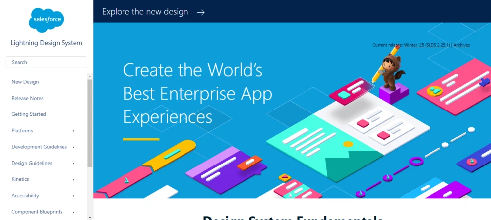
As the React implementation of the Salesforce Design System, Salesforce Lightning Design System ensures that developers and designers can build consistent, intuitive, and productivity-enhancing user experiences while maintaining seamless integration with Salesforce’s extensive ecosystem.
One of its standout features is the use of detailed, on-page submenus. These submenus appear on the right side of the screen, effectively decluttering the main navigation by presenting only one option per design element. Additional details and options are neatly organized in the submenu, enabling smoother navigation through otherwise complex pages.
The system’s engaging visuals on its introduction pages are also captivating, providing an inviting entry point into the design system’s extensive capabilities. Complementing this is a comprehensive tools section that houses all the resources developers and designers need to work effectively, including guidance on implementing and customizing components.
With its focus on accessibility, localization, and seamless compatibility, the Salesforce Lightning Design System empowers teams to create applications that align with the Salesforce ecosystem and enhance user satisfaction through thoughtful design and functionality.
Audi UI React: Best for Efficient Product Development
Standout features:
- Comprehensive accessibility tools
- Well-organized menu that doesn’t overwhelm the user
- Insightful “Getting Started” guides
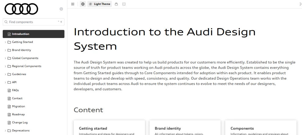
The Audi UI React library, part of the Audi Design System, provides a centralized resource for building products efficiently and consistently across the brand’s global landscape. As the single source of truth for product teams, it ensures alignment and a unified approach to design and development.
Its comprehensive accessibility tool offers functionalities like theme changes, background level adjustments, outline and grid previews, language selection, and even a vision simulator. These tools make the system highly inclusive, catering to diverse user needs and promoting accessibility across products.
The well-organized menu allows teams to locate components and guidelines effortlessly, encouraging streamlined workflows. Furthermore, the insightful “Getting Started” guides act as a perfect entry point for team members, providing clear direction on leveraging the system effectively while fostering a deeper understanding of Audi's design principles.
By housing indispensable resources like global and regional components, frequently asked questions (FAQs), and contact information, the Audi UI React library empowers product teams to create applications that resonate with Audi’s ethos of quality and innovation while maintaining efficiency and consistency.
Talend UI: Best for Developing Unified and Structured UI
Standout features:
- Engaging welcome section
- Organized menu
- Comprehensive Talend design guide
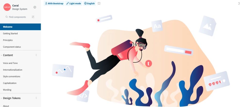
Talend UI, supported by the Coral design system, offers a well-structured and inclusive framework for creating cohesive user experiences across Talend’s products.
By leveraging a repository of pre-implemented and thoroughly documented components, it enables teams to streamline the interface-building process and ensure consistency across applications, regardless of the team or department.
A particularly engaging element of Talend UI is its welcome section, which provides a warm and intuitive introduction to the system. This section effectively orients new users while reinforcing Talend’s commitment to accessibility and inclusivity.
The menu, organized with separation lines, enhances navigation by clearly dividing categories and simplifying access to the system’s extensive resources. This thoughtful design ensures users can locate components and documentation effortlessly.
Additionally, the comprehensive Talend design guide serves as a one-stop resource, offering detailed insights into the principles and implementation of Coral — from component testing to responsive adjustments and translations.
With a focus on real-time interaction and accessibility, Talend UI empowers teams to build interfaces that cater to diverse user needs while promoting efficiency and inclusiveness in the design process.
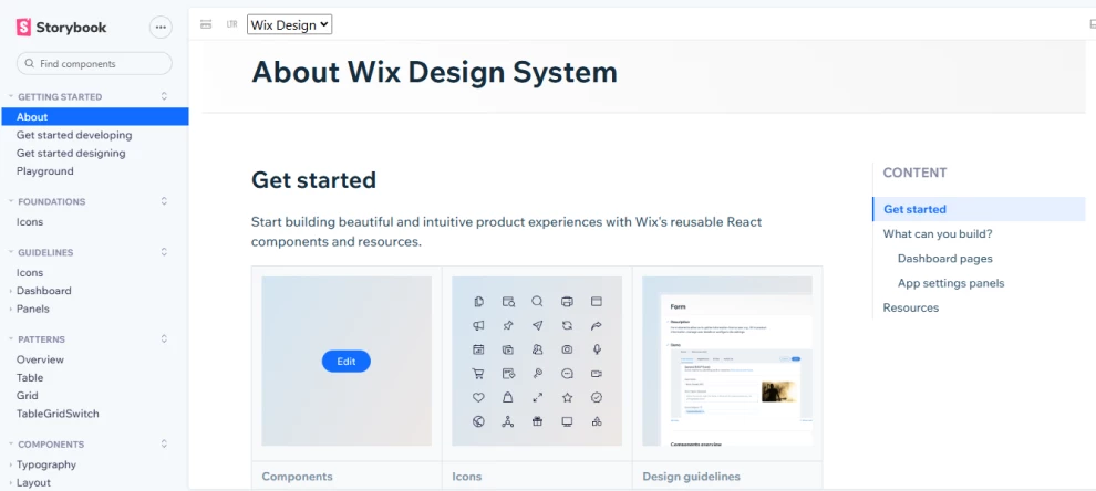
Wix Design System: Best for Real-Time Experimentation and Customization
Standout features:
- A vast icon library divided into sections and types
- Playground feature where you can experiment with components
- Detailed component information
The Wix Design System offers a powerful framework for building elegant and intuitive product experiences tailored to React-based Wix applications. It provides developers and designers with a comprehensive suite of resources, including reusable components, text styles, and page templates.
A highlight of the system is its vast icon library, thoughtfully divided into sections by type. This organization simplifies the search and selection process, allowing users to find the perfect icon for their needs quickly.
Additionally, the playground feature enhances creativity and experimentation by enabling users to interact with components directly, test various configurations, and preview their applications in real time.
Its detailed component information also elevates usability by providing more than just basic presentations and code snippets. Instead, it offers examples of variations, common use cases, and best practices for implementing each component.
With these features, the Wix Design System is a versatile toolkit, empowering teams to craft cohesive and visually appealing applications while maintaining a user-friendly design language.
Storybook Examples: The Bottom Line
These Storybook examples highlight the potential of well-designed UI systems to streamline workflows, improve user experience, and inspire creativity. By exploring these systems, developers can uncover innovative ways to enhance modularity, consistency, and accessibility in their projects.
Storybook Examples FAQs
1. Why is Storybook important for design systems?
Storybook provides an isolated environment for developing and testing components, ensuring modularity, consistency, and reusability across design systems.
2. Can Storybook be used with any framework?
Storybook supports popular frameworks like React, Vue, and Angular, making it highly versatile for front-end development.
3. How does Storybook simplify UI development?
Storybook isolates components for independent development and testing, promoting modularity and reusability while ensuring consistency across design systems.
4. Can Storybook be used for large-scale projects?
Yes, Storybook is ideal for large projects. It allows teams to document, test, and organize components efficiently, ensuring scalability and cohesion.