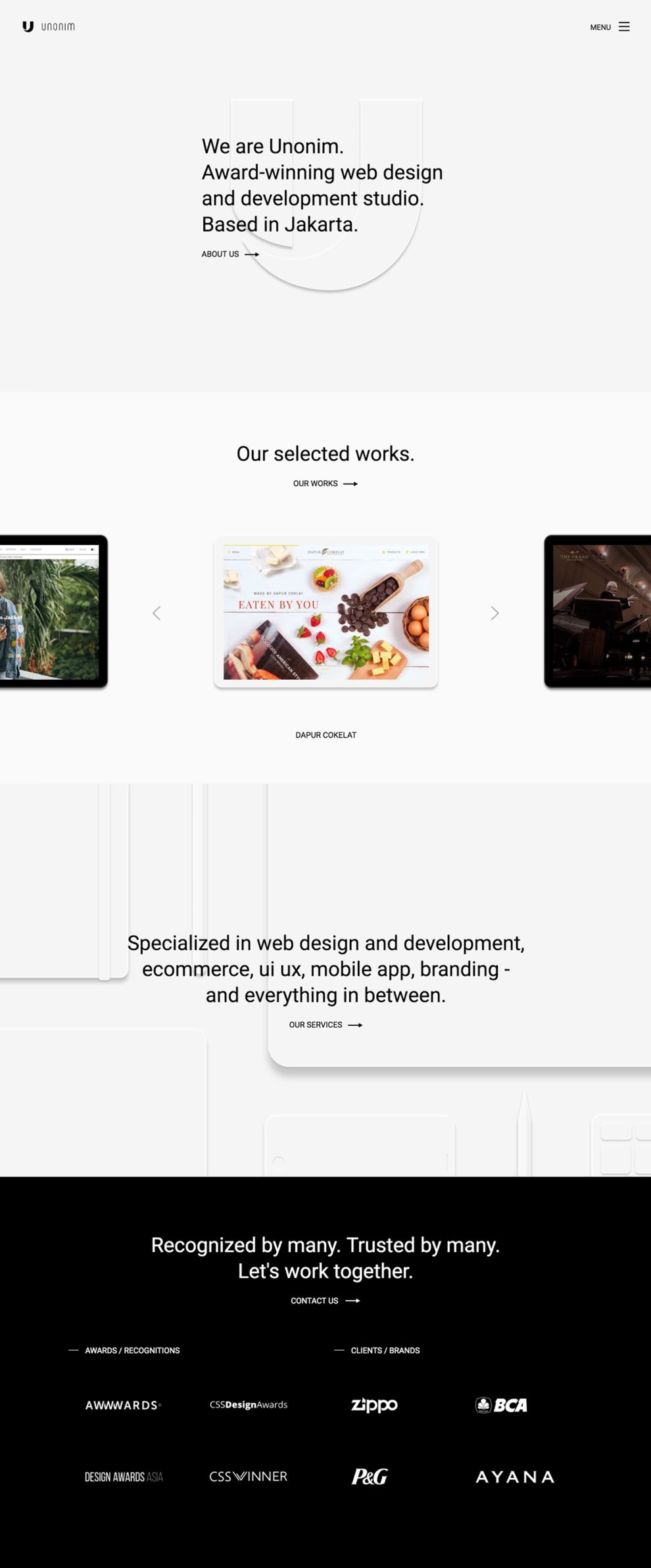
Unonim is a digital marketing studio whose work spans anything from branding to e-commerce, from website design to app design. With a motto of “simple, not simpler,” the sleek and minimalistic design of the website speaks to how seriously they take that statement.
Offering both a scroll down option on the home page as well as a clickable menu option, Unonim makes it easy for the user to navigate their website. By scrolling down, the consumer can access all four of the website’s pages with a brief explanation. From there, they can pick and choose where they want to go.
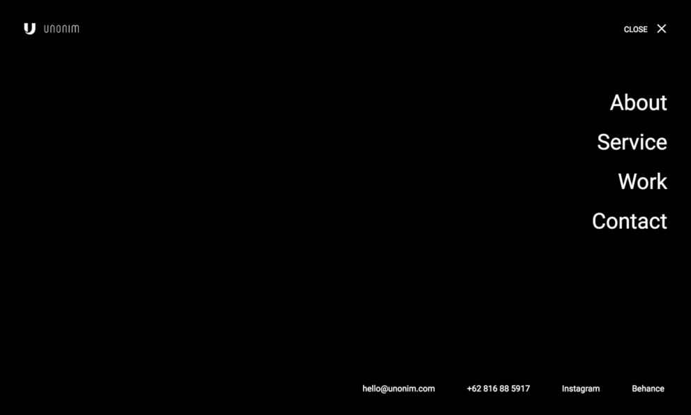
If the consumer is looking for a more direct approach to finding what they want, the home page offers a simple menu in the upper right corner. With a simple click, every area of Unonim’s website is laid out for them to access. The menu also presents the user with multiple hyperlinks to utilize as ways to navigate to Unonim’s social media sites and access their contact information.
As the viewer navigates through the various pages, the menu option is continuously accessible.
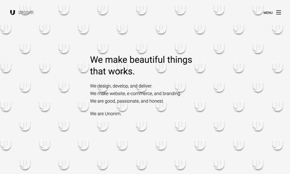
Within each area presented to the consumer, Unonim opens each page with a textual hook to draw them in. The simplistic pages begin with a minimal amount of information and gradually add to it. While each area is divided into clear pages of content, they are only accessible through long scrolling.
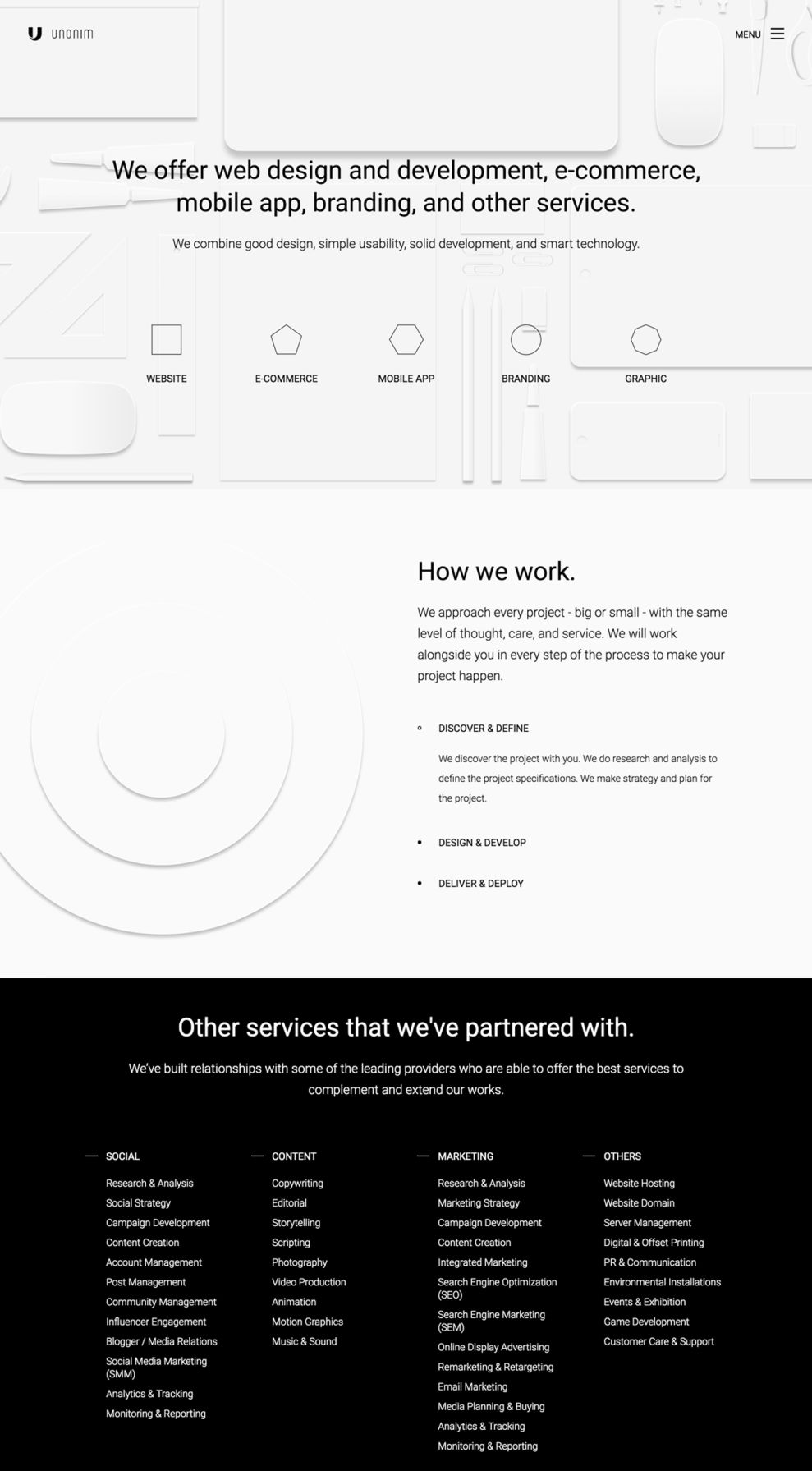
Unonim presents a sleek and clean design by using only varying shades of blacks, whites, and grays. They continue this minimalistic approach by relying on negative space to draw the eye of the consumer toward the information given to them. Unonim also makes prominent use of their logo as a geometric design element in both flat and skeuomorphic formatting. The presentation of geometric shapes is carried over in the creation of their navigation buttons, as well.
The monochromatic approach to their design is only abandoned when highlighting two important segments of information: their team and their portfolio. The use of color in displaying members of their team highlights the importance of who Unonim is. Similarly, the use of color in presenting demonstrations of their past work makes each sample pop and draws on the efficiency of their services.

Unonim continues using hyperlinks on its contact page as a way for users to reach out to the company. When the viewer clicks on the email address of the company, a modal window pops up, directing the user to their personal email platform.
For those looking to hire Unonim for a project, the same area of the website offers online chat features that allow instant conversation with someone who can better direct them.
In a similar fashion to the contact segment, those interested in working for Unonim will be directed through a modal window if they are interested in submitting their personal resume and applying for one of the open positions within Unonim.
Unonim is a clean website design in the Advertising, Arts & Recreation and Professional Services industries.