Vectron Biosolutions Website Design Uses Large Fonts & Negative Space to Enhance Its Messaging
Vectron Biosolutions is a team of experts in microbial protein production. The company's About Us page states that their business aims to be the “obvious choice for technologies and services for microbial applications within the life science industries.”
Designed and developed by LIFT Agency, their website successfully translates the visual language akin to life sciences to an online environment. While these visual cues are present in delicate amounts, it is this subtlety coupled with messaging-oriented best practices that truly elevate this website design.
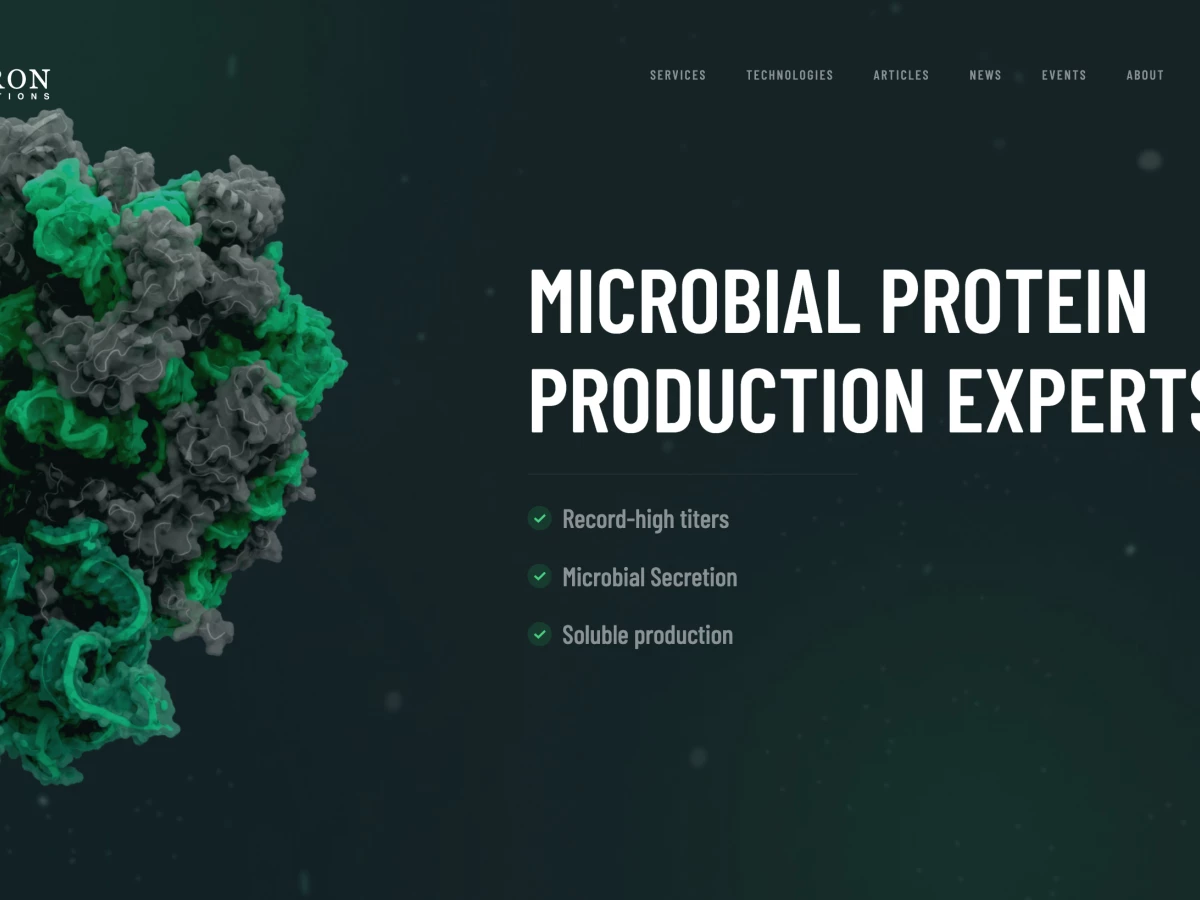
Upon landing on the homepage, the visitor is confronted with a bold proclamation, front and center, of what Vectron Biosolutions is. Contrasting the dark green background are the white fonts in a very legible sans serif typeface, accompanied with the additional bullet points in light grey. The electric green accents provide a nice change of pace from what would be a drab color palette.
This section above the fold doesn't feature much else. It signals a very generous use of negative space that is very consistent throughout the rest of the website.

Vectron Biosolutions’s Sticky Main Navigation Ensures an Easy and Efficient User Journey
Another critical website element that can be found above the fold is the main menu. This basic navigational tool is "sticky,” meaning it stays put on the screen even as a visitor scrolls down. Professional web developers use this technique to enhance website navigation and improve user experience, as it always ensures easy access to important navigation options.
Sporting the same typography as the rest of the website, it lends consistency to the overall look, while not being obtrusive. The smaller font size and its light grey color make the menu visible just enough for it to be easily noticed.
The spacing between each menu item is quite generous. This ensures that each link stands out on its own, without breaking the menu's substance. The final menu item (Contact Us) is framed, as it is one of the most important lead generation points of Vectron's website.

Science-Inspired Microanimations Add Life to Vectron’s Website Design
As noticed before, the green palette is, of course, a direct homage to a world of nature and life sciences. And as Vectron Biosolutions operates on a sub-particle level, any web design company would want to include visuals that signal this.
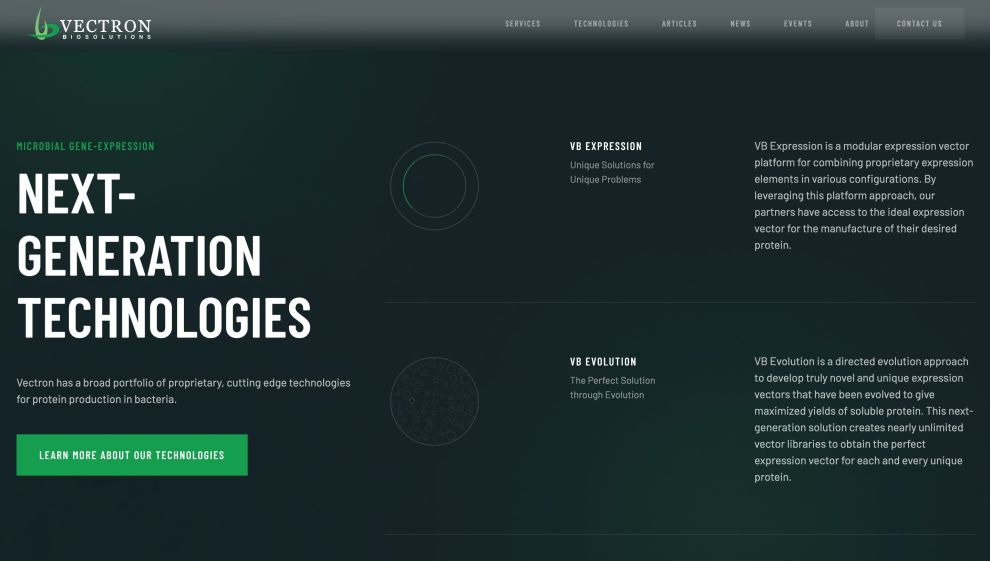
Scattered around the site are animated diagrams of atoms’ orbital movements and protein structures. Most commonly grouped in threes, they are laid out vertically and horizontally, depending on the context of a section on a page.
The animated parts are highlighted in the same lime green used as an accent color on the text and in the figures. As a part of the company's social proof, the website points out certain takeaways from the organization's track record. It does so with huge numbers with a lime green outline that no other website element uses.
The Strategic Use of CTAs Prove It Can Expedite Conversion on Vectron’s Website
Call-to-action buttons are, of course, a staple of modern, customer-centric web design. They expedite the audience education, facilitate lead generation and drive visitors down the funnel by directing them to pages of special importance. Hence, they can fast-track customer conversion.
Vectron website design uses different CTAs across the entire homepage (as well as elsewhere on the website) for different purposes. Another characteristic of their usage of CTAs is that they are present on every screen, whenever the user scrolls, optimizing click-through rates.
These CTAs lead to a contact page, technology page and services page – three different user journey touchpoints that all serve a specific aspect of visitor education. Easy access to these website hotspots ensures the audience is directed to all the right pages that would educate them on the matter and potentially entice them to convert.
Vectron Biosolutions Website Design is Consistent, Streamlined and Visitor-Oriented
Vectron Biosolutions website design showcases excellent consistency in design, layout and visual impact whose aim is to educate the audience and convince them of the company’s competency.
A very classy color palette rooted in the business’s scientific character, the subtle use of micro-animations and accent colors contribute to its clean look overall. It's the same way branding experts use color theory to convey specific qualities and create a cohesive visual identity.
This design consistency is one of the well-applied best practices that favor the visitors. It helps logically organize the messaging, making navigating the website more intuitive. The usability of this website is apparent on all of its pages.
The prominent calls-to-action accelerate the user journey towards conversion while making sure each aspect of the company is sufficiently covered and no stone is left unturned.
It is for all of the reasons outlined above that the Vectron website design is deserving of DesignRush’s Best Website Design award for March 2022.