
Vice i-D is a web publication from the international alternative journal, Vice. The publication is specifically meant to provide editorial pieces that focus on the varying identities and associated communities of young people today. It’s a website that focuses on the specificities and values of people’s different identities, and the web design has been engineered to reflect this interest.
Smart Web Design Helps Building a Brand Image
For example, the home page for Vice i-D always features the headline piece of the day. Each piece includes a large image that consumes the entirety of the frame, and when complimented by its headline, it evokes the identity focus of the entire site. Additionally, while the site is largely journalistic, it does infuse its design with various, casual slang and colloquialisms that further brands the site as youthful and subculture-conscious.
The piece’s use of the popular acronym “TBT,” for example, gives the otherwise staunch think piece a playful and counter-culture connotation. By allowing the premiere identity piece of the day to consume the entirety of its home page, Vice i-D is stating that they appreciate the intersection of journalism and subculture.
The Overall Design Simplicity Lets Readers Focus on the Journalism
With the headline piece often featuring a flashy image of highly-fashionable, chic young people taking the entire screen, the rest of the website is not what you might expect design-wise. As soon as you go below the fold, things get different.
Overall design of Vice i-D is clean and quite simple, both visually and structurally. A bit of latest articles, a couple of videos and a few featured pieces are all you can find on their home page. Nothing too glamorous or flamboyant.
Same goes for the design of article pages. There’s a lot of white space with blocks of text broken by beautiful HD images and taking only a half of the screen. This design provides a pleasant reading experience and ensures that the visitors’ focus is on the very article. Also, with the infinite scroll feature, Vice is inviting and tempting their readers to consume more and more content, emphasizing the importance of the work their reporters are doing.

Straight Design Sends a Message About Embracing Differences
A very straight and clean design of the website might have another unlikely, almost paradoxical purpose. Namely, Vice often features strange stories from the edge of society. As a brand, they’re known for writing articles and shooting documentaries about people or social groups that are seen as peculiar, extravagant and obscure.
And their brand is not only about presenting the attitudes, beliefs and everyday lives of these people. It’s also about embracing them, and the design might be the way to show this. Incorporating these unusual stories into a conventional design frame may suggest a broad-minded approach to understanding and accepting these curious stories as common and natural.
Utilizing Web Design to Connect Two Brands
Furthermore, Vice i-D inherits not just the ideology and sociopolitical principles from its parent magazine, but also some of the important design elements. Their website also has a large hero image belonging to the featured article above the fold and a design structure generally conceived to put focus on the published stories.
The design and placement of the drop-down menu are also basically identical and conceptually similar. From the first look at Vice i-D, you can tell that they tried hard to firmly associate their website with their parent brand.
However, Vice i-D has its own integrity and personality as well. Being traditionally a publication more focused on fashion and art, it varies from the Vice website just enough to point this fact out.
Namely, Vice i-D is just a bit less conventional and a bit more flashy in design, but certainly not to an extent you would expect from a glossy fashion magazine. This is simply because Vice i-D has no intention to be a typical glossy fashion magazine, let alone look like one. For Vice, connecting the two publications and putting them under the roof of the same brand was obviously more important than developing a completely separate character for Vice i-D.
Reinforcing Individuality by Showcasing the Human Content
The menu page demonstrates how Vice i-D continues to foreground their values of individuality, identity, and culture. The menu drops down the top of the page, and it includes every tool and category required to properly navigate the site.
By allowing the menu to not only navigate, but also showcase the very human content of the page, the designer has provided functionality that doesn’t take away from the impetus of the site.
Users are able to simultaneously browse new categories and explore their current one, further expanding the site’s focus on their identity-based content. By formatting the UI to maintain focus on the material, this designer has contributed to a UX that focuses exclusively on the identities contained within the content of the page.
Using a Change in Website Design to Emphasize the Shift in Focus
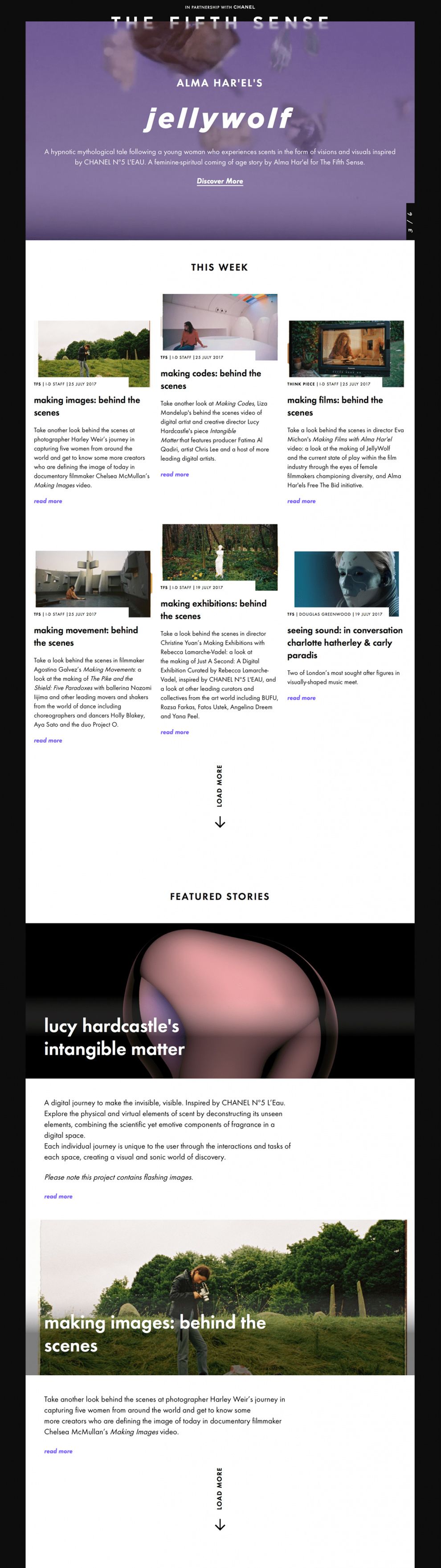
Perhaps the most unique element of the design of Vice i-D’s site is the alternative section known as, “The Fifth Sense.” Here, a different kind of journalistic material takes on a new face and perspective. The previously white UI has been inverted to black, and the focus of the design along with it.
On this page, material takes a back seat to UI like the half-blurred title, subheadings, and navigation tools. Inverting the design of the rest of the site evokes a sense that this space is different, even contrary, to the intentions of the other pages. Here, we see an example of how design schemes can be used to cue up categorical differences between different realms of a site.
Web Design That Aims to Provide Value and Promote a Progressive Worldview
All in all, Vice i-D website is a great example of content-oriented design that reflects a certain purpose and puts focus on journalism instead of mere looks. It’s clean, straightforward and easy to use and navigate.
This website design is also curious because of the values and beliefs it seems to reinforce and is a great example of how to leave the room for the successful promotion of a certain ideology using different design features. It also clearly highlights the connection with a parent brand which largely helps in building particular aspects of its image.


-preview.jpg)