Estudio NK is a creative and colorful website developed by a company that specializes in digital marketing and branding for their clients. The company effectively displays one of the awards they recently won as the first image on their home page. The placement is smart, immediately inspiring potential clients with a fullscreen, high-resolution representation of their abilities.
The home page utilizes a deep scroll that showcases a variety of photographs related to the company’s work. Images are presented in a side-by-side grid format, utilizing the edges of each photograph as the grid’s borders. Laid over each high-resolution photograph, the company employs a bubbly, white sans serif font to make the name of the project pop.
Estudio NK employs a header menu that is aligned to the right, allowing for potential clients to quickly find what they are looking for by navigating to various pages. Pulling from the company’s logo, each page title in the header is navy blue in color and uses the universal sans serif font of the home page. Pages are underlined in the menu when viewed, making navigation around the website easy to follow. The overall use of a white negative space within the header separates the menu from the remainder of the page.
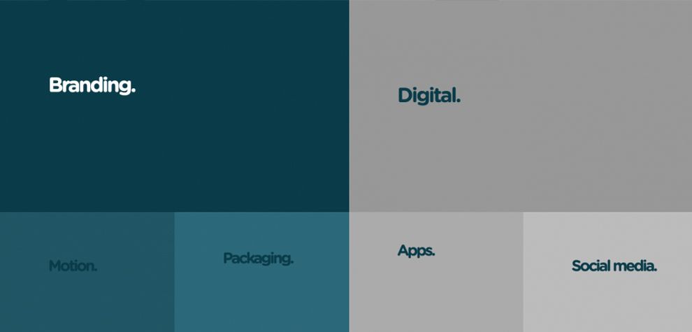
As an addition to their “About” page, the company separates what services they offer from their story. The page divides their skills straight down the screen, showcasing their digital skills on the right side of the page and their branding skills on the left. Skills are broken down by color boxes, using varying shades of navy on the left and gray on the right to decipher one box from another in the grid. Additional words appear inside each box when users move their cursor into an individual panel. This adds a depth to the page that creates intrigue for potential clients.

Calling on the use of colored text boxes, Estudio NK creates a vast amount of pale gray negative space on their contact page. Enlarged and navy in color for a stark contrast effect, the company’s contact information is aligned to the left in one condensed area. This keeps the eyes from wandering, simplifying the contacting process for users.
Estudio NK uses an analogous color scheme of blues and grays in combination with bold fonts to create a strong web platform. The addition of a powerful portfolio with high-resolution photography makes the entire website impactful to the user.
Estudio NK is a colorful website design in the Advertising and Professional Services industries.