You can have plenty of traffic and still struggle to get results. People land on your homepage, glance around for a few seconds, and leave because they can’t see who you are, what you do, or where to go next.
This checklist is designed to fix that.
Website Content Checklist: Key Findings
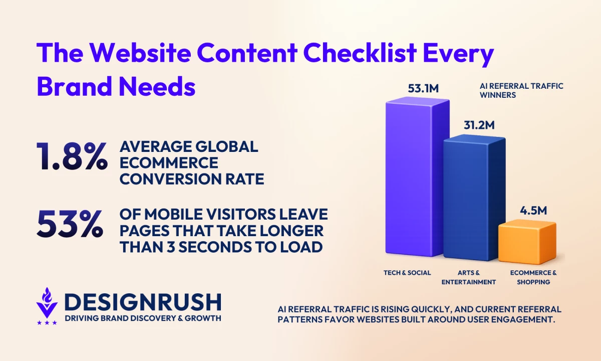
- The average global ecommerce conversion rate across all verticals is 1.8%, which means most visitors leave without taking action.
- 53% of mobile users leave pages that take longer than 3 seconds to load, proving the importance of mobile readability and page structure for engagement.
- AI platforms generated more than 1.13 billion referral visits in June 2025 alone, which puts more pressure on websites to publish content that AI systems can easily summarize and cite.
Website Content Checklist Overview
This checklist outlines every page that matters, what it should be doing, and what might be missing.
Use the table below to quickly audit your site page by page, spot gaps, and decide what to fix or optimize next.
| Page Type | Components |
| Sitewide Foundations |
|
| Homepage |
|
| About Page |
|
| Service Page |
|
| Product Page |
|
| Blog and Resources |
|
| FAQ Page |
|
| Contact Page |
|
| Legal & Trust Pages |
|
In the next sections, we discuss each page granularly, breaking everything down into elements you can work through one by one.
Complete Website Content Checklist
If you want your website to consistently attract, engage, and convert visitors, you need more than “good copy” on a few key pages.
Use this section as a practical walkthrough that you can apply page by page to tighten your messaging, remove friction, and make every word on your site work harder for your goals.
All examples are from our own website.
1. Sitewide Content Foundations
Even before you zoom in on individual pages, your site needs a strong foundation.
These are the elements that affect every page: how easy your site is to navigate, how your brand sounds, and how quickly visitors can understand what you do.
Get these right, and every other piece of content you create will perform better.
1.1. Make navigation labels simple and descriptive
UX and navigation directly affect whether visitors stay or convert. Baymard Institute's research of more than 50 major US and European sites found that up to 67% score mediocre or poor on homepage and navigation UX, and poor navigation is one of the most common reasons visitors leave without taking action.
Use clear labels like Pricing, Services, or Resources so visitors instantly know where to go, and avoid clever or branded names that create confusion. If someone has to pause to decode your navigation, you've already lost momentum.
1.2. Ensure a consistent brand voice and tone
Decide how you want to sound (friendly, authoritative, playful, etc.) and apply that style across every page, so your site feels cohesive and trustworthy.
Think of specifics: will you use “you” and “we” or keep it more formal? Are you avoiding jargon or leaning into industry language? Will you use short, punchy sentences or more detailed, explanatory ones?
Document a few do’s and don’ts so anyone creating content for your site can stay on-brand.
1.3. Write for scannability
Break up text with headings, short paragraphs, and bullet points. Assume most visitors skim webpages and make it easy to spot the key points in seconds.
1.4. Check content on mobile for readability
Read your pages on a phone: are headlines cut off, paragraphs too long, or CTAs hard to tap? Adjust spacing, line length, and button size so it’s effortless to read and act.
Mobile users also expect content to load instantly. Google says 53% of people leave if a page drags past three seconds. Slow load times can chip away at your conversions.
1.5. Refine SEO basics
Organic search is responsible for more than 30% of all website traffic, so getting your fundamentals right is crucial to long-term success.
Give every important page a clear H1, a focused topic, intent-based keywords, and compelling meta titles and descriptions that inspire clicks from search results.
2. Homepage That Captures Attention and Drives Action
Your homepage is often the first — and sometimes only — impression visitors get of your brand. In a few quick seconds, it needs to tell people who you are, who you help, and why they should care, then guide them toward a clear next step.
Treat it like a storefront window: focused, inviting, and designed to turn curiosity into action.
2.1. Establish clear value proposition above the fold
Use your hero section to answer three questions at a glance: who you help, what you offer, and why it matters.
Pair a clear headline with a short supporting line so visitors don’t have to scroll to understand what you do and why they should stay.
2.2. Use engaging visuals and media
Roughly 75% of users say they judge credibility based on design alone. Choose images, graphics, or short videos that support your message and show your product or service in action, not generic stock photos.
Make sure every visual loads quickly, looks great on mobile, and helps guide attention toward key headlines and CTAs instead of pulling focus away.
Check out award winning website designs here.
2.3. Showcase compelling social proof
Place trust signals like logos of clients, short testimonials, star ratings, or key stats near the top of your homepage where new visitors can see them immediately.
Focus on proof that speaks to outcomes (“Increased leads by 40%”) rather than vague praise (“Great to work with”).
2.4. Add a clear, primary call to action
Decide the single most important next step you want visitors to take (e.g., “Book a demo,” “Get a quote”) and feature that CTA prominently above the fold.
Use action-oriented copy, repeat it in a few strategic spots down the page, and avoid cluttering the hero section with too many competing buttons.
3. About Page That Builds Credibility and Connection
Your About page is where visitors decide whether to trust you. It should go beyond corporate-speak and show what you stand for, why you exist, and who’s behind the work.
Done well, it reassures people they’re in the right place and makes them feel confident choosing you over competitors.
3.1. Establish your mission and core values
Open with a concise mission statement that explains why your company exists and who you’re here to serve.
Avoid vague phrases like “world-class solutions” or “customer-first mindset.” Instead, describe the specific change you’re trying to create for your customers and industry.
3.2. Tell a compelling brand story
Share a short origin story that explains how your company started, the problem you noticed, and the moment you decided to solve it.
Highlight the challenges you faced and what you learned along the way. The goal isn’t to talk about yourself for its own sake; it’s to show that you understand your audience’s struggles because you’ve lived or studied them deeply.
3.3. Showcase your achievements and awards
Highlight concrete proof that you deliver results: notable clients, case study outcomes, press mentions, certifications, industry awards, or years in business.
Choose achievements that matter to your target audience, such as recognition from respected industry bodies and measurable impact.
3.4. Introduce your team as real people
Feature key team members with names, roles, and short bios that explain what they do and why they’re good at it.
Use these bios to build trust: mention relevant experience, specialties, and what each person cares about in their work.
4. Service Page That Clearly Sells Your Solutions
Your service pages are where visitors evaluate whether what you offer fits their needs, budget, and timeline — and how you compare to competitors.
A strong service page clearly communicates outcomes and removes friction, so the next step (contacting your sales team, purchasing a product, or signing up for a subscription) feels obvious and low risk.
4.1. Provide clear, detailed service descriptions
Explain each service in plain language, starting with what it is and who it’s for. Avoid internal jargon and acronyms your audience may not know.
Break complex offers into sections so visitors can quickly understand scope and fit. If you offer multiple tiers or variations, give each one a short, distinct description instead of a generic bullet list.
4.2. Highlight specific benefits and outcomes
Move beyond features (“monthly reporting,” “strategy sessions”) and spell out what clients actually gain from working with you (e.g., “more qualified leads,” “faster sales cycles,” “clearer brand messaging”).
Frame your copy around the problems you solve and the goals you help customers achieve, so visitors can quickly see themselves in the outcome.
4.3. Be transparent about pricing, packages, and next steps
Where possible, include clear pricing, package ranges, or starting points, so visitors know whether you’re in their ballpark.
If you can’t publish exact rates, explain how pricing is calculated and what factors affect the investment.
Outline what happens after someone reaches out: Do they book a call? Fill out a brief? Receive a proposal within a set timeframe?
A simple “What to expect” section reduces uncertainty and makes it easier for qualified leads to take the next step with confidence.
5. Product Pages That Convert Browsers into Buyers
Your product pages are where visitors compare options, check the details, and decide whether they trust your product enough to click “Add to cart” or “Get started.”
Strong product pages provide the right information at the right time and make the value of your offer feel obvious.
Examples are from Amazon.
5.1. Keep key product details front and center
Above the fold, clearly show what the product is, who it’s for, price, and the main benefit or use case. Don’t make visitors hunt for basics like size, color options, key specs, or availability.
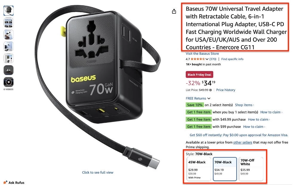
Use a short, benefit-led headline and a concise summary or bullet list to quickly communicate why this product is worth considering. Your primary CTA (e.g., “Add to cart,” “Start free trial”) should sit close to these core details.
5.2. Use high-quality product images and media
Include a gallery of high-resolution images, short videos, 360° views, or GIFs that show the product from multiple angles and in real-life use. Let users zoom in to check details like texture, materials, or interface elements.
Make sure media loads quickly and looks sharp on mobile devices, so it doesn’t slow down or frustrate shoppers.
5.3. Highlight differentiating features and benefits
Translate features into concrete benefits your customers care about (“stays charged for 12 hours,” “cuts admin time in half,” “fits comfortably in small spaces”).
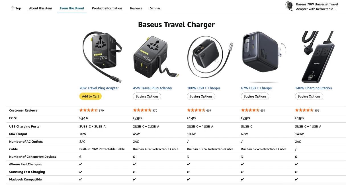
Use short bullets or comparison blocks so shoppers can quickly see why they should choose you over similar options.
5.4. Answer common buyer questions directly on the page
Use your product page to pre-empt the questions that typically come up before purchase: sizing or fit, compatibility, installation, shipping costs and timelines, returns, warranties, or usage instructions.
Shoppers shouldn’t have to leave the product page to get answers. The clearer you are here, the fewer doubts and abandoned carts you’ll see.
Click here for the best product listing page designs.
5.5 Add persuasive social proof
Include reviews, star ratings, testimonials, or user-generated content (like customer photos) tied to each product.
Highlight snippets that speak to real outcomes (“lasts longer than expected,” “setup took less than 10 minutes,” “customer support was fantastic”).
6. Blog and Resource Content That Nurtures Prospects
Consistently sharing valuable, well-written content plays a major role in search performance. Studies show it influences nearly a quarter of the algorithm factors that determine how well a site ranks.
Your content should educate your audience, build trust, and guide visitors toward becoming customers by answering their questions and addressing their concerns.
6.1. Map topics to each stage of the buyer journey
Plan content for awareness, consideration, and decision stages:
- Top-of-funnel (awareness): define problems and trends
- Mid-funnel (consideration): compare options and explain solutions
- Bottom-funnel (conversion): help readers choose your brand (case studies, comparisons, ROI explainers)
6.2. Use compelling, benefit-led headlines that hook readers
Write headlines that clearly state the value of the piece: make the benefit obvious and specific. Instead of “Website Content Tips,” go for “7 Website Content Tweaks That Can Double Your Lead Conversions.”
Test different headline formulas and keep them short enough to read at a glance. If a busy reader can’t tell what they’ll gain from the headline alone, rewrite it.
6.3. Answer high-intent questions your audience is already asking
Use real data and conversations to decide what to write: search queries, sales and support questions, live chat logs, social media comments, and industry communities.
Structure posts so the main question is answered near the top, then expand with details, examples, and next steps. This makes your content scannable and more likely to perform well in search.
6.4. Include clear CTAs to relevant products, services, or next steps
Every blog post or resource should lead somewhere. Add contextual CTAs that naturally follow from the topic: link to a relevant service page, a product, a demo, a downloadable guide, or a newsletter sign-up.
6.5. Interlink related posts to keep visitors engaged longer
Use internal links to guide readers deeper into your content, especially to key pages like product, service, and case study pages.
Link relevant terms and topics to more detailed guides, FAQs, or tutorials so readers can explore at their own pace.
6.6. Structure Blog Content for AI Citation (GEO Basics)
AI search platforms increasingly pull information directly from webpages when generating answers, summaries, and recommendations.
AI referral traffic is still small in comparison to traditional search, but it is growing quickly. Similarweb reported that AI platforms generated more than 1.13 billion referral visits to the top 1,000 websites in June 2025 alone, up 357% year over year.
Content written for traditional SEO can still perform well, but pages are more likely to appear in AI-generated answers when the structure is easy to skim, summarize, and cite. You should make sure to:
- Answer the main question early in the article instead of delaying the core point several sections down
- Use clear H1s and subheadings that closely match the wording people actually search for
- Add short summary sections or succinct takeaway paragraphs for long articles
- Cite named sources for statistics, claims, and research
- Format FAQs in natural language because AI systems often cite direct question-and-answer content
- Keep definitions, explanations, and comparisons simple enough to quote cleanly in generated answers
You can also track whether AI platforms are sending traffic to your site using GA4 referral reports and custom channel groupings for sources such as ChatGPT, Perplexity, Gemini, and Copilot.
7. FAQ Content That Handles Objections
Your FAQ page surfaces the hesitations and questions that stop people from converting. When answered clearly, prospects feel safer moving forward with your brand’s offerings.
7.1. Prioritize questions that address objections and friction points
Start by collecting questions from sales calls, support tickets, live chat, and social DMs.
Flag questions that show hesitation: concerns about price, timing, risk, complexity, fit, or support. These are the ones most likely to affect conversions.
7.2. Write clear, concise answers in your brand voice
Match your brand voice, but don’t let style get in the way of clarity. Explain simply and tell the reader exactly what to do if they’re unsure (e.g., “If your situation doesn’t fit these examples, contact us and we’ll recommend the best option.”).
Use short paragraphs, straightforward language, and concrete examples where helpful. If a reader has to decode your answer or read it twice, it’s too long or too vague.
7.3. Optimize FAQ content with natural-language keywords for SEO
Phrase questions the way your audience actually asks them: “How long does implementation take?” not “Implementation timeline overview.”
Use the same wording you see in search suggestions, customer emails, and chat logs.
8. Contact Page Content That Converts Visitors
A strong contact page makes reaching out feel like the obvious next step. It’s where warm interest turns into a real lead.
If your contact details are confusing, buried, or demanding too much effort, visitors will drop off.
8.1. Make your contact information easy to find and scan
Place your contact page in the main navigation and use a straightforward label like “Contact” or “Contact Us.”
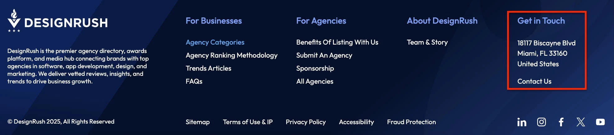
On the page itself, clearly list key details: email address, phone number (if you use one), and physical address or service area if relevant.
8.2. Simplify your contact form to reduce friction
Only ask for the fields you truly need to respond effectively: usually name, email, and one or two contextual fields (like company size or project type).
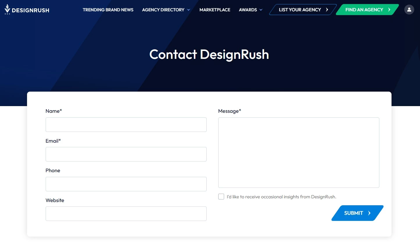
Every extra field feels like extra effort and can lower submission rates.
8.3. Set clear expectations on response time and next steps
Clarity about what comes next makes reaching out feel more predictable and builds trust before the first conversation even starts.
Tell visitors exactly what happens after they hit “Submit.” For example: who will contact them, within what timeframe, and via which channel.
A simple line like “We’ll get back to you within one business day” can significantly reduce anxiety and drop-off.
9. Legal and Trust Pages Every Website Needs
Visitors expect clear policies before they hand over personal information, create an account, or make a purchase. These pages also set expectations around how your site works and how user data is treated.
9.1. Publish a privacy policy
Explain what data you collect, how it’s used, whether it’s shared with third parties, and how users can contact you about their data. If you serve users in regions covered by laws such as GDPR or CCPA, your policy should comply with those requirements.
9.2. Add terms of service or terms and conditions
Your terms page must outline rules for using the site, account responsibilities, payment or subscription terms (if applicable), intellectual property ownership, and limitations of liability.
9.3. Include an accessibility statement
Accessibility requirements continue to expand for digital services, particularly in the EU, following the enforcement of the European Accessibility Act in 2025.
An accessibility statement explains the standards your site follows, the accessibility features available to users, and how visitors can report issues.
9.4. Explain cookie usage and tracking
If your site uses analytics, advertising, or tracking cookies, explain what is collected and give users control over consent preferences where required by law.
The Best Tools To Support Your Website Content Workflow in 2026
These tools can streamline each stage of your workflow:
- UX & behavior analytics tools (e.g., Contentsquare, Hotjar) to understand how visitors interact with your content and where any issues come up.
- Heatmaps, like those provided by Contentsquare, show which sections attract attention and which are ignored. Session replays let you watch real user journeys, including clicks and scrolls.
- Content planning tools (e.g., Notion, Trello, Asana) to organize page outlines, editorial calendars, and content briefs.
- Research and SEO tools (e.g., Ahrefs, Semrush, Google Search Console) to uncover topics, keywords, and questions your audience actually searches for.
- Writing and editing tools (e.g., Grammarly, Hemingway, language models like ChatGPT) to tighten copy, fix errors, and improve clarity.
- Design and visual tools (e.g., Canva, Figma, Loom) to create on-brand graphics, annotations, and short explainer videos that support your message.
- Analytics tools (e.g., Google Analytics, Hotjar) to see which pages convert, where people drop off, and what needs improvement.
Of course, tools can only take you so far.
If you don’t have the time or in-house expertise to plan, write, design, and optimize all this content, hiring a specialized website or content marketing agency can help you move faster and get better, more consistent results.
Website Content Checklist: Final Thoughts
You don’t need to redesign your entire site to see better conversions. You just need to systematically upgrade the words and structure on the pages you already have.
Use this checklist to review one section at a time, tighten what’s unclear, and add what’s missing.
Our team ranks agencies worldwide to help you find a qualified partner. Visit our Agency Directory for the Top Content Marketing Companies, as well as:
- Top NYC Content Marketing Agencies
- Top Content Creation Companies
- Top Digital Marketing Agencies
- Top Marketing Strategy Agencies
- Top Social Media Marketing Agencies
- Top Digital Advertising Agencies
Our design experts also recognize the most innovative design projects across the globe. Visit our Awards section to see the best in website, app, logo, video, print, and packaging designs.
Website Content Checklist FAQs
1. How often should I review or update my website content?
Review your core pages at least every 6 to 12 months, especially your Homepage, About, Services, Product, and Contact pages. These pages shape first impressions and often influence conversions more than blog content.
Check performance metrics such as conversions, bounce rate, search rankings, and time on page. Update outdated messaging, weak CTAs, pricing details, screenshots, case studies, and answers to recurring sales or support questions.
Also, high-traffic blog posts usually need more frequent refreshes, particularly if they target competitive search terms.
2. What makes a good About page?
A successful About page explains who you are, what you do, and why visitors should trust you. It should sound specific and avoid generic company descriptions.
About pages usually include a short company story, proof of experience, team information, and examples of results or client work. Visitors should leave with a better sense of the people behind the business.
3. What makes a homepage convert better?
Homepages should explain what the business offers, who it helps, and why it matters within the first few seconds.
Clear headlines, visible CTAs, trust signals, and simple navigation all help reduce drop-off. Pages also need enough structure and spacing for visitors to scan quickly, especially on mobile.
4. What website content matters most for SEO?
Pages that clearly answer search intent tend to perform best in search results. That includes service pages, product pages, FAQs, comparison pages, and educational blog content tied to real customer questions.
You should also consider the structure, headings, internal links, fast-loading pages, and mobile-friendly formatting, which can help search engines better understand and rank your content.
5. What should a contact page include?
A contact page should make getting in touch feel straightforward. At a minimum, include a contact form, email address, and response time.
Depending on your business, you may also want to include a phone number, office location, booking link, support hours, or sales contact information. Keep forms short and avoid asking for unnecessary information upfront.