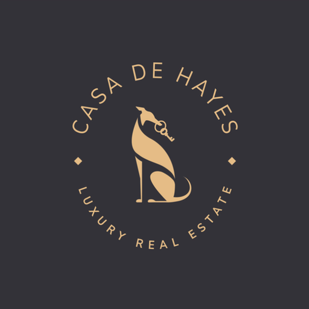
Standout Features:
- Circular logotype
- Elegant sans serif typography
- Sleek fox illustration
Miranda Wagner Design beautifully illustrated Casa de Hayes’s brand, which exudes elegance and timeless appeal. The logotype’s circular layout is timeless, perfectly framing the design’s focal point – the majestic fox illustration.
This captivating symbol sits at the logo's center, mirroring the company's clever and calculated approach to real estate. The gold color scheme against the dark background creates a premium look that reinforces the brand's high-end positioning.
The thin sans serif typography reflects the company's commitment to excellence and tradition, resonating with an audience looking for reliability. The diamond detailing is a nice touch; it further underscores the exclusive nature of Casa de Hayes. Discover the best real estate logo designs.
Together, these elements create a cohesive and attractive logo that will attract the discerning eyes of an upscale clientele.