Lift’s Logo Design Exudes Trustworthiness Through Simple Visuals
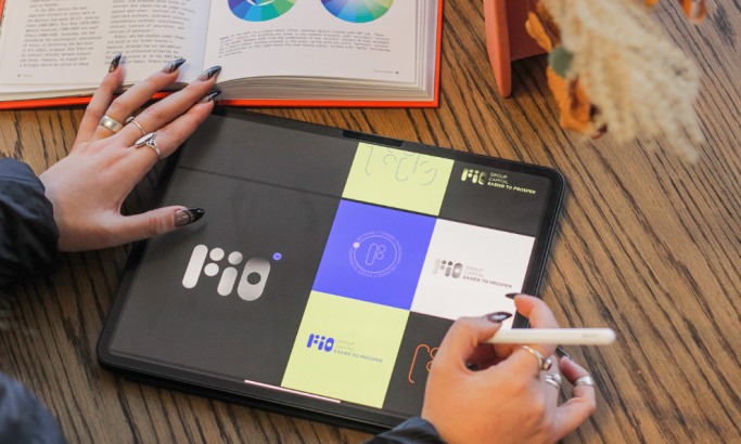
Lift Insight & Capital Partners' logo design embodies security through simplicity, thanks to design agency 97 Switch.
The design focuses on the brand's mission of lifting businesses through expert guidance and first-hand industry experience. The agency communicated this by utilizing a calming blue and white palette, a sans-serif font, and a minimalist layout.
In addition, the design's modern and approachable aesthetic showcases 97 Switch's expertise in creating resonant visual identities and achieving what other professional logo designers aim for.
Browse our collection of the most successful logo designs.
Lift’s Logo Design Conveys Approachability by Leveraging Lowercase Typography
One of the standout design features in Lift's logo design is the use of lowercase typography. It adds a sense of reliability and openness to the brand identity.
Using Europa Bold, this choice positions the company as a friendly and accessible partner, ready to help businesses reach their potential. A sans-serif font fits the brand's modern aesthetic, making it look fresh and dynamic.
The superscript dot in the letter 'i' is slightly far up than usual, symbolizing how the company aims to lift businesses to new heights.

The Color Story in Lift’s Logo Design Reassures Clients of the Brand’s Credibility
The agency's color choice is visually appealing and meaningful. The calming blue and white palette conveys the brand's trustworthiness and dedication to its clients. Also, the color story helps the brand gain the customers' trust and remain consistent in its identity.
Color psychology works for logo designs, allowing them to portray characteristics without using too many visual elements.
Explore more of these most powerful logo design examples.

The Logo Design for Lift Insight & Capital Partners Embraces Minimalism for Maximum Impact
Lift's logo design focuses on the essentials, making it easy to recognize and remember. The simple and solid visual identity allows Lift to stand out and resonate with the modern consumer's preference for a straightforward yet meaningful design.
The design remains consistent on other visual assets important to the brand, such as website design, social media posts, internal communications like letterheads and email signatures, and so on.
Overall, 97 Switch did an amazing job strengthening the brand identity and making Lift a more trustworthy company committed to providing its customers with the best quality of service they deserve.